
Analyzing competition is one of the key aspects of running a business. In this article, learn how to use Excel’s scatter plots to understand competition.
Recently, Kaiser at Junk Charts pointed to a very effective business chart that shows the dynamics of competitive land scape with ease.
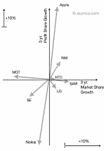
The chart shown aside originally appeared in Asymco, shows how mobile handset market has changed between 2007 & 2010.
What is so special about this chart?
I like this type of chart because it clearly tells the story of what happened in mobile handset market between 2007 and 2010. It shows how then leader, Nokia, kept loosing profit share despite a tiny loss in market share. It shows how new entrants like Apple have eroded the profit share for others. [related: good charts tell stories]
The chart instantly lets me ask important questions like, “So what did Nokia do wrong?”, “How come RIM is also in the same league as Apple (ie both market share and profit share went up) ?” etc. and explore for answers.
And that is what a chart should do. It should present a story and poke our curiosity to ask questions (or address problems).
How to construct similar chart in Excel?
Here is how you can construct similar business chart in excel.
Step 1: Get your data
In case of analytical charts like this, getting correct data is all important. For the sake of example, we will use the same variables – Market Share & Profit Share for 4 fictitious products – A,B,C & D. The data is shown below:

Step 2: Re-arrange the data, so we get first and last values
This is very simple. Use cell references to extract the data for just first and last periods. Now make starting values as zero and calculate ending values. Something like this:

Step 3: Make a scatter plot
Select the data and make a scatter plot. When you are done, it should look something like this:

Step 4: Format the chart
Do the following to format the chart:
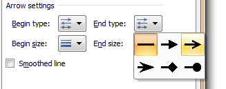
- Add lines to scatter plot so that starting and end point are connected

- Set arrow symbol as the end-point style for these lines (new feature in Excel 2007 and above)
- Remove grid lines and legend
- Add data labels to either starting or end points alone.
- Add axis labels, position them accordingly
- Make axis and labels subtle.
- Add a descriptive chart title
And you are done. The chart should look something like this:

Bonus Step: Making a scatter plot of absolute values
As you can see, the above chart only shows changes in market share and profit share of products between Q1-2008 and Q2-2010. But a more descriptive option would be to show absolute position of each product at both times.
Like this:

To make this chart, all the steps are same as above, just change your data to starting and end points, not the calculated ones.
Download Competition Analysis Chart Templates:
I have prepared a simple excel chart template to help you create similar charts on your own. Click below links to download.
You can see the chart construction steps in the downloaded workbook.
What do you think about this chart?
As I mentioned I really liked how this chart lays out the dynamics of market place without complicating or animating anything. I think it is both simple and elegant [related: keep your charts simple]
What do you think? Please share your opinion and ideas thru comments. Also, tell us how you would have plotted same data?
More Excel Charts for Analysis:
Excel charts are powerful visual tools for analysis and exploration. We have posted several useful chart templates & ideas on chandoo.org. Please visit these pages for more resources on charting & analytics.


9 Responses
I like the first chart because the four quadrants are clearly evident, but for this data set I like your second chart even more because you get to see the starting points.
For me, the second chart is more useful. The first only tells me movement that each product has made, but there is no context for that movement. In the second chart, I get to see the same movement but also the context (i.e. the relative position of each. For example, in the first chart Product D looks to be the absolute worst. In the second chart, however, I can see that Product D is falling, but is still the dominant product.
Sorry for the remedial question, it must be a typical Monday for me and everything is going wrong. Scatter charts are always the worst for me. When I select the data ranges and create the chart, nothing even remotely resembles the unformatted scatter chart you have in Step 3. What am I doing wrong?
@Gregory & Michael… I agree. Even I like the 2nd chart better.
I’ve downloaded the file and repeat the instruction steps myself. It took me some time to realize that you didn’t add trendlines to have the arrows. You wrote “add line” instead.
I had a problem with the direction of the arrows if I add trendlines to the data series, C & D for instance (I did set arrow for end style of trendline).
Could you help to explain why?
dear sir,
first time i show this types of clock in excel . this is fantastic i like it very very nice.
once again very nice.
On the relative chart the labels for B & C are reversed. They are correct on the absolute chart. Also they are correct on the preliminary relative charts. Perhaps it’s coffee time, but can’t seem to fix this in the downloaded file. For example, what I check “Format data labels”, not of the boxes are checked. Very strange…
I already have great appreciation for the site, but help with this would also be appreciated!
Joe
Figured it out! (In Excel 2010 anyway). When you set the data label on the end point, it defaults to the value. If you right click the data label, none of the check boxes are on (Series Name, X, Y). If you activate Series Name, then it is on both begin and end points….
However if you **double click** the data label, then the “Y” value is activated. Change it to Series Name and all set.
A truly arcane bug in Excel!
simple and comprehensive
Nice information. Thanks for sharing the information.