All articles with 'visualizations' Tag
Interviewing Garr Reynolds on this Friday, send me your questions

Ok, this is *totally* exciting. I am big fanboy of Garr Reynolds of Presentation Zen. His blog is one of the very first blogs I have started reading and I still read it whenever there is a new post. Few days back I saw on his blog that he is coming down to Malmo, Sweden for a keynote presentation at FBTB Conference. I am interviewing him on this friday. Please send me your questions by commenting or tweeting me on @r1c1.
Continue »Incell Dot Plots in Microsoft Excel

Dot plots are a very popular and effective charts. According to wikipedia “Dot plots are one of the simplest plots available, and are suitable for small to moderate sized data sets. They are useful for highlighting clusters and gaps, as well as outliers.”
Today we will learn about creating in-cell dot plots using excel. We will see how we can create a dot plot using 3 data series of some fictitious data.
Continue »
This post is a testament that readers of this blog are way cooler and enterprising than I am. Justin, who I must say, has some really amazing excel skills, contacted me in April with a VBA Script he made that can draw two circle venn diagrams in excel.
Continue »Tweetboard Implementations – Download and make your twitter style dashboard today

Check out two fabulous implementations of tweetboards in excel. Download the workbooks and play with them yourself. Thanks Fernando and Lee for sharing these workbooks with us.
Continue »What is Your Opinion on Pie Charts?

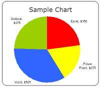
Pie charts are one of the most used charts in the world. And for obvious reasons: they are simple to create and easy to understand. When it comes to pie chart, I have no clear opinion. Part of me says use them, the other says avoid them.
What is your opinion on Pie charts ?
Continue »A Good Bubble Chart About the Bust

Checkout this very neatly done “where did all the money go?” data visualization on Guardian, and share your opinion.
Continue »Do you know how to KISS, Wall Street Journal Does!

Do you know the “KISS” principle of chart design ?
Continue »Featured Visualizations – Jan 09

Check out user journeys and other cool visualizations in this weeks edition.
Continue »5 Awesome Info-graphics for your Inspiration [Dec 19]
![5 Awesome Info-graphics for your Inspiration [Dec 19]](https://img.chandoo.org/c/periodic-table-awesoments.jpg)
Every week PHD features 5 of the most beautiful and awesome visualizations seen on the web for your inspiration and amusement. These charts explore and present data in creative ways and provide new ideas. Browse past visualizations for inspiration and fun.
Continue »Parking Tickets in New York – Cool Interactive Visualization from NYTimes

When you have the data of 9,955,441 parking tickets from New York city, what would you do with it? Of course, you will make a visualization out of it so that anyone can know where the tickets are issued most. Check out this interactive visualization of parking tickets from NY Times.
Continue »Fun way to clean up modern art with visualization
TED Talks are a great way to keep your mind nourished. They inspire you, give you a ton of new ideas. I saw this ted talk (embedded below) Tidying up art by Ursus Wehrli and couldn’t resist sharing it with you. It is an entertaining one and I recommend watching it. In this talk the […]
Continue »5 visualizations to inspire you [Nov 21]
![5 visualizations to inspire you [Nov 21]](https://chandoo.org/wp/wp-content/uploads/2008/11/oh-shiiit-how-many-searches.jpg)
The best 3d pie chart ever We all know that 3D pies are not a very good way to express your story. I guess this one is an exception we all are happy to make [via PTS Blog] How to solve problems – Interactive visualization This interactive visualization shows how to solve problems in a […]
Continue »5 Visualizations for your Inspiration [Nov 07]
![5 Visualizations for your Inspiration [Nov 07]](https://chandoo.org/wp/wp-content/uploads/2008/11/donations-to-obama-president-thumb.jpg)
Every week Pointy Haired Dilbert features 5 beautiful & creative info-graphic visualizations for your inspiration. I like building, reading and sharing charts and info-graphics and it is a pleasure sharing these with you all. Happy weekend 🙂 Who donated to Obama and how much? This beautiful arc chart shows how much people have donated to […]
Continue »
Yesterday I have learned this cool excel charting trick and I cant wait to share it with you all. The problem: I have too many charts & want to show one based on selection You have made 3 charts to show your company performance in the last 8 years. But you don’t want to clutter […]
Continue »Sports Statistics Dashboard in Excel – Few More Alternatives

First of all, thanks everyone for making the should you always start barcharts at zero? discussion lively. Almost everyone felt that we should start bar charts at zero. After spending sometime with my initial test cricket statistics dashboard, I have created few alternatives. You can see them below. But somehow I feel that I haven’t […]
Continue »

