All articles with 'templates' Tag
{ 21 Comments }
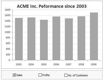
Simple KPI Dashboard using Excel
Published on Aug 25, 2011 in Charts and Graphs, Cool Infographics & Data Visualizations
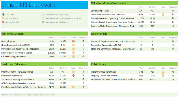
Any Tom, Dick and Sally can make things complex. It takes guts and clarity to simplify things. That is why I was pleasantly surprised to see this dashboard prepared by Michigan State. You can see it in the detailed article.
Linda, one of My Excel School students shared this dashboard link with me and asked if I can show how to construct something like this. Here is my version of the dashboard.
Read this post to learn how to construct a similar dashboard on your own. Also, you can download the excel workbook and play with it.
Continue »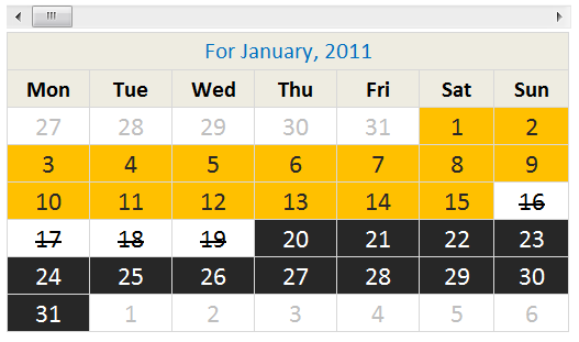
Today I want to share an Employee Shift Calendar Template with you. You can use this template to keep track of shift timings on various days. See a demo of the template: How does this template work? This template uses a 3 main ideas, Excel formulas to create the calendar & checking for a day’s […]
Continue »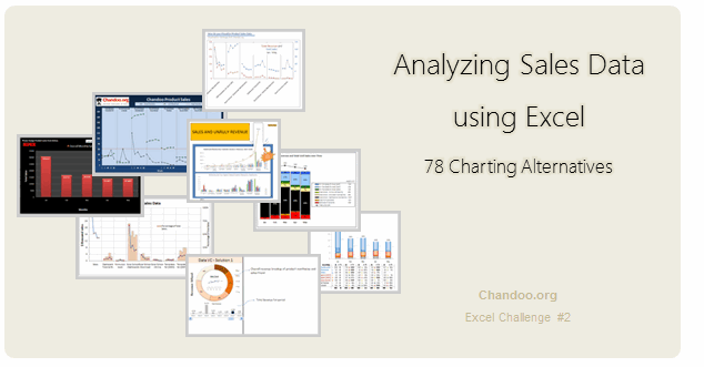
Recently, I ran a contest asking you to analyze a bunch of sales data and present your results in charts. We received a total of 78 charts from 45 people. The contest entries had a mind-boggling variety of excel charts, techniques and ideas. It took me a while to go thru all the files and compile the results. Thanks for your patience. In this post, you can find all the charts along with my comments & links to download files.
Continue »{ 5 Comments }
Win Loss Chart from a Series of Win, Loss Data
Published on Jun 15, 2011 in Charts and Graphs
Last week, we learned how to create win-loss charts in Excel. In the comments, Dan said,
“Incidentally, the fastest way to do this would be using SFE, just reflect your data with 1 for a win, – 1 for a loss. There’s even an option to automatically invert negative numbers.”
Of course, we can use the beautiful Sparklines for Excel addin to do this and several other charts. But if you just have a series of Wins and Losses, like below, you can use a column chart to create win loss charts too.
Today, we will learn how to create a win loss chart from a set of win, loss data in Excel.
Continue »{ 15 Comments }
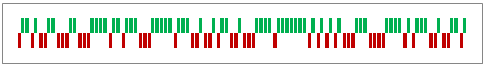
How to create a Win-Loss Chart in Excel? [Tutorial & Template]
Published on Jun 9, 2011 in Charts and Graphs
![How to create a Win-Loss Chart in Excel? [Tutorial & Template]](https://img.chandoo.org/c/win-loss-chart-excel-template.png)
Win Loss Charts are an interesting way to show a range of outcomes. Lets say, you have data like this:
win, win, win, loss, loss, win, win, loss, loss, win
The Win Loss chart would look like this:

Today, we will learn, how to create Win Loss Charts in Excel.
We will learn how to create Win Loss charts using Conditional Formatting and using In-cell Charts.
Continue »![2011 Calendar – Excel Template [Downloads]](https://img.chandoo.org/c/2011-calendar-template-download.png)
Here is a 2011 new year gift to all our readers – a free 2011 calendar template.
(a little secret: just change the year in worksheet “Full” from 2011 to 2012 to get the next year’s calendar. It works all the way up to year 9999)
You can add notes to individual dates or complete month using the excel template very easily. There are 6 different calendar templates in the download file,
* 4 Yearly Calendar Templates with different color schemes.
* 1 Mini Calendar
* 1 Monthly Calendar (prints in 12 pages)
Go ahead and download the calendar files. Enjoy.
Continue »{ 53 Comments }
How to make a Birthday Reminder in Excel ? [Video]
Published on Oct 26, 2010 in Excel Howtos
Learn how to create a birthday reminder worksheet in excel in this video post. You can also download a template to keep track of upcoming birthdays and anniversaries.
Continue »{ 9 Comments }
Analyze Competition with Scatter Plots – A business chart example
Published on Oct 25, 2010 in Charts and Graphs

Analyzing competition is one of the key aspects of running a business. In this article, learn how to use Excel’s scatter plots to understand competition, like shown aside.
The inspiration for this comes from a recent article on Asymco analyzing mobile handset market (Apple iPhone, Nokia etc.) and how it has changed since 2007.
Read the rest of the post to learn how to create this type of chart in excel. Also, you can download the chart template. Go ahead.
Continue »{ 140 Comments }
How to cook a delicious dynamic chart that will have your boss drool
Published on Aug 31, 2010 in Charts and Graphs, Featured
Dynamic charts are like my favorite food, Mangoes. They tempt, tease and taste awesomely. In this post, we are going to learn how to create a dynamic chart using check boxes and formulas as shown in the animation aside. Are you ready for some excel chart cooking?
You can also download a FREE Dynamic chart template from the post. So go ahead and make your boss drool.
Continue »{ 164 Comments }
7 Personal Expense Trackers using Excel – Download Today
Published on Jul 16, 2010 in Charts and Graphs, excel apps
Keeping track of your expenses is one of the fundamentals of living good life. So I asked you to prepare a personal expense tracker as part of our 10,000 RSS Subscriber Milestone contest. I have received 7 excellent entries in this contest, each capable of making expense tracking a breeze while providing good analytics of […]
Continue »{ 13 Comments }
Gantt Box Chart Tutorial & Template – Download and Try today
Published on Jul 12, 2010 in Charts and Graphs, Learn Excel
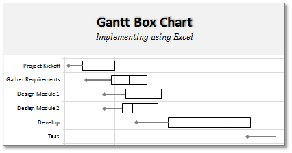
On Firday, we proposed a new chart for showing project plans. I chose an ugly name for it and called it Gantt Box Chart. Essentially, a gantt box chart is what you get when a gantt chart and box plot go to a bar, get drunk and decide to make out. It shows the project […]
Continue »{ 23 Comments }
Excel Quotation Template [Spreadsheets for Small Business]
Published on Jun 16, 2010 in excel apps
![Excel Quotation Template [Spreadsheets for Small Business]](https://chandoo.org/img/small-biz/excel-quotation-template.png)
Like most of the small businesses, I too use Excel for running various activities including preparing quotations, estimates and pricing models. In this post you can find a couple excel quotation templates that you can immediately use.
The first template is useful for sending quotations for one time work or services.
The second template is useful for sending quotations for hourly work like repairs, services, consulting.
Go ahead and download these excel quote templates to prepare beautiful quotations right from your favorite program.
Continue »
While I was working Denmark, there is one thing I noticed. Danes are one hell of football lovers. The football (soccer) enthusiasm is over the top when there is a match between Denmark and Sweden. A common practice in many offices is a football pool. This is how it works: When there is a match […]
Continue »{ 8 Comments }
Introducing PHD Sparkline Maker – Dead Simple way to Create Excel Sparklines
Published on Mar 22, 2010 in Charts and Graphs

Sparkline or Microchart is a tiny little chart that you can place on dashboards, reports or presentations to provide rich visualization without loosing much space. In excel 2010, MS introduced a beautiful feature for creating sparklines from data in spreadsheets. For earlier versions of Excel (that is 2007 and before) there is no native support […]
Continue »{ 115 Comments }
Sales Dashboards – Visualizing Sales Data – 32 Dashboard Examples & Implementations
Published on Jan 4, 2010 in Charts and Graphs, Featured

Sales reports and dashboards are very common in any company. There are several ways in which you can visualize sales data to understand the trends and sales performance. So in November, I have asked you to visualize sales data using sample data. The visualization challenge #2, sponsored by Zoho Reports generated a huge buzz around the community and fetched 32 incredible entries. The response was so overwhelming that it took me almost 24 hours to write this post. Thanks everyone for participating and making this a huge learning experience for everyone. Personally I have learned several useful dashboard and charting tricks. I will be sharing some of these lessons with all of you in the coming weeks.
Continue »
