All articles with 'sumifs' Tag
CP030: Detecting fraud in data using Excel – 5 techniques for you
Podcast: Play in new window | Download
Subscribe: Apple Podcasts | Spotify | RSS
In the 30th session of Chandoo.org podcast, let’s learn how to uncover fraud in data.

What is in this session?
In the wake of hedge fund scams, accounting frauds and globalization, We, analysts are constantly second guessing every source of data. So how do you answer a simple question like, “am I being lied to?” while looking at a set of numbers your supplier has sent you.
That is our topic for this podcast session.
In this podcast, you will learn
- Quick announcements about 50 ways & 200k BRM
- Introduction to fraud detection
- 5 techniques for detecting fraud
- Benford’s law
- Auto correlation
- Discontinuity at zero
- Analysis of distribution
- Learning systems & decision trees
- Implementing these techniques in Excel
- A word of caution
![Who is the most consistent seller? [BYOD]](https://chandoo.org/wp/wp-content/uploads/2015/02/who-is-the-most-consistent-seller-data.png)
Who is the most consistent of all?
Imagine you are a category manager at a large e-commerce company. Your site offers various products, but you don’t really make these products. You list products made by other vendors on your site. Every day, these vendors would send you invoices for the amount of product they have sold. Above is a snapshot of such invoices.
Looking at this list, you have a few questions.
- Who is the best seller?
- Who is the most active seller?
- Who is the most consistent seller?
- Which seller has fewest invoices?
Let’s go ahead and answer these using Excel. Shall we?
Continue »Looking up when the data won’t co-operate (case study)
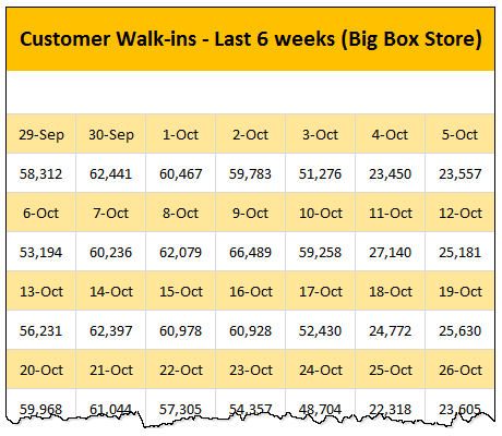
Occasionally we deal with data that is so uncooperative that we might as well give up and go back to calculators & ledger books.
Recently I found myself in such a situation and learned something new.
Introducing … data that won’t play nice
Drum roll please. Here is a data-set that I got from somewhere.
The problem – build a lookup formula
And the problem. Oh, simple. Write a lookup formula to find how many customer walk-ins we have on any given day.
But how?
Continue »The ultimate VLOOKUP trick – Multi-condition Lookup
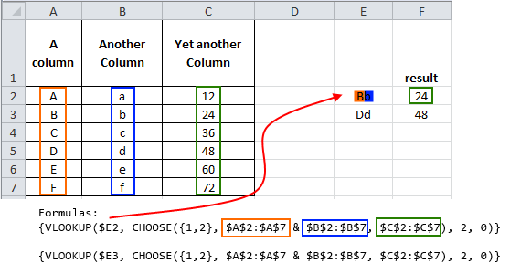
This is a guest post by Sohail Anwar.
Let’s not bore you with an intro. You are about to learn a VLOOKUP trick that Lucifer himself would not want you to know. It’s so absurdly powerful that it was developed in a lab and had to be tested on Rocky’s arch nemesis Ivan Drago.
Presenting the Multiple criteria VLOOKUP!
…boring…pass, we’ve seen it.
Oh, have you? Not like this you haven’t. This will change the way you work with Excel.
Let me start with an easy example. Here’s some data and we would love to know what Bb and Dd is.
Continue »A better chart to visualize “Best places to live” – Top 100 cities comparison Excel chart
Recently, I saw this chart on Economist website.
It is trying to depict how various cities rank on livability index and how they compare to previous ranking (2014 vs 2009).
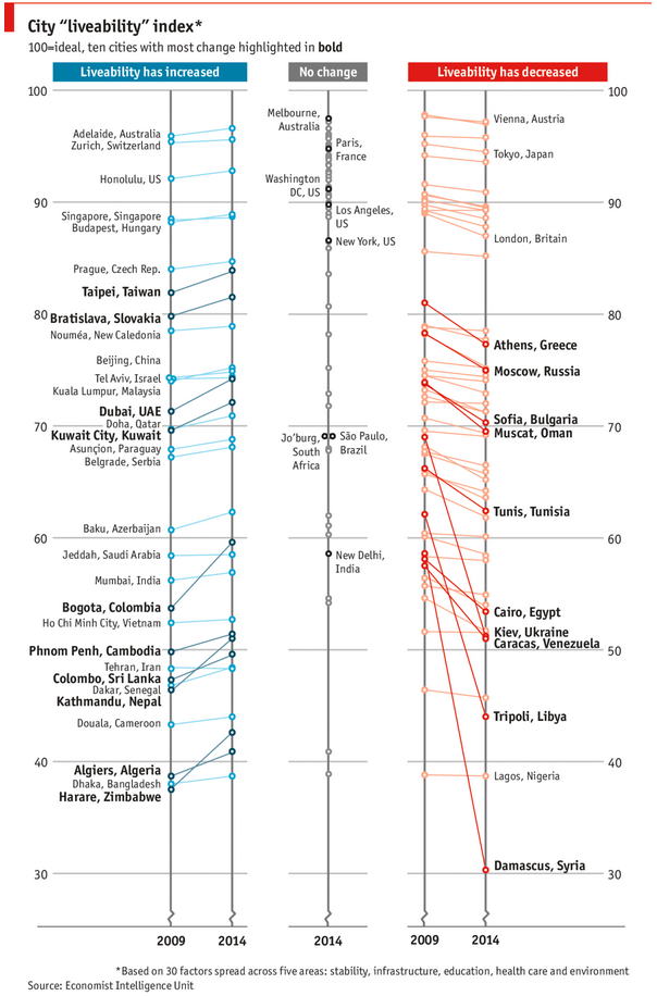
As you can see, this chart is not the best way to visualize “Best places to live”.
Few reasons why,
- The segregated views (blue, gray & red) make it hard to look for a specific city or region
- The zig-zag lines look good, but incredibly hard to understand % changes (or absolute changes)
- Labels are all over the place, thus making data interpretation hard.
- Some points have no labels (or ambiguous labels) leading to further confusion.
After examining the chart long & hard, I got thinking.
Its no fun criticizing someones work. Creating a better chart from this data, now thats awesome.
Continue »
Ok people. Let me tell you that this post is almost not about Excel. It is about how one Excel blogger’s (yours truly) dream of long distance cycling came true. So sit back, grab your favorite drink and read between sips.
So what is this all about?
Last Sunday (27th July) & Monday (28th), I finished my first ever 200KM bicycle ride. I rode for a little more than 12 hours, burned 5,179 calories & rode 206 kilometers.
It is definitely one of the most memorable, tiresome & uplifting experiences in my life. So naturally, I want to share the story with you.
Continue »Matching transactions using formulas [Accounting]
![Matching transactions using formulas [Accounting]](https://img.chandoo.org/f/example-of-matching-transactions.png)
Imagine you are the head of Accounts Receivable department at a large company. Drab, I know, But humor me and imagine.
Now, every month you get a transaction report.
And you want to know which numbers are matching up.
i.e, if your company gave Vendor-0002 $872.34 on 1st of April, 2014 and your received below payments from them subsequently,
- $427.77 on 1st April
- $152.88 on 2nd April
- $291.69 on 2nd April
Then you consider the account matched since the total received is same as total payable.(427.77 + 152.88 + 291.69 = 872.34).
Continue »CP007: aweSUM() – Overview of SUM functions in Excel

Podcast: Play in new window | Download
Subscribe: Apple Podcasts | Spotify | RSS
In the 7th session of Chandoo.org podcast, lets make you aweSUM().
Imagine for a second that Excel cannot add up numbers. And no it cant subtract them either. What would that look like?
A glorified Notepad. That’s right. Excel’s ability to add up numbers, along with features like formulas, charts, pivot tables & BHATTEXT() are what make it such a lovely software. May be not the BHATTEXT(), but we all agree that Excel is so versatile and useful because it can add up numbers (and perform other calculations) with ease.
But how well do you know the SUM formulas of Excel?
In this podcast, you will learn,
- Special personal fruit announcement 😛
- + operator
- Status bar & total rows in tables
- Auto Sum feature
- SUM() function
- SUMIFS function
- Special cases of SUMIFS function
- SUBTOTAL & AGGREGATE functions
- Other summing functions – SUMPRODUCT etc.
Ever seen a formula like =SUMIFS(Sheet1!B2:B3923, Sheet1!C2:C3923, A1, Sheet1!D2:D3923, A2) and wondered what it is really doing?!?
If so, you are not alone.
Formulas written with cell references tend to look complicated and clunky. What if we could write formulas in plain English?
That is what Structural References do. When using structural references in formulas, your focus will be on your data, not on which cell ranges the data takes up.
For example, you can write formulas like these:
1) SUM(mySales[no. of customers]) to find how many customers we had.
2) SUMIFS(mySales[no. of customers], mySales[product], “FastCar”) to find how many customers bought “FastCar”

Last week, we had our very first quiz – “How well do you know your LOOKUPs?”. I hope you have enjoyed it.
Today lets understand the answers & explanations for this quiz.
Continue »Details about our Power Pivot Course [and a video for those of you not interested]
![Details about our Power Pivot Course [and a video for those of you not interested]](https://img.chandoo.org/power-pivot/power-pivot-course-details.png)
Hello folks,
If this article was a person, they would be schizophrenic. You see, it has 2 purposes:
- Give you all the details about my upcoming Power Pivot course
- Give you a solution to last week’s vacation days problem
Details about Power Pivot Course
Power Pivot, an Excel add-in makes it easy to connect, analyze & visualize massive amounts of data. This course aims to teach you how to use Power Pivot to analyze data, create advanced reports & prepare dashboards all from familiar interface of Excel. This is ideal for data analysts, reporting & MIS professionals, business analysts, managers & dashboard makers.
Designing a dashboard to track Employee vacations [case study]
![Designing a dashboard to track Employee vacations [case study]](https://chandoo.org/wp/wp-content/uploads/2013/01/employee-vacation-dashboard-full-view.png)
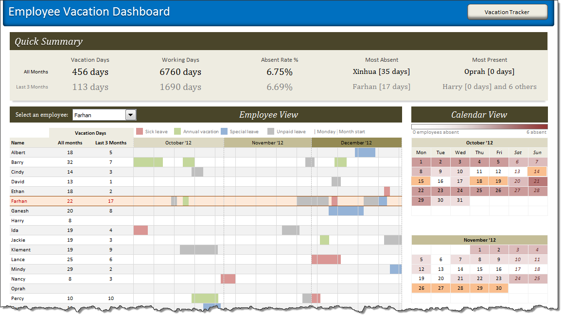
HR managers & department heads always ask, “So what is the vacation pattern of our employees? What is our average absent rate?”
Today lets tackle that question and learn how to create a dashboard to monitor employee vacations.
What do HR Managers need? (end user needs)
There are 2 aspects tracking vacations.
1. Data entry for vacations taken by employees
2. Status dashboard to summarize vacation data

Few weeks ago, someone asked me “What are the top 10 formulas?” That got me thinking.
While each of us have our own list of favorite, most frequently used formulas, there is no standard list of top 10 formulas for everyone. So, today let me attempt that.
If you want to become a data or business analyst then you must develop good understanding of Excel formulas & become fluent in them.
A good analyst should be familiar with below 10 formulas to begin with.
Continue »![Making your dashboards interactive [Dashboard Essentials]](https://img.chandoo.org/vp/grammy-bump-chart-replication-in-excel-demo.gif)
Everyone likes to be in control. Even my 2 year old daughter jumps with joy when she lays her hands on TV remote. She pushes the buttons and assumes it is working. It is another story that we rarely watch TV at home.
By adding an element of control, we can make our dashboard reports fun. Interactive elements like form controls, slicers etc. invite users to play with your dashboard, get involved and understand data by asking questions. That is why I recommend making dashboards interactive.
Today lets understand how you can make dashboards interactive.
Continue »![Interactive Sales Chart using MS Excel [video]](https://img.chandoo.org/vp/interactive-sales-chart-quick-demo.gif)
Finally, I got some time to sit down and do what I love most – write a blog post to make you awesome in Excel. After a whirlwind trip to Sydney, I am back in India to spend few days with my kids & wife before rushing to Australia to run 2nd leg of my training programs (in Perth, Melbourne & Brisbane). I did 2 sessions in Sydney – one for KPMG and other for public and both went very well. We got lots of positive feedback and people really loved it. I am saving the details for another post, but today lets talk about Interactive Sales Chart using Excel.
Take a look at the Interactive Sales Chart
First, take a look at interactive sales chart. Today, you will learn how to build this using Excel.
Continue »

