Employee training tracker & calendar – tutorial & download
Imagine you are the head of training department at ACME Inc. You arrange training programs round the year to empower your team. It is hard work, coordinating between employees, trainers, department heads, venues and coffee machines. What if there is something to help you keep track of all this? I am not talking about getting you a shiny new iPad, you silly. I am talking about a tracker & calendar built in Excel that ties everything together (well, almost everything, you still have to fill the coffee machine.)
We are going to build a training program tracker & calendar using Excel.
CP030: Detecting fraud in data using Excel – 5 techniques for you
Podcast: Play in new window | Download
Subscribe: Apple Podcasts | Spotify | RSS
In the 30th session of Chandoo.org podcast, let’s learn how to uncover fraud in data.

What is in this session?
In the wake of hedge fund scams, accounting frauds and globalization, We, analysts are constantly second guessing every source of data. So how do you answer a simple question like, “am I being lied to?” while looking at a set of numbers your supplier has sent you.
That is our topic for this podcast session.
In this podcast, you will learn
- Quick announcements about 50 ways & 200k BRM
- Introduction to fraud detection
- 5 techniques for detecting fraud
- Benford’s law
- Auto correlation
- Discontinuity at zero
- Analysis of distribution
- Learning systems & decision trees
- Implementing these techniques in Excel
- A word of caution
Who is the most consistent seller? [BYOD]
Who is the most consistent of all?
Imagine you are a category manager at a large e-commerce company. Your site offers various products, but you don’t really make these products. You list products made by other vendors on your site. Every day, these vendors would send you invoices for the amount of product they have sold. Above is a snapshot of such invoices.
Looking at this list, you have a few questions.
- Who is the best seller?
- Who is the most active seller?
- Who is the most consistent seller?
- Which seller has fewest invoices?
Let’s go ahead and answer these using Excel. Shall we?
Looking up when the data won’t co-operate (case study)
Occasionally we deal with data that is so uncooperative that we might as well give up and go back to calculators & ledger books.
Recently I found myself in such a situation and learned something new.
Introducing … data that won’t play nice
Drum roll please. Here is a data-set that I got from somewhere.
The problem – build a lookup formula
And the problem. Oh, simple. Write a lookup formula to find how many customer walk-ins we have on any given day.
But how?
The ultimate VLOOKUP trick – Multi-condition Lookup
This is a guest post by Sohail Anwar.
Let’s not bore you with an intro. You are about to learn a VLOOKUP trick that Lucifer himself would not want you to know. It’s so absurdly powerful that it was developed in a lab and had to be tested on Rocky’s arch nemesis Ivan Drago.
Presenting the Multiple criteria VLOOKUP!
…boring…pass, we’ve seen it.
Oh, have you? Not like this you haven’t. This will change the way you work with Excel.
Let me start with an easy example. Here’s some data and we would love to know what Bb and Dd is.
A better chart to visualize “Best places to live” – Top 100 cities comparison Excel chart
Recently, I saw this chart on Economist website.
It is trying to depict how various cities rank on livability index and how they compare to previous ranking (2014 vs 2009).
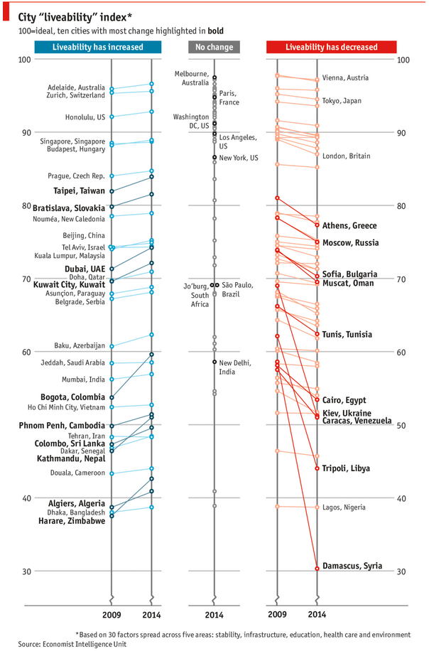
As you can see, this chart is not the best way to visualize “Best places to live”.
Few reasons why,
- The segregated views (blue, gray & red) make it hard to look for a specific city or region
- The zig-zag lines look good, but incredibly hard to understand % changes (or absolute changes)
- Labels are all over the place, thus making data interpretation hard.
- Some points have no labels (or ambiguous labels) leading to further confusion.
After examining the chart long & hard, I got thinking.
Its no fun criticizing someones work. Creating a better chart from this data, now thats awesome.
Story of my first ever 200KM bike ride (plus an Excel dashboard with ride stats)

Ok people. Let me tell you that this post is almost not about Excel. It is about how one Excel blogger’s (yours truly) dream of long distance cycling came true. So sit back, grab your favorite drink and read between sips.
So what is this all about?
Last Sunday (27th July) & Monday (28th), I finished my first ever 200KM bicycle ride. I rode for a little more than 12 hours, burned 5,179 calories & rode 206 kilometers.
It is definitely one of the most memorable, tiresome & uplifting experiences in my life. So naturally, I want to share the story with you.