All articles with 'slicers' Tag
{ 16 Comments }
Analyzing half a million consumer complaints [Part 1 of 3]
Published on Feb 16, 2016 in Analytics, Charts and Graphs
![Analyzing half a million consumer complaints [Part 1 of 3]](https://chandoo.org/wp/wp-content/uploads/2016/02/analyzing-consumer-complaints-interactive-treemap-th.png)
How would you analyze data when you have lots of it? That is the inspiration for this series.
Let’s meet our data – Finance Industry Consumer Complaints
As part of open data initiatives, US government & Consumer Financial Protection Bureau maintain a list of all consumer complaints made against financial institutions (banks, credit unions etc.) You can download this data from the catalog page here. I have obtained the data on 1st of February, 2016. The download has 513,824 records. Each row contains one complaint.
In this and next two parts of the series, we are going to analyze these half a million complaints to find insights.
Continue »{ 18 Comments }
Use slicers to create a cool selection mechanism [quick tip]
Published on Feb 8, 2016 in Learn Excel, Pivot Tables & Charts
Most advanced Excel users know that slicers are cool. Today, let’s learn how to use slicers to create an awesome selection mechanism for your dashboards and forms.
First see a quick demo

Looks slick, eh? Read on.
Continue »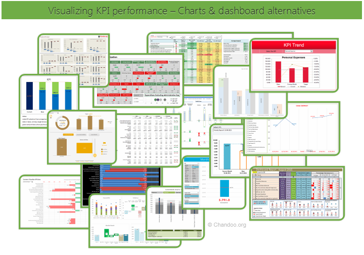
Hello all, prepare to be amazed! Here are 43 creative, fun & informative ways to visualize KPI data.
About a month ago, I asked you to visualize KPI data. We received 65 entries for this contest. After carefully reviewing the entries, our panel of judges have discarded 22 of them due to poor charting choices, errors or just plain data dumps. We are left with 43 amazing entries, each creatively analyzed the data and presented results in a powerful way.
How to read this post?
This is a fairly large post. If you are reading this in email or news-reader, it may not look properly. Click here to read it on chandoo.org.
- Each entry is shown in a box with the contestant’s name on top. Entries are shown in alphabetical order of contestant’s name.
- You can see a snapshot of the entry and more thumbnails below.
- The thumb-nails are click-able, so that you can enlarge and see the details.
- You can download the contest entry workbook, see & play with the files.
- You can read my comments at the bottom.
- At the bottom of this post, you can find a list of key charting & dashboard design techniques. Go thru them to learn how to create similar reports at work.
Thank you
Thank you very much for all the participants in this contest. I have thoroughly enjoyed exploring your work & learned a lot from them. I am sure you had fun creating these too.
So go ahead and enjoy the entries.
Continue »{ 9 Comments }
How to create cascading drop downs in Excel – video
Published on Aug 31, 2015 in Excel Howtos, Learn Excel

Cascading drop downs enhance usability of your dashboards & interactive workbooks. A cascading drop-down is a 2 or more level selection mechanism. When you have 100s of selection choices, instead of creating one massive drop down or combo-box, you can set up multiple levels of drop downs, so that users can narrow down their selection. For example, users can select Country, State and then City using cascading drop downs.
There are many ways to setup cascading drop downs. You can use formulas coupled with either data validation or form controls. You can also use Slicers. In this video we will review these techniques.
Continue »{ 12 Comments }
How to use GETPIVOTDATA with Excel Pivot Tables
Published on Aug 26, 2015 in Pivot Tables & Charts

Pivot tables are very powerful analysis tools. They can summarize vast amounts of data with just few clicks. But they are lousy when it comes to output. Imagine the horror of putting a pivot table right inside your beautiful dashboard. One refresh could ruin the layout and create half-an-hour extra work for you.
How to combine the power of pivot tables with elegance of your dashboards?
The answer is: GETPIVOTDATA()
Continue »{ 49 Comments }
Introduction to Slicers – What are they, how to use them, tips, advanced techniques & interactive reports using Excel Slicers
Published on Jun 24, 2015 in Learn Excel, Pivot Tables & Charts
Slicers are one of my favorite feature in Excel. And here is a quick demo to show why they are my favorite.
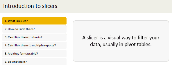
Slicers – what are they?
Slicers are visual filters. Using a slicer, you can filter your data (or pivot table, pivot chart) by clicking on the type of data you want.
For example, let’s say you are looking at sales by customer profession in a pivot report. And you want to see how the sales are for a particular region. There are 2 options for you do drill down to an individual region level.
- Add region as report filter and filter for the region you want.
- Add a slicer on region and click on the region you want.
With a report filter (or any other filter), you will have to click several times to pick one store. With slicers, it is a matter of simple click.
Read more to learn all about slicers
Continue »{ 13 Comments }
Narrating the story of change using Excel charts – case study
Published on May 18, 2015 in Charts and Graphs, Cool Infographics & Data Visualizations

Here are three questions you often hear from your boss:
- What changes are happening in our business and how do they look?
- Do you know how to operate this new coffee machine?
- Why does every list has 3 items?
Jokes aside, our urge to find change in environment predates cave drawing, slice bread and Tommy Lee Jones. So, today let’s examine a very effective chart that tells the story of change and re-create it in Excel.
Continue »{ 9 Comments }
Drag to multi-select slicer items [quick tip]
Published on Sep 29, 2014 in Excel Howtos
![Drag to multi-select slicer items [quick tip]](https://img.chandoo.org/q/drag-to-multiselect-slicer-items-demo.gif)
Hola folks…
My trip to Houston & Dallas was very successful, fun & awesome. I got back home on Friday and instantly I am in another fun, awesome & happy place with my kids, Jo (my wife), rest of the family & friends.
Today, I want to share a very simple yet super awesome trick with you. I learned this from Augie, one of the Houston Masterclass participants.
You can drag slicer items to multi-select them.
Selecting multiple items in a slicer quickly
We know that slicers are powerful, friendly and fun way to filter the pivot tables, pivot charts, power pivot tables and regular tables (only in 2013). They are visual filters that can be used to instantly filter the data (or report). But when it comes to selecting multiple items, slicers can be hard. We must hold CTRL key and tap multiple slicer items one at a time to select them. At least that is how I used to do it.
Do you know we can drag to multi-select?
See this demo:
Continue »{ 47 Comments }
Mapping relationships between people using interactive network chart
Published on Aug 13, 2014 in Charts and Graphs

Today, lets learn how to create an interesting chart. This, called as network chart helps us visualize relationships between various people.
Demo of interactive network chart in Excel
First take a look at what we are trying to build.
Looks interesting? Then read on to learn how to create this.
Continue »{ 10 Comments }
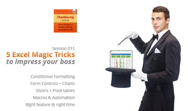
CP011: 5 Excel magic tricks to impress your boss
Published on Jun 19, 2014 in Chandoo.org Podcast Sessions
Podcast: Play in new window | Download
Subscribe: Apple Podcasts | Spotify | RSS
If you want to create magical effect with your Excel workbook (or report, dashboard, model), then hear no further. In this episode, we explore 5 very powerful magic tricks you can apply to get jaw dropping reactions from your bosses, clients & colleagues.
In this podcast, you will learn,
- Annoucements
- Why magic
- 5 Excel Magic Tricks
- 1: Conditional formatting
- 2: Form controls + Charts
- 3: Pivot tables + Slicers
- 4: Macros + Automation
- 5: Using right feature @ right time
- How to learn these magic tricks
- Conclusions
{ 8 Comments }
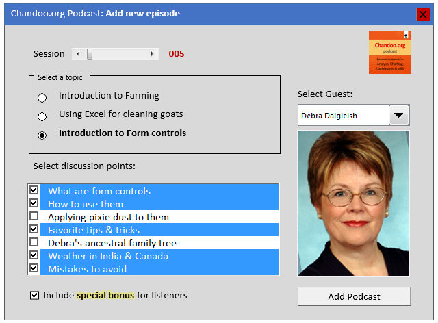
CP005: Introduction to Form Controls – an interview with Debra Dalgleish
Published on Apr 17, 2014 in Chandoo.org Podcast Sessions, VBA Macros
Podcast: Play in new window | Download
Subscribe: Apple Podcasts | Spotify | RSS
In the 5th session of Chandoo.org podcast, we are going to demystify form controls.
I am very happy and excited to interview my good friend, fellow Excel MVP, author, blogger and virtual mentor – Debra Dalgleish about this topic.
In this podcast, you will learn,
- What are form controls
- When you would use them?
- Example form control – Combo box
- How form controls differ from active-x controls
- How to enable form controls in your Excel?
- Various important form controls
- Special bonus & how to obtain it
{ 28 Comments }
How to find sum of top 3 values based on filtered criteria [video]
Published on May 17, 2013 in Excel Howtos
![How to find sum of top 3 values based on filtered criteria [video]](https://img.chandoo.org/f/sum-of-top-3-values-meeting-filtered-criteria-excel.png)
Lets say you are looking at some data as shown above and wondering what is the sum of budgets for top 3 projects in East region with Low priority. How would you do that with formulas?
Continue »{ 4 Comments }
Distinct Count & Blanks – Power Pivot Real Life Example
Published on Feb 11, 2013 in Power Pivot
When it comes to analyzing business data, managers are always asking, “so how many distinct x each y is doing?”
And that sends us, data analysts & reporting professionals running from pillar to post figuring out the best way to do it.
- We can use variations of SUMPRODUCT, COUNTIFS etc, but the methods are not flexible..
- We can use VBA, but it would become slow as you add more data.
- We can use Pivot tables, but it only gives half of what we want ie each y part, but not distinct count of x.
- We might as well shave our head with a shovel before manually counting values.
And that brings us to 2 distinctly simple solutions:
- Using Power Pivot & Excel 2010
- Using regular pivot tables in Excel 2013
Today, lets talk about these 2 approaches & see why they are so better than anything else for distinct count situations.
Continue »{ 38 Comments }
How the tax burden has changed over the years – Excellent chart by NYTimes & Redoing it in Excel
Published on Dec 6, 2012 in Charts and Graphs
If I need some charting inspiration, I always visit New York Times. Their interactive visualizations are some of the best you can find anywhere. Clear, beautifully crafted and powerful. Long time readers of Chandoo.org knew that I like to learn from visualizations in NY Times & redo them using Excel.
Today let me present you one such chart. This is based on an interactive visualization prepared by NY Times explaining how the tax burden has changed over years for various income groups.
Take a look at tax burden chart – Excel implementation
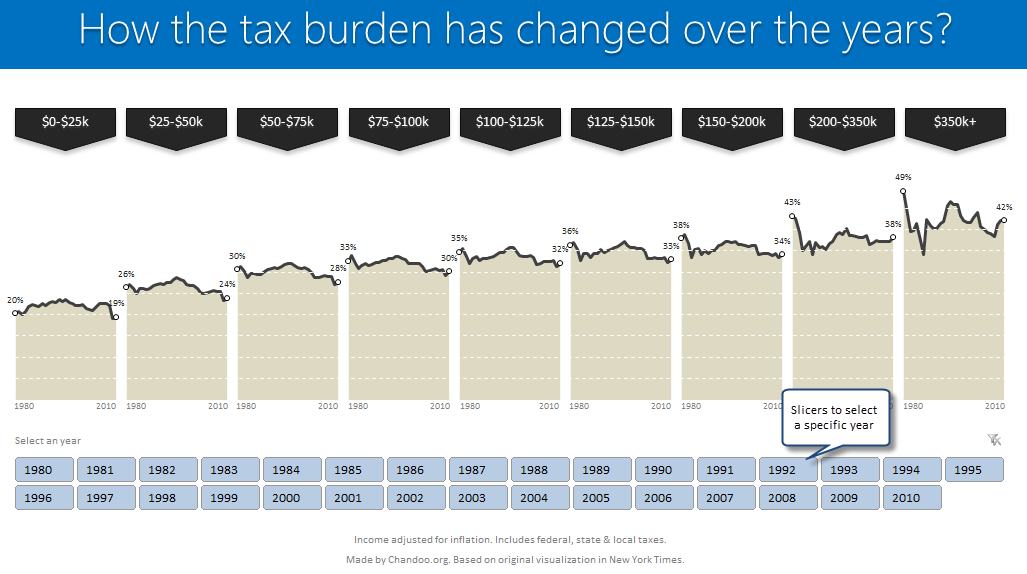
Read on to learn how to create this chart using Excel.
Continue »![Making your dashboards interactive [Dashboard Essentials]](https://img.chandoo.org/vp/grammy-bump-chart-replication-in-excel-demo.gif)
Everyone likes to be in control. Even my 2 year old daughter jumps with joy when she lays her hands on TV remote. She pushes the buttons and assumes it is working. It is another story that we rarely watch TV at home.
By adding an element of control, we can make our dashboard reports fun. Interactive elements like form controls, slicers etc. invite users to play with your dashboard, get involved and understand data by asking questions. That is why I recommend making dashboards interactive.
Today lets understand how you can make dashboards interactive.
Continue »
