All articles with 'pivot tables' Tag
{ 12 Comments }
How to use GETPIVOTDATA with Excel Pivot Tables
Published on Aug 26, 2015 in Pivot Tables & Charts

Pivot tables are very powerful analysis tools. They can summarize vast amounts of data with just few clicks. But they are lousy when it comes to output. Imagine the horror of putting a pivot table right inside your beautiful dashboard. One refresh could ruin the layout and create half-an-hour extra work for you.
How to combine the power of pivot tables with elegance of your dashboards?
The answer is: GETPIVOTDATA()
Continue »{ 12 Comments }
How to create dynamic sparklines for latest 30 days [video]
Published on Aug 2, 2015 in Charts and Graphs, Pivot Tables & Charts
![How to create dynamic sparklines for latest 30 days [video]](https://chandoo.org/wp/wp-content/uploads/2015/08/dynamic-sparklines-v2.png)
Sparklines are fun and very insightful. They are easy to create, easy to maintain and fit into any dashboard.
But there is one tiny problem with them. Usually we have a lot of data, but we don’t to visualize all of it. We just want to visualize latest 30 days trend or last 12 months trend or QTD or something similar. What then?
In this video, learn a powerful and very simple way to create dynamic sparklines using Excel.
Continue »{ 15 Comments }
Are you an analyst? Use these 25 shortcuts & tricks to boost your productivity
Published on Jul 7, 2015 in Keyboard Shortcuts, Learn Excel

Analyst’s life is busy. We have to gather data, clean it up, analyze it, dig the stories buried in it, present them, convince our bosses about the truth, gather more evidence, run tests, simulations or scenarios, share more insights, grab a cup of coffee and start all over again with a different problem.
So today let me share with you 25 shortcuts, productivity hacks and tricks to help you be even more awesome.
Continue »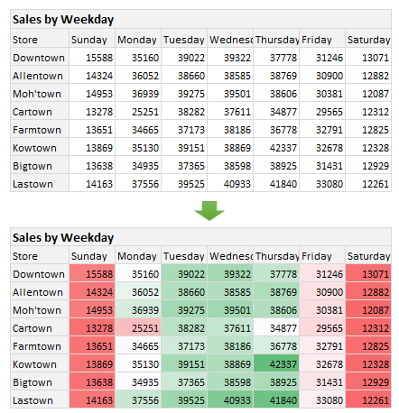
Here is a situation all too familiar.
You are looking at a spreadsheet full of data. You need to analyze and tell a story about it. You have little time. You don’t know where to start.
Today let me share 15 quick, simple & very powerful ways to analyze business data. Ready? Let’s get started.
Continue »{ 49 Comments }
Introduction to Slicers – What are they, how to use them, tips, advanced techniques & interactive reports using Excel Slicers
Published on Jun 24, 2015 in Learn Excel, Pivot Tables & Charts
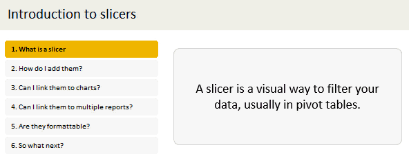
Slicers are one of my favorite feature in Excel. And here is a quick demo to show why they are my favorite.
Slicers – what are they?
Slicers are visual filters. Using a slicer, you can filter your data (or pivot table, pivot chart) by clicking on the type of data you want.
For example, let’s say you are looking at sales by customer profession in a pivot report. And you want to see how the sales are for a particular region. There are 2 options for you do drill down to an individual region level.
- Add region as report filter and filter for the region you want.
- Add a slicer on region and click on the region you want.
With a report filter (or any other filter), you will have to click several times to pick one store. With slicers, it is a matter of simple click.
Read more to learn all about slicers
Continue »{ 18 Comments }
How to insert a blank column in pivot table?
Published on Apr 16, 2015 in Excel Howtos, Learn Excel

We all know pivot table functionality is a powerful & useful feature. But it comes with some quirks. For example, we cant insert a blank row or column inside pivot tables.
So today let me share a few ideas on how you can insert a blank column.
But first let’s try inserting a column
Imagine you are looking at a pivot table like above.
And you want to insert a column or row. Go ahead and try it.
Continue »![Who is the most consistent seller? [BYOD]](https://chandoo.org/wp/wp-content/uploads/2015/02/who-is-the-most-consistent-seller-data.png)
Who is the most consistent of all?
Imagine you are a category manager at a large e-commerce company. Your site offers various products, but you don’t really make these products. You list products made by other vendors on your site. Every day, these vendors would send you invoices for the amount of product they have sold. Above is a snapshot of such invoices.
Looking at this list, you have a few questions.
- Who is the best seller?
- Who is the most active seller?
- Who is the most consistent seller?
- Which seller has fewest invoices?
Let’s go ahead and answer these using Excel. Shall we?
Continue »![How to consolidate data that is different shapes [BYOD]](https://chandoo.org/wp/wp-content/uploads/2015/02/consolidating-data-in-different-shapes-excel-problem.png)
Last week, I asked my email newsletter readers to submit “one data analysis problem you are struggling with”. We called it BYOD – Bring your own data. More than 100 people have emailed various interesting (and often very difficult) problems. This week (between 16th of February to 20th of February), let’s take a look at some of these problems and solve them.
Consolidating data in different shapes
We can use either VBA or Excel’s consolidation features to combine data that has same shape (ie same number & type of columns). Here is one way to do it.
But what if we need to consolidate data that is in different shapes?
Something like above.
In such cases, we can use 3 powerful tools.
- Multiple Consolidation Ranges – Pivot Tables
- VBA
- Power Query
So let’s examine how to use these approaches to consolidate data in different shapes.
Continue »{ 9 Comments }
Drag to multi-select slicer items [quick tip]
Published on Sep 29, 2014 in Excel Howtos
![Drag to multi-select slicer items [quick tip]](https://img.chandoo.org/q/drag-to-multiselect-slicer-items-demo.gif)
Hola folks…
My trip to Houston & Dallas was very successful, fun & awesome. I got back home on Friday and instantly I am in another fun, awesome & happy place with my kids, Jo (my wife), rest of the family & friends.
Today, I want to share a very simple yet super awesome trick with you. I learned this from Augie, one of the Houston Masterclass participants.
You can drag slicer items to multi-select them.
Selecting multiple items in a slicer quickly
We know that slicers are powerful, friendly and fun way to filter the pivot tables, pivot charts, power pivot tables and regular tables (only in 2013). They are visual filters that can be used to instantly filter the data (or report). But when it comes to selecting multiple items, slicers can be hard. We must hold CTRL key and tap multiple slicer items one at a time to select them. At least that is how I used to do it.
Do you know we can drag to multi-select?
See this demo:
Continue »{ 6 Comments }
CP018: Dont be a Pivot Table Virgin!
Published on Aug 21, 2014 in Chandoo.org Podcast Sessions, Pivot Tables & Charts
Podcast: Play in new window | Download
Subscribe: Apple Podcasts | Spotify | RSS
In the 18th session of Chandoo.org podcast, lets loose your Pivot table virginity.
Note: This is a short format episode. Less time to listen, but just as much awesome.

What is in this session?
Pivot tables are a very powerful & quick way to analyze data and get reports from Excel. But surprisingly, not many use them. Today, lets bust your pivot table virginity and understand the concepts like pivoting, values, labels, filters, groups and more.
In this podcast, you will learn,
- Announcements
- What is a Pivot Table?
- Example of business data & reporting needs
- Key pivot table terms to understand
- Creating your first pivot table
- Learning more about pivot tables
{ 47 Comments }
Mapping relationships between people using interactive network chart
Published on Aug 13, 2014 in Charts and Graphs

Today, lets learn how to create an interesting chart. This, called as network chart helps us visualize relationships between various people.
Demo of interactive network chart in Excel
First take a look at what we are trying to build.
Looks interesting? Then read on to learn how to create this.
Continue »{ 8 Comments }
CP015: Handling big data, Controlling model railroad sets, Overcoming Excel obsession & more – ASK CHANDOO
Published on Jul 24, 2014 in Chandoo.org Podcast Sessions
Podcast: Play in new window | Download
Subscribe: Apple Podcasts | Spotify | RSS
In the 15th session of Chandoo.org podcast, lets answer some of your burning Excel questions.

What is in this session?
Around last week, I invited you to ask me anything. More than 150 people responded to this call and sent in their questions. Since answering all the questions is not possible, I handpicked roughly 10 questions to answer in this episode of Chandoo.org podcast.
In this podcast, you will learn,
- How to fill blank cells with data from above
- How to work with Big data in Excel
- How to combine data from multiple sources & analyze it in Excel
- How I am managing my life after starting Chandoo.org
- How to create and distribute stand-alone Excel products
- How to control a model railroad set using Excel VBA (not fully answered)
- & more…
{ 10 Comments }
CP011: 5 Excel magic tricks to impress your boss
Published on Jun 19, 2014 in Chandoo.org Podcast Sessions

Podcast: Play in new window | Download
Subscribe: Apple Podcasts | Spotify | RSS
If you want to create magical effect with your Excel workbook (or report, dashboard, model), then hear no further. In this episode, we explore 5 very powerful magic tricks you can apply to get jaw dropping reactions from your bosses, clients & colleagues.
In this podcast, you will learn,
- Annoucements
- Why magic
- 5 Excel Magic Tricks
- 1: Conditional formatting
- 2: Form controls + Charts
- 3: Pivot tables + Slicers
- 4: Macros + Automation
- 5: Using right feature @ right time
- How to learn these magic tricks
- Conclusions
{ 9 Comments }
Top 10 things we struggle to do in Excel & awesome remedies for them
Published on Jun 18, 2014 in Charts and Graphs, Learn Excel, Pivot Tables & Charts, Power Pivot, VBA Macros

Recently we asked you, what do you struggle doing in Excel? 170 people responded to this survey and shared their struggles. In this post, lets examine the top 10 struggles according to you and awesome remedies for them.
Continue »Hello everyone. Stop reading further and go fetch your helmet. Because what lies ahead is mind-blowingly awesome.
About a month and half ago, we held our annual dashboard contest. This time the theme is to visualize state to state migration in USA. You can find the contest data-set & details here.
We received 49 outstanding entries for this. Most of the entries are truly inspiring. They are loaded with powerful analysis, stunning visualizations, amazing display of Excel skill and design finesse. It took me almost 2 weeks to process the results and present them here.
![]()
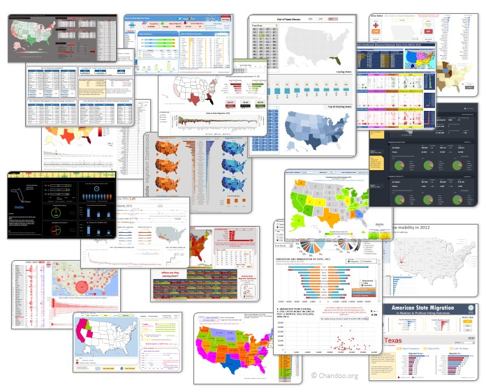
Click on the image to see the entries.
Continue »
