All articles with 'pivot tables' Tag
{ 1 Comment }
A quick tip about data analysis while on bike [Video + Personal]
Published on Oct 3, 2016 in Pivot Tables & Charts
![A quick tip about data analysis while on bike [Video + Personal]](https://chandoo.org/wp/wp-content/uploads/2016/10/data-analysis-on-bike.jpg)
Wellington(NZ) sure is beautiful on a clear day. There are so many cool bike tracks, walking trails and beaches to keep you busy. Today, I went cycling on my usual route towards Makara beach. At the turn off point, I thought, “This is selfish. I can’t keep all this beauty to myself. I must share it with you.” So here we go.
A quick video about data analysis while on bike
Technically, I was not on bike when recording this video. Watch it below or on our YouTube Channel.
Continue »![Analyzing 300,000 calls for help [case study]](https://chandoo.org/wp/wp-content/uploads/2016/08/raw-data-first-onscene.png)
Over the weekend, I got an email from Mr. E, one of my students. Mr. E works at a police department in California and as part of his work, he was looking at calls received by police. Whenever police get a call for help, multiple teams can respond to the call and go to the location. All of these dispatches are recorded. So a single call can have several such dispatches. And Mr. E wanted to findout which team responded the first. The problem?
Finding the first responded team is tricky.
Today let’s take up this problem as a case study and understand various methods to solve it. We are going to learn about writing better lookups, pivot tables, power pivot and optimization. Put on your helmets, cause this is going to be mind blowingly awesome.
Continue »{ 3 Comments }
Fish Eye Effect for highlighting selection – Is it effective? [Advanced Charting]
Published on May 26, 2016 in Charts and Graphs
![Fish Eye Effect for highlighting selection – Is it effective? [Advanced Charting]](https://chandoo.org/wp/wp-content/uploads/2016/05/fish-eye-effect-thumb.png)
A few days back, WSJ ran a visualization titled “What’s your pay gap?” It depicts median pay gap between female & male workers in 422 different professions in USA. The chart uses fish eye effect to highlight the selected profession. See below demo to understand the effect.
Continue »{ 36 Comments }
Advanced Interactive Charts using Excel [Master Class]
Published on Apr 14, 2016 in Charts and Graphs, Cool Infographics & Data Visualizations, Master Class, Pivot Tables & Charts, VBA Macros
As announced earlier, here is the first one of our Master Classes. In this one, you will learn how to create advanced interactive charts in Excel by blending pivot tables, slicers, timelines, VBA, conditional formatting and charts. The final outcome is BEAUTIFUL!!! Monthly Master Class – Episode 1 – Trailer Check out a quick trailer of the […]
Continue »{ 5 Comments }
CP054: Top 10 Pivot Table Tricks for YOU
Published on Mar 31, 2016 in Chandoo.org Podcast Sessions, Pivot Tables & Charts

Podcast: Play in new window | Download
Subscribe: Apple Podcasts | Spotify | RSS
In the 54th session of Chandoo.org podcast, let’s make you awesome in Pivot Tables.
What is in this session?
In this podcast,
- Quick updates
- Top 10 pivot table tricks
- Adding same value field twice
- Tabular layouts
- GETPIVOTDATA & 2 bonus tricks
- Relationships & data model
- One slicer to rule them all
- Show only top x values
- Relative performance
- Show unique count
- Spruce up with conditional formats
- Not so ugly pivot charts
- Resources & Show notes for you
{ 2 Comments }
A slicer that doesn’t slice [Pivot Table Tricks]
Published on Mar 30, 2016 in Pivot Tables & Charts, Power Pivot
![A slicer that doesn’t slice [Pivot Table Tricks]](https://chandoo.org/wp/wp-content/uploads/2016/03/slicer-chart-confusion.gif)
Mary Ellen, one of our readers, has an interesting conundrum,
I have some data that goes to Pivot table then to pivot chart. There is a slicer to filter the data. But when I slice, my pivot chart gets messed up. How to have the slicer, but still see the insights in the chart?!?
See above demo to understand:
This is because when you slice by a school, the pivot table gets filtered and hence % row total for that school becomes 100% (as there are no other schools).
How to fix the problem? The easy answer is to remove the slicers. But we want to have our slicers and eat a slice of them too. So we crank up the Excel awesomeness valve and get to work. There are two ways to achieve what we want.
- Old school method: Two pivot tables, some formulas & a line chart
- New Excel method: Power Pivot and a line chart
Read the rest of this article to know more.
Continue »{ 13 Comments }
Unpivot and then pivot for clarity (case study)
Published on Mar 8, 2016 in Pivot Tables & Charts, Power Query

Or more appropriately titled, the one where Power Query solves the problem in less time than it takes you to say Get & Transform Data.
Recently, one of my students Mr. K, sent me a pivot table problem.
Today my boss asked me “how much we paid to staff since the inception of our business with their respective date of joining?” He wanted to know, level wise summary of the last 16 years (on Quarterly / Year wise basis).
The records appended from the database month wise. Have a look to the file and give your ideas.
Mr. K’s data looked like above.
Continue »{ 13 Comments }
Analyzing half a million complaints – Customer Satisfaction Scorecard [Part 3 of 3]
Published on Feb 23, 2016 in Charts and Graphs, Cool Infographics & Data Visualizations, Learn Excel
![Analyzing half a million complaints – Customer Satisfaction Scorecard [Part 3 of 3]](https://chandoo.org/wp/wp-content/uploads/2016/02/customer-satisfaction-scorecard-analysis-complaints-data.png)
This is the final part of our series on how to analyze half a million customer complaints. Click below links to read part 1 & 2.
- Complaint reason analysis – Part 1
- Regional trends & analysis – Part 2
Customer satisfaction scorecard
In the previous parts of this case study, we understood what kind of complaints were made and where they came from (states). For the customer satisfaction scorecard, let’s focus on individual companies.
Continue »{ 16 Comments }
Analyzing half a million consumer complaints [Part 1 of 3]
Published on Feb 16, 2016 in Analytics, Charts and Graphs
![Analyzing half a million consumer complaints [Part 1 of 3]](https://chandoo.org/wp/wp-content/uploads/2016/02/analyzing-consumer-complaints-interactive-treemap-th.png)
How would you analyze data when you have lots of it? That is the inspiration for this series.
Let’s meet our data – Finance Industry Consumer Complaints
As part of open data initiatives, US government & Consumer Financial Protection Bureau maintain a list of all consumer complaints made against financial institutions (banks, credit unions etc.) You can download this data from the catalog page here. I have obtained the data on 1st of February, 2016. The download has 513,824 records. Each row contains one complaint.
In this and next two parts of the series, we are going to analyze these half a million complaints to find insights.
Continue »{ 18 Comments }
Use slicers to create a cool selection mechanism [quick tip]
Published on Feb 8, 2016 in Learn Excel, Pivot Tables & Charts
Most advanced Excel users know that slicers are cool. Today, let’s learn how to use slicers to create an awesome selection mechanism for your dashboards and forms.
First see a quick demo

Looks slick, eh? Read on.
Continue »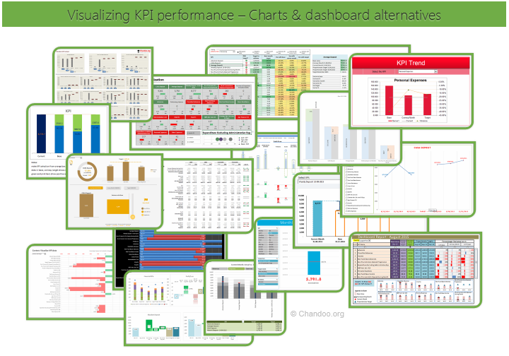
Hello all, prepare to be amazed! Here are 43 creative, fun & informative ways to visualize KPI data.
About a month ago, I asked you to visualize KPI data. We received 65 entries for this contest. After carefully reviewing the entries, our panel of judges have discarded 22 of them due to poor charting choices, errors or just plain data dumps. We are left with 43 amazing entries, each creatively analyzed the data and presented results in a powerful way.
How to read this post?
This is a fairly large post. If you are reading this in email or news-reader, it may not look properly. Click here to read it on chandoo.org.
- Each entry is shown in a box with the contestant’s name on top. Entries are shown in alphabetical order of contestant’s name.
- You can see a snapshot of the entry and more thumbnails below.
- The thumb-nails are click-able, so that you can enlarge and see the details.
- You can download the contest entry workbook, see & play with the files.
- You can read my comments at the bottom.
- At the bottom of this post, you can find a list of key charting & dashboard design techniques. Go thru them to learn how to create similar reports at work.
Thank you
Thank you very much for all the participants in this contest. I have thoroughly enjoyed exploring your work & learned a lot from them. I am sure you had fun creating these too.
So go ahead and enjoy the entries.
Continue »{ 5 Comments }
CP047: Best Excel tools for Entrepreneurs
Published on Oct 22, 2015 in Chandoo.org Podcast Sessions, Pivot Tables & Charts

Podcast: Play in new window | Download
Subscribe: Apple Podcasts | Spotify | RSS
In the 47th session of Chandoo.org podcast, let’s see how Excel can make you an awesome entrepreneur.
What is in this session?
In this podcast,
- Why Excel for entrepreneurs
- Key areas of a business owner’s work
- Projects & to dos
- Finances
- Customers & marketing
- Planning & strategy
- Processes & workflows
- 5 features of Excel that help
- Conclusions
{ 9 Comments }
Unpivot data quickly with Power Query [tutorial]
Published on Sep 29, 2015 in Pivot Tables & Charts, Power Query
![Unpivot data quickly with Power Query [tutorial]](https://chandoo.org/wp/wp-content/uploads/2015/09/unpivot-data-using-power-query.png)
Power Query (Get & Transform data in Excel 2016) is a must have tool, if you wrangle with data every day. Here is a quick introduction, in case you are new.
Let’s learn how to use Power Query to unpivot data.
Essentially, we are trying to go from left to right in the above picture.
Doing something like this thru either formulas or VBA can be very complex. But Power Query can get you unpivoted data in just a few clicks. Sounds interesting? Read on.
Continue »Time for a quick weekend poll. What is your favorite tool for data analysis?
- Formulas
- Pivot Tables
- Or both
Post your choice in the comments. Also mention the number of years Excel experience you have.
For ex, my answer is: Both (10 years)
Continue »{ 5 Comments }
CP043: My favorite time saving features of Excel, Revealed.
Published on Aug 27, 2015 in Chandoo.org Podcast Sessions

Podcast: Play in new window | Download
Subscribe: Apple Podcasts | Spotify | RSS
In the 43rd session of Chandoo.org podcast, let’s talk about top time saving features of Excel.
What is in this session?
In this podcast,
- Quick announcement about Awesome August
- My 9 favorite time saving features of Excel
- Remove Duplicates
- Tables
- Pivot Tables
- Auto fill
- Format Painter
- Find & Replace
- VBA / Macro Recorder
- Auto save
- Auto complete / Intellisence
- Recap & Conclusions

