All articles with 'picture link' Tag
How to make an Interactive Chart Slider Thingy

Ok, I will be honest. I have no idea what to call it. May be Chart Cover Flow? But Interactive Chart Slider Thingy sounds so better. So let’s go with it.
Learn how to create this magical contraption in Excel.
Continue »Tour de France – Distance & Pace over time – Radial Charts

This is an Excel replica of excellent Tableau visual on Tour de France winner data made by Marc Reid.
Last week I saw a stunning visualization on Tour de France using radial charts. I wanted to replicate it in Excel. So here we go.
Continue » In about 3 days, I am leaving to USA for participating in PASS Business Analytics conference – 2015. It is an annual event for people in analytics profession. This is the first time I am attending & speaking at the event. I am so excited for many reasons.
- I will be meeting many Excel bloggers, authors & internet friends for the first time
- I will be meeting many of you (readers, listeners, followers & customers of Chandoo.org) too
- I will be speaking at an awesome conference
- I will be visiting San Francisco for the first time in life
- I will be meeting a few college friends too
All this excitement means, I have too much going on. But that shouldn’t leave you out . So here are a few awesome Excel links for you. Check out and learn.
Continue »How to create an Interactive Chart in Excel? [Tutorial]
![How to create an Interactive Chart in Excel? [Tutorial]](https://cache2.chandoo.org/images/c/interactive-chart-in-excel-demo.gif)
Imagine you have a worksheet with lots of charts. And you want to make it look awesome & clean.
Solution?
Simple, create an interactive chart so that your users can pick one of many charts and see them.
Today let us understand how to create an interactive chart using Excel.
Continue »Speeding up & Optimizing Excel – Tips for Charting & Formatting [Speedy Spreadsheet Week]
![Speeding up & Optimizing Excel – Tips for Charting & Formatting [Speedy Spreadsheet Week]](https://img.chandoo.org/optimize/speeding-up-optimizing-excel-charts-formatting.png)
Is Excel acting slow & taking ages? As part of our Speedy Spreadsheet Week, today lets talk about optimizing & speeding up Excel by formatting & charting better. Use these tips & ideas to super-charge your sluggish workbook.
No matter how much data you got, how many formulas you wrote, the end users seldom see them on your workbook. They see the finalized dashboard, they play with the model, they look at the report. And if you make poor choices, your end users will thing your workbook is slow.
So let me present you 7 charting & formatting tips to optimize & speed up Excel. Read on…,
Continue »Free Picture Calendar Template – Download and make a personalized calendar today!
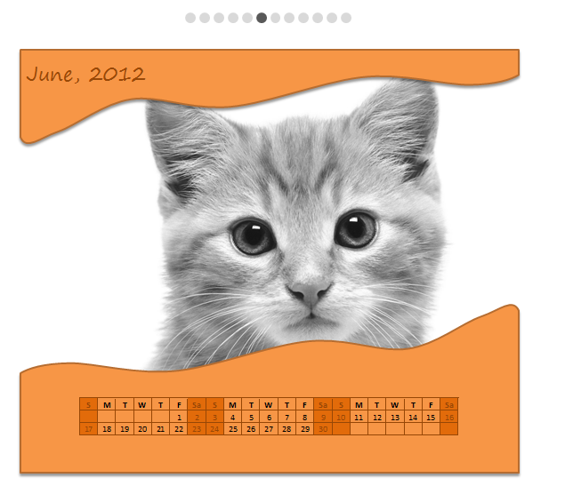
Here is something fun, personalized and delicious to start your new year. A Picture Calendar built in Excel!
Using this you can print a 12 month calendar with your own photos. Its fun to use, easy to set up and looks great. Read more to understand how this works & download the template.
Continue »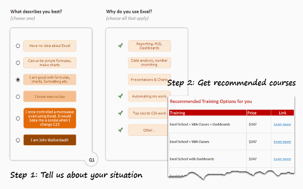
First a Quick Announcement: Our VBA Class enrollments will be closed this Friday (Sep 16). If you want to learn VBA & Excel, please consider joining our course. More than 120 students have already joined us in the second batch and are learning VBA as you read this. Click here to learn more about the VBA Classes and join us.
Moving on…,
As you may know, Chandoo.org offers quite a few Online Excel training programs. Over the last few weeks, many of you have emailed us and asked which training program is best for your situation. This got me thinking. “It should be easy for YOU to know what is best.”
So today morning, I locked my office room and made a beautiful Excel workbook that asks you only 2 questions and tells you which training programs are best for you. Try it here.
Continue »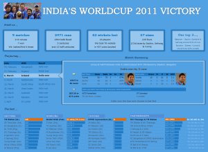
I know I am late to the party, but better late than…, uh! forget it.
As the keen readers of our blog knew, I like cricket and I show my enthusiasm by making an excel dashboard (or info-graphic) whenever Indian team reaches a major milestone. So naturally, I was super excited when we won the ICC World cup 2011. Last time Indian won the event was in 1983 and my idea of a dashboard at that time was a bottle of milk and jingo-bell, my favorite shake-to-make-annoying-noise toy. I think our latest world-cup victory deserves something more than that. So here we go.
Continue »Use Analytical Charts to Make your Boss Love You
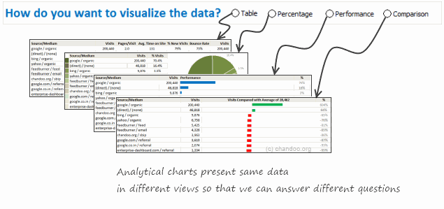
There are beautiful, powerful & awesome charting examples all around us. Today, I want to show you how we can harness the power of Excel to create Analytical Charts.
Analytical What?!?
To be frank, I do not know what to call these charts, so I choose the term Analytical Charts. But this is what I have in mind when I say Analytical charts:
A chart is analytical chart,
(1) If it is interactive
(2) It it can answer different questions by re-structuring same data differently
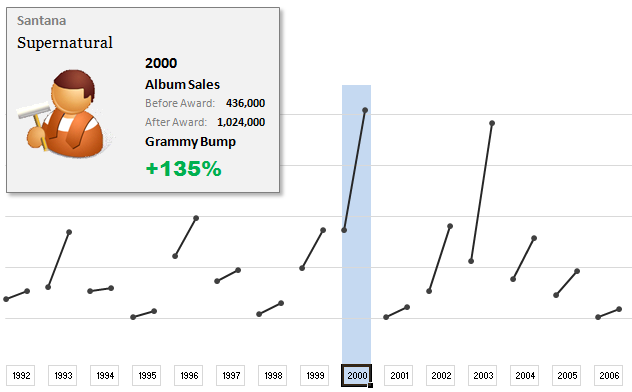
The folks at Washington Post made an interesting chart to understand whether winning a Grammy award makes any difference to album sales. Go ahead and browse it if you have not already seen it. Go, I will wait.
Are you impressed?
I really liked this chart. This is what I liked about the chart,
- It tells a story.
- It is an ego chart. We would all instantly search for our favorite artists and learn about how Grammy award changed their album sales.
- It is a simple chart. No clutter, no gaudy colors, just a bunch of lines and the story is out there.
- It lets you play.
In fact, I liked the chart so much that I wanted to make it in Excel.. You can see a snapshot of what I came up with above. Read the rest of this article to learn more.
Continue »Happy Birthday Hui, An Excel Dashboard to prove you are awesome!
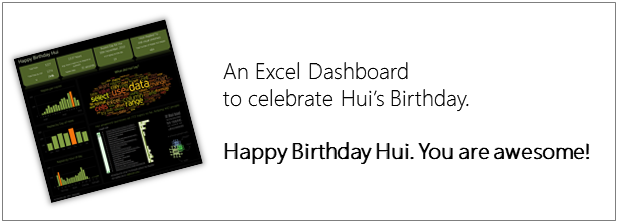
Some of you know our guest author and Excel ninja Hui. Yesterday was his birthday. And I wanted to create nice birthday gift for him. So I took a database dump of our forums data and created a dashboard.
Read rest of this post to see the dashboard & download workbook.
Continue »An Excel Dashboard to Visualize 10,007 Comments [Dashboard Tutorial]
![An Excel Dashboard to Visualize 10,007 Comments [Dashboard Tutorial]](https://chandoo.org/img/vp/10007-comments-dashboard-thumb.png)
First some good news, On 21st November, 2010, our little blog received its 10,000th comment!
Thank you so much for making this happen.
Those of you reading chandoo.org for a while know my penchant for comments. I have learned a lot of excel tips & ideas just by reading the comments you posted on this blog. I think comments are one of the best parts of this blog. So, naturally, I wanted to celebrate this milestone, with something big & awesome.
My intention was to download all the 10,000+ comments and play with the data to come up with something outstanding, like a dashboard. It took me 2 days to conceptualize and create this beauty.
Continue »Learn an Excel Feature: Picture Links (or Camera Snapshots)

Today I want to introduce a new excel feature to you, called as Picture link.
Well, picture links are not really new, they are called as camera snapshots in earlier versions. They provide a live snapshot of a range of cells to you in an image. So that you can move the image, resize it, position it wherever you want and when the source cells change, the picture gets updated, immediately.
Continue »

