
This is an Excel replica of excellent Tableau visual made by Marc Reid here.
Last week, I saw a stunning visualization on Tour de France using of radial charts on twitter.
???? @Marc_DS5 combined #SportsVizSunday (Tour de France) and #SWDChallenge (radial charts) to create this #VOTD! Learn about the fastest and longest tours in history: https://t.co/Xge6mtyVYE pic.twitter.com/6luDs9Riwp
— Tableau Public (@tableaupublic) July 9, 2019
As an amateur cyclist, somewhat pro data analyst, I jumped with joy seeing that visual. I immediately thought, this needs to be redone in Excel. So here is an implementation of radial charts in Excel.
Demo of Excel Replica – TdF Distance & Pace Radial charts

Download Tour de France Radial Charts viz in Excel
Click here to download the completed workbook. Have a play with the viz tab or explore the data&calc tab to see how it’s put together.
How is this chart made?
This will be a brief recipe with links to other articles that explain the technical elements. Feel free to poke around the download file to discover odd missing elements.
Step 0: Inspiration
As mentioned earlier, the inspiration for this came from Marc Reid’s excellent visual. I loved the visual instantly and wanted to replicate it in Excel as much as possible.

Step 1: Getting data
The data for this came from Thomas Camminady’s page on Every cyclist of Tour de France in a single CSV file. As the name suggests, it’s a CSV file, so there was no post processing needed. For each year, each finisher there is one row in the data set with columns like name, team name, duration, distance, pace, position and few other bits.
Step 2: Calcs for radial visualization
Meet ometrys. You might have seen them back in high school.
- Geometry
- Trigonometry
They will help us take the cycling data and transform that in to a radial chart.
Since there is 94 years of data (between 1913 and 2017 there were 94 editions of the tour) each spoke will be separated by 2pi / 94 radians.
Let’s take a look the anatomy of radial chart spokes.


We could simply draw one line per spoke, but to get the thick edge, thin center look, I went with triangle approach.
As you can see, if we can calculate points a,b,c & d for each year, our job is done.
The center is (0,0). Points a & d lie on the inner ring. Points b & c depend on the actual distance (or pace) we are plotting for the given year.
Let’s say inner ring size (radius) is defined by a named range hole.size and triangle edges are separated by 1 degree (2pi/360 radians).
- point a (x,y) = (hole.size * SIN(theta), hole.size *COS(theta))
- point d (x,y) = (hole.size * SIN(theta + 2pi/360), hole.size *COS(theta + 2pi/360))
To calculate b & c, we need to use the distance in that year too. As the distances (and paces) are all over the places, I have used a scale.factor to scale them down or up to make the radial charts uniform. This is how the formula looks for points b & c.
- point b (x,y) = (dist/scale.factor.d * SIN(theta), dist/scale.factor.d * COS(theta))
- point c (x,y) = (dist/scale.factor.d * SIN(theta + 2pi/360), dist/scale.factor.d * COS(theta + 2pi/260))
As we need 4 points for each year, we need to calculate 4 x 94 values to plot the radial chart for distance. Similar set of values need to be calculated for pace too.
Once all these values are ready, it is a simple matter of creating XY scatter plot, formatting it to get the spokes.
This method of drawing spokes / radials in Excel is explained in great detail here. For more also see network relationships chart in Excel.
The calculations for line charts are rather straight forward, so I am not explaining them here.
Step 3: Extra series for highlighting max, min and selected values
Once the calculations are done, we can add additional x,y values for each of these scenarios.
- If the pace is maximum, then get (x,y) else (NA(), NA())
- Pace is minimum, get (x,y) else NA()
- Year is selected by the user, get (x,y) else NA()
Related: How to conditionally format charts?
Step 4: User interaction for year selection – scrollbar form control
I added a scrollbar control to the visuals area and then set it up to go from 1913 to 2017. We can use the linked cell value to drive the calculations needed for “year selection” bit.

Related: Introduction to Excel Form Controls
Step 5: Stats for selected year with Picture Link
For the selected year, we can easily calculate stats (winner’s name, duration, distance, pace and percentage changes compared to previous edition of the tour). Once these stats are calculated, we can show them on the visual by using picture link. As you play with the scrollbar, the picture link changes.
Here is a re-cap of all the 5 steps in construction.

Other bits & pieces
- We can add labels for important points on radial chart by using “value from cell” option for data labels.
- But the labels on XY charts tend to be poorly positioned. I needed more space between edge of spoke and label. To get this, I added an extra label series that is offset 12 points from the edge.
- We can add number of finishers in each year and see that trend too. As you can see, over the years, the competition has gone intense.
The final output – Tour de France distance & pace over time as radial charts
How do you like the visualization?
My love for cycling, data and story-telling coincided perfectly in this. That said, if I remove my rose-tinted glasses, I can see a couple of issues with the visualization.
- Redundancy: The line charts at bottom depict the same info as radials, but do a better job. They can work even with 500 data points, where as the radial spokes will get very busy with such large volume of data.
- Obvious: The conclusion from visualization is “as distance goes down, pace has gone up”. But this is kind of obvious.
That said, I loved the challenge of replicating it in Excel. I would say, barring the trigonometry part, it is rather simple to re-create this in Excel. I suggest giving it a try to improve your charting skills.
What about you? What do you think about the original Tableau visual and its replica in Excel? Please share your thoughts in comment section.
Do you like sport & data – Check out these stories too:
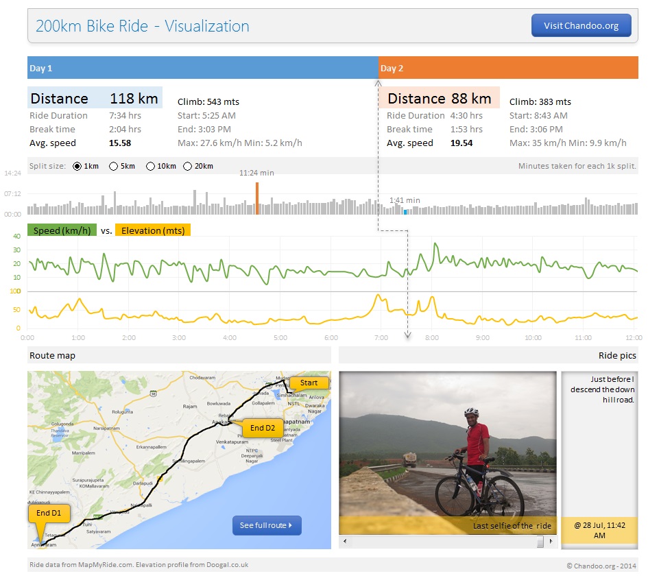
My first 200km bike ride as a dashboard
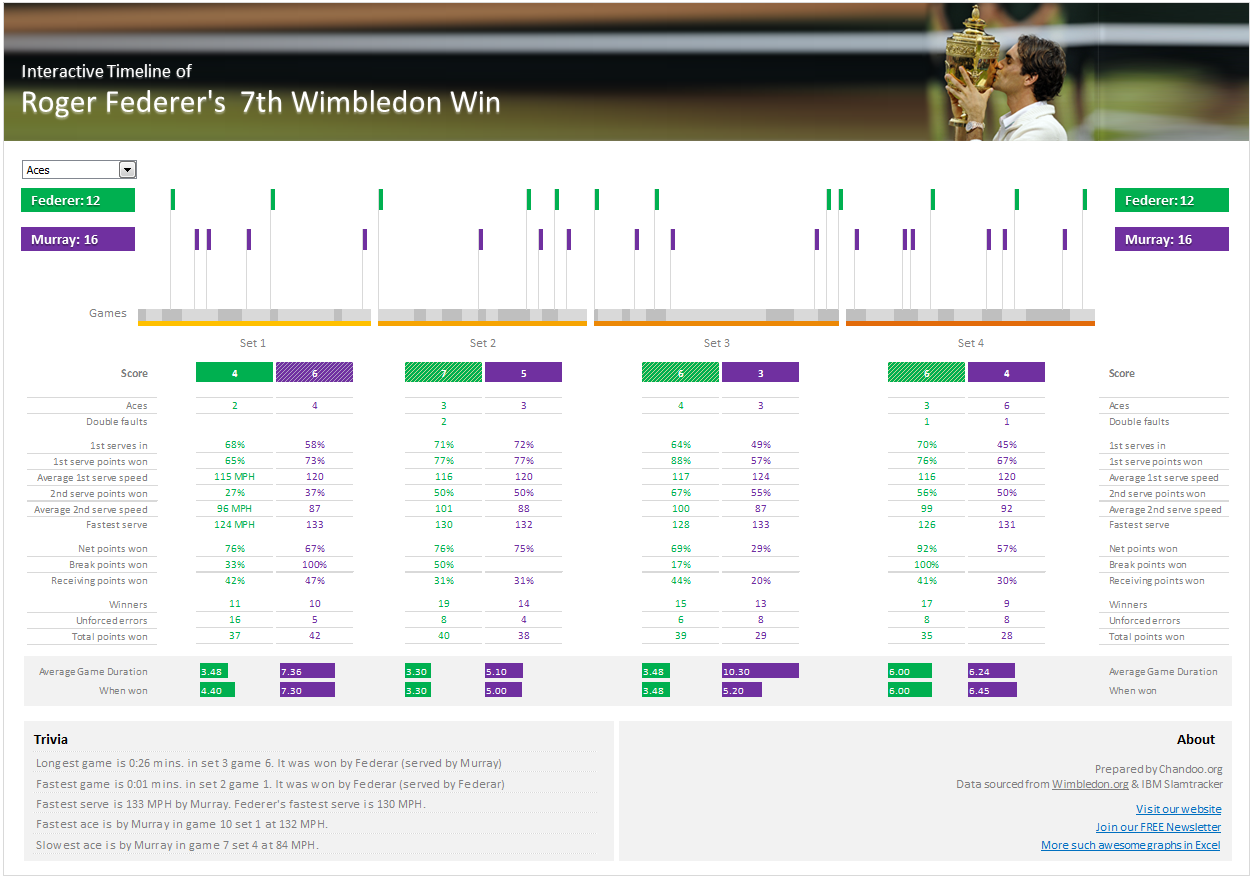
Roger Federer’s 7th Wimbledon Title – Timeline
Commonwealth Games 2018 – Medal Tally Report (Power BI)


25 Responses to “Shift Calendar Template – FREE Download”
Hi Chandoo,
your recent postings include only Excel 2007 templates. Unfortunately the company I work at still runs Excel 2003. Is it possible to get your awesome files in other excel version as well?
Thanks so much for your great excel stuff!
Is it possible to do this for shifts with hours instead of days? To organise a three shift day?
Thanks in advance,
Stelios
In my organization there are 45 employees i need split then into three shifts ex:A shift:14,B shift:14,C shift:14 and week off:3 kindly help me on this.
@Masthan
You need to understand what rules your company has for the various shifts / roster combinations
Chandoo, I once did a shift control spreadsheet for my team. I put one person in each line, the columns were the days. I put a shift code in each cell indicating in which shift that person should work, or if the person were out that day. I have two codes for being out. One is for vacations and one is to compensate days worked in weekends. This way I was able to count how many persons I have in each shift, how many were on vacations and how many were out compensating (that's the term we use here) weekend worked hours.
Later I included the possibility of a person be in two lines one for normal hours other for overtime. This is mainly used for planning purposes. If you would like I can send you an example. The only problem of this spreadsheet is that we don't have a person view, only this consolidated view.
Hi George, I would like to have a copy of your spreadsheet if you can share it.
Thanks in advance, Chuck
Hi Chandoo,
Where is the code located ? is it VBA ? If so , how do you hide it ? Or it is .NET ?
Thx
@Idan
.
No VBA or code, it is all done with Mirrors.
Only Joking,
.
But there is no VBA or code,
It is all done with Named Formulas and Lookups.
Have alook at the cells in the calander area and Named Formulas in the Formulas, Name Manager Tab.
How can i calculate between two or more different workbooks? Please, reply me as early as possible.
@Anand
Open the workbooks you want to link to
Start a formula = and click and change between workbooks as required.
You can use the View, Switch window menu to change workbooks mid formula
The format for using workbooks is
=[Workbook.xlsm]Sheet1!$A$1
or
=SUM('[Book2.xls]Sheet1'!$A$1:$D$10)
etc
Hi Chandoo,
I am working with a call centre wherein i ned to update at the month end 20 to 30 employees login hours which are defict to track it at the month end is very difficult is there any template which can be made to track that why on a particular day a guy who needs to be on calls was why not on calls.
Thank you so much Chandoo. This is really helping me. As usual, you rock.
What's FortyTwoDays and Calendar in Name manager?
Both are unused and FortyTwoDays doesn't make any sense.
I have a SQL db that contains records of events scheduled/completed on a particular date. Can this method ous building a calendar be used to display those events on the respective day?
Positively awesome!
I'm attempting to help a friend create a schedule for adult classes - and of course its not"paid help". Here is the scenario:
20 classes, instructor, room#, student class size, start date, number of class days (need to subtract weekends)
class
instructor
room
students
start
#days
PATH
karen
201
21
01/01/13
11
BILLING
jane
401
15
01/12/13
13
MEDISOFT
mike
301
11
01/25/13
9
he'd like to see these classes show up in different colors within the same month's calendar chart. He can draw it, but I'd like to see it done automatically through data, and I just can't visualize it, but I KNOW this will work - can you help?
Jan 🙂
Dear chandoo,
Try many way to download still can't access. Any way we want to try out 3 shifts with 3 guys in a group .eg Group A Morn, Group B Night and Group C Rest. And every each group must work on sunday to take turns. In fact we are security teams so that's why sunday is required to work. Pls guide and show how to put in the working calendar. Thank you in advance.
I've been trying to copy and/or recreate this to use in a workbook I'm doing for the transportation department I'm working for. I need to have the calendar on the first sheet in my document (it has graph's from data on another sheet). I'm trying to use it to track (with the conditional formatting) accidents and injuries. I've redone the conditional formatting to do 4 different accident types (no injury, near miss, OSHA recordable injury and work loss injury), but when I enter the formula's you have in the calendar portion where it says "DateOfFirst-FirstWeekDay" I can't figure out how you did that. Are you able to help?
I would like to use Excel to solve the following problem for a community work. I want to create a Driver schedule for a given month from a pool of volunteers for a community service. Each of these volunteers can drive only on specific days in a week. I would like to populate the driving schedule for each weekday with primary, secondary and tertiary drivers in a random fashion so that I do not overburden one person. I would greatly any help you can provide.
Hi chandoo,
Thanks for your valuable effort for create this template and let me know how to add multiple employees in the the Roaster.
Hi Chandoo,
This article on shift roaster is very helpful. Could you please let me know how i can use the same for n number of resources who work 24/7, considering their leaves and holidays?
Thanks,
Savitha
Hi Chandoo,
This article on shift roaster is very helpful to all. Could you please let me know how i can use the same if I want to add for some more shifts, since the color is not getting change if I add more shifts like 4,5 etc.,
Thanks,
Murali
nice post
How can I change the date to 2017 under Shift Data worksheet.
solution 1:
mydata=B2:C16
stoplist=E2:E8
=LET(RNG,A2:A16,SMR,C2:C16, F,(RNG=E2)+(RNG=E3)+(RNG=E4)+(RNG=E5)+(RNG=E6)+(RNG=E7)+(RNG=E8),SUM(SMR)-SUM(SMR*F))
=LET(RNG,A2:A16,SMR,C2:C16,RH,N(B2:B16=B2), F,(RNG=E2)+(RNG=E3)+(RNG=E4)+(RNG=E5)+(RNG=E6)+(RNG=E7)+(RNG=E8),TOT,SUM(SMR)-SUM(SMR*RH*F),SUM(SMR*RH)-SUM(SMR* RH*F))
ALTERNATE SOLUTION
=SUM(C2:C16)-SUM(FILTER(C2:C16,ISNUMBER(BYROW(A2:A16,LAMBDA(a,TOROW(SEARCH(a,E2:E8),2))))))
=SUM((B2:B16=B2)*(C2:C16))-SUM((ISNUMBER(BYROW(A2:A16,LAMBDA(a,TOROW(SEARCH(a,E2:E8),2))))*(B2:B16=B2)*(C2:C16)))
let
Source = Excel.CurrentWorkbook(){[Name="Table1"]}[Content],
#"Replaced Value" = Table.ReplaceValue(Source,null,";",Replacer.ReplaceValue,{"Column1"}),
#"Transposed Table" = Table.Transpose(#"Replaced Value"),
#"Removed Other Columns" = Table.SelectColumns(#"Transposed Table",{"Column1", "Column2", "Column3", "Column4", "Column5", "Column6", "Column7", "Column8", "Column9", "Column10", "Column11", "Column12", "Column13", "Column14", "Column15", "Column16", "Column17", "Column18", "Column19", "Column20", "Column21", "Column22", "Column23", "Column24", "Column25", "Column26", "Column27", "Column28", "Column29", "Column30", "Column31", "Column32", "Column33", "Column34", "Column35", "Column36", "Column37", "Column38", "Column39", "Column40", "Column41", "Column42", "Column43", "Column44", "Column45", "Column46", "Column47", "Column48", "Column49", "Column50", "Column51", "Column52", "Column53", "Column54", "Column55", "Column56", "Column57", "Column58", "Column59", "Column60", "Column61", "Column62", "Column63", "Column64", "Column65", "Column66", "Column67", "Column68", "Column69", "Column70", "Column71", "Column72", "Column73", "Column74", "Column75", "Column76", "Column77", "Column78", "Column79", "Column80", "Column81", "Column82", "Column83", "Column84", "Column85", "Column86", "Column87"}),
#"Merged Columns" = Table.CombineColumns(#"Removed Other Columns",{"Column1", "Column2", "Column3", "Column4", "Column5", "Column6", "Column7", "Column8", "Column9", "Column10", "Column11", "Column12", "Column13", "Column14", "Column15", "Column16", "Column17", "Column18", "Column19", "Column20", "Column21", "Column22", "Column23", "Column24", "Column25", "Column26", "Column27", "Column28", "Column29", "Column30", "Column31", "Column32", "Column33", "Column34", "Column35", "Column36", "Column37", "Column38", "Column39", "Column40", "Column41", "Column42", "Column43", "Column44", "Column45", "Column46", "Column47", "Column48", "Column49", "Column50", "Column51", "Column52", "Column53", "Column54", "Column55", "Column56", "Column57", "Column58", "Column59", "Column60", "Column61", "Column62", "Column63", "Column64", "Column65", "Column66", "Column67", "Column68", "Column69", "Column70", "Column71", "Column72", "Column73", "Column74", "Column75", "Column76", "Column77", "Column78", "Column79", "Column80", "Column81", "Column82", "Column83", "Column84", "Column85", "Column86", "Column87"},Combiner.CombineTextByDelimiter("|", QuoteStyle.None),"Merged"),
#"Split Column by Delimiter" = Table.ExpandListColumn(Table.TransformColumns(#"Merged Columns", {{"Merged", Splitter.SplitTextByDelimiter(";", QuoteStyle.Csv), let itemType = (type nullable text) meta [Serialized.Text = true] in type {itemType}}}), "Merged"),
#"Added Prefix" = Table.TransformColumns(#"Split Column by Delimiter", {{"Merged", each "|" & _, type text}}),
#"Replaced Value1" = Table.ReplaceValue(#"Added Prefix","||","|",Replacer.ReplaceText,{"Merged"}),
#"Split Column by Delimiter1" = Table.SplitColumn(#"Replaced Value1", "Merged", Splitter.SplitTextByDelimiter("|", QuoteStyle.Csv), {"Merged.1", "Merged.2", "Merged.3", "Merged.4", "Merged.5", "Merged.6", "Merged.7", "Merged.8"}),
#"Removed Columns" = Table.RemoveColumns(#"Split Column by Delimiter1",{"Merged.1"}),
#"Removed Duplicates" = Table.Distinct(#"Removed Columns")
in
#"Removed Duplicates"