All articles with 'form controls' Tag

Analyst’s life is busy. We have to gather data, clean it up, analyze it, dig the stories buried in it, present them, convince our bosses about the truth, gather more evidence, run tests, simulations or scenarios, share more insights, grab a cup of coffee and start all over again with a different problem.
So today let me share with you 35 shortcuts, productivity hacks and tricks to help you be even more awesome.
Continue »How to make an Interactive Chart Slider Thingy

Ok, I will be honest. I have no idea what to call it. May be Chart Cover Flow? But Interactive Chart Slider Thingy sounds so better. So let’s go with it.
Learn how to create this magical contraption in Excel.
Continue »Tour de France – Distance & Pace over time – Radial Charts

This is an Excel replica of excellent Tableau visual on Tour de France winner data made by Marc Reid.
Last week I saw a stunning visualization on Tour de France using radial charts. I wanted to replicate it in Excel. So here we go.
Continue »
On twitter I follow many charting and visualization related accounts. One of them is @Andy Kriebel, who runs Makeover Monday. The idea is simple. Every Monday they publish a data-set and ask the community to visualize. Last Monday (7th May, 2018), they have published about toughest sport by skill data. This categorizes 60 sports by 10 skill categories to find out which sport is the toughest. Over the weekend, Andy posted a summary of all toughest sport viz entries. Many of the entries are made in Tableau. I thought it would be a fun challenge to re-create some of these charts in Excel. The result is this post. 60 sports in 6 charts. Check out the charts and download workbook to learn more.
First four charts are re-creations of Tableau designs. Last two are mine.
Continue »Modelling Inventory Run Rate & Cash Flows using Excel

Imagine you run an office furniture company. You want to stop reordering two brands of furniture – Relaxer (a type of chair) and Boca Top (a type of table). You currently have 20,000 Relaxer chairs and 5,000 Boca Tops. These are valued at $200,000 and $100,000 respectively. When sold, they will yield $100,000 and $25,000 gross profit. You are hoping to sell them off in 2 or 3 years. You forecast that we can sell off these as per some yearly schedule.
You need to analyze this and prepare a cash flow model.
Let’s learn how to answer such open ended questions using various analysis techniques in Excel.
Continue »On / Off conditional formatting with this simple trick

Here is a quick & awesome way to make your dashboards sexy. Add an on / off switch to your conditional formats.
Take a look at above demo to understand what I mean.
Continue »“How Trump happened” in Excel [visualizations]
![“How Trump happened” in Excel [visualizations]](https://chandoo.org/wp/wp-content/uploads/2016/03/how-trump-happened-excel-replica.png)
During last week, an alert reader of our blog, Jørgen emailed me a link to “How Trump happened“. It is an interactive visualization by Wall Street Journal. Jørgen asked me if we could replicate the visualization in Excel. My response: “Making a new chart in Excel? Hell yeah!”
Read on for awesome visualizations and full explanation.
Continue »Use slicers to create a cool selection mechanism [quick tip]
Most advanced Excel users know that slicers are cool. Today, let’s learn how to use slicers to create an awesome selection mechanism for your dashboards and forms.
First see a quick demo

Looks slick, eh? Read on.
Continue »
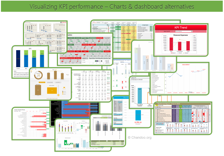
Hello all, prepare to be amazed! Here are 43 creative, fun & informative ways to visualize KPI data.
About a month ago, I asked you to visualize KPI data. We received 65 entries for this contest. After carefully reviewing the entries, our panel of judges have discarded 22 of them due to poor charting choices, errors or just plain data dumps. We are left with 43 amazing entries, each creatively analyzed the data and presented results in a powerful way.
How to read this post?
This is a fairly large post. If you are reading this in email or news-reader, it may not look properly. Click here to read it on chandoo.org.
- Each entry is shown in a box with the contestant’s name on top. Entries are shown in alphabetical order of contestant’s name.
- You can see a snapshot of the entry and more thumbnails below.
- The thumb-nails are click-able, so that you can enlarge and see the details.
- You can download the contest entry workbook, see & play with the files.
- You can read my comments at the bottom.
- At the bottom of this post, you can find a list of key charting & dashboard design techniques. Go thru them to learn how to create similar reports at work.
Thank you
Thank you very much for all the participants in this contest. I have thoroughly enjoyed exploring your work & learned a lot from them. I am sure you had fun creating these too.
So go ahead and enjoy the entries.
Continue »How to create cascading drop downs in Excel – video

Cascading drop downs enhance usability of your dashboards & interactive workbooks. A cascading drop-down is a 2 or more level selection mechanism. When you have 100s of selection choices, instead of creating one massive drop down or combo-box, you can set up multiple levels of drop downs, so that users can narrow down their selection. For example, users can select Country, State and then City using cascading drop downs.
There are many ways to setup cascading drop downs. You can use formulas coupled with either data validation or form controls. You can also use Slicers. In this video we will review these techniques.
Continue »A simple trick to make your dashboards user friendly [video]
Whenever you have a dashboard that is quite long or spans across multiple worksheet tabs, it can be hard to use. Here is a simple trick to make your dashboards user friendly. If your dashboard has form controls, create duplicate sets of them and place them in locations where users are looking. For example, If your […]
Continue »![How to highlight overdue items [video]](https://chandoo.org/wp/wp-content/uploads/2015/08/highglight-overdue-items-howto.png)
We, adults can’t escape three things:
- Deadlines
- Demanding bosses (replace with customers or nagging spouses or naughty kids)
- Taxes
While I can’t help you with demanding bosses or taxes, when it comes to deadlines, I have the right tool for you.
A tracker that highlights all overdue items so that you know where to focus your attention.
Let’s learn how to use awesome powers of Excel to find-out which items are due. You can apply these concepts to nail down over due invoices, pending project tasks or scheduling workforce.
Continue »Are you an analyst? Use these 25 shortcuts & tricks to boost your productivity

Analyst’s life is busy. We have to gather data, clean it up, analyze it, dig the stories buried in it, present them, convince our bosses about the truth, gather more evidence, run tests, simulations or scenarios, share more insights, grab a cup of coffee and start all over again with a different problem.
So today let me share with you 25 shortcuts, productivity hacks and tricks to help you be even more awesome.
Continue »
Imagine you are the in-charge of finance department at Hogwarts. So one fine day, while you are practicing the spells, Dumbledore walks in to your office and says, “Our electricity bills are way too high. As the muggles don’t accept wizard money, we have to find a way to reduce our power consumption.”
So you summoned the previous 12 month utility bills to examine energy consumption patterns, and pretty soon you realized that most of the electricity consumption is due to the light bulbs. You suddenly have a brilliant idea. Why not replace the light bulbs with a variety that consumes low power? A light bulb moment indeed.
Your next step is to figure out what varieties of light bulbs are out there. Fortunately this is easier than catching a snitch in a game of quidditch. A quick search revealed that there are 3 types of light bulbs:
- Regular incandescent bulbs (the kind Hogwarts currently uses)
- Compact Fluorescent Light bulbs (CFL)
- Light Emitting Diode bulbs (LED)
Now your job is to do a cost benefit analysis of these options and pick one.
Continue »A better chart to visualize “Best places to live” – Top 100 cities comparison Excel chart
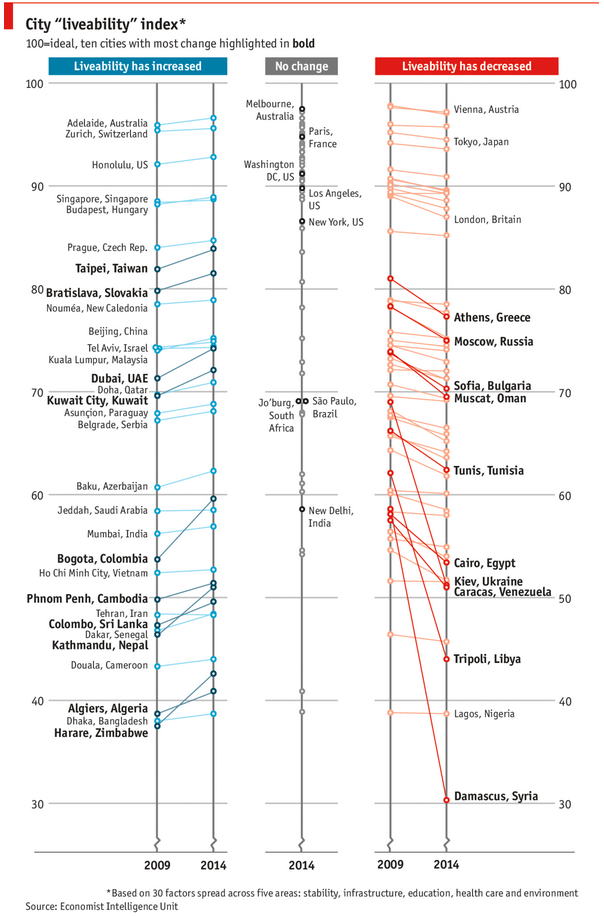
Recently, I saw this chart on Economist website.
It is trying to depict how various cities rank on livability index and how they compare to previous ranking (2014 vs 2009).

As you can see, this chart is not the best way to visualize “Best places to live”.
Few reasons why,
- The segregated views (blue, gray & red) make it hard to look for a specific city or region
- The zig-zag lines look good, but incredibly hard to understand % changes (or absolute changes)
- Labels are all over the place, thus making data interpretation hard.
- Some points have no labels (or ambiguous labels) leading to further confusion.
After examining the chart long & hard, I got thinking.
Its no fun criticizing someones work. Creating a better chart from this data, now thats awesome.
Continue »

