All articles with 'dynamic charts' Tag
Customer Service Dashboard using Excel [Dashword Week]
![Customer Service Dashboard using Excel [Dashword Week]](https://img.chandoo.org/dashboards/dw/customer-service-dashboard-excel.png)
Early in Jan, I got this mail from Mara, a student in Excel School first batch.
Hi Chandoo,
I took your first Excel batch class and loved it. I created a dynamic and interactive dashboard for my work. My boss thinks it’s an excellent tool and I have you to thank for and also Francis Chin who shared his travel dynamic dashboard. I integrated things you taught so thanks so much!
I felt very proud reading her email, so I asked her if she can share the dashboard with some dummy data so that we all can learn from her example.
Being a lovely person Mara is, she gladly emailed me the workbook and I am thrilled to include it in Dashboard Week.
Continue »Health-care Dashboard in Excel [Dashboard Week]
![Health-care Dashboard in Excel [Dashboard Week]](https://img.chandoo.org/dashboards/dw/health-care-dashboard-small.png)
As part of Dashboard Week, in this post, we will take a look at Health-care Dashboard prepared and shared by Alberto. He put together an excellent dashboard to visualize hospital performance and understand what is going on. Read this post to understand how this dashboard is made, watch a tutorial video & download example workbook.
Thank you Alberto for sharing the file & helping us learn.
Continue »Use Analytical Charts to Make your Boss Love You

There are beautiful, powerful & awesome charting examples all around us. Today, I want to show you how we can harness the power of Excel to create Analytical Charts.
Analytical What?!?
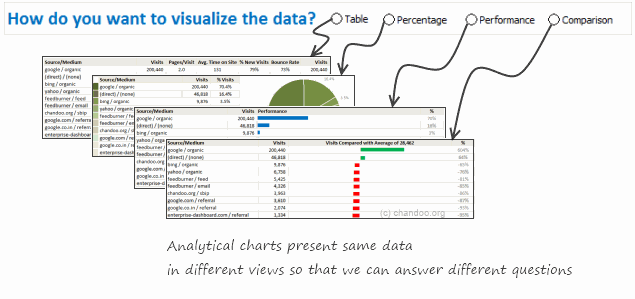
To be frank, I do not know what to call these charts, so I choose the term Analytical Charts. But this is what I have in mind when I say Analytical charts:
A chart is analytical chart,
(1) If it is interactive
(2) It it can answer different questions by re-structuring same data differently
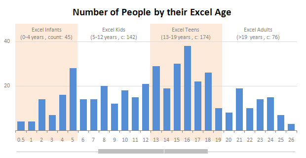
Excel Teens are out to get you & Other findings from our Survey

Our of curiosity and fun I asked you “how long have you been using Excel?”. I was overwhelmed by the response we got to this simple question. More than 437 people responded with their comments, stories and enthusiastic responses. Thank you so much.
It would taken me more time to make the charts and understand the data. But thanks to Hui, who volunteered to tabulate all the survey data in a simple CSV.
Shown above is a chart I came up with based on the data. Read the rest of the post to understand the survey results and view more charts. Also, you can download the excel workbooks and original data set to play.
Continue »
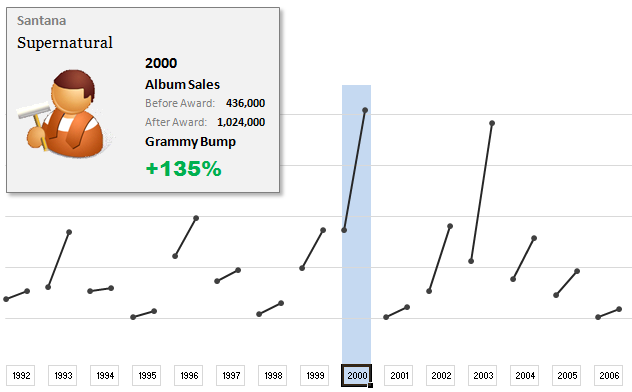
The folks at Washington Post made an interesting chart to understand whether winning a Grammy award makes any difference to album sales. Go ahead and browse it if you have not already seen it. Go, I will wait.
Are you impressed?
I really liked this chart. This is what I liked about the chart,
- It tells a story.
- It is an ego chart. We would all instantly search for our favorite artists and learn about how Grammy award changed their album sales.
- It is a simple chart. No clutter, no gaudy colors, just a bunch of lines and the story is out there.
- It lets you play.
In fact, I liked the chart so much that I wanted to make it in Excel.. You can see a snapshot of what I came up with above. Read the rest of this article to learn more.
Continue »A Huge Collection of Spreadsheets for Teachers [What Excel Can Do]
![A Huge Collection of Spreadsheets for Teachers [What Excel Can Do]](https://img.chandoo.org/g/spreadsheets-for-teachers-what-can-you-do.png)
Way back in November, I received this email from Tom, a senior researcher at the Center for Learning Innovation in Australia.
I’ve been developing & have published spreadsheet applications for teachers for some time now. In particular, I have animations, adventure scenarios etc that can be used to create games for the classroom. I need to promote these so teachers eventually try these and use them. … Perhaps you could post some of these on your site.
What a noble cause, I thought. So I wrote back to him and invited him to share his files along with a guest article. Tom acted quick and emailed me his article and Excel workbooks by Thanksgiving day. I was too lazy and got lost in the flow of things. But now, I am very very glad to feature his work.
There are so many valuable tricks, ideas and powerful concepts buried in his workbook. I encourage everyone to play with his file (you need to enable macros) so that you can learn a thing or two. If you are a teacher, feel free to use the files to make your classroom teaching even more awesome.
Continue »How do Business Analysts use Excel [Guest Post from a Rock-star BA]
![How do Business Analysts use Excel [Guest Post from a Rock-star BA]](https://chandoo.org/img/g/rockstar-business-analyst-with-excel.jpg)
This is a guest article by Matt, who works as a Business Analyst with allrecipes.com. He shares with us how he is using Excel to become a rockstar business analyst. In his own words,
“At Allrecipes.com we use excel for a variety of purposes. Analyzing site trends, forecasting traffic, charts, dashboards, and slide shows; you name it, we use excel for it. That’s why Chandoo’s tips have been so helpful – because we use excel every day. Thanks to chandoo.org, I’ve developed a reputation as an “excel wizard” and even taught a 4 week excel training class!“
Continue »How would you Visualize World Education Ranking Data [Homework + Video]
![How would you Visualize World Education Ranking Data [Homework + Video]](https://chandoo.org/img/vp/world-education-scores-excel-chart.png)
Here is a charting challenge to begin your Christmas week. Recently Guardian’s Data Blog released World Education Rankings data and a sample visualization. Now your challenge is to make your chart visualizing World Education Rankings data.
You can see the chart I have constructed above. Read the rest of the post to find out how I made this chart and download the workbook.
Post your submissions using comments.
Continue »
Introducing a method of allowing data points to be interactively highlighted in Excel Scatter / X-Y Charts and Line Charts.
You will see a lot of these style charts in various places where you want to highlight various aspects of the chart to your audience. It is a great technique for complex scientific and engineering charts where you may have hundreds or thousands of points.
How to cook a delicious dynamic chart that will have your boss drool

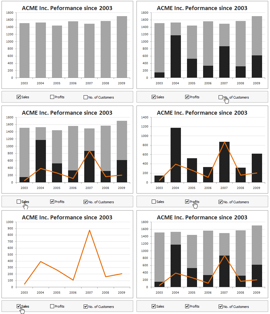
Dynamic charts are like my favorite food, Mangoes. They tempt, tease and taste awesomely. In this post, we are going to learn how to create a dynamic chart using check boxes and formulas as shown in the animation aside. Are you ready for some excel chart cooking?
You can also download a FREE Dynamic chart template from the post. So go ahead and make your boss drool.
Continue »![9 Excel Tips & Downloads Submitted by Our Readers [Reader Awesomeness Week]](https://img.chandoo.org/raw/reader-awesomeness-week.png)
Last week I announced Reader Awesomeness Week to celebrate the passion, attitude and knowledge of our little community here. I got 9 interesting and beautiful entries from our readers. In this post you can see 9 tips & downloads submitted by our readers. These include a project management template, a macro to remove blanks, a technique to make Google Earth maps using Excel and several other interesting tips & tricks.
Go ahead and read them, download attached workbooks and become awesome in Excel. 🙂
Continue »How Francis Landed on Chandoo.org, Become Awesome and Made a Superb Dashboard, all in ONE Weekend
As part of our Reader Awesomeness Week, Francis shares with us a travel site dashboard he made for his company. Francis took just two days to prepare this awesome dashboard which uses concepts like bullet charts, sortable KPI grid, Date based filtering, dynamic charts and more. I was really moved by Francis’ gesture in sharing his work with us, so much that, I did a video review of his work. You can see it in the embedded youtube video to the left.
Read the rest of the article to know how this dashboard is made and get a copy of the file.
Continue »Official FIFA World-cup Soccer Balls since 1930 in an Excel Chart [Excel Fun]
![Official FIFA World-cup Soccer Balls since 1930 in an Excel Chart [Excel Fun]](https://chandoo.org/img/vp/official-fifa-worldcup-soccer-balls-from-1930.png)
The FIFA World-cup 2010 edition is around the corner. Like millions of people around the world, I too am an ardent fan of football. (although, I have played only one game of soccer in which I waited near opponents goal post as I was too lazy to run around. And when my team mates kicked […]
Continue »Dynamic Dashboard in Excel – Pulling it all together [Part 4 of 4]
![Dynamic Dashboard in Excel – Pulling it all together [Part 4 of 4]](https://chandoo.org/img/ed/excel-dynamic-dashboard-final-th.png)
In the last installment of our dynamic dashboard tutorial, we will take all that we have learned in first 3 parts and combine that to create a final dashboard. We are going to use concepts like table of contents, macros and data validation to help us get ahead. You can find the entire macro and downloadable workbook inside the post. Read on…
Continue »Making a Dynamic Dashboard in Excel [Part 3 of 4]
![Making a Dynamic Dashboard in Excel [Part 3 of 4]](https://chandoo.org/img/ed/moving-objects-with-vba.gif)
In this post we are going to look at a simple example of the VBA behind the Dynamic Dashboard. Essentially we will learn to write macros for doing this. Read the rest of this post to find code samples and downloadable files to play with.
Continue »

