All articles with 'dynamic charts' Tag
Ladies & gentleman, put on your helmets. This is going to be mind-blowingly awesome.
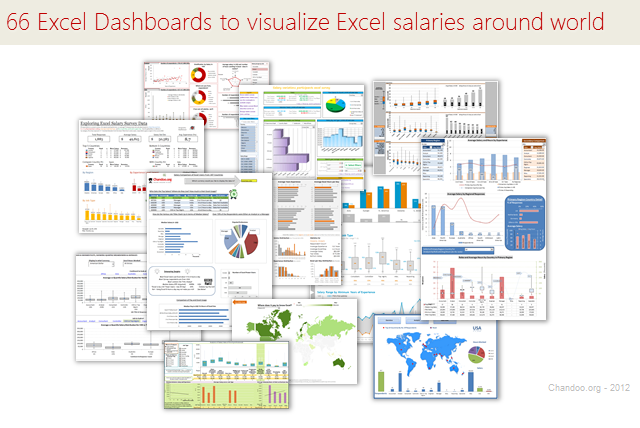
See how many different ways are there to analyze Excel salary data. Look at these 66 fantastic, beautifully crafted dashboards and learn how to one up your dashboard awesomeness quotient.
Continue »{ 21 Comments }
Visualizing Roger Federer’s 7th Wimbledon Win in Excel
Published on Jul 9, 2012 in Cool Infographics & Data Visualizations
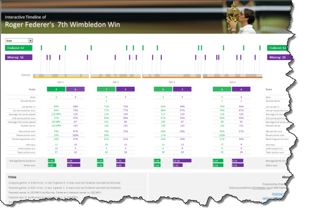
Did I tell you I love tennis? Some of my personal heroes & motivators are tennis players. And as you can guess, I admire Roger Federer. Watching him play inspires me to achieve more. So last night when he lifted Wimbledon trophy for 7th time, I wanted to celebrate the victory too, in my style. So I made an interactive timeline chart in Excel depicting his victory.
Continue »![Interactive Sales Chart using MS Excel [video]](https://img.chandoo.org/vp/interactive-sales-chart-quick-demo.gif)
Finally, I got some time to sit down and do what I love most – write a blog post to make you awesome in Excel. After a whirlwind trip to Sydney, I am back in India to spend few days with my kids & wife before rushing to Australia to run 2nd leg of my training programs (in Perth, Melbourne & Brisbane). I did 2 sessions in Sydney – one for KPMG and other for public and both went very well. We got lots of positive feedback and people really loved it. I am saving the details for another post, but today lets talk about Interactive Sales Chart using Excel.
Take a look at the Interactive Sales Chart
First, take a look at interactive sales chart. Today, you will learn how to build this using Excel.
Continue »{ 7 Comments }
Adding Macros & Final Touches to Customer Service Dashboard [Part 4 of 4]
Published on Apr 26, 2012 in Charts and Graphs, VBA Macros
![Adding Macros & Final Touches to Customer Service Dashboard [Part 4 of 4]](https://img.chandoo.org/dashboards/macros-vba-in-customer-service-dashboard.png)
Welcome back. In final part of Making a Customer Service Dashboard using Excel let us learn how to add macros & VBA code that makes our dashboard interactive.
As you can see, there are 2 important macros in this dashboard.
Continue »{ 4 Comments }
Creating Customer Service Dashboard in Excel [Part 3 of 4]
Published on Apr 18, 2012 in Charts and Graphs, Learn Excel
![Creating Customer Service Dashboard in Excel [Part 3 of 4]](https://img.chandoo.org/dashboards/constructing-charts-customer-service-dashboard.png)
Welcome back. In third installment of our Customer Service Dashboard series, we will learn how to construct the charts in our dashboard. We will understand the sparklines, traffic lights & dynamic chart setup. To help you learn better, I have recorded a short video too. Go ahead and enjoy.
Continue »{ 12 Comments }
Analyzing Performance of Stocks using Excel [Example]
Published on Sep 21, 2011 in Charts and Graphs
![Analyzing Performance of Stocks using Excel [Example]](https://chandoo.org/wp/wp-content/uploads/2011/09/stock-analysis-in-excel.png)
Last week, we learned how to visualize Suicides vs. Murders data using Interactive charts in Excel. William, one of our readers, took this technique and applied it to Stocks. He emailed me because he has some formula issues with the stock data. Once I solved the problem, I asked him, “Can I share this with […]
Continue »{ 24 Comments }
Suicides & Murders by US States – An Interactive Excel Chart
Published on Sep 9, 2011 in Charts and Graphs, Cool Infographics & Data Visualizations
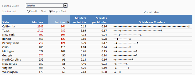
Over at PTS Blog, my dear friend & charting guru, Jon Peltier has an interesting post on using dot plots to visualize Murders & Suicides data by US States.
Not that murders & suicides fascinate me, but I wanted to play with this data myself and see how we can visualize it. So I emailed Jon and asked him to share the raw data. Being a lovely chap Jon is, he immediately sent me the data. So here we are, playing with gory data on a Friday.
Suicides & Murders by US States – An Interactive Excel Chart
You can see a demo of the chart I came up with above. Read on to learn how this chart is constructed.
Continue »{ 11 Comments }
MLB Pitching Stats Dashboard in Excel+VBA by our VBA Class Student
Published on Aug 10, 2011 in VBA Macros
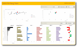
Nothing gives a teacher more satisfaction than seeing a student apply the knowledge to do something awesome. So naturally, I jumped with joy when I got this email from Dan, one of my VBA Class students,
Hi Chandoo,
After going thru your VBA Classes, I realized that we can lots of awesome stuff with pivot tables + simple macros. I recently created an Excel Dashboard to depict MLB (Major League Baseball) Pitching Stats. I could not have done this had I not learned VBA. Thank you so much for teaching the class.
I got curious and requested Dan, if I could share the file with you all. Being a lovely person, Dan agreed immediately.
Continue »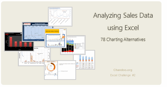
Recently, I ran a contest asking you to analyze a bunch of sales data and present your results in charts. We received a total of 78 charts from 45 people. The contest entries had a mind-boggling variety of excel charts, techniques and ideas. It took me a while to go thru all the files and compile the results. Thanks for your patience. In this post, you can find all the charts along with my comments & links to download files.
Continue »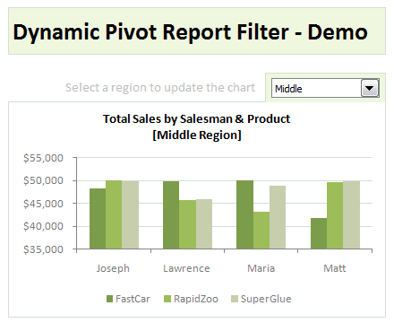
Last week, we have learned what Pivot Table Report Filters are & how to use them.
Today, I am going to show, how you can use simple macro code to change the report filter value dynamically.
We will learn how to create the chart shown here.
Continue »{ 15 Comments }
Comparing Sales of One Product with Another [Excel Techniques]
Published on Apr 25, 2011 in Charts and Graphs
![Comparing Sales of One Product with Another [Excel Techniques]](https://img.chandoo.org/c/comparing-sales-of-one-product-with-another-demo.png)
This is a guest article by Theodor on how to Compare Sales of One Product with Another
Ok, now here’s one for you.
Suppose you’d like to come up with a sales report on different products, comparing their evolution on the same period of different years (say Jan ’09 vs. Jan Jan ’10). At the same time, you’d like to keep an eye on their yearly trend (entire 2009 vs. entire 2010).
Read on to learn how you can use Excel Charts to do this very easily.
Continue »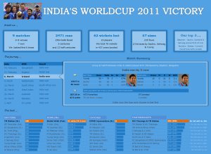
I know I am late to the party, but better late than…, uh! forget it.
As the keen readers of our blog knew, I like cricket and I show my enthusiasm by making an excel dashboard (or info-graphic) whenever Indian team reaches a major milestone. So naturally, I was super excited when we won the ICC World cup 2011. Last time Indian won the event was in 1983 and my idea of a dashboard at that time was a bottle of milk and jingo-bell, my favorite shake-to-make-annoying-noise toy. I think our latest world-cup victory deserves something more than that. So here we go.
Continue »![Show Details On-demand in Excel [Tutorial + Training Program]](https://img.chandoo.org/c/on-demand-analysis-and-details-in-excel-demo.gif)
Yesterday, we have seen a beautiful example of how showing details (like distribution) on-demand can increase the effectiveness of your reports. Today, we will learn how to do the same in Excel.
Continue »{ 7 Comments }
Give more details by showing average and distribution [Charting Tips]
Published on Apr 6, 2011 in Charts and Graphs
![Give more details by showing average and distribution [Charting Tips]](https://chandoo.org/img/c/show-distribution-along-with-average-to-give-more-details-charting-tips.jpg)
When we have lots of data, we try to summarize it by calculating the average. As they say, averages are mean, they do not give away much.
I want to share with you an interesting example from Amazon.com on how they give more details by combining average with distribution.
As you might know, Amazon shows the rating of each of the products they sell. Customers & users rate the products from 1 to 5 stars. When you visit the product page you will see the average rating. But there is a small down-arrow next to it. When you click on it, Amazon shows you the break-up of that rating so you have a better idea of how the ratings are split.
Continue »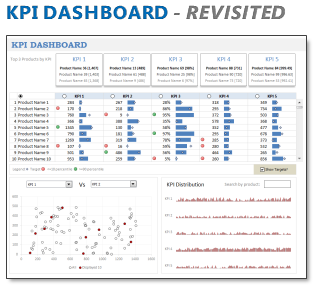
In 2008, I received an email from Robert Mundigl, which was the start of a life-long friendship. Robert asked me if he can teach us how to make KPI dashboards using Excel. I gladly said yes because I am always looking for new ways to use Excel.
The original KPI dashboards using Excel article was so popular. They still help around 12,000 people around the globe every month. Many of our regular readers and members have once started their journey on Chandoo.org from these articles.
In this article, we will revisit the dashboard and give it a fresh new spin using Excel 2007.
Continue »
