All articles with 'charting principles' Tag
Use Advances vs. Declines chart to understand change in values
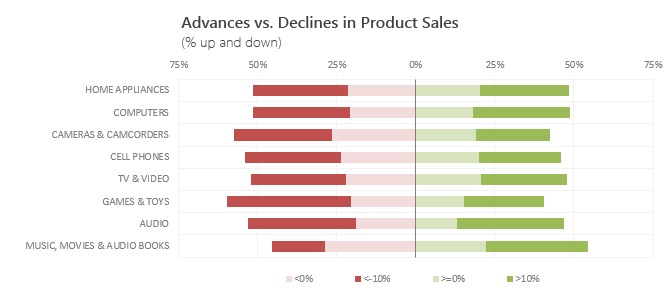
Lets say you are responsible for sales of 100s of products (which belong to handful of categories). You are looking at sales of each product in last month & this month. And you want to understand whether sales are improving or declining by category. How would you do it?
Turns out, this is not a difficult problem. In fact, this question is asked every day & answered using Advances vs. Declines chart.
You may have seen this chart in financial newspapers or websites. Shown above, Advances vs. Declines chart tells us how many items have advanced & how many have declined.
Read on to learn how to create this chart using Excel.
Continue »How the tax burden has changed over the years – Excellent chart by NYTimes & Redoing it in Excel
If I need some charting inspiration, I always visit New York Times. Their interactive visualizations are some of the best you can find anywhere. Clear, beautifully crafted and powerful. Long time readers of Chandoo.org knew that I like to learn from visualizations in NY Times & redo them using Excel.
Today let me present you one such chart. This is based on an interactive visualization prepared by NY Times explaining how the tax burden has changed over years for various income groups.
Take a look at tax burden chart – Excel implementation
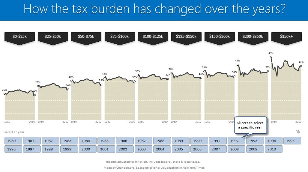
Read on to learn how to create this chart using Excel.
Continue »Pie of a Pie of a Pie chart [Good or Bad?]
![Pie of a Pie of a Pie chart [Good or Bad?]](https://img.chandoo.org/c/water-stats-pie21.jpg)
There are some charts that look so stunning and yet confusing. You cant make up your mind whether it tells a compelling story or it is just plain wrong.
Today, let me present you one such chart. I call this Pie of a Pie of a Pie chart.
Continue »Use Indexed charts when understanding change [Charting Techniques]
![Use Indexed charts when understanding change [Charting Techniques]](https://img.chandoo.org/c/example-indexed-chart-in-excel.png)
Today, lets talk about indexing, a technique used to compare changes in values over time.
What is indexing?
Lets say you want to compare prices of Gold & Coffee over last few years. Gold price in 2011 (oct) is $1,655 per ounce. And now (sept 2012) it is $1,744. Like wise, Silver price in 2011 is $32.06 and in 2012 it is $33.61. How do we compare such diverse numbers?
Enter indexing.
First we need to calculate price of Gold and Silver in 2012 assuming their starting price is 100. This can be done with simple arithmetic.
Now, we can easily compare the prices. Looking at the indexed prices, we can conclude that both Gold & Silver prices have gone up by similar percentage (~5%).
Continue »Speeding up & Optimizing Excel – Tips for Charting & Formatting [Speedy Spreadsheet Week]
![Speeding up & Optimizing Excel – Tips for Charting & Formatting [Speedy Spreadsheet Week]](https://img.chandoo.org/optimize/speeding-up-optimizing-excel-charts-formatting.png)
Is Excel acting slow & taking ages? As part of our Speedy Spreadsheet Week, today lets talk about optimizing & speeding up Excel by formatting & charting better. Use these tips & ideas to super-charge your sluggish workbook.
No matter how much data you got, how many formulas you wrote, the end users seldom see them on your workbook. They see the finalized dashboard, they play with the model, they look at the report. And if you make poor choices, your end users will thing your workbook is slow.
So let me present you 7 charting & formatting tips to optimize & speed up Excel. Read on…,
Continue »Simple KPI Dashboard using Excel
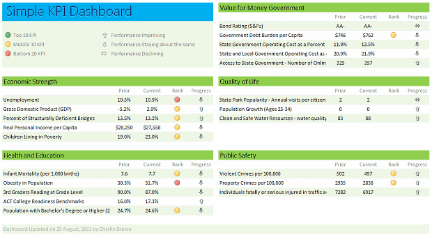
Any Tom, Dick and Sally can make things complex. It takes guts and clarity to simplify things. That is why I was pleasantly surprised to see this dashboard prepared by Michigan State. You can see it in the detailed article.
Linda, one of My Excel School students shared this dashboard link with me and asked if I can show how to construct something like this. Here is my version of the dashboard.
Read this post to learn how to construct a similar dashboard on your own. Also, you can download the excel workbook and play with it.
Continue »Place Key Information in Golden Triangle on your Reports, Dashboards etc. [Quick Tips]
![Place Key Information in Golden Triangle on your Reports, Dashboards etc. [Quick Tips]](https://img.chandoo.org/dashboards/golden-traingle-excel-workbooks.jpg)
Today, we will take a detour to world-wide web and learn how we can improve our dashboards, reports, presentations or workbooks by using one of the ideas, called as Golden Triangle.
Continue »![Show Details On-demand in Excel [Tutorial + Training Program]](https://img.chandoo.org/c/on-demand-analysis-and-details-in-excel-demo.gif)
Yesterday, we have seen a beautiful example of how showing details (like distribution) on-demand can increase the effectiveness of your reports. Today, we will learn how to do the same in Excel.
Continue »Give more details by showing average and distribution [Charting Tips]
![Give more details by showing average and distribution [Charting Tips]](https://chandoo.org/img/c/show-distribution-along-with-average-to-give-more-details-charting-tips.jpg)
When we have lots of data, we try to summarize it by calculating the average. As they say, averages are mean, they do not give away much.
I want to share with you an interesting example from Amazon.com on how they give more details by combining average with distribution.
As you might know, Amazon shows the rating of each of the products they sell. Customers & users rate the products from 1 to 5 stars. When you visit the product page you will see the average rating. But there is a small down-arrow next to it. When you click on it, Amazon shows you the break-up of that rating so you have a better idea of how the ratings are split.
Continue »Health-care Dashboard in Excel [Dashboard Week]
![Health-care Dashboard in Excel [Dashboard Week]](https://img.chandoo.org/dashboards/dw/health-care-dashboard-small.png)
As part of Dashboard Week, in this post, we will take a look at Health-care Dashboard prepared and shared by Alberto. He put together an excellent dashboard to visualize hospital performance and understand what is going on. Read this post to understand how this dashboard is made, watch a tutorial video & download example workbook.
Thank you Alberto for sharing the file & helping us learn.
Continue »Use Analytical Charts to Make your Boss Love You
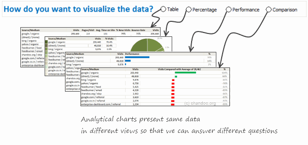
There are beautiful, powerful & awesome charting examples all around us. Today, I want to show you how we can harness the power of Excel to create Analytical Charts.
Analytical What?!?
To be frank, I do not know what to call these charts, so I choose the term Analytical Charts. But this is what I have in mind when I say Analytical charts:
A chart is analytical chart,
(1) If it is interactive
(2) It it can answer different questions by re-structuring same data differently
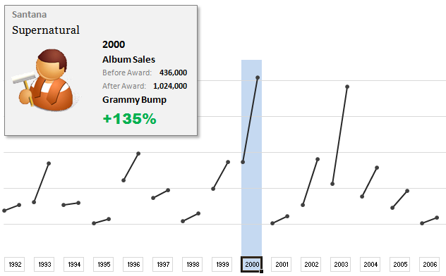
The folks at Washington Post made an interesting chart to understand whether winning a Grammy award makes any difference to album sales. Go ahead and browse it if you have not already seen it. Go, I will wait.
Are you impressed?
I really liked this chart. This is what I liked about the chart,
- It tells a story.
- It is an ego chart. We would all instantly search for our favorite artists and learn about how Grammy award changed their album sales.
- It is a simple chart. No clutter, no gaudy colors, just a bunch of lines and the story is out there.
- It lets you play.
In fact, I liked the chart so much that I wanted to make it in Excel.. You can see a snapshot of what I came up with above. Read the rest of this article to learn more.
Continue »How would you Visualize World Education Ranking Data [Homework + Video]
![How would you Visualize World Education Ranking Data [Homework + Video]](https://chandoo.org/img/vp/world-education-scores-excel-chart.png)
Here is a charting challenge to begin your Christmas week. Recently Guardian’s Data Blog released World Education Rankings data and a sample visualization. Now your challenge is to make your chart visualizing World Education Rankings data.
You can see the chart I have constructed above. Read the rest of the post to find out how I made this chart and download the workbook.
Post your submissions using comments.
Continue »Do you use (or make) Excel Dashboards? Tell us about yourself to win a free training kit

(You can win my latest Excel Dashboard Training kit free, read this post to find out how.)
Over at Jorge’s ExcelCharts blog, he started a very good discussion on Excel Dashboards: Who needs them anyway?.
Jorge has very good experience designing, working on and teaching about dashboards. So he uses all that skill to gaze in to a crystal ball, to understand who needs excel dashboards and why. In this post, I build on his argument and ask you the big question – “If you make or use Excel Dashboards, who are you?”
Continue »Show Top 10 Values in Dashboards using Pivot Tables
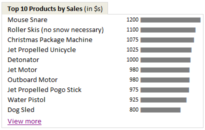
A good dashboard must show important information at a glance and provide option to drill down for details.
Showing Top 10 (or bottom 10) lists in a dashboard is a good way to achieve this (see aside). Today we will learn an interesting technique to do this in Excel.
Continue »

