All articles with 'charting principles' Tag
{ 33 Comments }
Show Months & Years in Charts without Cluttering
Published on Nov 17, 2010 in Charts and Graphs

We make charts with date axis all the time. So, today we will learn how to set up axis settings in Excel so that Months & Years are shown neatly structured without cluttering your chart. See the example next to understand.
Continue »{ 9 Comments }
Analyze Competition with Scatter Plots – A business chart example
Published on Oct 25, 2010 in Charts and Graphs

Analyzing competition is one of the key aspects of running a business. In this article, learn how to use Excel’s scatter plots to understand competition, like shown aside.
The inspiration for this comes from a recent article on Asymco analyzing mobile handset market (Apple iPhone, Nokia etc.) and how it has changed since 2007.
Read the rest of the post to learn how to create this type of chart in excel. Also, you can download the chart template. Go ahead.
Continue »{ 14 Comments }
August 2010 – Best Month Ever (and 2 charting tips inside)
Published on Sep 3, 2010 in blogging, Charts and Graphs
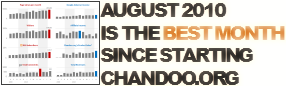
Time to stop everything we do and celebrate, for, our little community at chandoo.org had the most fantastic, awesome month ever.
That is right. August 2010 has been the best month since I started chandoo.org. We have broken a majority of previous records in terms of conversations, connections, content and revenues.
In August, we had 17 posts, with 604 comments. We had 178,000 visitors reading 453,000 pages. Our RSS subscriber base grew to 11,917 (it was 5738 an year ago). August has been the best month in-terms of revenues too. We sold highest number of project management templates & excel formula e-books since launch. We had a stellar launch for wedding planner with 22 customers.
Read rest of this post to find statistics about chandoo.org and get 2 charting tips.
Continue »{ 64 Comments }
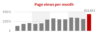
How do you make charts when you have lots of small values but few extremely large values? [Debate]
![How do you make charts when you have lots of small values but few extremely large values? [Debate]](https://img.chandoo.org/c/charts-with-small-large-values-th.png)
Here is an interesting charting problem we come across once in a while. We have a lot of small numbers and a few very large numbers. How do we effectively plot all of them in a chart?
Now, how do you go about making a chart?
Continue »{ 12 Comments }
5 Rules for Making Better Charts (and one fun chart)
Published on Jul 30, 2010 in Charts and Graphs
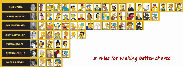
Jeff Weir, an alert reader of this blog points me this chart showcasing voice-over artist’s for various Simpson’s characters. I am a hard-core Simpon’s fan, so I naturally wasted quarter-hour looking at the chart. That is when I realize this chart is not only fun, it also teaches 5 valuable lessons on making better charts. Read the rest of this post to find out the five rules.
Continue »{ 25 Comments }
Display Alerts in Dashboards to Grab User Attention [Quick Tip]
Published on May 25, 2010 in Charts and Graphs
![Display Alerts in Dashboards to Grab User Attention [Quick Tip]](http://chandoo.org/img/dashboards/dashboard-alerts-example-th.png)
Dashboards can be overwhelming with lots of details and context. A simple way to drag user’s attention to important stuff in the dashboard is to use alerts. See this example to understand what alerts mean. How to display alerts in Excel Dashboards? The easiest way to display alerts is to use Excel 2007’s Conditional Formatting […]
Continue »It has been quite a while since we had an excel links post. It doesn’t mean that I am not reading anything new on excel or charting. I have been reading lots of awesome articles and useful content and sharing it on my google reader recommendation list. But it is just that I have been […]
Continue »{ 20 Comments }
What are your favorite colors for charts?
Published on Apr 23, 2010 in Charts and Graphs
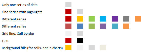
Ok, it is Friday again. That means poll time. I would like to know what color choices you prefer for your charts?
My Favorite Colors for Charting are,
These are the colors I use when making charts in Excel 2007 (it has capability to set any color for chart elements).
Continue »{ 29 Comments }
How to pick a chart type – Charting 101
Published on Apr 19, 2010 in Charts and Graphs
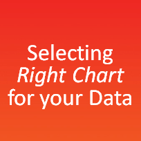
Bar chart or Line? Scatter plot or box plot? These are the questions we ask ourselves when we set out to make a chart. Because, “Selecting right chart for our data” is very important to tell our story.
In this article, we will learn how to “select the right chart” based on our data and situation.
Continue »{ 8 Comments }
Speaking at TechEd 2010 on “How to Select the Right Chart for your Data”
Published on Apr 13, 2010 in blogging, Charts and Graphs
I have come to Bangalore to attend the TechEd 2010 conference by Microsoft. Today (April 13th), I will be speaking on “How to select the right chart for your data”. A short talk telling people how to choose the correct chart based on the message they want to convey. [You can see the schedule and […]
Continue »
We all know that legend can be added to a chart to provide useful information, color codes etc.
Today we will learn how to make the chart legends smarter so that they provide more meaning and context to the chart, like this:
This type of legend can be more useful than a plain legend as this provides more useful information without taking up too much space.
Continue »![How to Visualize Survey Results using Incell Panel Charts [case study]](http://chandoo.org/img/cb/survey-results-panel-chart-example.png)
A panel chart (often called as trellis display or small-multiples) shows data for multiple variables in an easy to digest format. It lets users compare in any way and draw conclusions with ease.
Today, I want to discuss how the principles of panel chart can be applied to visualize a complex set of survey results. For this we will use the recent survey conducted by Gartner on how various customers use BI (Business Intelligence) tools.
Continue »{ 21 Comments }
Best Month Ever (and a charting tip inside)
Published on Feb 5, 2010 in blogging, Charts and Graphs
Let us take a minute and bask in some glory, for, our little community at PHD had the most fantastic month ever. That is right, January 2010 is so far the best month since I started blogging. We have broken all sorts of previous records on content, conversations, connections, traffic and revenue. In January, we […]
Continue »{ 10 Comments }
Flu Trends in a City chart from Google is Awesome!
Published on Jan 15, 2010 in Cool Infographics & Data Visualizations

There is nothing awesome about flu. In fact, it is anti-awesome if you have flu. I have been fortunate enough not to get it ever (it is another story that I have cold almost 364 days of an year).
Don’t worry if you are afraid of it, Folks at Google are not letting you down. They are using google search terms to predict flu trends and present the information in a beautiful chart.
Today I want to tell you why this particular chart on flu trends made by Google is awesome…
Continue »{ 14 Comments }
Group Smaller Slices in Pie Charts to Improve Readability
Published on Dec 2, 2009 in Charts and Graphs
Jon Peltier can stand on his roof and shout in to a megaphone “Use Bar Charts, Not Pies”, but the fact remains that most of us use pie charts sometime or other. In fact I will go ahead and say that pie charts are actually the most widely used charts in business contexts.
Today I want to teach you a simple pie chart hack that can improve readability of the chart while retaining most of the critical information intact.
Continue »
