All articles with 'charting principles' Tag
{ 15 Comments }
Use shapes to enhance your Excel charts [tip]
Published on Aug 8, 2015 in Charts and Graphs
![Use shapes to enhance your Excel charts [tip]](https://chandoo.org/wp/wp-content/uploads/2015/08/use-shapes-to-enhance-your-charts.png)
Here is a simple way to enhance your Excel charts – use shapes & pictures in your charts.
We will learn how to create something like above.
Looks interesting? Read on…
Continue »{ 5 Comments }
CP041: 6 charts you’ll see in hell – v2.0
Published on Aug 6, 2015 in Chandoo.org Podcast Sessions, Charts and Graphs

Podcast: Play in new window | Download
Subscribe: Apple Podcasts | Spotify | RSS
In the 41st session of Chandoo.org podcast, Let’s take a trip to data hell and meet 6 ugly, clumsy, confusing charts. I am revisiting a classic Chandoo.org article – 6 Charts you will see in hell.
What is in this session?
In this podcast,
- Quick announcement about Awesome August
- 6 charts you should avoid
- 3D charts
- Pie / donut charts with too many slices
- Too much data
- Over formatting
- Complex charts
- Charts that don’t tell a story
- Conclusions
{ 6 Comments }
Shading an area chart with different colors for up & down movements [case study]
Published on Jul 29, 2015 in Charts and Graphs
![Shading an area chart with different colors for up & down movements [case study]](https://chandoo.org/wp/wp-content/uploads/2015/07/indian-stock-market-chart.png)
We all know that area charts are great for understanding how a list of values have changed over time. Today, let’s learn how to create an area chart that shows different colors for upward & downward movements.
The inspiration for this came from a recent chart published in Wall Street Journal about Chinese stock markets.
We will try to create a similar chart using Excel. We are going to create the above chart in Excel.
Looks interesting? Read on…
Continue »{ 4 Comments }
CP038: Data to Ink Ratio – What is it, How to optimize it, Techniques & Discussion
Published on Jul 9, 2015 in Chandoo.org Podcast Sessions, Charts and Graphs

Podcast: Play in new window | Download
Subscribe: Apple Podcasts | Spotify | RSS
In the 38th session of Chandoo.org podcast, Let’s optimize data to ink ratio of your charts.
What is in this session?
In this podcast,
- Announcements
- What is Data to Ink Ratio?
- Obvious ways to optimize Data to Ink Ratio
- More ways to optimize Data to Ink ratio
- Highlighting what is important
- Conclusions
{ 29 Comments }
Changing stubborn opinions with visualizations [case study]
Published on May 29, 2015 in Charts and Graphs
![Changing stubborn opinions with visualizations [case study]](https://chandoo.org/wp/wp-content/uploads/2015/05/family-income-vs-college-enrollment-nytimes.png)
We, analysts take pride in the fact that we tell stories. But what if you have a boss, client or colleague who wouldn’t buy the story?
This is a problem we face often. Let’s say your boss has stubborn opinion about something, like more advertising leads to more sales. You know the data doesn’t support this theory. But how do you change your boss’ mind?
Here is an interesting way, showcased in NY Times recently.
Continue »{ 2 Comments }
CP032: Rules for making legendary column charts
Published on Apr 2, 2015 in Chandoo.org Podcast Sessions, Charts and Graphs

Podcast: Play in new window | Download
Subscribe: Apple Podcasts | Spotify | RSS
In the 32nd session of Chandoo.org podcast, let’s make legendary column charts.
What is in this session?
Column charts are everywhere. As analysts, we are expected to create flawless, strikingly beautiful & insightful column charts all the time. Do you know the simple rules that can help you create legendary column charts?
That is our topic for this podcast session.
In this podcast, you will learn
- Few personal announcements
- Rule 0: Start at zero
- Rule 1: Sort the chart
- Rule 2: Slap a title on it
- Rule 3: Axis + grid-lines vs. Lables
- Rule 4: Moderate formatting
- Conclusions
{ 2 Comments }
CP029: Impress your boss with Excel charts – 6 step road map for you
Published on Feb 5, 2015 in Chandoo.org Podcast Sessions, Charts and Graphs

Podcast: Play in new window | Download
Subscribe: Apple Podcasts | Spotify | RSS
In the 29th session of Chandoo.org podcast, let’s impress the boss with Excel charts.
What is in this session?
Many Excel charts live a short life. They spawn in an ambitious analyst’s spreadsheet. They go to boss with literally flying colors. The boss frowns, they disappear in to recycle bin.
Don’t curse your Excel charts with short life span.
Here is a 6 step road map to help you create awesome Excel charts, everytime.
That is our topic for this podcast session.
In this podcast, you will learn
- Quick announcements about 50 ways & Einstein
- 6 step road map for charting success
- ONE: Dig your data
- TWO: Validate insights
- THREE: Pick charts that go well
- FOUR: Add title & message
- FIVE: Remove clutter
- SIX: Prompt action
- A real life example with road map in action
- Resources for creating awesome charts
{ 12 Comments }
A better chart to visualize “Best places to live” – Top 100 cities comparison Excel chart
Published on Oct 8, 2014 in Charts and Graphs, Cool Infographics & Data Visualizations
Recently, I saw this chart on Economist website.
It is trying to depict how various cities rank on livability index and how they compare to previous ranking (2014 vs 2009).
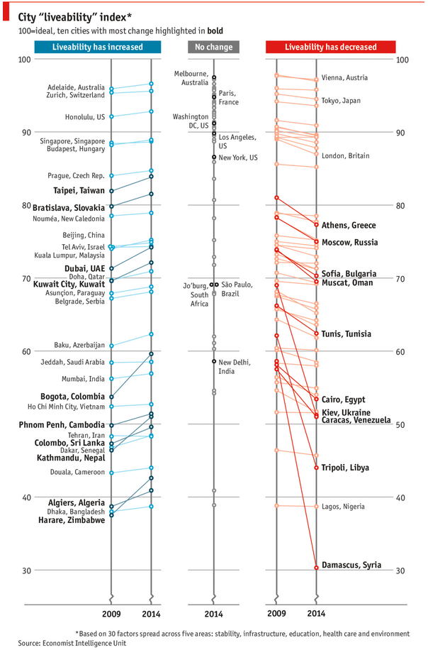
As you can see, this chart is not the best way to visualize “Best places to live”.
Few reasons why,
- The segregated views (blue, gray & red) make it hard to look for a specific city or region
- The zig-zag lines look good, but incredibly hard to understand % changes (or absolute changes)
- Labels are all over the place, thus making data interpretation hard.
- Some points have no labels (or ambiguous labels) leading to further confusion.
After examining the chart long & hard, I got thinking.
Its no fun criticizing someones work. Creating a better chart from this data, now thats awesome.
Continue »{ 4 Comments }
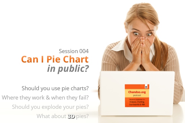
CP004: Can I Pie Chart in Public? Discussion about Pie charts, their merits and drawbacks, when to use & when to avoid them
Published on Apr 3, 2014 in Chandoo.org Podcast Sessions, Charts and Graphs
Podcast: Play in new window | Download
Subscribe: Apple Podcasts | Spotify | RSS
In the 4th session of Chandoo.org podcast, lets talk about Pie charts.
Pie charts evoke strong opinions among analysts & managers. Some people love them and can’t have enough of them in reports. Others despise them and go to any lengths to avoid them. And that is why we are going to talk about them in this session.
You will learn,
- Special, secret transmission from guest stars
- What is a pie chart?
- Why they work? 2 reasons
- Why they don’t work ? 4 reasons
- Cousins & siblings of Pie charts
- Donut charts
- Gauge charts (speedometer)
- 3D pies
- Area charts
- Bubble charts
- 4 Situations when making a pie chart is ok
- Alternatives to Pie charts
- Mistakes you should avoid
- About the resources
- Conclusions
{ 23 Comments }
I won’t eat donut with a thread inside, but lets make one anyway!
Published on Feb 20, 2014 in Charts and Graphs
Today lets take a stroll outside what Excel can do and make something fancy, fun and may be useful.
Nowadays, many newspapers, websites and magazines are featuring info-graphics. An info-graphic is a collection of shiny, colorful & data-full charts (or often pieces of text.) In many of these info-graphics, you can see threaded-donut charts. Not sure what that is..? It is not same as the blasphemy of spoiling a soft, sweet, supple donut with a piece of string. No one should be excused for an offense like that.
What I am talking about is shown above
Continue »{ 58 Comments }
42% of the world goes to polls around a pie chart – Like it or hate it?
Published on Jan 10, 2014 in Charts and Graphs
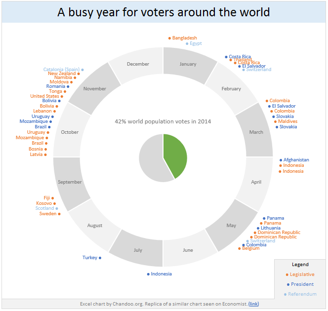
Today lets have a poll. Lets debate if this pie chart about world elections in 2014 is good or bad.
First lets take a look at the chart
This chart, published by The Economist talks about how 42% of the world population is going to vote this year. Take a look and read on to learn how you can re-create this in Excel.
Continue »{ 8 Comments }
Closing gaps in this Gender Equality Gap chart…
Published on Nov 5, 2013 in Charts and Graphs
Today lets close some gaps.
Recently I saw this interesting chart on Economist Daily Charts page. This chart is based on World Economic Forum’s survey on how women compare to men in terms of various development parameters. First take a look at the chart prepared by Economist team.
So what are the gaps in this chart?
This chart fails to communicate because,
- All country charts look same, thus making it difficult to spot any deviations.
- We cannot quickly compare one country with another on any particular indicator.
- It does not provide a better context (for eg. how did these countries perform last year?)
But criticizing someone’s work is not awesome. Fixing it and making an even better chart, that has awesome written all over it. So that is what we are going to do. You can see the improved chart above. Click on it to learn how you can create it.
Continue »{ 53 Comments }
Never use simple numbers in your dashboards (bonus tip: how to fix default conditional formatting)
Published on Jul 11, 2013 in Charts and Graphs
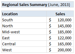
Pop quiz: What is wrong with above report?
At first glance, it looks alright. But if you observe closely, you realize that it is not telling the entire story. Just looking at regional sales numbers, you have not much clue what is going on with them.
So how to improve it?
Continue »{ 13 Comments }
10 Rookie mistakes to avoid when making dashboards [video]
Published on Apr 25, 2013 in Charts and Graphs
Are you making these 10 rookie mistakes when creating dashboards?
Watch below to video to understand what these mistakes and how to avoid them.
10 Rookie mistakes to avoid when making dashboards [23 mins]

{ 39 Comments }
Some charts try to make you an April fool all the time (or why 3d pie charts are evil)
Published on Apr 12, 2013 in Charts and Graphs
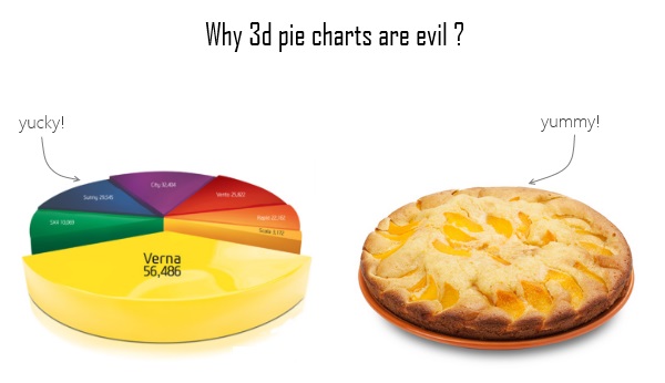
Recently I saw a big screaming ad that said “the chartbuster rules”. Of course, I know that chartbusters rule. Not just because I was one of them 🙂
So I got curious and read on. And I realized the ‘chartbuster’ is actually a car, not some cool, spreadsheet waving, goatee sporting dude like Jon Peltier. What a bummer!
And then to my horror of horrors, I saw the exploding 3d pie chart, with reflection effects & glossy colors. And the sole purpose of the chart is to create an impression that Verna sells better than any car in India.
Today, lets talk about this chart and alternatives for it. Read on.
Continue »
