All articles with 'chart formatting' Tag
Format charts quickly with chart styles & color themes [quick tip]
![Format charts quickly with chart styles & color themes [quick tip]](https://chandoo.org/wp/wp-content/uploads/2016/01/chart-formatting-with-styles-colors.png)
Here is a quick tip to reduce the time you spend on chart formatting – use chart styles & color themes.
Excel offers various pre-defined color schemes and chart styles. Using them is very simple.
- Select your chart
- Go to Chart Design ribbon
- Click on the style or color scheme you want.
- Your chart changes instantly.
![Color changing line chart [tutorial]](https://chandoo.org/wp/wp-content/uploads/2015/12/color-changing-line-chart.png)
Let’s learn how to create a color changing line chart using Excel. This is what we will create.
Looks interesting? Read on.
Continue »Show forecast values in a different color with this simple trick [charting]
![Show forecast values in a different color with this simple trick [charting]](https://chandoo.org/wp/wp-content/uploads/2015/09/show-forecast-values-in-different-color-on-charts.png)
Let’s say you made a chart to show actual and forecast values. By default, both values look in same color. But we would like to separate forecast values by showing them in another color.
If you are a seasoned Excel user, you may be thinking, “Oh, that’s easy. I will just create 2 sets of data (one for actual and one for forecast), make a chart from them and apply separate colors.”
But here is a really simple way to get the same effect.
Use a semi-transparent box to mask the forecast values, as shown above. Read on to learn how to do this.
Continue »Use arrow keys to select small, unreachable chart series [quick tip]
![Use arrow keys to select small, unreachable chart series [quick tip]](https://chandoo.org/wp/wp-content/uploads/2015/04/use-arrow-keys-to-select-chart-elements.gif)
Here is a fairly annoying problem.
Imagine a chart showing both sales & customer data. Sales numbers are large and customer numbers are small. So when you make a chart with both of these, selecting the smaller series (customers) becomes very difficult.
In such cases, you can use arrow keys – as shown above.
Continue »
A lot of analysts swear strong allegiance to keyboard shortcuts. But when it comes to formatting a spreadsheet, these shortcuts go for a toss as formatting is a mouse-heavy activity.
But we can use a few simple & effective shortcuts to zip through various day to day formatting tasks. Let me share my favorite formatting shortcuts.
Continue »ABC Inventory Analysis using Excel
ABC analysis is a popular technique to understand and categorize inventories. Imagine you are handling inventory at a plant that manufactures high-end super expensive cars. Each car requires several parts (4,693 to be exact) to assemble. Some of these parts are very costly (say few thousand dollars per part), while others are cheap (50 cents per part). So how do you make sure that your inventory tracking efforts are optimized so that you waste less time on 50 cent parts & spend more time on costly ones?
This is where ABC analysis helps.
We group the parts in to 3 classes.
- Class A: High cost items. Very tight control & tracking.
- Class B: Medium cost items. Tight control & moderate tracking.
- Class C: Low cost items. No or little control & tracking.
Given a list of items (part numbers, unit costs & number of units needed for assembly), how do we automatically figure which class each item belongs to?
And how do we generate above ABC analysis chart from it?
Continue »Create a line chart with bands [tutorial]
![Create a line chart with bands [tutorial]](https://img.chandoo.org/c/line-chart-with-bands-to-depict-kpi-or-goals.png)
Here is an interesting scenario.
Imagine you are responsible for customer satisfaction at ACME Inc. Every month you track customer satisfaction rate for the 3 products you sell which are conveniently named Product A, B & C.
You also have bands for the satisfaction rating.
- Rating of 85% or below is Average
- Rating between 85% & 95% is OK
- Rating above 95% is good
At the end of the year, you want to visualize the ratings for last 12 months for 3 products along with bands.
Something like above.
Unfortunately, there is no “Insert Banded line chart” button in Excel. So what to do?
That is what we will learn today. Ready?
Continue »I won’t eat donut with a thread inside, but lets make one anyway!
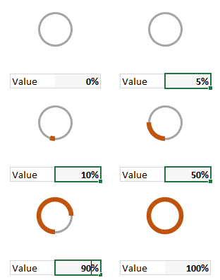
Today lets take a stroll outside what Excel can do and make something fancy, fun and may be useful.
Nowadays, many newspapers, websites and magazines are featuring info-graphics. An info-graphic is a collection of shiny, colorful & data-full charts (or often pieces of text.) In many of these info-graphics, you can see threaded-donut charts. Not sure what that is..? It is not same as the blasphemy of spoiling a soft, sweet, supple donut with a piece of string. No one should be excused for an offense like that.
What I am talking about is shown above
Continue »42% of the world goes to polls around a pie chart – Like it or hate it?
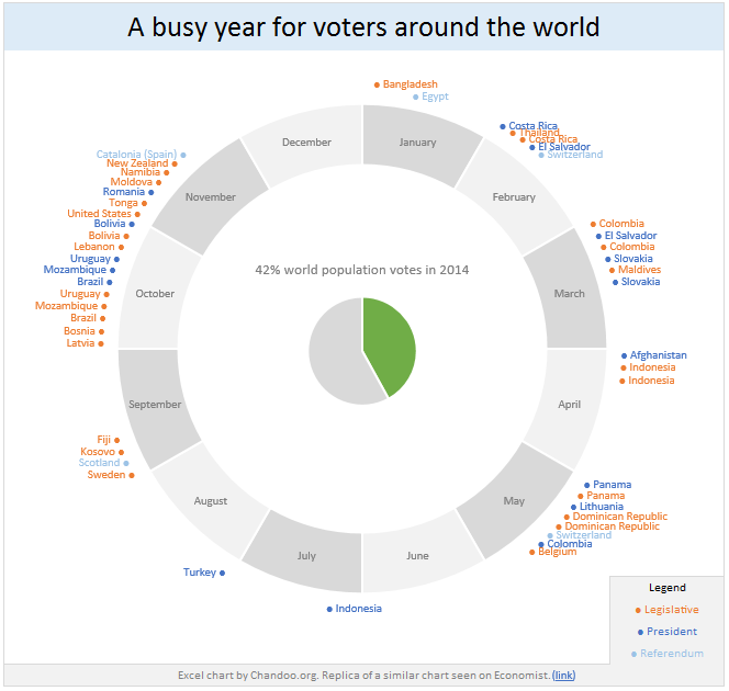
Today lets have a poll. Lets debate if this pie chart about world elections in 2014 is good or bad.
First lets take a look at the chart
This chart, published by The Economist talks about how 42% of the world population is going to vote this year. Take a look and read on to learn how you can re-create this in Excel.
Continue »Bar chart with lower & upper bounds [tutorial]
![Bar chart with lower & upper bounds [tutorial]](https://img.chandoo.org/c/bar-chart-with-lower-and-upper-bounds.png)
Bar & Column charts are very useful for comparison. Here is a little trick that can enhance them even more.
Lets say you are looking at sales of various products in a column chart. And you want to know how sales of a given product compare with a lower bound (last year sales) and an upper bound (competition benchmark). By adding these boundary markers, your chart instantly becomes even more meaningful.
Lets learn how to create a column chart with lower & upper bounds in this tutorial.
Continue »How to create a column chart with background image in Excel ?
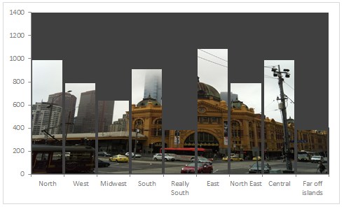
Tony sends this chart and asks if it can be done in Excel.
It sounded like a good challenge for a lazy Sunday morning. So here we go. (Posting it on Monday).
Now I could not get an oil rig photo or that data. So I made up few numbers and used a photo of Flinders street station I took when I was in Melbourne last year.
Continue »Chart for wall hygrometric physic (or how to create a chart with custom x axis intervals?)
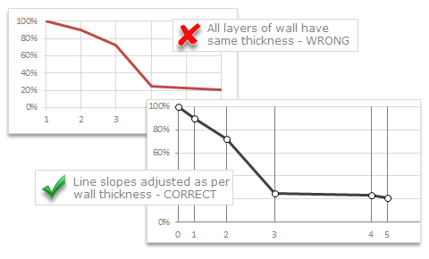
Livio, one of our readers from Italy sent me this interesting problem in email.
Continue »I would like to prepare an xy linear graphic as representation of the variation of temperature trough a wall between two different bulk temperature i.e. outside and inside a house. This graphic should show the temperature gradient trough the wall thickness. The wall is normally made by different construction materials (different layers, as bricks, insulation, …..) and so the temperature change but not as a straight line with only one slope, instead as few lines with different slopes (see below figure) Calculations are not difficult, and also prepare the graphic also not difficult.
But, I am looking a beautiful solution for x-axis. X-axis should be divided not with constant interval, instead with different length between each sub-division exactly as the different thickness of the wall. This is a correct graphic, because you can show the correct slope of each straight line though each layer of the wall.
Some charts try to make you an April fool all the time (or why 3d pie charts are evil)
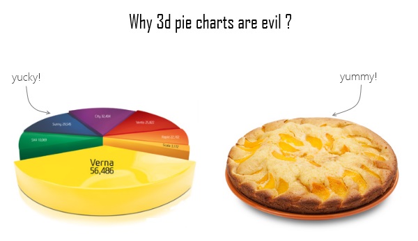
Recently I saw a big screaming ad that said “the chartbuster rules”. Of course, I know that chartbusters rule. Not just because I was one of them 🙂
So I got curious and read on. And I realized the ‘chartbuster’ is actually a car, not some cool, spreadsheet waving, goatee sporting dude like Jon Peltier. What a bummer!
And then to my horror of horrors, I saw the exploding 3d pie chart, with reflection effects & glossy colors. And the sole purpose of the chart is to create an impression that Verna sells better than any car in India.
Today, lets talk about this chart and alternatives for it. Read on.
Continue »Use Advances vs. Declines chart to understand change in values
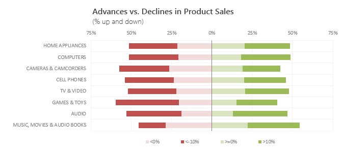
Lets say you are responsible for sales of 100s of products (which belong to handful of categories). You are looking at sales of each product in last month & this month. And you want to understand whether sales are improving or declining by category. How would you do it?
Turns out, this is not a difficult problem. In fact, this question is asked every day & answered using Advances vs. Declines chart.
You may have seen this chart in financial newspapers or websites. Shown above, Advances vs. Declines chart tells us how many items have advanced & how many have declined.
Read on to learn how to create this chart using Excel.
Continue »Shading above or below a line in Excel charts [tutorial]
![Shading above or below a line in Excel charts [tutorial]](https://img.chandoo.org/c/shaded-line-charts-tell-a-better-story.png)
When comparing 2 sets of data, one question we always ask is,
- How is first set of numbers different from second set?
A classic example of this is, lets say you are comparing productivity figures of your company with industry averages. Merely seeing both your series as lines (or columns etc.) is not going to tell you the full story. But if we can shade our productivity line in red or green when it is under or above industry average… now that would be awesome! Something like above.
Continue »

