All articles with 'chart formatting' Tag
{ 38 Comments }
How the tax burden has changed over the years – Excellent chart by NYTimes & Redoing it in Excel
Published on Dec 6, 2012 in Charts and Graphs
If I need some charting inspiration, I always visit New York Times. Their interactive visualizations are some of the best you can find anywhere. Clear, beautifully crafted and powerful. Long time readers of Chandoo.org knew that I like to learn from visualizations in NY Times & redo them using Excel.
Today let me present you one such chart. This is based on an interactive visualization prepared by NY Times explaining how the tax burden has changed over years for various income groups.
Take a look at tax burden chart – Excel implementation
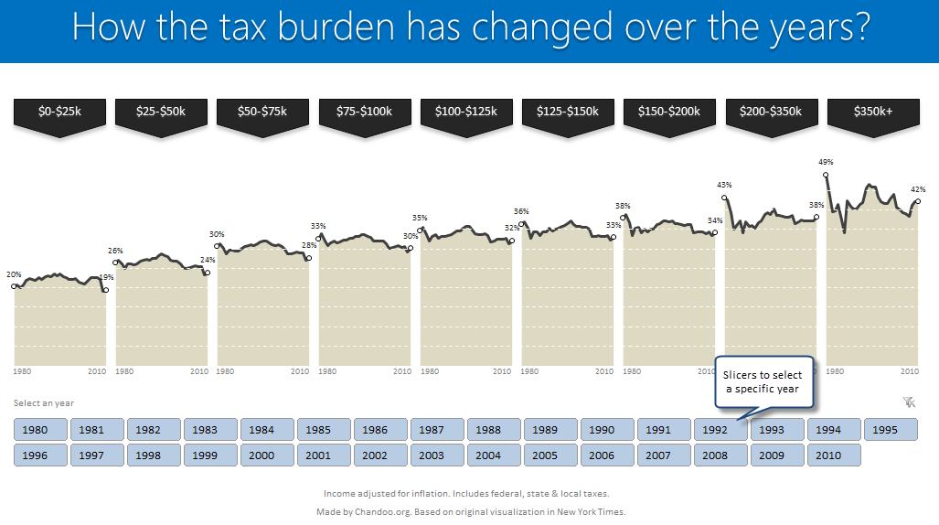
Read on to learn how to create this chart using Excel.
Continue »{ 22 Comments }
How to make Box plots in Excel [Dashboard Essentials]
Published on Jul 31, 2012 in Charts and Graphs
![How to make Box plots in Excel [Dashboard Essentials]](https://img.chandoo.org/dashboards/bp/box-plot-in-excel-how-to.png)
Whenever we deal with large amounts of data, one of the goals for analysis is, How is this data distributed?
This is where a Box plot can help. According to Wikipedia, a box plot is a convenient way of graphically depicting groups of numerical data through their five-number summaries: the smallest observation (sample minimum), lower quartile (Q1), median (Q2), upper quartile (Q3), and largest observation (sample maximum)
Today, let us learn how to create a box plot using MS Excel. You can also download the example workbook to play with static & interactive versions of box plots.
Continue »{ 17 Comments }
Thermo-meter chart with Marker for Last Year Value
Published on Jun 11, 2012 in Charts and Graphs, Excel Howtos

During a recent training program, one of the students asked,
Thermo-meter chart is very good to show how actual value compares with target (or budget). But how can we add another point for say Last Year value to the chart with out cluttering it.
Something like above.
Sounds interesting? Read on
Continue »{ 12 Comments }
Speeding up & Optimizing Excel – Tips for Charting & Formatting [Speedy Spreadsheet Week]
Published on Mar 21, 2012 in Charts and Graphs, Excel Howtos
![Speeding up & Optimizing Excel – Tips for Charting & Formatting [Speedy Spreadsheet Week]](https://img.chandoo.org/optimize/speeding-up-optimizing-excel-charts-formatting.png)
Is Excel acting slow & taking ages? As part of our Speedy Spreadsheet Week, today lets talk about optimizing & speeding up Excel by formatting & charting better. Use these tips & ideas to super-charge your sluggish workbook.
No matter how much data you got, how many formulas you wrote, the end users seldom see them on your workbook. They see the finalized dashboard, they play with the model, they look at the report. And if you make poor choices, your end users will thing your workbook is slow.
So let me present you 7 charting & formatting tips to optimize & speed up Excel. Read on…,
Continue »{ 30 Comments }
Making Small Multiples in Excel [Charting Technique]
Published on Nov 16, 2011 in Charts and Graphs
![Making Small Multiples in Excel [Charting Technique]](https://img.chandoo.org/c/final-small-multiples-chart.png)
Today, lets learn how to create small-multiples (or panel charts) to visualize trend of 2 product lines over years in various regions. The inspiration for this chart and article came from my friend, Paresh‘s recent article on his blog.
See how you can create a combination of area & line chart to create the small-multiple chart and clone it. You can also download the workbook and play with it to understand this technique better.
Continue »![Show Details On-demand in Excel [Tutorial + Training Program]](https://img.chandoo.org/c/on-demand-analysis-and-details-in-excel-demo.gif)
Yesterday, we have seen a beautiful example of how showing details (like distribution) on-demand can increase the effectiveness of your reports. Today, we will learn how to do the same in Excel.
Continue »{ 23 Comments }
How would you Visualize World Education Ranking Data [Homework + Video]
Published on Dec 20, 2010 in Charts and Graphs
![How would you Visualize World Education Ranking Data [Homework + Video]](https://chandoo.org/img/vp/world-education-scores-excel-chart.png)
Here is a charting challenge to begin your Christmas week. Recently Guardian’s Data Blog released World Education Rankings data and a sample visualization. Now your challenge is to make your chart visualizing World Education Rankings data.
You can see the chart I have constructed above. Read the rest of the post to find out how I made this chart and download the workbook.
Post your submissions using comments.
Continue »{ 33 Comments }
Show Months & Years in Charts without Cluttering
Published on Nov 17, 2010 in Charts and Graphs

We make charts with date axis all the time. So, today we will learn how to set up axis settings in Excel so that Months & Years are shown neatly structured without cluttering your chart. See the example next to understand.
Continue »{ 14 Comments }
90% of you can see up to cell M26 & other findings [visualization]
Published on Nov 12, 2010 in Charts and Graphs, Learn Excel
![90% of you can see up to cell M26 & other findings [visualization]](https://chandoo.org/img/vp/last-visible-cell-in-excel-visualization-thumb.png)
Two weeks back I ran a poll asking you to tell me what is the last visible cell in your excel window. It was a casual poll. So I didn’t expect a lot of responses. But, boy I was wrong! 295 of you have responded at last count. This is so much more than what I expected.
As I said, the purpose of this poll is to make a visualization out of the poll responses. In this post you can see the chart(s) I made from this data & learn more.
Continue »{ 9 Comments }
Analyze Competition with Scatter Plots – A business chart example
Published on Oct 25, 2010 in Charts and Graphs

Analyzing competition is one of the key aspects of running a business. In this article, learn how to use Excel’s scatter plots to understand competition, like shown aside.
The inspiration for this comes from a recent article on Asymco analyzing mobile handset market (Apple iPhone, Nokia etc.) and how it has changed since 2007.
Read the rest of the post to learn how to create this type of chart in excel. Also, you can download the chart template. Go ahead.
Continue »{ 11 Comments }
Thanks half a million… (and 2 excel tips)
Published on Oct 1, 2010 in blogging, Excel Howtos

I have a happy news to share with you!!! For the first time since starting this website, we got 500,000 + page views in the month of September 2010. Half-a-million! Thank you so much. To put this in context, in Sept 2009, we got 245,000 views. Traffic grew by more than 100% in last 12 […]
Continue »{ 14 Comments }
August 2010 – Best Month Ever (and 2 charting tips inside)
Published on Sep 3, 2010 in blogging, Charts and Graphs
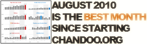
Time to stop everything we do and celebrate, for, our little community at chandoo.org had the most fantastic, awesome month ever.
That is right. August 2010 has been the best month since I started chandoo.org. We have broken a majority of previous records in terms of conversations, connections, content and revenues.
In August, we had 17 posts, with 604 comments. We had 178,000 visitors reading 453,000 pages. Our RSS subscriber base grew to 11,917 (it was 5738 an year ago). August has been the best month in-terms of revenues too. We sold highest number of project management templates & excel formula e-books since launch. We had a stellar launch for wedding planner with 22 customers.
Read rest of this post to find statistics about chandoo.org and get 2 charting tips.
Continue »{ 12 Comments }
5 Rules for Making Better Charts (and one fun chart)
Published on Jul 30, 2010 in Charts and Graphs
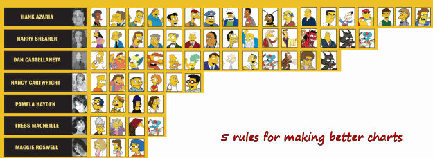
Jeff Weir, an alert reader of this blog points me this chart showcasing voice-over artist’s for various Simpson’s characters. I am a hard-core Simpon’s fan, so I naturally wasted quarter-hour looking at the chart. That is when I realize this chart is not only fun, it also teaches 5 valuable lessons on making better charts. Read the rest of this post to find out the five rules.
Continue »{ 13 Comments }
Gantt Box Chart Tutorial & Template – Download and Try today
Published on Jul 12, 2010 in Charts and Graphs, Learn Excel
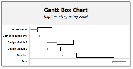
On Firday, we proposed a new chart for showing project plans. I chose an ugly name for it and called it Gantt Box Chart. Essentially, a gantt box chart is what you get when a gantt chart and box plot go to a bar, get drunk and decide to make out. It shows the project […]
Continue »{ 32 Comments }
Introduction to Panel Charts using Excel – Tutorial & Template
Published on May 12, 2010 in Charts and Graphs, Featured
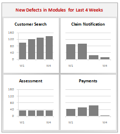
In this article we will learn what a Panel Chart is and how you can construct a panel chart in Excel.
What is a Panel Chart?
A panel chart is a set of similar charts neatly aligned in panels to help us understand some data which has multiple variables in it. Panel charts are also called by names “trellis displays” or “small multiples”. They are an effective way to display multi-variable data.
Here is an example panel chart showing the total defects per module over the last 4 weeks.
Continue »
