Excel Charts, Graphs and Templates
Tutorials, Examples and explanations on Excel charting. You can learn how to create almost any chart type in this section. Also learn how to create effective charts, make them interactive and add automation thru VBA
Show Months & Years in Charts without Cluttering |
|
|
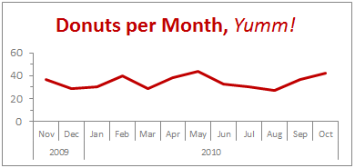
We make charts with date axis all the time. So, today we will learn how to set up axis settings in Excel so that Months & Years are shown neatly structured without cluttering your chart. See the example next to understand. |
90% of you can see up to cell M26 & other findings [visualization] |
|
![90% of you can see up to cell M26 & other findings [visualization]](https://chandoo.org/img/vp/last-visible-cell-in-excel-visualization-thumb.png)
|
Two weeks back I ran a poll asking you to tell me what is the last visible cell in your excel window. It was a casual poll. So I didn’t expect a lot of responses. But, boy I was wrong! 295 of you have responded at last count. This is so much more than what I expected. As I said, the purpose of this poll is to make a visualization out of the poll responses. In this post you can see the chart(s) I made from this data & learn more. |
Highlighting Data Points in Scatter and Line Charts |
|

|
Introducing a method of allowing data points to be interactively highlighted in Excel Scatter / X-Y Charts and Line Charts. |
A Technique for Analysing Large Tables of Data |
|

|
Once you start using Excel to develop systems, budget, forecast and large tables of data you may come across the dilemma of “How do I know this is right” or “How do I truth check this”. |
Analyze Competition with Scatter Plots – A business chart example |
|

|
Analyzing competition is one of the key aspects of running a business. In this article, learn how to use Excel’s scatter plots to understand competition, like shown aside. The inspiration for this comes from a recent article on Asymco analyzing mobile handset market (Apple iPhone, Nokia etc.) and how it has changed since 2007. Read the rest of the post to learn how to create this type of chart in excel. Also, you can download the chart template. Go ahead. |
Excel School Closing in a Few Hours – Join Now! |
|

|
As some of you know, I run an online Excel Training Program called as Excel School. I have opened registrations for 3rd batch of this program on September 14th. Thank you very much for supporting this program wildly. In a few hours, I will be closing the registrations for Excel School. Click here to sign up for Excel School Read the rest of the post to learn more about Excel School and also download time across world chart template. |
How I Analyze Excel School Sales using Pivot Tables [video] |
|
![How I Analyze Excel School Sales using Pivot Tables [video]](https://cache.chandoo.org/images/c/excel-charting-example-v1.png)
|
Some of you know that I run an online excel training program called Excel School. If you want to join, click here. Only 8 days left. I run excel school mainly to meet new students, understand their problems and learn new ways to solve them. But, Excel School also presents me with an interesting analytics challenges. In this post, I will share 2 pivot table based analytic techniques I used just yesterday to answer few questions I had about Excel School sign-ups. Watch this 15 min. video to see how I analyzed the data |
August 2010 – Best Month Ever (and 2 charting tips inside) |
|

|
Time to stop everything we do and celebrate, for, our little community at chandoo.org had the most fantastic, awesome month ever. That is right. August 2010 has been the best month since I started chandoo.org. We have broken a majority of previous records in terms of conversations, connections, content and revenues. In August, we had 17 posts, with 604 comments. We had 178,000 visitors reading 453,000 pages. Our RSS subscriber base grew to 11,917 (it was 5738 an year ago). August has been the best month in-terms of revenues too. We sold highest number of project management templates & excel formula e-books since launch. We had a stellar launch for wedding planner with 22 customers. Read rest of this post to find statistics about chandoo.org and get 2 charting tips. |
How to cook a delicious dynamic chart that will have your boss drool |
|
|
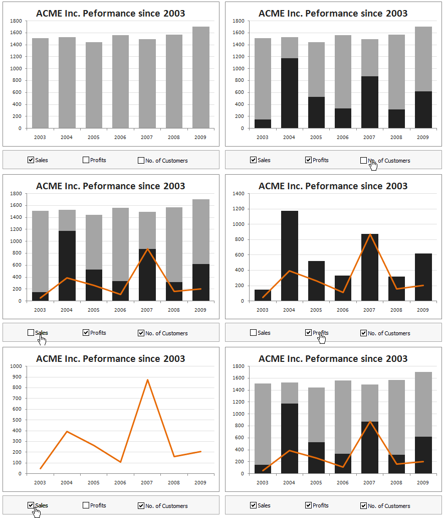
Dynamic charts are like my favorite food, Mangoes. They tempt, tease and taste awesomely. In this post, we are going to learn how to create a dynamic chart using check boxes and formulas as shown in the animation aside. Are you ready for some excel chart cooking? You can also download a FREE Dynamic chart template from the post. So go ahead and make your boss drool. |
How do you make charts when you have lots of small values but few extremely large values? [Debate] |
|
![How do you make charts when you have lots of small values but few extremely large values? [Debate]](https://img.chandoo.org/c/charts-with-small-large-values-th.png)
|
Here is an interesting charting problem we come across once in a while. We have a lot of small numbers and a few very large numbers. How do we effectively plot all of them in a chart? Now, how do you go about making a chart? |
Take your Excel Baby Steps with 89 Minutes of FREE Online Training |
|
|
I don’t remember when was the last time both of us (Jo and I) were this excited. And the reason? Nakshatra and Nishanth have started taking their first steps last week !!! It is such a joy watching them take one step at a time. Aah, the beauty of parenting 🙂 So I asked myself, “What is a good way to celebrate this without looking like a super-excited dad?” and I got my answer in 72 milli-seconds. I have created 10 short (<10 min) videos helping you to take baby steps in Excel world. Each video introduces you to one new functionality of Excel and shows you some nice examples. Before jumping straight in to the videos, I want to share a short clip (30 seconds) of our kids taking their baby steps. |
9 Excel Tips & Downloads Submitted by Our Readers [Reader Awesomeness Week] |
|
![9 Excel Tips & Downloads Submitted by Our Readers [Reader Awesomeness Week]](https://img.chandoo.org/raw/reader-awesomeness-week.png)
|
Last week I announced Reader Awesomeness Week to celebrate the passion, attitude and knowledge of our little community here. I got 9 interesting and beautiful entries from our readers. In this post you can see 9 tips & downloads submitted by our readers. These include a project management template, a macro to remove blanks, a technique to make Google Earth maps using Excel and several other interesting tips & tricks. Go ahead and read them, download attached workbooks and become awesome in Excel. 🙂 |
How Francis Landed on Chandoo.org, Become Awesome and Made a Superb Dashboard, all in ONE Weekend |
|

|
As part of our Reader Awesomeness Week, Francis shares with us a travel site dashboard he made for his company. Francis took just two days to prepare this awesome dashboard which uses concepts like bullet charts, sortable KPI grid, Date based filtering, dynamic charts and more. I was really moved by Francis’ gesture in sharing his work with us, so much that, I did a video review of his work. You can see it in the embedded youtube video to the left. Read the rest of the article to know how this dashboard is made and get a copy of the file. |
Immigrants in Denmark – An Excel Infographic |
|
|
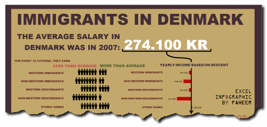
Faheem (@FaheemH) from Denmark sent me this beautiful infographic depicting various facts about Immigrants in Denmark. Immigrants in Denmark – Excel Infographic: [view high res] How is this Info-graphic made? Faheem used a variety of tricks to create this infographic. Some of the key ideas are, Using text boxes and drawing shapes Using bar charts […] |
5 Rules for Making Better Charts (and one fun chart) |
|
|
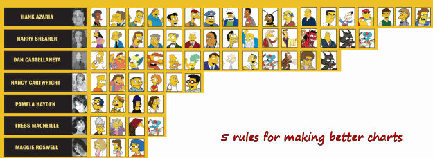
Jeff Weir, an alert reader of this blog points me this chart showcasing voice-over artist’s for various Simpson’s characters. I am a hard-core Simpon’s fan, so I naturally wasted quarter-hour looking at the chart. That is when I realize this chart is not only fun, it also teaches 5 valuable lessons on making better charts. Read the rest of this post to find out the five rules. |
7 Personal Expense Trackers using Excel – Download Today |
|
|
|
Keeping track of your expenses is one of the fundamentals of living good life. So I asked you to prepare a personal expense tracker as part of our 10,000 RSS Subscriber Milestone contest. I have received 7 excellent entries in this contest, each capable of making expense tracking a breeze while providing good analytics of […] |
4 Alternatives to Export Excel Dashboards as Web Pages |
|
|
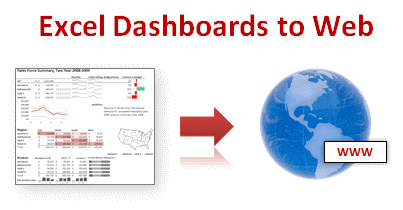
This article is written by Alex Kerin from Data Driven Consulting. “When expensive dashboard software doesn’t work, do it with Excel” stated Stephen Few back in 2006. This was before the release of Tableau, and some of the other solutions now available for visualizing your data, but Excel remains a great choice for creating dashboards when you […] |
Gantt Box Chart Tutorial & Template – Download and Try today |
|
|
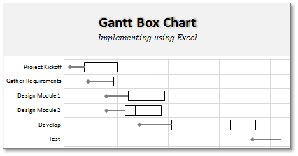
On Firday, we proposed a new chart for showing project plans. I chose an ugly name for it and called it Gantt Box Chart. Essentially, a gantt box chart is what you get when a gantt chart and box plot go to a bar, get drunk and decide to make out. It shows the project […] |
A Gantt Chart Alternative – Gantt Box Chart |
|
|
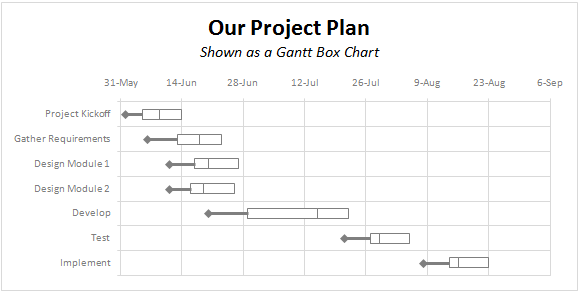
Traditional project plans use Gantt Charts to depict the plan. While gantt charts work great and provide instant picture of overall plan, they fail to communicate the uncertainty in the plan. In most real world projects, the plans always change. Most of the management energy is spent on controlling and communicating about this plan uncertainty. This is where a project plan like gantt box chart can help. This chart (as shown above) clearly shows the variance in end dates of project tasks thus giving a clear picture of uncertainty in the plan. Read more to find out how this chart can be used in project management. |
What new chart types you want to see in Excel? [poll] |
|
![What new chart types you want to see in Excel? [poll]](https://chandoo.org/img/polls/what-new-chart-in-excel.png)
|
Hui, one of our in-house excel ninjas at Chandoo.org Forums, has asked an interesting question. Microsoft is already planning the next version of Excel and is looking for our feedback into what extra chart types it should offer/include. [more] It is an interesting question, so lets have a poll. What new chart types you prefer […] |


