Archive for August, 2015
{ 11 Comments }
In-cell 5 star chart – tutorial & template
Published on Aug 15, 2015 in Charts and Graphs, Excel Howtos
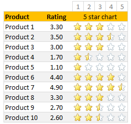
Whenever we talk about product ratings & customer satisfaction, 5 star ratings come to our mind. Today, let’s learn how to create a simple & elegant 5 star in-cell chart in Excel. Something like above.
Read on to learn how to create the above chart.
Continue »{ 3 Comments }
Work with charts faster using selection pane & select object tools [quick video tip]
Published on Aug 14, 2015 in Charts and Graphs, Excel Howtos
Working with multiple charts (or drawing shapes / images) can be a very slow process. But here is a secret to boost your productivity.
Use selection pane & select object tools
Selection Pane & Select Objects?
If you have never heard of these, don’t worry. These are 2 very powerful features hidden in Excel. Once you know how to unlock them, you will never look back.
How to use selection pane & select object tools to work with charts faster – Video
In this video, understand how to use these powerful features to work with charts faster.
Continue »{ 1 Comment }
CP042: Financial Analysis & Modeling concepts – 101
Published on Aug 13, 2015 in Chandoo.org Podcast Sessions, Financial Modeling

Podcast: Play in new window | Download
Subscribe: Apple Podcasts | Spotify | RSS
In the 42nd session of Chandoo.org podcast, Let’s talk about money. We are going to learn about various concepts that are vital for doing financial analysis and building models.
What is in this session?
In this podcast,
- Quick announcement about Awesome August
- 5 key finance concepts
- Time value of money
- Compound interest
- Risk free rate of return
- Net Present Value – NPV
- Internal Rate of Return – IRR
- Case study – Uber vs. Your car
- Conclusions
{ 5 Comments }
Format faster with paste special & double click [video]
Published on Aug 12, 2015 in Learn Excel
![Format faster with paste special & double click [video]](https://chandoo.org/wp/wp-content/uploads/2015/08/format-faster-howto.png)
Making your workbooks, charts, dashboards & presentations beautiful is a time consuming process. It is a mix of art & craft. Naturally, we spend hours polishing that important slideshow or visualization. But do you know about simple features in Excel that can save you a lot of time and help you create gorgeous output?
Continue »
VLOOKUP is one of the most useful Excel functions. So much so that I even wrote a book about it. But it has one serious limitation.
It looks up the first occurrence and returns corresponding data.
What if you want to find the last value?
Say, for example, you are looking at a task assignment list and want to know what is the last task assigned to employee Emp13?
We want to extract the task “Make amazing workbook”. Of course our good old VLOOKUP stops once it finds Emp13 and returns the answer as “Create intuitive workbook”.
Continue »{ 4 Comments }
Make bar charts in original order of data for improved readability [charting tip]
Published on Aug 10, 2015 in Charts and Graphs
![Make bar charts in original order of data for improved readability [charting tip]](https://chandoo.org/wp/wp-content/uploads/2015/08/fixing-bar-chart-order-for-better-readability.png)
To make friends in a new town hit the bars – Old saying.
To make sense of a new data-set, make bar charts – New saying.
Bar charts (or column charts if you like your data straight up) are vital in data analysis. They are easy to make. But one problem. By default, a bar chart show the original data in reverse order.
See the above example.
Unfortunately, we humans read from top to bottom, not the other way around.
Continue »Conditional formatting is one of the most powerful & awesome features of Excel. It is very easy to setup. Naturally, people use it extensively. But the default conditional formatting rules can clutter your reports. Here is one tip that can declutter your reports.
Just show the formatting, not values.
See the above report.
Continue »{ 15 Comments }
Use shapes to enhance your Excel charts [tip]
Published on Aug 8, 2015 in Charts and Graphs
![Use shapes to enhance your Excel charts [tip]](https://chandoo.org/wp/wp-content/uploads/2015/08/use-shapes-to-enhance-your-charts.png)
Here is a simple way to enhance your Excel charts – use shapes & pictures in your charts.
We will learn how to create something like above.
Looks interesting? Read on…
Continue »{ 7 Comments }
Remove duplicate combinations in your data [quick tip]
Published on Aug 7, 2015 in Excel Howtos
![Remove duplicate combinations in your data [quick tip]](https://chandoo.org/wp/wp-content/uploads/2015/08/remove-duplicate-combinations-v2.gif)
By now, we know how to remove duplicates from data. You can use the Remove Duplicates button to do that.
But do you know that we can use remove duplicates button to get rid off duplicate combinations too?
Remove duplicate combinations – Tutorial
To remove duplicate combinations in your data, just follow below 4 steps:
- Select your data
- Click on Data > Remove Duplicates button
- Make sure all columns are checked
- Click ok and done!
See this demo:
Continue »{ 5 Comments }
CP041: 6 charts you’ll see in hell – v2.0
Published on Aug 6, 2015 in Chandoo.org Podcast Sessions, Charts and Graphs

Podcast: Play in new window | Download
Subscribe: Apple Podcasts | Spotify | RSS
In the 41st session of Chandoo.org podcast, Let’s take a trip to data hell and meet 6 ugly, clumsy, confusing charts. I am revisiting a classic Chandoo.org article – 6 Charts you will see in hell.
What is in this session?
In this podcast,
- Quick announcement about Awesome August
- 6 charts you should avoid
- 3D charts
- Pie / donut charts with too many slices
- Too much data
- Over formatting
- Complex charts
- Charts that don’t tell a story
- Conclusions
{ 13 Comments }
Save time with custom ribbons in Excel [tutorial]
Published on Aug 5, 2015 in Excel Howtos
![Save time with custom ribbons in Excel [tutorial]](https://chandoo.org/wp/wp-content/uploads/2015/08/create-custom-ribbon-tabs-excel.png)
A significant portion of our time in Excel is spent navigating between various ribbon tabs and clicking buttons. Wouldn’t it be better if you can combine all the frequently used features in to one ribbon? Something like above:
Read on to learn how to create, edit and share custom ribbons in Excel.
Continue »{ 35 Comments }
Calculate sum of top 10 values [formulas + homework]
Published on Aug 4, 2015 in Formula Challenges, Learn Excel
![Calculate sum of top 10 values [formulas + homework]](https://chandoo.org/wp/wp-content/uploads/2015/08/sum-of-top-10-values-excel.png)
Analyzing top n (or bottom m) items is an important part of any data analysis exercise. In this article, we are going to learn Excel formulas to help you with that.
Let’s say you are the lead analyst at a large retail chain in Ohio, USA. You are looking at the latest sales data for all the 300 stores. You want to calculate the total sales of top 10 stores. Read on to learn the techniques.
Continue »![How to highlight overdue items [video]](https://chandoo.org/wp/wp-content/uploads/2015/08/highglight-overdue-items-howto.png)
We, adults can’t escape three things:
- Deadlines
- Demanding bosses (replace with customers or nagging spouses or naughty kids)
- Taxes
While I can’t help you with demanding bosses or taxes, when it comes to deadlines, I have the right tool for you.
A tracker that highlights all overdue items so that you know where to focus your attention.
Let’s learn how to use awesome powers of Excel to find-out which items are due. You can apply these concepts to nail down over due invoices, pending project tasks or scheduling workforce.
Continue »{ 12 Comments }
How to create dynamic sparklines for latest 30 days [video]
Published on Aug 2, 2015 in Charts and Graphs, Pivot Tables & Charts
![How to create dynamic sparklines for latest 30 days [video]](https://chandoo.org/wp/wp-content/uploads/2015/08/dynamic-sparklines-v2.png)
Sparklines are fun and very insightful. They are easy to create, easy to maintain and fit into any dashboard.
But there is one tiny problem with them. Usually we have a lot of data, but we don’t to visualize all of it. We just want to visualize latest 30 days trend or last 12 months trend or QTD or something similar. What then?
In this video, learn a powerful and very simple way to create dynamic sparklines using Excel.
Continue »
Excel has many powerful & time-saving features. Even by Excel’s standard, Flash Fill is magical. Introduced in 2013, Flash Fill is a rule engine to Excel’s fill logic. Every time you type something in a cell, Excel will try to guess the pattern and offers to fill up the rest of cells for you. That is some serious time saving magic.
Let’s understand what Flash Fill is and few sample use cases.
Continue »
