
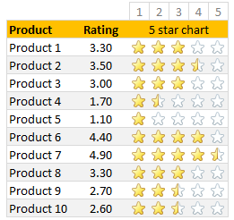
Whenever we talk about product ratings & customer satisfaction, 5 star ratings come to our mind. Today, let’s learn how to create a simple & elegant 5 star in-cell chart in Excel. Something like this:
A while ago, Hui showed us a fun way to create 5 star charts in Excel using bar charts with 5 star mask. I highly recommend reading that article if you want to create a regular chart version of this.
Tutorial for creating a 5 star chart
1. Meet the data
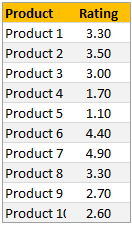
Here is our data. Very simple. First column has product names. Second column has customer rating – from 1 to 5.
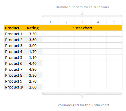
2. Set up 5 blank columns for the 5 star chart
Let’s create a 5 column grid right next to our data set. This is where the in-cell 5 star chart will go. At this stage our 5 star chart looks like this:
If you haven’t guessed yet, we will be using conditional formatting > star icons to get the 5 star chart.
3. Write formulas in the 5 column grid
Now, we need to write formulas to fill up the 5 column grid. We need to formulas to return either 1, 0 or decimal values in the grid depending on the rating for that row.
So, for example, if a product has 3.30 rating, we want to print 1, 1, 1, 0.30 and 0 in 5 columns.
You can use any number of formulas to get this result. The simplest one will be IF formula.
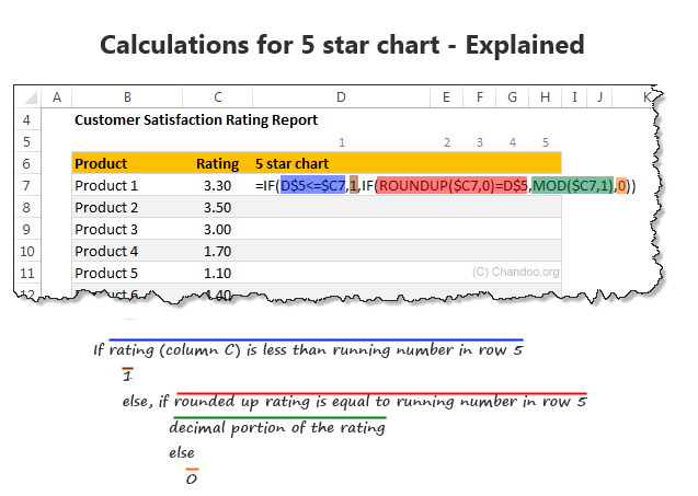
Assuming column C (from C7) has product ratings & row 5 has running numbers 1 to 5 (from cell D5), we can use below formula to get what we want:
=IF(D$5<=$C7,1,IF(ROUNDUP($C7,0)=D$5,MOD($C7,1),0))
To understand the above formula , see this illustration.
If you like to avoid IF formulas, here is an alternative:
=MAX(($C7>=D$5)*1,MOD($C7,1))*(ROUNDUP($C7,0)>=D$5)
A challenge for you: Can you think of any other ways to write this formula?
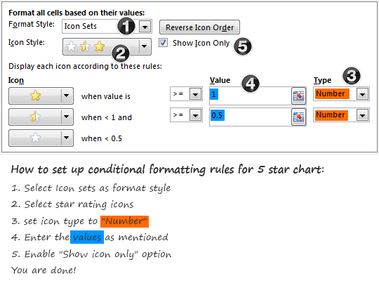
4. Apply conditional formatting to the 5 column grid
Select the 5 column grid and apply conditional formatting (Home > Conditional Formatting > New rule)
Set up the rule as shown below:
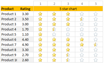
At this stage, our report looks like this:
5. Adjust column width and borders
Once the formatting is applied, just clean up the report by adjusting column width (set it to 24 px) and add horizontal borders only.
And our product rating report is ready.
Download in-cell 5 star chart template
Please click here to download the in-cell 5 star chart workbook. It also contains a variation of the 5 star chart made with data bars & 5 star mask. Check out both examples to understand how they work.
More in-cell chart tutorials & techniques
In-cell charts are a powerful & lightweight way to visualize your data. Check out below tutorials to one up your awesomeness.
 Create in-cell charts with markers for target / average
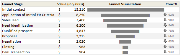
- In-cell sales funnel charts
- Suicides vs. Murders – story told with in-cell charts
- Another 5 star chart (plus show details on click)
- Exploring survey results in interactive dot-plot chart
How would you visualize customer ratings in Excel?
While 5 star charts are traditional, they dumb-down the data. Can you think of other fun ways to visualize customer / product rating data? Please share your thoughts & implementations in the comments.


11 Responses
=IF($C8>=D$6,1,IF(MOD($C8,1)+$C8=D$6,0,5,0))
To hide the empty stars:
=IF($C8+0,5=D$6,1,IF(MOD($C8,1)+$C8=D$6,0,5,0)))
In cell D7 type =$C7-D$5+1 and copy paste the formula
Great! And afterwards very logical. Thank you.
Hi Sam.. that is genius. Very elegant solution indeed. Thanks for posting it 🙂
Great! Thank you
Thank you Chandoo
Hi! Does this only work for Excel 2015? thanks!
These are all great solutions. Just one thing that was a little confusing (probably more so for newer excel users).
In the explanation, you have:
=IF(D$5<=$C7,1,IF(ROUNDUP($C7,0)=D$5,MOD($C7,1),0))
But in the explanation graphic, it says "If rating (Column C) is less than running number in row 5"
Shouldn't it be "If the running number in row 5 is less than or equal to the rating (Column C)?
So Im pretty confused here. I followed the instructions and I changed the cells and rows to the ones im using and nothing. no matter what number (between 1-5) I use, all stars highlight no matter what.
I need it to be 1=1 star 2=2 start and so on…any help would be appreciated.
This is what I am using. Help please.
=IF(K$12<=$J14,1,IF(ROUNDUP($J14,0)=K$12,MOD($J14,1),0))
Thank u 🙂