Archive for August, 2014
CP018: Dont be a Pivot Table Virgin!
Podcast: Play in new window | Download
Subscribe: Apple Podcasts | Spotify | RSS
In the 18th session of Chandoo.org podcast, lets loose your Pivot table virginity.
Note: This is a short format episode. Less time to listen, but just as much awesome.

What is in this session?
Pivot tables are a very powerful & quick way to analyze data and get reports from Excel. But surprisingly, not many use them. Today, lets bust your pivot table virginity and understand the concepts like pivoting, values, labels, filters, groups and more.
In this podcast, you will learn,
- Announcements
- What is a Pivot Table?
- Example of business data & reporting needs
- Key pivot table terms to understand
- Creating your first pivot table
- Learning more about pivot tables
Convert fractional Excel time to hours & minutes [Quick tip]
![Convert fractional Excel time to hours & minutes [Quick tip]](https://img.chandoo.org/q/convert-fraction-to-hours-minutes-in-excel.png)
Time for another quick Excel tip.
Lets say the park near your house rents tennis courts by hour. And they charge $10 per hour. At the end of an intense tennis playing week, Linda, the tennis court manager called you up and said you need to pay $78 as rent for that week.
How many hours did you play?
Of course 78/10 = 7.8 hours.
But we all know that 7.8 hours makes no sense.
We also know that 7.8 hours is really 7 hours 48 minutes.
So how to convert 7.8 hrs to 7:48 ?
Continue »What is the average speed of this road trip? [Solution & Discussion]
![What is the average speed of this road trip? [Solution & Discussion]](https://img.chandoo.org/hw/time-per-50-mile-laps.png)
Last week, we had an interesting homework problem – What is the average speed of this road trip?
We received more than 150 answers. But to my surprise, 57 of them are wrong. So today, lets learn how to calculate the average speed correct way.
Continue »CP017: Top 10 non-Excel MS Office tips for you – Interview with Paul Woods – Office MVP & Blogger

Podcast: Play in new window | Download
Subscribe: Apple Podcasts | Spotify | RSS
In the 17th session of Chandoo.org podcast, lets leave Excel aside and talk about other MS Office apps.
Thats right. We will be learning 10 tips on how to use Word, Power Point, Outlook etc. Ready?
In this podcast, you will learn,
- About Paul
- Ten tips for MS Office
- 1. Use Excel to communicate instead of just calculations
- 2. Paste Special
- 3. Double click trick!
- 4. Inserting screenshots
- 5. Turning off notifications
- & more…
Mapping relationships between people using interactive network chart

Today, lets learn how to create an interesting chart. This, called as network chart helps us visualize relationships between various people.
Demo of interactive network chart in Excel
First take a look at what we are trying to build.
Looks interesting? Then read on to learn how to create this.
Continue »What is the average speed of this road trip? [homework]
Its homework time again. This time, lets tackle an interesting & everyday problem. Lets introduce our protagonist of the story – Jack. Jack likes long road trips, smell of freshly brewed Colombian coffee, clicky-clack sound of his computer keyboard. He hates toll plazas (they slow him down) & Potassium permanganate. And oh yes, Jack is […]
Continue »CP016: 3 Must have books for aspiring analysts

Podcast: Play in new window | Download
Subscribe: Apple Podcasts | Spotify | RSS
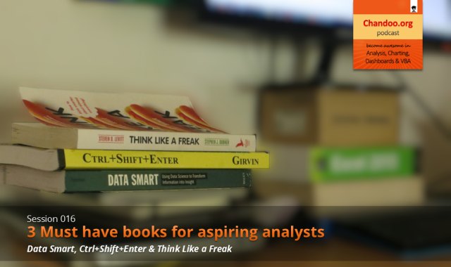
In the 16th session of Chandoo.org podcast, lets review 3 very useful books for aspiring analysts.
What is in this session?
Analytics is an increasingly popular area now. Every day, scores of fresh graduates are reporting to their first day of work as analysts. But to succeed as an analyst?
By learning & practicing of course.
And books play a vital role in opening new pathways for us. They can alter the way we think, shape our behavior and make us awesome, all in a few page turns.
So in this episode, let me share 3 must have books for (aspiring) analysts.
Continue »This is a guest post by Krishna, a football lover & one of our readers.
The wait for lifting the most valued priced in football for Germans was finally over. For a football fan, world cup is best time that is scheduled every four years and that if your favorite team lifting the trophy is like your crush is going on a date with you. 🙂
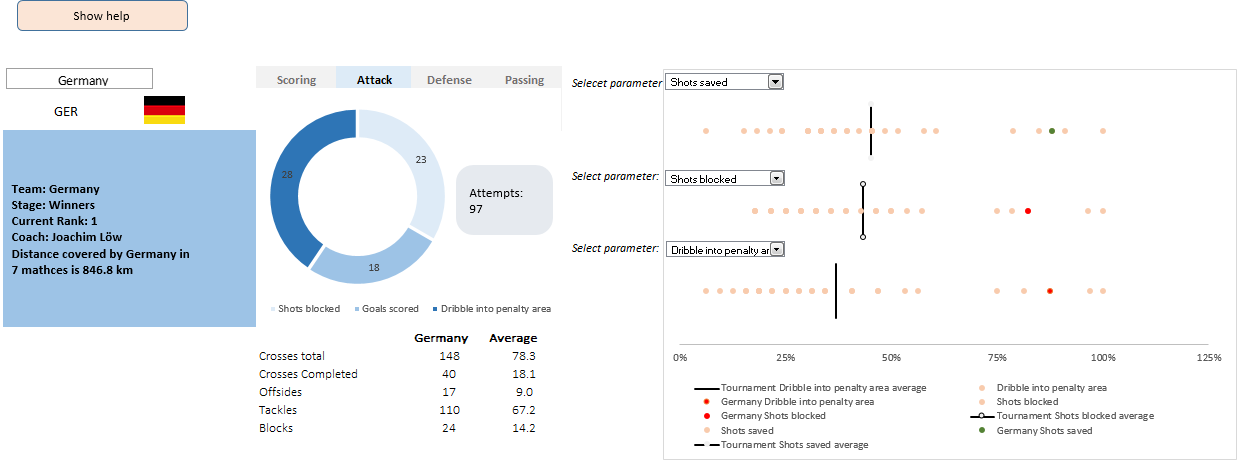
A sneak-peek at the final dashboard
Here is the final dashboard (it has more functionality than depicted). Click on it to enlarge.
Continue »
Ok people. Let me tell you that this post is almost not about Excel. It is about how one Excel blogger’s (yours truly) dream of long distance cycling came true. So sit back, grab your favorite drink and read between sips.
So what is this all about?
Last Sunday (27th July) & Monday (28th), I finished my first ever 200KM bicycle ride. I rode for a little more than 12 hours, burned 5,179 calories & rode 206 kilometers.
It is definitely one of the most memorable, tiresome & uplifting experiences in my life. So naturally, I want to share the story with you.
Continue »


