All articles with 'Microsoft Excel Conditional Formatting' Tag
{ 15 Comments }
Make Awesome Data Entry Forms by using Conditional Formatting + Data Validation
Published on Feb 7, 2011 in Learn Excel

Last week we saw a really cool holiday request form made by Theodor. This week, we will learn how to combine conditional formatting and data validation to create an awesome data entry form. First see a demo to understand what I mean: How to create such a data entry form? Very simple, just grab a […]
Continue »{ 25 Comments }
How do Business Analysts use Excel [Guest Post from a Rock-star BA]
Published on Feb 2, 2011 in interviews, Learn Excel
![How do Business Analysts use Excel [Guest Post from a Rock-star BA]](https://chandoo.org/img/g/rockstar-business-analyst-with-excel.jpg)
This is a guest article by Matt, who works as a Business Analyst with allrecipes.com. He shares with us how he is using Excel to become a rockstar business analyst. In his own words,
“At Allrecipes.com we use excel for a variety of purposes. Analyzing site trends, forecasting traffic, charts, dashboards, and slide shows; you name it, we use excel for it. That’s why Chandoo’s tips have been so helpful – because we use excel every day. Thanks to chandoo.org, I’ve developed a reputation as an “excel wizard” and even taught a 4 week excel training class!“
Continue »{ 18 Comments }
Holiday Request Form in Excel [Awesome Ways our Readers are using Excel]
Published on Feb 1, 2011 in excel apps, Learn Excel
![Holiday Request Form in Excel [Awesome Ways our Readers are using Excel]](https://chandoo.org/img/g/holiday-request-form-download.png)
Theodor, one of our readers, first emailed me in December asking a question. But he also made a promise to share some of his techniques with us thru Guest posts. Naturally, I was too happy and invited him to share a file or two so that I can use them for articles here.
Later during Christmas holidays, he sent me this beautiful Holiday Request Form made using Excel.
Continue »{ 14 Comments }
220 Excel Tips, Tutorials, Templates & Resources for You [Celebrating 20k RSS Members]
Published on Jan 20, 2011 in Charts and Graphs, Learn Excel
![220 Excel Tips, Tutorials, Templates & Resources for You [Celebrating 20k RSS Members]](https://img.chandoo.org/l/220-excel-tips-tricks-templates-resources.png)
I have an exciting news & massive post for you.
Chandoo.org reaches 20,156 RSS Subscriber mark on Jan 19, 2011As of Jan 19, 2011, our little blog has registered our 20,000th RSS Subscriber. While this is not a huge achievement or anything, It certainly calls for celebration. I am so happy to see our mission to make people awesome in Excel is reaching out to more people everyday. Thank you.
To celebrate this milestone, I am doing a massive post with 220 Excel tips, tricks, tutorials & templates.
Formulas [52 tips]
Formatting & Conditional Formatting [36 tips]
Charting [60 tips]
Tables & Pivot Tables [15 tips]
Using Excel [47 tips]
Free Downloads [5 tips]
Recommended Resources [5 tips]
{ 32 Comments }
Happy Birthday Hui, An Excel Dashboard to prove you are awesome!
Published on Jan 14, 2011 in Charts and Graphs, Cool Infographics & Data Visualizations

Some of you know our guest author and Excel ninja Hui. Yesterday was his birthday. And I wanted to create nice birthday gift for him. So I took a database dump of our forums data and created a dashboard.
Read rest of this post to see the dashboard & download workbook.
Continue »{ 14 Comments }
6 Christmas Cards in Excel – Download and Spread Joy
Published on Dec 15, 2010 in Learn Excel

Few days back, I have asked you to make a Christmas card in Excel (or any of your favorite festival’s card).
We got 6 entries for this contest. All the entries showed a lot of creativity to come up with beautiful cards using Excel. See the entries, download the excel files & find out who the winner is. Read the rest of this post.
Continue »{ 50 Comments }
Excel Animation without Macros!
Published on Nov 30, 2010 in Charts and Graphs, Learn Excel
Today we will learn an interesting animation technique that ONLY uses, … wait for it …, Excel Formulas. That is right, we will use simple formulas to animate values in Excel.
Intrigued? Confused? Interested?
First see a short demo of excel animation achieved using this technique.
Now read the rest of this post to learn more about this technique and download sample workbook.
Continue »{ 14 Comments }
90% of you can see up to cell M26 & other findings [visualization]
Published on Nov 12, 2010 in Charts and Graphs, Learn Excel
![90% of you can see up to cell M26 & other findings [visualization]](https://chandoo.org/img/vp/last-visible-cell-in-excel-visualization-thumb.png)
Two weeks back I ran a poll asking you to tell me what is the last visible cell in your excel window. It was a casual poll. So I didn’t expect a lot of responses. But, boy I was wrong! 295 of you have responded at last count. This is so much more than what I expected.
As I said, the purpose of this poll is to make a visualization out of the poll responses. In this post you can see the chart(s) I made from this data & learn more.
Continue »{ 82 Comments }
Show Zebra Lines when Value Changes [Excel Conditional Formatting Homework]
Published on Sep 28, 2010 in Featured, Learn Excel
![Show Zebra Lines when Value Changes [Excel Conditional Formatting Homework]](https://chandoo.org/img/hw/zebra-lines-when-value-changes-excel-conditional-formatting.png)
Here is a quick home work on excel conditional formatting. Lets say you have data as shown below to left and you need to show zebra lines whenever the value changes (see right). Your home work is simple. Just figure out how to write conditional formatting rules to add zebra lines. The data set is […]
Continue »{ 137 Comments }
Even Faster Way to Compare 2 Lists in Excel [Quick Tip]
Published on Jul 1, 2010 in Excel Howtos
![Even Faster Way to Compare 2 Lists in Excel [Quick Tip]](https://chandoo.org/img/cf/compare-lists-conditional-formatting-tip.png)
Last week we discussed a fun and easy way to compare two lists of data in excel using conditional formatting. In that post, Artem commented, The quickest way to find all about two lists is to select them both and them click on Conditional Formatting -> Highlight cells rules -> Duplicate Values (Excel 2007). The […]
Continue »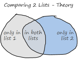
Comparison of lists of data is something that we do all the time. Today, lets learn a few tricks that you can apply immediately to compare 2 lists using Excel. This post discusses how to compare two lists with formula based rules. If you just want to quickly highlight common values, click here. If you […]
Continue »{ 25 Comments }
Display Alerts in Dashboards to Grab User Attention [Quick Tip]
Published on May 25, 2010 in Charts and Graphs
![Display Alerts in Dashboards to Grab User Attention [Quick Tip]](https://chandoo.org/img/dashboards/dashboard-alerts-example-th.png)
Dashboards can be overwhelming with lots of details and context. A simple way to drag user’s attention to important stuff in the dashboard is to use alerts. See this example to understand what alerts mean. How to display alerts in Excel Dashboards? The easiest way to display alerts is to use Excel 2007’s Conditional Formatting […]
Continue »{ 49 Comments }
New Features in Excel 2010 Conditional Formatting
Published on May 19, 2010 in Charts and Graphs, Learn Excel
Conditional formatting is one of favorite features in Excel. CF has helped me save the day at work more than a dozen occasions. I almost became project manager just because I knew how to make a gantt chart in excel using conditional formatting. I have written extensively about it.
So, I was naturally curious to explore what is new in Excel 2010’s Conditional Formatting. In this post, I will share some of the coolest improvements in CF.
Continue »{ 101 Comments }
What is new in Microsoft Excel 2010? [Office 2010 Week]
Published on May 17, 2010 in Featured, Learn Excel
![What is new in Microsoft Excel 2010? [Office 2010 Week]](https://chandoo.org/img/2010/excel-2010-whats-new.png)
Office 2010, the latest and greatest version of Microsoft Office Productivity applications is going to be available worldwide in the next few weeks. I have been using Office 2010 beta since November last year and recently upgraded my installation to the RTM version. I was pleasantly surprised when I ran Microsoft Excel 2010 for first time. It felt smooth, fast, responsive and looked great on my comp.
This week, I want to celebrate the launch of Excel 2010 and write about the following new features in Excel 2010.
Also, you can win a copy of Office 2010 – home & student edition by leaving a comment on this or any of the other excel 2010 posts scheduled for this week
Continue »{ 19 Comments }
Survey Results in Dot Plot Panel Chart [followup on Incell Panel Chart]
Published on Apr 9, 2010 in Charts and Graphs
![Survey Results in Dot Plot Panel Chart [followup on Incell Panel Chart]](https://chandoo.org/img/vp/incell-dot-plot-panel.gif)
In a follow up to last week’s how to visualize survey data in excel, we will explore how you can create an incell dot plot panel chart. Please follow the links in the article to get more commentary and insights from established persona in the visualization world (including Stephen Few, Naomi, Jon etc.)
Continue »
