All articles with 'Microsoft Excel Conditional Formatting' Tag
These icons are so pretty, can I get them in green? [conditional formatting trick]
![These icons are so pretty, can I get them in green? [conditional formatting trick]](https://chandoo.org/wp/wp-content/uploads/2016/03/conditional-formatting-with-green-down-arrow.png)
One of our readers emailed this question recently,
I like the conditional formatting icons. I am trying to present some business data where going down is good. How do I get a green colored down arrow icon?
Essentially, Ms. CanIGetItInGreen wants this:
Unfortunately, Excel’s conditional formatting icons are not customizable. So we can’t get the green down arrows without some sneak. And sneak we shall.
Continue »“How Trump happened” in Excel [visualizations]
![“How Trump happened” in Excel [visualizations]](https://chandoo.org/wp/wp-content/uploads/2016/03/how-trump-happened-excel-replica.png)
During last week, an alert reader of our blog, Jørgen emailed me a link to “How Trump happened“. It is an interactive visualization by Wall Street Journal. Jørgen asked me if we could replicate the visualization in Excel. My response: “Making a new chart in Excel? Hell yeah!”
Read on for awesome visualizations and full explanation.
Continue »Analyzing half a million complaints – Customer Satisfaction Scorecard [Part 3 of 3]
![Analyzing half a million complaints – Customer Satisfaction Scorecard [Part 3 of 3]](https://chandoo.org/wp/wp-content/uploads/2016/02/customer-satisfaction-scorecard-analysis-complaints-data.png)
This is the final part of our series on how to analyze half a million customer complaints. Click below links to read part 1 & 2.
- Complaint reason analysis – Part 1
- Regional trends & analysis – Part 2
Customer satisfaction scorecard
In the previous parts of this case study, we understood what kind of complaints were made and where they came from (states). For the customer satisfaction scorecard, let’s focus on individual companies.
Continue »2016 Calendar, daily planner Excel templates [free downloads]
Here is a New year gift to all our readers – free 2016 Excel Calendar & daily planner Template.
This calendar has,
- One page full calendar with notes, in 4 different color schemes
- Daily event planner & tracker
- 1 Mini calendar
- Monthly calendar (prints to 12 pages)
- Works for any year, just change year in Full tab.

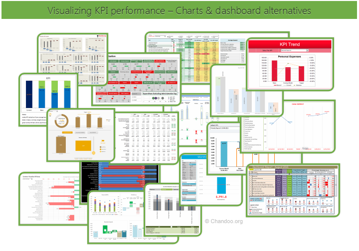
Hello all, prepare to be amazed! Here are 43 creative, fun & informative ways to visualize KPI data.
About a month ago, I asked you to visualize KPI data. We received 65 entries for this contest. After carefully reviewing the entries, our panel of judges have discarded 22 of them due to poor charting choices, errors or just plain data dumps. We are left with 43 amazing entries, each creatively analyzed the data and presented results in a powerful way.
How to read this post?
This is a fairly large post. If you are reading this in email or news-reader, it may not look properly. Click here to read it on chandoo.org.
- Each entry is shown in a box with the contestant’s name on top. Entries are shown in alphabetical order of contestant’s name.
- You can see a snapshot of the entry and more thumbnails below.
- The thumb-nails are click-able, so that you can enlarge and see the details.
- You can download the contest entry workbook, see & play with the files.
- You can read my comments at the bottom.
- At the bottom of this post, you can find a list of key charting & dashboard design techniques. Go thru them to learn how to create similar reports at work.
Thank you
Thank you very much for all the participants in this contest. I have thoroughly enjoyed exploring your work & learned a lot from them. I am sure you had fun creating these too.
So go ahead and enjoy the entries.
Continue »Employee training tracker & calendar – tutorial & download

Imagine you are the head of training department at ACME Inc. You arrange training programs round the year to empower your team. It is hard work, coordinating between employees, trainers, department heads, venues and coffee machines. What if there is something to help you keep track of all this? I am not talking about getting you a shiny new iPad, you silly. I am talking about a tracker & calendar built in Excel that ties everything together (well, almost everything, you still have to fill the coffee machine.)
We are going to build a training program tracker & calendar using Excel.
Continue »CP046: Gantt charts & project planning using Excel

Podcast: Play in new window | Download
Subscribe: Apple Podcasts | Spotify | RSS
In the 46th session of Chandoo.org podcast, let’s talk about gantt charts and project plans.
What is in this session?
In this podcast,
- A brief intro to Excel 2016
- What is a Gantt chart?
- How Gantt charts can help us?
- How to create Gantt charts in Excel
- Using bar charts with invisible series
- Using conditional formatting and formulas
- Using ready-made templates
- Resources on Gantt charts & project planning
- Conclusions
How countries spend their money – chart alternatives
Econimist’s daily chart is a one of my daily data porn stops. They take interesting data sets and visualize in compelling ways. While the daily chart page is insightful, sometimes they make poor charting choices. For example, this recent chart visualizing how countries spend their money uses a variation of notorious bubble chart. Click on the chart to enlarge.
What is wrong with this chart?
Bubble charts force us to measure and compare areas of circles. Unless you have a measuring tape somehow embedded in your eyes and you are a walking human scientific calculator, you would find this task impossible.
So when you look at the chart and want to find out what percentage Japanese spend on restaurants or how much Americans pay for housing, your guesses will have large error margins.
Not only bubble charts are difficult to read, they are very hard to align. So when you have a bunch of bubbles, no matter how hard you try, your chart looks clumsy (see how the Russian food bubble eats in to Mexico’s bubble, as if it is too hungry 😉 )
Let’s check out a few alternatives to this chart. Read on…
Continue »Make a quick funnel chart in Excel to track sales performance [video]
![Make a quick funnel chart in Excel to track sales performance [video]](https://chandoo.org/wp/wp-content/uploads/2015/08/funnel-chart-excel.png)
Funnel charts are useful to visualize sales & marketing performance. In this brief video, let’s understand how to make a quick funnel chart in Excel.
Read on to learn how to make funnel charts & to download a template for your funnel analysis needs.
Continue »![Monthly Planner Template [downloads]](https://chandoo.org/wp/wp-content/uploads/2015/08/monthly-planner-demo.gif)
Here is an awesome planner template to help you manage activities over a month. It is useful for charity drives, activity planning, school schedules, marketing initiatives, project planning etc.
Read on to download a copy of the template & learn how to use it.
Continue »Dashboard best practice: Highlight user selection [video]
Here is a best practice to improve your dashboard usability. If you have an interactive dashboard, highlight user selections thru conditional formatting.
Check out below quick video to understand what this means.
Continue »In-cell 5 star chart – tutorial & template

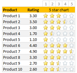
Whenever we talk about product ratings & customer satisfaction, 5 star ratings come to our mind. Today, let’s learn how to create a simple & elegant 5 star in-cell chart in Excel. Something like above.
Read on to learn how to create the above chart.
Continue »Conditional formatting is one of the most powerful & awesome features of Excel. It is very easy to setup. Naturally, people use it extensively. But the default conditional formatting rules can clutter your reports. Here is one tip that can declutter your reports.
Just show the formatting, not values.
See the above report.
Continue »![How to highlight overdue items [video]](https://chandoo.org/wp/wp-content/uploads/2015/08/highglight-overdue-items-howto.png)
We, adults can’t escape three things:
- Deadlines
- Demanding bosses (replace with customers or nagging spouses or naughty kids)
- Taxes
While I can’t help you with demanding bosses or taxes, when it comes to deadlines, I have the right tool for you.
A tracker that highlights all overdue items so that you know where to focus your attention.
Let’s learn how to use awesome powers of Excel to find-out which items are due. You can apply these concepts to nail down over due invoices, pending project tasks or scheduling workforce.
Continue »Ensure cleaner input dates with conditional formatting [quick tip]
![Ensure cleaner input dates with conditional formatting [quick tip]](https://chandoo.org/wp/wp-content/uploads/2015/05/cleaner-dates-demo.gif)
Here is a familiar problem: You create a workbook to track some data. You ask your staff to fill up the data. Almost all the input data is fine, except the date column. Every one types dates in their own format. Here is a fun, simple & powerful way to warn your users when they […]
Continue »


