All articles with 'charting' Tag
{ 13 Comments }
Revenue vs. Commission growth – Getting the message across [BYOD]
Published on Feb 17, 2015 in Analytics, Charts and Graphs
Situation: Our commissions are growing way faster than revenues
Let’s say you are looking revenues & sales commissions of your company for last few years. The data looks like this:

And you want to highlight the fact that commissions are growing faster than revenues.
So you plot YoY growth rates for revenues & commissions.
Problem: The chart of YoY growth rates is not convincing
Take a look at the chart. It doesn’t convey the message that we want. At best it says “revenue growth is less than commission growth”

How to convey the message “Commission growth is a problem for us”?
Continue »{ 2 Comments }
CP029: Impress your boss with Excel charts – 6 step road map for you
Published on Feb 5, 2015 in Chandoo.org Podcast Sessions, Charts and Graphs

Podcast: Play in new window | Download
Subscribe: Apple Podcasts | Spotify | RSS
In the 29th session of Chandoo.org podcast, let’s impress the boss with Excel charts.
What is in this session?
Many Excel charts live a short life. They spawn in an ambitious analyst’s spreadsheet. They go to boss with literally flying colors. The boss frowns, they disappear in to recycle bin.
Don’t curse your Excel charts with short life span.
Here is a 6 step road map to help you create awesome Excel charts, everytime.
That is our topic for this podcast session.
In this podcast, you will learn
- Quick announcements about 50 ways & Einstein
- 6 step road map for charting success
- ONE: Dig your data
- TWO: Validate insights
- THREE: Pick charts that go well
- FOUR: Add title & message
- FIVE: Remove clutter
- SIX: Prompt action
- A real life example with road map in action
- Resources for creating awesome charts
{ 15 Comments }
Creating In-cell charts with markers for average (or target) values
Published on Dec 3, 2014 in Charts and Graphs
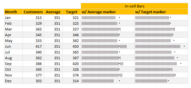
Today, lets talk about an interesting extension to the idea of in-cell charts. Adding average or target markers to the chart.
Adding a marker (like average or target or last year value) can enhance your charts greatly and provide more context. Lets understand how to add marker symbols to in-cell charts.
Continue »{ 12 Comments }
A better chart to visualize “Best places to live” – Top 100 cities comparison Excel chart
Published on Oct 8, 2014 in Charts and Graphs, Cool Infographics & Data Visualizations
Recently, I saw this chart on Economist website.
It is trying to depict how various cities rank on livability index and how they compare to previous ranking (2014 vs 2009).
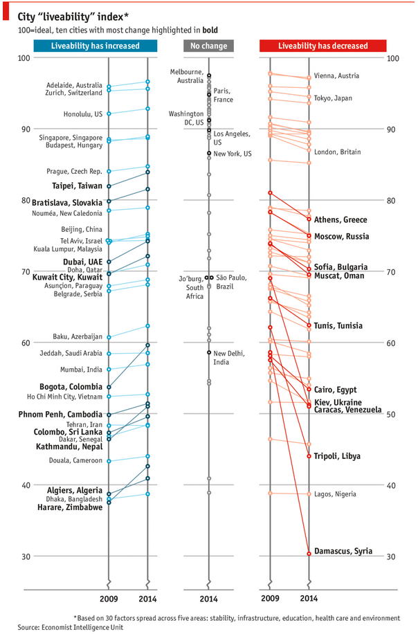
As you can see, this chart is not the best way to visualize “Best places to live”.
Few reasons why,
- The segregated views (blue, gray & red) make it hard to look for a specific city or region
- The zig-zag lines look good, but incredibly hard to understand % changes (or absolute changes)
- Labels are all over the place, thus making data interpretation hard.
- Some points have no labels (or ambiguous labels) leading to further confusion.
After examining the chart long & hard, I got thinking.
Its no fun criticizing someones work. Creating a better chart from this data, now thats awesome.
Continue »{ 43 Comments }
Mapping relationships between people using interactive network chart
Published on Aug 13, 2014 in Charts and Graphs

Today, lets learn how to create an interesting chart. This, called as network chart helps us visualize relationships between various people.
Demo of interactive network chart in Excel
First take a look at what we are trying to build.
Looks interesting? Then read on to learn how to create this.
Continue »
Ok people. Let me tell you that this post is almost not about Excel. It is about how one Excel blogger’s (yours truly) dream of long distance cycling came true. So sit back, grab your favorite drink and read between sips.
So what is this all about?
Last Sunday (27th July) & Monday (28th), I finished my first ever 200KM bicycle ride. I rode for a little more than 12 hours, burned 5,179 calories & rode 206 kilometers.
It is definitely one of the most memorable, tiresome & uplifting experiences in my life. So naturally, I want to share the story with you.
Continue »{ 2 Comments }
How fireworks animated chart is made [video tutorial]
Published on Jul 17, 2014 in Charts and Graphs, VBA Macros
On July 4th this year, I published an animated fireworks chart for you. Many of you liked it. Quite a few wanted to know how its made.
So here is a video explaining the construction of fireworks.
(You can see this video on our YouTube Channel too)
Continue »{ 39 Comments }
4th of July Fireworks – an Excel animation for you
Published on Jul 4, 2014 in Charts and Graphs, VBA Macros
To all our readers & friends from USA,
I wish you a happy, fun & safe 4th of July.
For the last 4th of July (2013), we (Jo, kids & I) were in USA. We went to Washington DC to meet up a few friends for that weekend. And we had one of the most memorable evenings of our lives when we went to national mall area in the evening to watch beautifully choreographed fireworks. Kids really loved the amazing display of fire-crackers and enthusiasm.
While we all are back in India this time, it doesn’t mean we cant celebrate 4th of July. So I made some fireworks. In Excel of course.
Here is a little Excel animation I made for all of us.
4th of July Fireworks – Excel animation
First watch this quick demo (<15 secs)
Continue »{ 4 Comments }
CP013: Is this a FIFA worldcup of late goals, lets ask Excel [How to analyze data to answer questions like these…]
Published on Jul 3, 2014 in Chandoo.org Podcast Sessions, Charts and Graphs
![CP013: Is this a FIFA worldcup of late goals, lets ask Excel [How to analyze data to answer questions like these…]](https://img.chandoo.org/podcast/session-013.png)
Podcast: Play in new window | Download
Subscribe: Apple Podcasts | Spotify | RSS
In the 13th session of Chandoo.org podcast, lets turn our attention to on-going FIFA worldcup and ask an important question.
What is in this session?
A week ago, we discussed “Has it been a late goal FIFA worldcup?” and used various charts & analysis techniques to answer the question. In podcast, lets tackle the same problem, understand various approaches to answer questions like these & shares some lessons for all the analysts.
{ 8 Comments }
A quick Excel tip for you while on a long bike trip…,
Published on Jul 1, 2014 in Charts and Graphs
Hi friends,
I have a surprise for you. Between the late night world-cup matches & my reinvigorated thirst for biking, I have difficulty finding time to write a long & detailed article for you. So I thought why not say hello to you and share an Excel tip while I am on a biking trip.
Go ahead and check it out. Its just 4 minutes.
Watch it below or on our YouTube channel.
Continue »{ 26 Comments }
Is this a FIFA worldcup of late goals? Lets ask Excel
Published on Jun 25, 2014 in Charts and Graphs
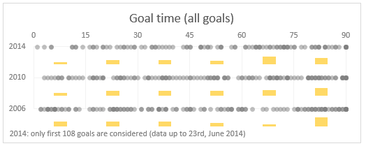
Just like millions of viewers around the world, I too have been spending hours watching FIFA world cup football matches on TV. I don’t like spending hours watching TV. But when its FIFA world-cup time (which is once every 4 years), I am glued to the idiot box. Blame it on PaWaRa, my school teacher in 8th grade who instilled this passion.
So while watching the match day before yesterday (it was Holland vs. Chile), the commentator said, “This has been a world-cup of late goals” as both teams maintained 0-0 until 77 minute mark when Leroy Fer scored a goal for Holland.
That got me thinking,
Is this really a world-cup of late goals?
But I quickly brushed away the thought to focus on the match.
Later yesterday, I went looking and downloaded all the goal data for 2006, 2010 & 2014 FIFA world-cup matches (2014 data for first 36 matches).
Lets examine the hypothesis “2014 has been a world-cup of late goals”.
Continue »{ 9 Comments }
Top 10 things we struggle to do in Excel & awesome remedies for them
Published on Jun 18, 2014 in Charts and Graphs, Learn Excel, Pivot Tables & Charts, Power Pivot, VBA Macros

Recently we asked you, what do you struggle doing in Excel? 170 people responded to this survey and shared their struggles. In this post, lets examine the top 10 struggles according to you and awesome remedies for them.
Continue »{ 24 Comments }
Create a line chart with bands [tutorial]
Published on May 5, 2014 in Charts and Graphs
![Create a line chart with bands [tutorial]](https://img.chandoo.org/c/line-chart-with-bands-to-depict-kpi-or-goals.png)
Here is an interesting scenario.
Imagine you are responsible for customer satisfaction at ACME Inc. Every month you track customer satisfaction rate for the 3 products you sell which are conveniently named Product A, B & C.
You also have bands for the satisfaction rating.
- Rating of 85% or below is Average
- Rating between 85% & 95% is OK
- Rating above 95% is good
At the end of the year, you want to visualize the ratings for last 12 months for 3 products along with bands.
Something like above.
Unfortunately, there is no “Insert Banded line chart” button in Excel. So what to do?
That is what we will learn today. Ready?
Continue »{ 4 Comments }
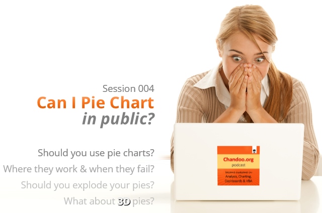
CP004: Can I Pie Chart in Public? Discussion about Pie charts, their merits and drawbacks, when to use & when to avoid them
Published on Apr 3, 2014 in Chandoo.org Podcast Sessions, Charts and Graphs
Podcast: Play in new window | Download
Subscribe: Apple Podcasts | Spotify | RSS
In the 4th session of Chandoo.org podcast, lets talk about Pie charts.
Pie charts evoke strong opinions among analysts & managers. Some people love them and can’t have enough of them in reports. Others despise them and go to any lengths to avoid them. And that is why we are going to talk about them in this session.
You will learn,
- Special, secret transmission from guest stars
- What is a pie chart?
- Why they work? 2 reasons
- Why they don’t work ? 4 reasons
- Cousins & siblings of Pie charts
- Donut charts
- Gauge charts (speedometer)
- 3D pies
- Area charts
- Bubble charts
- 4 Situations when making a pie chart is ok
- Alternatives to Pie charts
- Mistakes you should avoid
- About the resources
- Conclusions
{ 16 Comments }
Excel links – What is your next Excel book edition?
Published on Mar 5, 2014 in excel links

Outside of a dog, a book is a man’s best friend. Inside of a dog it’s too dark to read. -Groucho Marx
We don’t have a dog (yet), but we have a lot of books. Anytime I am in a bookshop, I feel like a mosquito in fat-camp. So you can imagine me smacking my lips when I saw your suggestions for favorite Excel books recently. There were more than 50 different books recommended by our readers. Of course I cannot buy all the 50 in one go. That would make Jo (my wife) angry. So I bought one that most of you recommended.
Ctrl + Shift + Enter by Mike Girvin
It is a book about array formulas, advanced formulas and data analysis techniques. I am eagerly waiting for the delivery to devour it. Once I am done with it, I will post a review here.
What about you? What Excel book are you reading now? Please share in comments.
Continue »
