All articles with 'Advanced Charting' Tag
{ 7 Comments }
CP014: How to create awesome dashboards – 10 step process for you
Published on Jul 10, 2014 in Chandoo.org Podcast Sessions, Charts and Graphs
Podcast: Play in new window | Download
Subscribe: Apple Podcasts | Spotify | RSS
In the 14th session of Chandoo.org podcast, lets figure out how to make awesome dashboards.
What is in this session?
Excel based dashboards are much in demand these days, thanks to advancements in Excel & growing pressure on costs. Now a days, analysts & managers are expected to quickly put together a dashboard using Excel. But how do you make a dashboard? What process you should follow? These are the questions we address in this podcast.
In this podcast, you will learn,
- Announcements about upcoming dashboard classes
- Ten step process for creating awesome dashboards
- 1. Talk to your end users
- 2. Make a sketch of the dashboard
- 3. Validate your understanding
- 4. Collect data
- 5. Structure the data
- …
Hello everyone. Stop reading further and go fetch your helmet. Because what lies ahead is mind-blowingly awesome.
About a month and half ago, we held our annual dashboard contest. This time the theme is to visualize state to state migration in USA. You can find the contest data-set & details here.
We received 49 outstanding entries for this. Most of the entries are truly inspiring. They are loaded with powerful analysis, stunning visualizations, amazing display of Excel skill and design finesse. It took me almost 2 weeks to process the results and present them here.
![]()
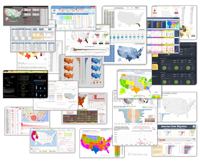
Click on the image to see the entries.
Continue »{ 11 Comments }
Combine pie and xy scatter charts – World Polls chart revisited
Published on Feb 4, 2014 in Charts and Graphs, Cool Infographics & Data Visualizations

Few days ago, we learned how to create a pie+donut combination chart to visualize polls around the world in 2014. It generated quite a bit of interesting discussion (47 comments so far). One of the comments was from Roberto, who along with Kris & Gábor runs The FrankensTeam an online library of advanced Excel tricks, charts and other mind-boggling spreadsheet wizardry.
I really liked Roberto’s comments on the original post and a charting solution he presented. So I asked him if he can do a guest post explaining the technique to our audience. He obliged and here we go.
Over to FrankensTeam.
Continue »{ 55 Comments }
Did Jeff just chart?
Published on Jan 27, 2014 in Charts and Graphs, Cool Infographics & Data Visualizations, Posts by Jeff

How do you segment customers by revenue easily in Excel, so that you can see which customer groups to focus on. Find out, and download this handy template.
In this charting example, Jeff, our guest author, occasional charter and Excel wizard shows us how to segment customers based on revenue and depict the result using Excel charts.
Continue »{ 58 Comments }
42% of the world goes to polls around a pie chart – Like it or hate it?
Published on Jan 10, 2014 in Charts and Graphs
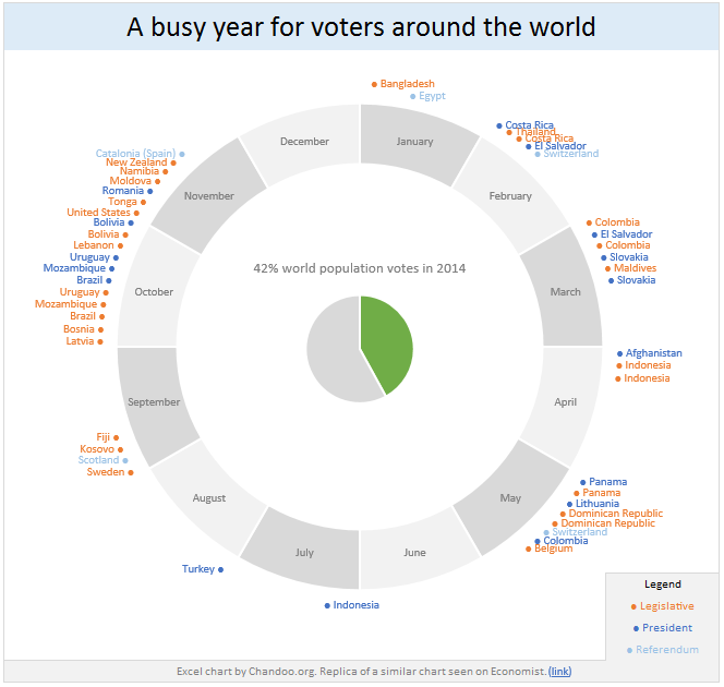
Today lets have a poll. Lets debate if this pie chart about world elections in 2014 is good or bad.
First lets take a look at the chart
This chart, published by The Economist talks about how 42% of the world population is going to vote this year. Take a look and read on to learn how you can re-create this in Excel.
Continue »{ 12 Comments }
Creating Triangular Plots using Excel
Published on Dec 9, 2013 in Charts and Graphs, Posts by Faseeh
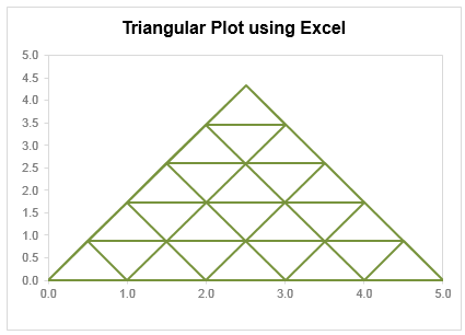
Triangular plot…! What is it?
Recently, a Chandoo.org forum member asked this,
‘I want to be able to make a graph that, in some aspects, looks like below, but I have no idea how to do it at all.’
After seeing it, I said to myself in Barney Stinson’s tone, ‘Challenge Accepted!‘
The final plot looks like above. Read on to learn how this is made.
Continue »{ 18 Comments }
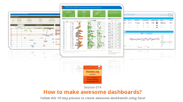
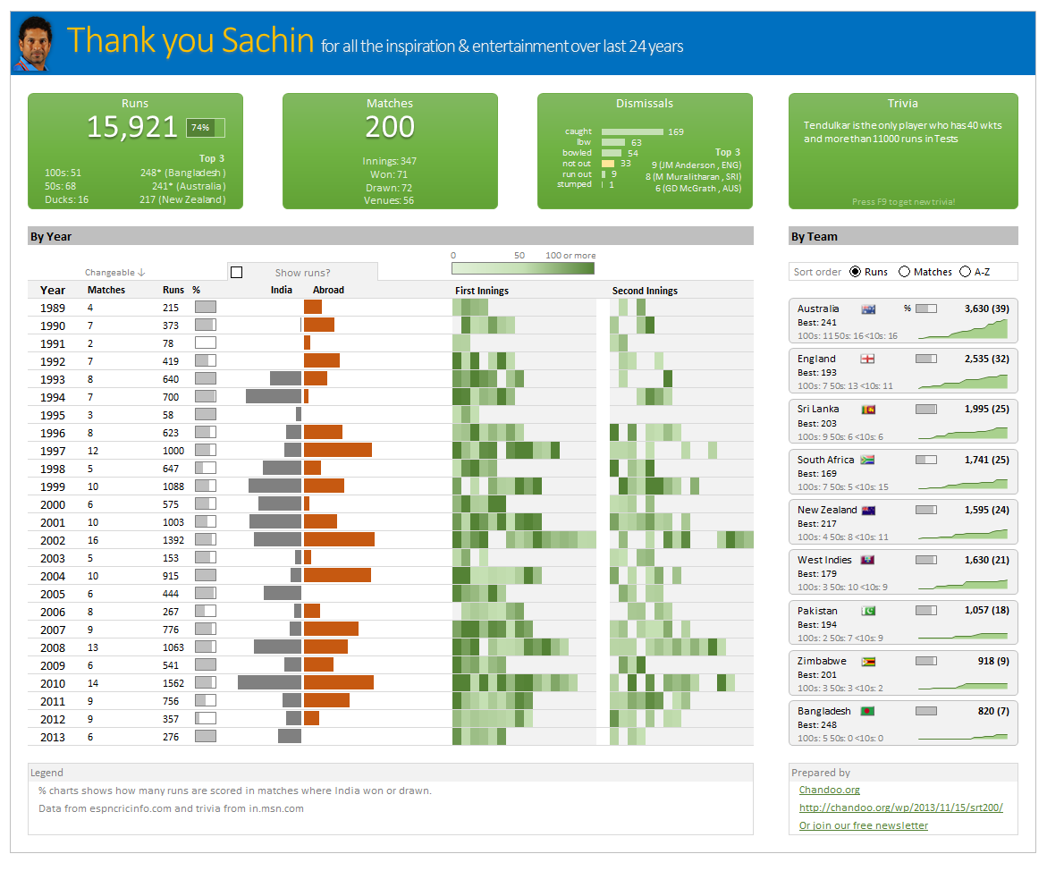
Thank you Sachin [a small tribute]
Published on Nov 15, 2013 in Charts and Graphs, Cool Infographics & Data Visualizations
Lets talk about people who inspire us. People who show us that anything is possible. People who prove that commitment, hard work and perseverance are true ingredients of a genius.
I am talking about Sachin Tendulkar. Those of you who never heard his name, he is the most prolific cricketer in the world. He is the leading scorer in both tests (15,921 runs) and one day matches (18,426 runs). Read more about him here.
Tendulkar has been an inspiration for me (and millions of others around the world) since I was a kid. The amount of dedication & excellence he has shown constantly motivates me. It is a pity that the great man is retiring from test cricket. He is playing his last test match (200th, most by any person) as I am writing this.
So as a small tribute, I have decided do something for him. Of course, I have never been a cricketer in my life. Once in college I was reluctantly asked to be a stand-by player in a game with seniors. I did not get a chance to pad up though. That is the closest I have been to a cricketer. So I did what I do best. Create an Excel workbook celebrating Sachin’s test career.
Thank you Sachin – his test career in a dashboard
Here is a dashboard I made visualizing his test cricket statistics. It is dynamic, fun & awesome (just like Sachin).
(click on the image to enlarge)
{ 8 Comments }
Closing gaps in this Gender Equality Gap chart…
Published on Nov 5, 2013 in Charts and Graphs
Today lets close some gaps.
Recently I saw this interesting chart on Economist Daily Charts page. This chart is based on World Economic Forum’s survey on how women compare to men in terms of various development parameters. First take a look at the chart prepared by Economist team.
So what are the gaps in this chart?
This chart fails to communicate because,
- All country charts look same, thus making it difficult to spot any deviations.
- We cannot quickly compare one country with another on any particular indicator.
- It does not provide a better context (for eg. how did these countries perform last year?)
But criticizing someone’s work is not awesome. Fixing it and making an even better chart, that has awesome written all over it. So that is what we are going to do. You can see the improved chart above. Click on it to learn how you can create it.
Continue »{ 40 Comments }
How to create a Then vs. Now interactive chart in Excel?
Published on Aug 6, 2013 in Charts and Graphs
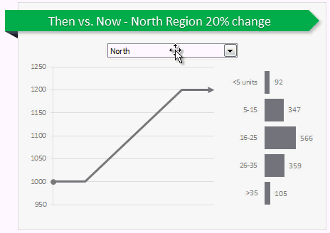
You have been there before.
Trying to compare last year numbers with this year, or last quarter with this quarter.
Today, let us learn how to create an interactive to chart to understand then vs. now.
Demo of Then vs. Now interactive chart
First, take a look the completed chart below. This is what you will be creating.
Continue »{ 35 Comments }
How to create a column chart with background image in Excel ?
Published on May 6, 2013 in Charts and Graphs, Excel Howtos
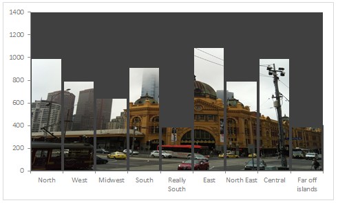
Tony sends this chart and asks if it can be done in Excel.
It sounded like a good challenge for a lazy Sunday morning. So here we go. (Posting it on Monday).
Now I could not get an oil rig photo or that data. So I made up few numbers and used a photo of Flinders street station I took when I was in Melbourne last year.
Continue »{ 18 Comments }
Use Advances vs. Declines chart to understand change in values
Published on Feb 21, 2013 in Charts and Graphs
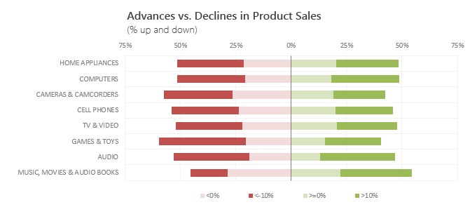
Lets say you are responsible for sales of 100s of products (which belong to handful of categories). You are looking at sales of each product in last month & this month. And you want to understand whether sales are improving or declining by category. How would you do it?
Turns out, this is not a difficult problem. In fact, this question is asked every day & answered using Advances vs. Declines chart.
You may have seen this chart in financial newspapers or websites. Shown above, Advances vs. Declines chart tells us how many items have advanced & how many have declined.
Read on to learn how to create this chart using Excel.
Continue »{ 19 Comments }
Shading above or below a line in Excel charts [tutorial]
Published on Feb 13, 2013 in Charts and Graphs
![Shading above or below a line in Excel charts [tutorial]](https://img.chandoo.org/c/shaded-line-charts-tell-a-better-story.png)
When comparing 2 sets of data, one question we always ask is,
- How is first set of numbers different from second set?
A classic example of this is, lets say you are comparing productivity figures of your company with industry averages. Merely seeing both your series as lines (or columns etc.) is not going to tell you the full story. But if we can shade our productivity line in red or green when it is under or above industry average… now that would be awesome! Something like above.
Continue »{ 38 Comments }
How the tax burden has changed over the years – Excellent chart by NYTimes & Redoing it in Excel
Published on Dec 6, 2012 in Charts and Graphs
If I need some charting inspiration, I always visit New York Times. Their interactive visualizations are some of the best you can find anywhere. Clear, beautifully crafted and powerful. Long time readers of Chandoo.org knew that I like to learn from visualizations in NY Times & redo them using Excel.
Today let me present you one such chart. This is based on an interactive visualization prepared by NY Times explaining how the tax burden has changed over years for various income groups.
Take a look at tax burden chart – Excel implementation
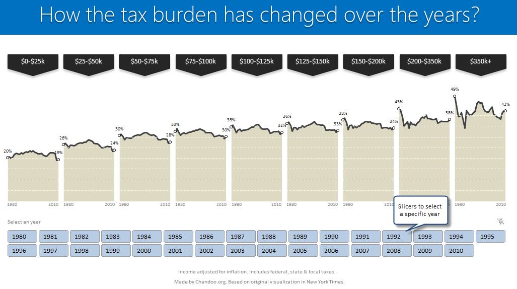
Read on to learn how to create this chart using Excel.
Continue »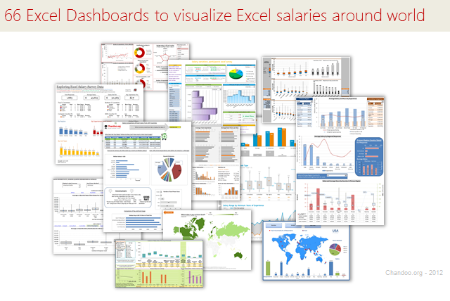
Ladies & gentleman, put on your helmets. This is going to be mind-blowingly awesome.
See how many different ways are there to analyze Excel salary data. Look at these 66 fantastic, beautifully crafted dashboards and learn how to one up your dashboard awesomeness quotient.
Continue »{ 21 Comments }
Data and Calculations for our Customer Service Dashboard [Part 2 of 4]
Published on Mar 14, 2012 in Charts and Graphs, Cool Infographics & Data Visualizations, Learn Excel
![Data and Calculations for our Customer Service Dashboard [Part 2 of 4]](https://img.chandoo.org/dashboards/variables-in-our-customer-service-dashboard.png)
Welcome back. In part 2 of Making a Customer Service Dashboard using Excel let us learn how the data & calculations for the dashboard are setup.
Designing Customer Service Dashboard
Data and Calculations for the Dashboard
Creating the dashboard in Excel
Adding Macros & Final touches
In this installment, we will examine all the variables, named ranges & various formulas that drive our dashboard. Also, you can download the full dashboard workbook and play with it to examine these formulas and learn better.
Continue »
