KPI performance charts & dashboards – 43 alternatives (contest entries)
Hello all, prepare to be amazed! Here are 43 creative, fun & informative ways to visualize KPI data.
About a month ago, I asked you to visualize KPI data. We received 65 entries for this contest. After carefully reviewing the entries, our panel of judges have discarded 22 of them due to poor charting choices, errors or just plain data dumps. We are left with 43 amazing entries, each creatively analyzed the data and presented results in a powerful way.
How to read this post?
This is a fairly large post. If you are reading this in email or news-reader, it may not look properly. Click here to read it on chandoo.org.
- Each entry is shown in a box with the contestant’s name on top. Entries are shown in alphabetical order of contestant’s name.
- You can see a snapshot of the entry and more thumbnails below.
- The thumb-nails are click-able, so that you can enlarge and see the details.
- You can download the contest entry workbook, see & play with the files.
- You can read my comments at the bottom.
- At the bottom of this post, you can find a list of key charting & dashboard design techniques. Go thru them to learn how to create similar reports at work.
Thank you
Thank you very much for all the participants in this contest. I have thoroughly enjoyed exploring your work & learned a lot from them. I am sure you had fun creating these too.
So go ahead and enjoy the entries.
Happy Diwali for all our readers – Animated Flower Pot Cracker in Excel for you…
Today is Diwali, the festival of lights. I wish you and your family a happy, bright and prosperous festive time. May your house shower with lots of light, laughter and love.
Diwali is one of my favorite festivals. It is a time when all family members get together, eat delicious food, laugh to hearts content and light up diyas (small oil lamps) to celebrate the victory of good over evil. This year, my kids (who are 6 yrs btw) are very excited about the festival. They are looking forward to lighting up diyas and crackers (fire works).
To celebrate the holiday, I made something for you.
An animated flower pot firework in Excel.
Cropped chart: when some values are too big to fit
We know that column charts are excellent for presenting information. But what if some of the columns are too tall and hijacking the rest. In a previous article, we discussed few of the approaches. Today let’s learn how to build a cropped chart (broken y-axis chart) using Excel, something like above.
Looks interesting? Read on.
Shading an area chart with different colors for up & down movements [case study]
We all know that area charts are great for understanding how a list of values have changed over time. Today, let’s learn how to create an area chart that shows different colors for upward & downward movements.
The inspiration for this came from a recent chart published in Wall Street Journal about Chinese stock markets.
We will try to create a similar chart using Excel. We are going to create the above chart in Excel.
Looks interesting? Read on…
Narrating the story of change using Excel charts – case study

Here are three questions you often hear from your boss:
- What changes are happening in our business and how do they look?
- Do you know how to operate this new coffee machine?
- Why does every list has 3 items?
Jokes aside, our urge to find change in environment predates cave drawing, slice bread and Tommy Lee Jones. So, today let’s examine a very effective chart that tells the story of change and re-create it in Excel.
Conditionally Format Chart Backgrounds
Learn two techniques to conditionally format the background of a chart based on some external value.
A better chart to visualize “Best places to live” – Top 100 cities comparison Excel chart
Recently, I saw this chart on Economist website.
It is trying to depict how various cities rank on livability index and how they compare to previous ranking (2014 vs 2009).
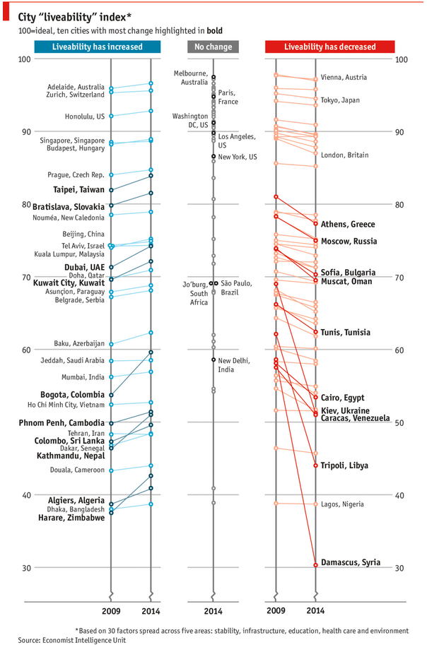
As you can see, this chart is not the best way to visualize “Best places to live”.
Few reasons why,
- The segregated views (blue, gray & red) make it hard to look for a specific city or region
- The zig-zag lines look good, but incredibly hard to understand % changes (or absolute changes)
- Labels are all over the place, thus making data interpretation hard.
- Some points have no labels (or ambiguous labels) leading to further confusion.
After examining the chart long & hard, I got thinking.
Its no fun criticizing someones work. Creating a better chart from this data, now thats awesome.