Excel Charts, Graphs and Templates
Tutorials, Examples and explanations on Excel charting. You can learn how to create almost any chart type in this section. Also learn how to create effective charts, make them interactive and add automation thru VBA
Dashboard best practice: Highlight user selection [video] |
|
![Dashboard best practice: Highlight user selection [video]](https://cache.chandoo.org/images/c/excel-charting-example-v1.png)
|
Here is a best practice to improve your dashboard usability. If you have an interactive dashboard, highlight user selections thru conditional formatting. Check out below quick video to understand what this means. |
Give descriptive titles to your charts for best results |
|

|
Here is a simple & effective tip on charting. Give your charts descriptive & bold titles. How to set up title that are smart & descriptive?Simple, follow below steps.
|
In-cell 5 star chart – tutorial & template |
|

|
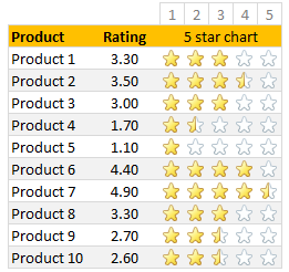
Whenever we talk about product ratings & customer satisfaction, 5 star ratings come to our mind. Today, let’s learn how to create a simple & elegant 5 star in-cell chart in Excel. Something like above. Read on to learn how to create the above chart. |
Work with charts faster using selection pane & select object tools [quick video tip] |
|
![Work with charts faster using selection pane & select object tools [quick video tip]](https://cache.chandoo.org/images/c/excel-charting-example-v1.png)
|
Working with multiple charts (or drawing shapes / images) can be a very slow process. But here is a secret to boost your productivity. Use selection pane & select object tools Selection Pane & Select Objects? If you have never heard of these, don’t worry. These are 2 very powerful features hidden in Excel. Once you know how to unlock them, you will never look back. How to use selection pane & select object tools to work with charts faster – VideoIn this video, understand how to use these powerful features to work with charts faster. |
Make bar charts in original order of data for improved readability [charting tip] |
|
![Make bar charts in original order of data for improved readability [charting tip]](https://chandoo.org/wp/wp-content/uploads/2015/08/fixing-bar-chart-order-for-better-readability.png)
|
To make friends in a new town hit the bars – Old saying. Bar charts (or column charts if you like your data straight up) are vital in data analysis. They are easy to make. But one problem. By default, a bar chart show the original data in reverse order. See the above example. Unfortunately, we humans read from top to bottom, not the other way around. |
Use shapes to enhance your Excel charts [tip] |
|
![Use shapes to enhance your Excel charts [tip]](https://chandoo.org/wp/wp-content/uploads/2015/08/use-shapes-to-enhance-your-charts.png)
|
Here is a simple way to enhance your Excel charts – use shapes & pictures in your charts. We will learn how to create something like above. Looks interesting? Read on… |
CP041: 6 charts you’ll see in hell – v2.0 |
|

|
Podcast: Play in new window | Download Subscribe: Apple Podcasts | Spotify | RSS In the 41st session of Chandoo.org podcast, Let’s take a trip to data hell and meet 6 ugly, clumsy, confusing charts. I am revisiting a classic Chandoo.org article – 6 Charts you will see in hell. What is in this session?In this podcast,
|
How to create dynamic sparklines for latest 30 days [video] |
|
![How to create dynamic sparklines for latest 30 days [video]](https://chandoo.org/wp/wp-content/uploads/2015/08/dynamic-sparklines-v2.png)
|
Sparklines are fun and very insightful. They are easy to create, easy to maintain and fit into any dashboard. But there is one tiny problem with them. Usually we have a lot of data, but we don’t to visualize all of it. We just want to visualize latest 30 days trend or last 12 months trend or QTD or something similar. What then? In this video, learn a powerful and very simple way to create dynamic sparklines using Excel. |
Shading an area chart with different colors for up & down movements [case study] |
|
![Shading an area chart with different colors for up & down movements [case study]](https://chandoo.org/wp/wp-content/uploads/2015/07/indian-stock-market-chart.png)
|
We all know that area charts are great for understanding how a list of values have changed over time. Today, let’s learn how to create an area chart that shows different colors for upward & downward movements. The inspiration for this came from a recent chart published in Wall Street Journal about Chinese stock markets. We will try to create a similar chart using Excel. We are going to create the above chart in Excel. Looks interesting? Read on… |
CP038: Data to Ink Ratio – What is it, How to optimize it, Techniques & Discussion |
|

|
Podcast: Play in new window | Download Subscribe: Apple Podcasts | Spotify | RSS In the 38th session of Chandoo.org podcast, Let’s optimize data to ink ratio of your charts. What is in this session? In this podcast,
|
15 Quick & powerful ways to analyze business data |
|

|
Here is a situation all too familiar. You are looking at a spreadsheet full of data. You need to analyze and tell a story about it. You have little time. You don’t know where to start. Today let me share 15 quick, simple & very powerful ways to analyze business data. Ready? Let’s get started. |
CP036: How to do trend analysis using Excel? |
|

|
Podcast: Play in new window | Download Subscribe: Apple Podcasts | Spotify | RSS In the 36th session of Chandoo.org podcast, Let’s follow the trend. What is in this session?In this podcast,
|
Changing stubborn opinions with visualizations [case study] |
|
![Changing stubborn opinions with visualizations [case study]](https://chandoo.org/wp/wp-content/uploads/2015/05/family-income-vs-college-enrollment-nytimes.png)
|
We, analysts take pride in the fact that we tell stories. But what if you have a boss, client or colleague who wouldn’t buy the story? This is a problem we face often. Let’s say your boss has stubborn opinion about something, like more advertising leads to more sales. You know the data doesn’t support this theory. But how do you change your boss’ mind? Here is an interesting way, showcased in NY Times recently. |
Narrating the story of change using Excel charts – case study |
|

|
Here are three questions you often hear from your boss:
Jokes aside, our urge to find change in environment predates cave drawing, slice bread and Tommy Lee Jones. So, today let’s examine a very effective chart that tells the story of change and re-create it in Excel. |
Use arrow keys to select small, unreachable chart series [quick tip] |
|
![Use arrow keys to select small, unreachable chart series [quick tip]](https://chandoo.org/wp/wp-content/uploads/2015/04/use-arrow-keys-to-select-chart-elements.gif)
|
Here is a fairly annoying problem. Imagine a chart showing both sales & customer data. Sales numbers are large and customer numbers are small. So when you make a chart with both of these, selecting the smaller series (customers) becomes very difficult. In such cases, you can use arrow keys – as shown above. |
CP032: Rules for making legendary column charts |
|

|
Podcast: Play in new window | Download Subscribe: Apple Podcasts | Spotify | RSS In the 32nd session of Chandoo.org podcast, let’s make legendary column charts. What is in this session?Column charts are everywhere. As analysts, we are expected to create flawless, strikingly beautiful & insightful column charts all the time. Do you know the simple rules that can help you create legendary column charts? That is our topic for this podcast session. In this podcast, you will learn
|
Conditionally Format Chart Backgrounds |
|

|
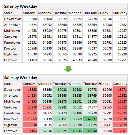
Learn two techniques to conditionally format the background of a chart based on some external value. |
Formatting shortcuts for keyboard junkies |
|

|
A lot of analysts swear strong allegiance to keyboard shortcuts. But when it comes to formatting a spreadsheet, these shortcuts go for a toss as formatting is a mouse-heavy activity. But we can use a few simple & effective shortcuts to zip through various day to day formatting tasks. Let me share my favorite formatting shortcuts. |
Celebrate Holi with this colorful Excel file |
|

|
Today is Holi, the festival of colors in India. It is a fun festival where people smear each other with colors, water balloons, tomatoes and sometimes rotten eggs. This year we wanted to play with only water guns, but kids vetoed that idea vehemently. So we ended up driving to my sister-in-law’s place to play with colors (there were no rotten eggs or tomatoes, thankfully). Let me smear a few colors on you I would love to splash a jug full of color water on you and say Happy Holi. But the internets have not advanced thus far. So I am going to give you the next best option. An Excel workbook to play holi |
Revenue vs. Commission growth – Getting the message across [BYOD] |
|
![Revenue vs. Commission growth – Getting the message across [BYOD]](https://cache.chandoo.org/images/c/excel-charting-example-v1.png)
|
Situation: Our commissions are growing way faster than revenues
And you want to highlight the fact that commissions are growing faster than revenues. So you plot YoY growth rates for revenues & commissions. Problem: The chart of YoY growth rates is not convincing Take a look at the chart. It doesn’t convey the message that we want. At best it says “revenue growth is less than commission growth”
How to convey the message “Commission growth is a problem for us”? |


