
This post is part of Excel Dashboard Week
Background:
In 2008, I received an email from Robert Mundigl, which was the start of a life-long friendship. Robert asked me if he can teach us how to make KPI dashboards using Excel. I gladly said yes because I am always looking for new ways to use Excel.
The original KPI dashboards using Excel article was so popular. They still help around 12,000 people around the globe every month. Many of our regular readers and members have once started their journey on Chandoo.org from these articles.
In this article, we will revisit the dashboard and give it a fresh new spin using Excel 2007.
KPI Dashboard – Reconstructed in Excel 2007
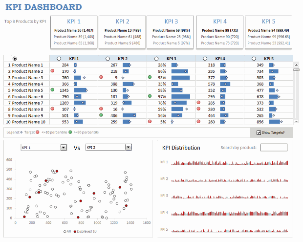
KPI Dashboard – Snapshot
First, take a look at the dashboard I have constructed. This uses almost the same data as Robert’s original dashboard, but adds a lot of new features etc.
KPI Dashboard – Demo Video
How is this KPI Dashboard Constructed?
It would take me 2300 words and 7 cups of coffee to type out the entire instruction. So I will instead tell you what new things I have added to it and how they are done.
Note: For a detailed step-by-step instruction, please consider joining Excel School because this is a 3 part, 120 minute lesson in our class.
Changes to the KPI Dashboard:
I have made the following changes to the original dashboard:
- Added a top bar where we show top 3 products in each KPI
- Added ability to restore to original sort order (as per the input data in Data sheet)
- Instead of showing triangle arrows, used conditional formatting arrow icons – green for values >=90th percentile and red for <= 10th percentile for any given KPI.
- Added individual KPI targets by product (instead of same KPI targets for all products). Also, changed the bar chart visualization to show target markers.
- Added ability to switch on/off the target indicators.
- Added a KPI distribution chart and ability to search by any product.

How are these changes made?
Restoring original sort-order:
For this, I have used the product numbers (values 1 to 100) in Data sheet and sorted them on ascending order. When you click on the product column’s sort button, in the background I just use the product numbers column to sort the KPIs.
Percentile Indicators:
This is the same technique as alert icons in dashboard. Just that I also showed green icons.
Turning on / off the KPI target indicators:
Based on the check-box setting, I return #N/A (thru NA() formula) or actual target value to the chart’s source data range. Rest of the puzzle, you can figure out.
The technique is also explained here: Dynamic Excel Chart with Checkboxes.
Search by Product & Highlight KPI values:
For this I have used an active-x text box and linked it to a cell (L22). Then, I used COUNTIF with wild-card search to locate if a product matches the input or not. [More on the wild-card search technique]
KPI Distribution Chart:
This is an area chart, re-sized to fit inside the space. The red-lines are y-error bars and they are drawn for products that match the search criteria.
Download the KPI Dashboard Workbook
Click here to download the Excel workbook with the KPI Dashboard.
Thanks you Robert:
Special thanks to Robert for such a beautiful dashboard. Visit his clearlyandsimply blog to get some more awesome dashboard / Excel ideas.
How would you have designed the KPI Dashboard?
Share your views on the above dashboard. Also, tell me how you would have designed the same. What charts / tables will you retain. What will you remove and what will you add.
Share your ideas using comments.
More Resources on Excel Dashboards:
- Excel Dashboards – Lots of examples, information and downloads.
- Sales Dashboards – 32 Examples & Download workbooks
- KPI Dashboards using Excel – 6 part tutorial
- Dynamic Dashboards in Excel – 4 part tutorial
- Excel School Dashboard Program – Learn how to make world-class dashboards using Excel


