All articles with 'dashboard week' Tag
{ 15 Comments }
Learning Dashboards? – Go thru these 33 Recommended Resources
Published on Mar 25, 2011 in Charts and Graphs, Learn Excel
During last one week, we had a gala time with Dashboard Week on chandoo.org. To wrap-up the week, I am sharing a list of recommended resources, websites, tutorials & ideas for making dashboards.
Recommended Resources on Making Dashboards:
I have broken down this post in to various sections. Click on the links to quickly access the part you want to know or just keep scrolling to get the whole thing.
- Books on Dashboards
- Websites for Learning about Dashboards
- Dashboard Training Programs
- Add-ins & Software to Make Dashboards
- Dashboard Tutorials & Downloads on Chandoo.org
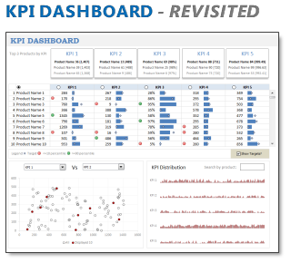
In 2008, I received an email from Robert Mundigl, which was the start of a life-long friendship. Robert asked me if he can teach us how to make KPI dashboards using Excel. I gladly said yes because I am always looking for new ways to use Excel.
The original KPI dashboards using Excel article was so popular. They still help around 12,000 people around the globe every month. Many of our regular readers and members have once started their journey on Chandoo.org from these articles.
In this article, we will revisit the dashboard and give it a fresh new spin using Excel 2007.
Continue »{ 8 Comments }
Executive Review Dashboard in Excel [Dashboard Week]
Published on Mar 23, 2011 in Charts and Graphs
![Executive Review Dashboard in Excel [Dashboard Week]](https://chandoo.org/img/dashboards/dw/executive-review-dashboard-in-excel.png)
Purpose of the dashboard:
This is a guest article written by John for our Excel Dashboard Week.
This Dashboard was constructed for a number of reasons, one of which was to reduce the number of reports produced with the same data ( up to 6 separate files ). As we all know, when it comes to senior management and reports / files the more information they can get on one report / file the better for them. So, with this in mind I created the Dashboard to show the data they need to see “quickly” each week.
Continue »{ 29 Comments }
Customer Service Dashboard using Excel [Dashword Week]
Published on Mar 22, 2011 in Charts and Graphs
![Customer Service Dashboard using Excel [Dashword Week]](https://img.chandoo.org/dashboards/dw/customer-service-dashboard-excel.png)
Early in Jan, I got this mail from Mara, a student in Excel School first batch.
Hi Chandoo,
I took your first Excel batch class and loved it. I created a dynamic and interactive dashboard for my work. My boss thinks it’s an excellent tool and I have you to thank for and also Francis Chin who shared his travel dynamic dashboard. I integrated things you taught so thanks so much!
I felt very proud reading her email, so I asked her if she can share the dashboard with some dummy data so that we all can learn from her example.
Being a lovely person Mara is, she gladly emailed me the workbook and I am thrilled to include it in Dashboard Week.
Continue »{ 5 Comments }
Health-care Dashboard in Excel [Dashboard Week]
Published on Mar 22, 2011 in Charts and Graphs
![Health-care Dashboard in Excel [Dashboard Week]](https://img.chandoo.org/dashboards/dw/health-care-dashboard-small.png)
As part of Dashboard Week, in this post, we will take a look at Health-care Dashboard prepared and shared by Alberto. He put together an excellent dashboard to visualize hospital performance and understand what is going on. Read this post to understand how this dashboard is made, watch a tutorial video & download example workbook.
Thank you Alberto for sharing the file & helping us learn.
Continue »{ 10 Comments }
Announcing Dashboard Week – Submit your entries now!
Published on Mar 21, 2011 in blogging, Charts and Graphs

Hello there,
I am glad to announce this week (21-25 March, 2011) as Dashboard Week on Chandoo.org
What happens in Dashboard Week?
As you can guess, during this week, I will be posting exclusively about Excel Dashboards. This is the tentative agenda … []

