
This is a guest post by Myles Arnott from Clarity Consultancy Services – UK.
In this and next 3 posts, we will learn how to make a Dynamic Dashboard using Microsoft Excel.
At the end of this tutorial, you will learn how easy it is to set up a dynamic dashboard using excel formulas and simple VBA macros.

[Click here for large version of the image]
Introduction:
The dashboard also demonstrates the standard approach I use in all of my models which is to incorporate three key sheets in addition to the data and analysis tabs.
These are:
- Home page
- Inputs (or drivers)
- Helpsheet
The dynamic dashboard can be downloaded here [mirror, ZIP Version]
The dashboard file works in Excel 2007+. Pls. enable macros to get it work.
The plan is to break this dashboard tutorial down into four parts over the next four weeks. If further topics fall out as a result of discussions either Chandoo or I will pick them up and if necessary post further parts.
- Part 1: Introduction & overview
- Part 2: Dynamic Charts in the Dashboard
- Part 3: VBA behind the Dynamic Dashboard a simple example
- Part 4: Pulling it all together
I would like to take a quick opportunity to give credit for some of the elements of functionality in the model:
- Boxcharts – Chandoo [Link]
- Scrolling report – Chandoo [Link]
- Competitor analysis – Chandoo [Link]
- Use of camera tool – Chandoo [Link]
- In cell microcharts – Chandoo [Link]
- Helpsheet – John Walkenbach
Okay so lets get started with an overview:
What is the objective of the report?
The Dynamic Dashboard is intended to provide pertinent summary information to aid management decision making. Combining a high level of flexibility within each report and then allowing the user to choose which reports to include and where to position them allows an enormous amount of flexibility over the message to be communicated.
What does this Dynamic Dashboard do?
The dynamic dashboard allows the user to select a report from the range of reports within the model and decide where to position it on the page. The user can select “hide” to hide a report that they do not want to see or select “view” to preview it prior to choosing its position.
- Clicking on either the hyperlink name or the report image will take you to the report.
- Each report is highly flexible allowing the user to cut the data in many ways to show management the most pertinent information.
Overview of Dashboard Tabs:
Home Page
I always include a homepage in my models and often set an auto_open routine to select this as the first page seen on opening. The Home page is designed to present the contents of the model to the user and provide links to each page for easy navigation.

The Dynamic Dashboard
This is the main tab for pulling together the dashboard and will be covered in parts 3 and 4.
Inputs
This is the page for all validation lists and drivers.

Help Sheet
Once again a sheet that is in all of my models. This user form based help sheet provides the user with a quick help function and complements the accompanying user notes. I find it helpful to lay it out in tab order.

This is how the Help user form looks once opened. The user can either choose the topic from the dropdown or by clicking next.

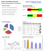
Chart 1 and 2 : Flexible pie charts
Dynamic pie charts with the option to select the KPI, period and product/salesperson to be analyzed. These are covered in part 2.

Chart 3 & 4: Flexible line charts
Dynamic line charts with the option to select the KPI, period and product/salesperson to be analyzed. These are also covered in part 2.

Chart 5: Box Chart
Details on how to create these box charts.

Chart 6: Scrolling Report of KPIs
Chandoo’s blog on how to create this scrolling report can be found here. Micro charts which is of my favorite blogs from Chandoo are covered here.

Chart 7: Scrolling Comparison Chart
Details on how to create this scrolling chart.

Chart 8 : Executive Summary
A simple executive summary. Please see Chandoo’s article on a twitter board for an alternative view.

So that was an overview of the model and its main tabs.
What Next?
Next week we will look at Part 2 of this series and learn how to construct dynamic charts.
Download the complete dashboard
Go ahead and download the dashboard excel file. The dynamic dashboard can be downloaded here [mirror, ZIP Version]
It works on Excel 2007 and above. You need to enable macros and links to make it work.
Added by PHD:
Myles has taken various important concepts like Microcharts, form controls, macros, camera snapshot, formulas etc and combined all these to create a truly outstanding dashboard. I am truly honored to feature his ideas and implementation here on Chandoo.org. I have learned several valuable tricks while exploring his dashboard. I am sure you would too.
If you like this tutorial please say thanks to Myles.
Related Material & Resources
- Excel Dashboards – Tutorials & Templates Section of PHD
- 6 Part Tutorial on Making KPI Dashboards in Excel
- Recommended Product: Jorge Camoes’ Dashboard Training Kit
This is a guest post by Myles Arnott from Clarity Consultancy Services – UK.


35 Responses
Thanks, Myles. I’m looking forward to the next installment. Get that baby some milk 🙂
@Tom… the baby is not Myles’. It is my sweetie, Nakshatra. I recorded the demo vid.
Myles congrats!
Chandoo – awesome post once again – you totally rock and yeah hope Nakshatra is not crying now 🙂
Oddly enough, I was just thinking the other day about building a dashboard like this. I look forward to seeing the finished example. Could you post it in 2003?
@Chandoo…sorry for the mix-up. I love her name!
Awesome! Thanks Myles and PHD … you guys rock
HI Chandoo,
Need some guidance on a problem I have been trying to tackle (but gave up and put it on deep freeze)
Here is my situation: I want to do a certain data manipulation and caluclations to stcok market data from BSE India.com but when I import the data into excel, the data does not get imported. I guess, this is due to ASP page.
Can you tell me how can I import the data into excel? The ultimate purpose being to do calculations on the same.
Thanks and best regards,
J
JB
Have you tried importing data from Yahoo Finance,
use the .BO extension for the Bombay exchange
eg DLF.BO as the stock code etc
Hi Chandoo,
Congrats on you baby daughter… Nakshatra! Sweet Star.
@Hui: I need several other data like marketcap, real-time which I am not sure if I can take from Yahoo. And one app I built using Yahoo is freaky in the sense, it starts and stops working for inexplicable reasons. But I would be open to work with Google Finance. Any ideas on either one of them.
Thanks,
Hello,
I ran upon your site and think it would be extremely useful if only it applied to Excel 2003. Is it possible to post these tutorials for Excel 2003 ASAP? I am working on a summer project and could really use this help. However, when I download the dynamic dashboard I can’t explore much of the functionality because it doesn’t conver to an older version. Please advise!
Hi, can you let me know if there is a download version for Excel 2003.
Thanks in anticipation
@PB Intern
I commiserate with you but a lot of the fancy dashboard stuff is only available with improved and new functionality not available with older versions of Excel.
Follow the basics and read the tutorials and you can still go a long way with 2003.
Keep asking questions here for assistance where you need it specifically.
I have been working on this dashboard: ” Dynamic Dashboard using Microsoft Excel” by Myles Arnott.
Does anybody know what tool is for help button? And how is this linked to a form?
Do we drop the form in helpsheet and then link the button help into it?
I can partially understand what is going on and I understand the code which is written for help button, which says:
Sub ShowHelp()
FormHelp.Show
End Sub
Please help me with this.
Regards,
Guity
Hello Chandoo,
This is really very helpful and good .
Have a look at the interactive Excel/VBA dashboard I made a few years ago. It’s quite different from the one you’re proposing here as it mimics the user-interface of QlikView: http://www.qlikfix.com/2011/03/16/excel-and-vba-the-poor-mans-qlikview/
Hello Chandoo,
I need to create powerpoint Dashboard from the pivot Values every week . The Weekly Report Contains 12-Week data, every week new pivot values should be updated to that report. It takes lot of time to do this. Can you suggest possible Way to do it rather than updating it manually every week through Interactive or Dynamic Dashboards or different means to do it.
@Sera
Have you had a look at: http://chandoo.org/wp/2011/08/03/create-powerpoint-presentations-using-excel-vba/
Hi Chandoo,
I just ran across your sir just now and I really like everything of it. I am planning to do some of your ideas in my project management task, cause I always get lost of track of all the excel sheets I have for issues&taks. But I am not really that skillful of excel, until now I realize it is a great tool to use in keeping track of projects. I really wan to make all those you said in your project management tutorial (1-6). Its really going to be helpful to me and by boss.
At work I use 2007, at home I have 2010.
Q1: can you achieve the same in MS Excel 2010?
Also, any tips for me on how to start effectively managing projects using excel?
Thanks.
I forgot to ask,
can you do this in google docs excel sheet? or possibly import it to google excel? so that I can share it to the team and they can just view it?
Thanks.
I need few tutorials from you to create a Dynamic Dashboard on Managed Print Services. We can discuss this through email/phone.
This is a lucrative project. Just let me know if we discuss this in detail.
Thanks & regards,
Sanchit Gupta,
Business Consultant – ARC
Hi Chandoo,
I am a relatively new user of Excel and your website is really aiding my slow progression to becoming an absolute excel wizard. As a new user, are there any particular parts of your website, books etc. that you believe are essential to a quick progression in to the Excel Elite? – I am particularly interested in the Dashboards and VBA and macros and am really looking to impress my boss and blow all my competitive colleagues out of the water…
It’s really helpfull. i need some animated graph ideas, can you help me in this
Thanks & Regards,
Ashish
@Ashish
Hi All,
I have been trying to find out way that i can copy a scanned image text to excel. Is there any way to copy text from image using excel macros and paste into new sheet.
If anyone has a clean and simply way of doing this without using any software like OCR,it would be much appreciated.
Thanks in Advance.
Bhanu.
Uhhhh, I’m lucky. I have been looking page like this for three days and now I have what I want.
It was pretty Helpful, for beginners! Thanks Buddy.
Hi Chandoo,
You Always rocks.
Hi Chandoo,
Can you please share your email id so that I can connect with you to understand more details around the dashboard. Thanks
Welcome to Chandoo.org and thanks for your comments. You can get in touch with me at chandoo.d@gmail.com