Archive for February, 2009
How Many Bubbles are Too Many Bubbles?
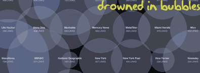
In How Many Links are Too Many Links, O’Reilly radar shows us this unfortunate bubble chart. Read the rest to see why the chart is unfortunate.
Continue »How to Change Shapes in Microsoft Office 2007

Ever since we made a switch to Microsoft Office 2007 at work, this has been bothering me.”How to change one shape to another?”
This is very useful feature, especially when you are using PowerPoint.
Continue »What would you like to ask John Walkenbach – Famous Excel Author and Guru?
As promised earlier, here is our next interview. PHD will be interviewing John Walkenbach, prolific Excel author and MVP. Please suggest your questions and help me get a killer interview from John.
Continue »What is Your Opinion on Pie Charts?
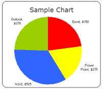
Pie charts are one of the most used charts in the world. And for obvious reasons: they are simple to create and easy to understand. When it comes to pie chart, I have no clear opinion. Part of me says use them, the other says avoid them.
What is your opinion on Pie charts ?
Continue »Welcome Robert & ClearlyAndSimply.com to Blogging
Remember Robert, he is the author of the popular KPI Dashboard Series of posts on this blog. Now there is good news, he started a blog and writes about information dashboards, data visualization.
Continue »Market Segmentation Charts using Conditional Formatting
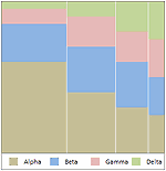
Trust Peltier to come up with solutions for even the most impossible looking charts. Today he shares a marimekko chart tutorial. I couldn’t sit still after seeing his post. So here comes market segmentation charts or marimekko charts using,
Google Spreadsheets Introduces Data Validation, Sweet!

Google Spreadsheets team has introduced another very useful feature to their online excel competitor: Data Validation.
Although the data validation is not as robust as that of Excel’s, it provides basic validations pretty neatly.
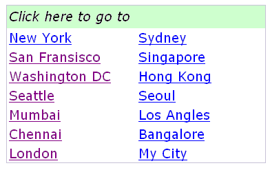
Learn how to create Table of Contents in Excel and other tricks to manage when you have too many worksheets.
Continue »A Good Bubble Chart About the Bust

Checkout this very neatly done “where did all the money go?” data visualization on Guardian, and share your opinion.
Continue »Excel Colors Somehow Getting Changed ?
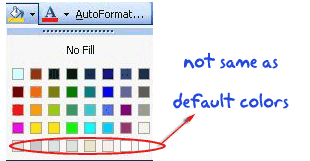
Reader Raja asks about “how he can reset the colors in his workbook”. Read more to find out how you can fix this problem.
Continue »Make a Dynamic Chart using Data Filters
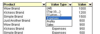
As part of our spreadcheats series, we will learn how you can use data filters to create dynamic charts in Microsoft excel
Continue »PHD reader gears up for a promotion despite recession and makes my day
Okay, time for totally shameless self promotion, call me a bragging blogger, but I don’t care, not today. Because I am very happy to receive this e-mail from one of our readers. Click to read more.
Continue »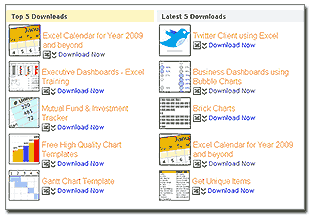
This week, check out the updated excel downloads page and 5 interesting excel articles from around the web. Read more to learn about a mouse trick to paste values, how you can tweet from excel using user forms, an intuitive charting principle and more.
Continue »Review of PTS Clustered Stack Chart

My Friend and long time Microsoft Excel MVP, Jon Peltier has released a wonderful little excel charting utility called Cluster Stack Chart Utility. Out of curiosity I have mailed Jon and asked him if he could send me a copy of it so that I can review the product and recommend it to PHD reader community. He is kind enough to mail the add-in to me and here goes my review of the tool.
Continue »Professional Resume or Data Visualization Fail? [poll]
![Professional Resume or Data Visualization Fail? [poll]](https://chandoo.org/img/c/data-visualization-resume.png)
Michael Anderson, a web designer has posted this delicious looking visual resume. While the resume looks stunning at a glance, a closer inspection reveals that you cant really make any valuable conclusions about Michael’s past experience and qualifications. Of course if the purpose of this resume is to show that he is a fabulous designer, then the resume definitely achieved that.
What is your opinion on this type of resume data visualizations ?


