All articles with 'videos' Tag
How to find sum of top 3 values based on filtered criteria [video]
![How to find sum of top 3 values based on filtered criteria [video]](https://img.chandoo.org/f/sum-of-top-3-values-meeting-filtered-criteria-excel.png)
Lets say you are looking at some data as shown above and wondering what is the sum of budgets for top 3 projects in East region with Low priority. How would you do that with formulas?
Continue »10 Rookie mistakes to avoid when making dashboards [video]
Are you making these 10 rookie mistakes when creating dashboards?
Watch below to video to understand what these mistakes and how to avoid them.
10 Rookie mistakes to avoid when making dashboards [23 mins]
Continue »Chart for wall hygrometric physic (or how to create a chart with custom x axis intervals?)
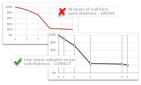
Livio, one of our readers from Italy sent me this interesting problem in email.
Continue »I would like to prepare an xy linear graphic as representation of the variation of temperature trough a wall between two different bulk temperature i.e. outside and inside a house. This graphic should show the temperature gradient trough the wall thickness. The wall is normally made by different construction materials (different layers, as bricks, insulation, …..) and so the temperature change but not as a straight line with only one slope, instead as few lines with different slopes (see below figure) Calculations are not difficult, and also prepare the graphic also not difficult.
But, I am looking a beautiful solution for x-axis. X-axis should be divided not with constant interval, instead with different length between each sub-division exactly as the different thickness of the wall. This is a correct graphic, because you can show the correct slope of each straight line though each layer of the wall.
Finding Conversion ratio using Pivot Table Calculated Items
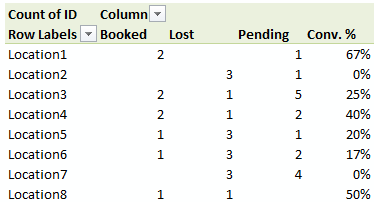
Today, lets understand how to use Calculated items feature in Pivot tables. We will use a practical problem many of us face to learn this feature – ie calculating conversion ratio from a list of sales calls.
Continue »Distinct Count & Blanks – Power Pivot Real Life Example
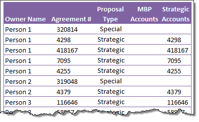
When it comes to analyzing business data, managers are always asking, “so how many distinct x each y is doing?”
And that sends us, data analysts & reporting professionals running from pillar to post figuring out the best way to do it.
- We can use variations of SUMPRODUCT, COUNTIFS etc, but the methods are not flexible..
- We can use VBA, but it would become slow as you add more data.
- We can use Pivot tables, but it only gives half of what we want ie each y part, but not distinct count of x.
- We might as well shave our head with a shovel before manually counting values.
And that brings us to 2 distinctly simple solutions:
- Using Power Pivot & Excel 2010
- Using regular pivot tables in Excel 2013
Today, lets talk about these 2 approaches & see why they are so better than anything else for distinct count situations.
Continue »Power Pivot & Advanced Excel course is open, Join us today!

Hello readers & supporters of Chandoo.org,
I am very glad to announce that our newest online class – Power Pivot course is now open for your consideration. In this post, you can understand details about this course & how to join us.
Click here if you are ready to join us. Read below to learn more.
What is Power Pivot course?
These days almost any job requires data analysis & presentation of results. While anyone can put a list of values in Excel & sum them up, not everyone can do advanced analysis, create charts, make them interactive, summarize data intelligently, present output in an intuitive dashboard or slice & dice data using Pivot tables & Power Pivot. Having these vital skills can make you invaluable to your organization & expose you to new opportunities. Not to mention the amount of time, money & effort you can save by efficiently using Excel.
That is why I have created 2 powerful courses – Excel School & Power Pivot Class. Think of these as steps in a ladder.
Continue »Details about our Power Pivot Course [and a video for those of you not interested]
![Details about our Power Pivot Course [and a video for those of you not interested]](https://img.chandoo.org/power-pivot/power-pivot-course-details.png)
Hello folks,
If this article was a person, they would be schizophrenic. You see, it has 2 purposes:
- Give you all the details about my upcoming Power Pivot course
- Give you a solution to last week’s vacation days problem
Details about Power Pivot Course
Power Pivot, an Excel add-in makes it easy to connect, analyze & visualize massive amounts of data. This course aims to teach you how to use Power Pivot to analyze data, create advanced reports & prepare dashboards all from familiar interface of Excel. This is ideal for data analysts, reporting & MIS professionals, business analysts, managers & dashboard makers.
Introduction to DAX Formulas & Measures for Power Pivot
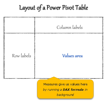
A measure is a formula for the values area of Power Pivot table.
A measure can be implicit or explicit.
Implicit measures are created automatically when you drag and drop a field in to Power Pivot values area. For example, in last week’s introduction, we created an implicit measure for SUM of Sales by dragging and dropping the sales amount field in to values area of our power pivot table.
Explicit measures are created by you using New measure button in Power Pivot tab (or Calculated Field button in Excel 2013 Power Pivot tab). You can also create a measure in the Power Pivot window.
Learn what measures are, how to create them using DAX (Data Analysis Expression) formulas in this video tutorial.
Continue »Can you calculate vacation days in a period? [Homework]
![Can you calculate vacation days in a period? [Homework]](https://img.chandoo.org/hw/calculate-vacation-days-excel-formula-homework.png)
Its Friday, that means time for another Excel challenge for you.
Calculate vacation days in a period:
Your mission, if you choose to accept it,
Step 1: Download the hom work problem file.
Step 2: Calculate number of vacations taken in a period. Specifically,
1) How many vacations are taken between start & end dates, assuming complete vacation should be inside the start & end date period?
2) How many vacations are taken such that at least one day of vacation is between start & end dates?
3) How many people took vacations? (if same person took multiple vacations, then count it as 1)
What is Power Pivot – an Introduction [video]
![What is Power Pivot – an Introduction [video]](https://img.chandoo.org/power-pivot/introduction-to-power-pivot-excel.png)
Today, lets talk about Power Pivot & understand it.
What is Power Pivot?
Power Pivot is an Excel add-in to connect, analyze & visualize massive amounts of data..
Lets take a closer look at the definition.
Connect: You can use multiple tables of data & set up relationships between them using Power Pivot. For example, you can connect customer details to sales transactions so that you can summarize sales by customer location or gender easily.
Analyze: You can create simple pivot table style reports or create something exceedingly complex by defining your own calculated fields for values area of the pivot. There is a whole set of formulas defined for exactly this purpose, called as DAX formulas.
Visualize: Instantly filter your reports using slicers, time lines (Excel 2013 or above only), conditional formats, pivot charts etc. You can even define KPIs and see the performance in bands.
Massive Amounts of Data: Although your typical Excel worksheet contains a million rows, if you tried to load even half of those with any data, Excel would quickly become slow & lazy. Power Pivot can take a million rows for breakfast and would be hungry for more. It can processes millions of rows of data very quickly and easily, all from the comfort of a standard desktop or laptop.
Continue »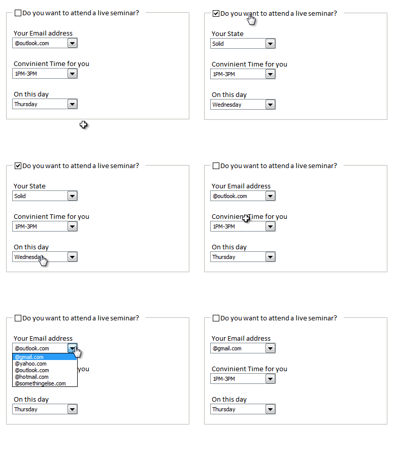
Rama, one of our readers emailed this:
I Have Many List boxes In That I need to Hide Few Of them Using Check box
Show Hide list boxes by using a check box
We can use check box and a bit of VBA to do this easily. Something like above demo.
Read on to learn how to do this using Excel & VBA.
Continue »Macros for Automatically Implementing Modeling Best Practices

In the first part on our Modeling Best Practices series, we learned 5 best practices to follow. This article shows how to automatically implement the best practices using macros.
Continue »![Project Portfolio Dashboard in Excel [Part 2 of 2]](https://img.chandoo.org/pm/project-portfolio-dashboard-small.png)
In this 2 part tutorial, we will learn how to design a project portfolio dashboard. Part 1 discussed user needs & design. Part 2 will show you Excel implementation.
Click here to get your copy.
Final Implementation – Project Portfolio Dashboard
First lets take a look at the finalized dashboard implementation. Continue reading to learn more & download this dashboard.
Continue »Project Portfolio Dashboard – Official Trailer
Behold, here is the official trailer for our Project Portfolio Dashboard, releasing worldwide on 19th November (Monday), 2012.
Continue »Last day to join Excel School + Excel Hero Academy
As you may know, I have partnered with Daniel Ferry to offer an irresistible bundle of Excel goodness: Excel School + Excel Hero Academy.
Today is the last day to enroll in this combined program. More than hundred eager & enthusiastic bunch of participants have already joined us. As you read this, there are dozens of people becoming awesome in Excel.
If you have been waiting to enroll, now is the time.
Continue »


