All articles with 'user polls' Tag
Hot or Not – McKinsey’s Innovation Heatmap

Take a look at the innovation heat map published by McKinsey and tell us what you think – Hot or Not?
Continue »Open Thread For First Time Commenters – What do you like in Excel?

If you have never commented on PHD this is your chance. Go ahead and comment and I will give you $1.00 discount on my Excel Formulas Help E-book.
The topic for the open thread is: What do you like in Microsoft Excel?
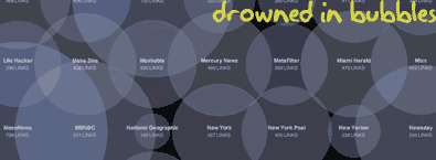
Continue »How Many Bubbles are Too Many Bubbles?

In How Many Links are Too Many Links, O’Reilly radar shows us this unfortunate bubble chart. Read the rest to see why the chart is unfortunate.
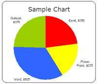
Continue »What is Your Opinion on Pie Charts?

Pie charts are one of the most used charts in the world. And for obvious reasons: they are simple to create and easy to understand. When it comes to pie chart, I have no clear opinion. Part of me says use them, the other says avoid them.
What is your opinion on Pie charts ?
Continue »A Good Bubble Chart About the Bust

Checkout this very neatly done “where did all the money go?” data visualization on Guardian, and share your opinion.
Continue »Professional Resume or Data Visualization Fail? [poll]
![Professional Resume or Data Visualization Fail? [poll]](https://chandoo.org/img/c/data-visualization-resume.png)
Michael Anderson, a web designer has posted this delicious looking visual resume. While the resume looks stunning at a glance, a closer inspection reveals that you cant really make any valuable conclusions about Michael’s past experience and qualifications. Of course if the purpose of this resume is to show that he is a fabulous designer, then the resume definitely achieved that.
What is your opinion on this type of resume data visualizations ?
[Weekend Poll] How do you Sex up your Charts?
![[Weekend Poll] How do you Sex up your Charts?](https://chandoo.org/img/a/your-fav-chart-format.png)
This weekend, let us talk … umm… charts. I want to know if you absolutely make sure your charts look good every time you sent them out to someone. I do this most of the time.
How do you sex up your charts?
Continue »[Reader Poll] Stacked, Seperated or Mirrored ?
![[Reader Poll] Stacked, Seperated or Mirrored ?](https://chandoo.org/img/a/bar-charts-ways-to-stack.gif)
Stacked bar charts are a popular way to depict 2 more series of related data, like sales of 2 products.But there are several ways to stack the bars in a bar chart. Here is a list of 6 ways to stack them
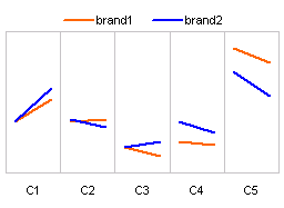
Continue »How to present changes in Market Share using Charts?

Most of us are comfortable with numbers, but we are confused when it comes to convert the numbers to charts. We struggle finding the right size, color and type of charts for our numbers. The challenge is two fold, we want to make the charts look good (we mean, really… really good) but at the […]
Continue »
It all began with my Excel Dashboard Tutorial – Making a dashboard with player statistics. I have used bar charts with axis whose minimum is not zero, to create a dramatic effect in the charts. See below: Jon Peltier commented saying that, Rule #1: Bar and column chart value axes should start at zero. Since […]
Continue »

