All articles with 'user polls' Tag
![What do you use Excel for? [Weekend Poll]](https://chandoo.org/img/dlt/learn-excel-online.png)
It is Friday again, time for another poll on PHD. This time, we will keep it very simple. I want to know what you use excel for? I use excel for, Preparing dashboards, reports, automation solutions for my clients Making invoices, estimates, plans for my projects Tracking various project activities (bugs, issues, changes, requirements etc.) […]
Continue »{ 50 Comments }
How do you consolidate data from multiple sheets in to one? [open thread]
Published on Feb 19, 2010 in Excel Howtos
![How do you consolidate data from multiple sheets in to one? [open thread]](https://chandoo.org/img/dlt/howto-consolidate-data-from-multiple-excels.png)
Long time PHD reader and mother of a lovely kid, Michelle, sent me a question in email that provoked me to write this post, I was wondering how to tabulate large amount of information gathered through surveys. Where I work customers are constantly handed survey sheets in order for us to measure how the service […]
Continue »{ 41 Comments }
What is the most useless feature in Excel? [poll]
Published on Feb 12, 2010 in Charts and Graphs
![What is the most useless feature in Excel? [poll]](https://chandoo.org/img/l/surface-charts-excel-whats-the-point.png)
What do you think is the most useless feature in MS Excel? I know there are a ton of cool, extremely useful features in excel. But it also comes with a few really un-necessary features. For me, the most useless feature seems to be a 3D surface chart. I have tried to figure why this […]
Continue »{ 18 Comments }
Best Charts to Compare Actual Values with Targets – What is your take?
Published on Dec 18, 2009 in Charts and Graphs, Featured
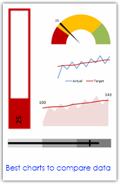
Comparing values is one of the main reasons we make charts. Yesterday we have a post on using thermometer charts to quickly compare actual values with targets. Today we follow up the post with 10 charting ideas you can use to compare actual values with targets. Check out how bullet charts, thermometer charts, traffic lights, gauges, column charts, area charts can help you compare targets with actual performances. A review of best charting options when you need to compare.
Read the rest of the post to see the options and participate in poll.
Continue »We interrupt usual routine of excel and charting tutorials to present the first ever readership survey on PHD. In fact, there are so few questions that to call it a survey would be an insult to other surveys, but I digress.
I want you to take few seconds and fill out this very simple form. Just type in whatever comes to your mind, honest and simple stuff. The survey is below, if you are not able to see it in RSS reader or email client, please go to http://bit.ly/phd-survey.
Continue »{ 7 Comments }
What is the most embarrassing charting mistake you made? [weekend poll]
Published on Nov 13, 2009 in Charts and Graphs
![What is the most embarrassing charting mistake you made? [weekend poll]](https://chandoo.org/wp/wp-content/uploads/2008/10/making-sports-dashboards-in-excel-sml.png)
This week’s poll is very simple. What is the the most embarrassing charting mistake your made?
For me it has to be that one time when I made a sports dashboard using excel. I have adjusted the axis scale of a bar chart so that my favorite cricket player (Sachin Tendulkar, who else?)’s records are emphasized. In a matter of minutes I have received several comments from all over world pointing out the mistake. Even though, the intention was to highlight the achievements of master blaster, the axis adjustment was obviously a mistake.
Continue »{ 63 Comments }
Chart this Sales Data and get an iPod Touch [Visualization Challenge #2]
Published on Nov 11, 2009 in Charts and Graphs
![Chart this Sales Data and get an iPod Touch [Visualization Challenge #2]](https://chandoo.org/img/cb/ipod-touch-8gb.png)
Here is a challenge many people face. How to make a chart visualizing sales data with several dimensions like product, brand, region, sales person name, year (or month or quarter) and one or two values like sales, # of units sold, profits, # of new customers.
In visualization challenge #2, all you have to do is a make a chart or dashboard to visualize this sales data effectively.
Continue »{ 31 Comments }
What buttons you have in the excel quick access bar ? [weekend poll]
Published on Oct 2, 2009 in Learn Excel
![What buttons you have in the excel quick access bar ? [weekend poll]](https://chandoo.org/img/i/quick-access-bar-excel-2007.png)
This week’s poll is quite simple. Tell us what buttons/ icons you have added to the quick launch bar in excel 2007 (or toolbar in excel 2003)?
As for me, I have these in my home laptop’s excel:
Just use the comments and tell me about your settings.
Continue »{ 31 Comments }
What would you do if a co-worker makes ugly chart? [weekend poll]
Published on Aug 7, 2009 in Charts and Graphs
![What would you do if a co-worker makes ugly chart? [weekend poll]](https://chandoo.org/wp/wp-content/uploads/2008/09/excel-charts-avoid-3d-column.png)
We talk alot about making better charts and perils of bad charts here.
I want to know what you usually do when a co-worker or boss makes an ugly chart?
- You tell them the chart sucks
- You gently point out the mistakes of their chart and tell them some nicer and cooler ways to tackle it
- You stay calm and send them an e-mail later (may be with a link to PHD chart pages or something like that)
- You don’t care (and may be continue doodling)
- Any other
Vote your option using comments.
Continue »{ 11 Comments }
14 Basic Skills for Chart Makers (Big question: How many do you have?)
Published on Jul 14, 2009 in Charts and Graphs, Cool Infographics & Data Visualizations
Blame John Walkenbach if you don’t like this post. There, I said it. He started the 14 basic skills for men. And then added 14 basic skills for women. Not stopping there, he went ahead and added 14 basic skills for dogs. Debra at Contextures blog added her 14 cents by writing 14 basic skills for excel users.
I got jittery and quickly searched 14 basic skills for people writing 14 basic skills posts on google. Alas! nothing found. But being the inveterate non-give-upper I went ahead and prepared my list.
<drum roll> here is the,
14 basic skills for people making charts (or graphs or plots or ok, you get the point)
![Fix this chart [excel homework #1]](https://chandoo.org/img/cb/axis-mixup-chart-fix.gif)
This column chart shows daily, weekly or monthly data depending on the user’s choice. In daily the columns are displayed properly, but in weekly & monthly mode the columns are a fraction of the width they should be – why, and how can this be avoided? Bonus points if you can describe how to use an INDIRECT formula on the x-axis labels which is another problem. Go fix it.
Continue »{ 3 Comments }
Share Your Excel Tips for Your Week – Open Thread
Published on May 15, 2009 in Learn Excel
We have 24 hours more to go before your week ends. So go ahead and share your tips, the thread is open, Use the comments below to share your tips. Teach us something new. We are waiting…
Continue »
That is right. Next week is your week on this blog. I will post content that is shared by you. So go ahead and share your tips and tricks with us. Read more to find out how you can share your tips with the community.
Continue »Do you want to make a budget vs. actual performance chart but not sure what option to use? Check out these 14 excel charting alternatives and find the one that tells your story.
Continue »Here is your chance to win a copy of The Visual Display of Quantitative Information by Edward Tufte, all you need to do is visualize budget vs. actual performance of the given data. Go!
Continue »
