All articles with 'tutorials' Tag
![How to pick a random date? [Formulas]](https://chandoo.org/img/i/random-date-time.png)
Often when you need to generate a sample from large data set, you may want to pick data from a random date. In such cases, you can use excel’s RAND() and RANDBETWEEN() formulas to pick a random date. Here I have included few examples,
Continue »Use Shapes and Images to make Prettier Charts [Dashboard Tricks]
![Use Shapes and Images to make Prettier Charts [Dashboard Tricks]](https://chandoo.org/img/c/use-shapes-to-make-better-dashboard-charts.png)
One of the annoyances of charts is that they all look like boxes (except for pie charts, they just look wrong). Boxes might be ok when you are making 1 or 2 charts. But a whole dashboard of boxes can look little rigid. So how can we make the charts peppy without loosing any effect? Like these charts below:
Very simple, we use drawing shapes in MS Excel to draw whatever we want and overlay the chart on top.
Continue »Group Smaller Slices in Pie Charts to Improve Readability

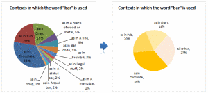
Jon Peltier can stand on his roof and shout in to a megaphone “Use Bar Charts, Not Pies”, but the fact remains that most of us use pie charts sometime or other. In fact I will go ahead and say that pie charts are actually the most widely used charts in business contexts.
Today I want to teach you a simple pie chart hack that can improve readability of the chart while retaining most of the critical information intact.
Continue »Grouping Dates in Pivot Tables

Do you know you can group dates in pivot tables to show the report by week, month or quarter? I have learned this trick while doing analysis on a pivot table today. In this online lesson on pivot tables, I will teach you how to group dates in pivot tables to analyze the data by month, week, quarter or hour of day.
Continue »Top X chart – Show Top X values of a chart Interactively

Two charting principles we hear all the time are,
- Sort your data in a meaningful order before plotting it.
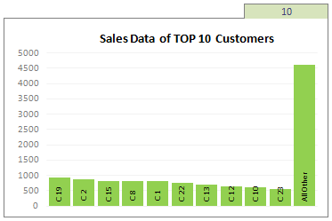
- Show only relevant information, not everything – because un-necessary information clutters the chart.
Today we will learn a dynamic charting technique that will mix these two ideas in a useful way. I call this a Top X chart.
Continue »What is Excel SUMPRODUCT formula and how to use it?

Today we will learn a new and exciting excel formula – the all powerful SUMPRODUCT.
At the outset SUMPRODUCT formula may not seem like all that useful. But once you understand how excel works with lists (or arrays) of data, the SUMPRODUCT’s relevance becomes crystal clear.
Continue »
We all have atleast one story of how that one time the boss / co-worker / classmate / cat ruined the carefully crafted excel spreadsheet by mucking up the formulas or disturbing the formatting. Read this post to learn 10 awesome excel tips to make better and boss-proof excel sheets.
Continue »Switch Rows and Columns in Charts [Quick Charting Tip]
![Switch Rows and Columns in Charts [Quick Charting Tip]](https://chandoo.org/img/c/switch-rows-columns-in-charts.png)
Let us say you have built a nice chart showing your sales and profits for the top 5 products (learn how to highlight top 5 products in a list), with products on X axis. Suddenly your boss wants to switch the rows to columns (or transpose the chart) so that she can see metric level grouping instead of product level grouping. No need to freak out and rush to Espresso machine, You can do it very easily with Excel Charting features.
In today’s quick tip you will learn how to swap chart rows and columns in excel.
Continue »
Yesterday I read about interaction plots on junk charts where he points out the merits of an interaction plot. Interaction plots show interaction effects between 2 factors. For eg. you can show how your product sales have changed between year 1 and year 2 using an interaction plot like the one shown aside.
Continue »Prevent Duplicate Data Entry using Cell Validations

We all know that data validation is a very useful feature in Excel. You can use data validation to create a drop-down list in a cell and limit the values user can enter. But, do you know that you can use data validation in a multitude of ways to prevent users from entering wrong data?
Here is a practical application: Prevent users from entering duplicate values in a range of cells.
For eg. you are making an invoice. Wouldn’t it be cool if Excel prompted you when you enter a duplicate line item so that increase the item quantity instead of repeating it.
Continue »Making a chart with dynamic range of values

We all know that to make a chart we must specify a range of values as input.
But what if our range is dynamic and keeps on growing or shrinking. You cant edit the chart input data ranges every time you add a row. Wouldn’t it be cool if the ranges were dynamic and charts get updated automatically when you add (or remove) rows?
Well, you can do it very easily using excel formulas and named ranges. It costs just $1 per each change. 😉
Ofcourse not, there are 2 ways to do this. One is to use Excel Tables and another is to use OFFSET formula.
Continue »Baby Feeding Chart using Excel

While feeding the babies last night, I had this idea. Why not make an excel sheet where you can keep track of the baby’s feeding and sleeping activities on day to day basis. It would probably help you understand your baby’s needs better and may be give you some insights.
Continue »![Project Management Dashboard / Project Status Report using Excel [Part 6 of 6]](https://chandoo.org/img/pm/project-status-dashboard-th.png)
Project management dashboards, project status reports help stakeholders, project sponsors and team-members can understand project status very quickly. In the last installment of project management using excel, learn how to make project management dashboard using excel in this tutorial. Also download the excel project status dashboard template.
Continue »Make a Bubble Chart in Excel [15 second tutorial]
![Make a Bubble Chart in Excel [15 second tutorial]](https://chandoo.org/img/l/bubble-chart-excel-tutorial.png)
A Bubble chart displays circles (or bubbles) at given X and Y co-ordinates. Bubble chart is a very good way to show 3 dimensional data (for eg. Region-wise product sales) without confusing users. In this tutorial, we will learn how to create a bubble chart using excel.
Continue »Recipe for a Donut Bar Chart

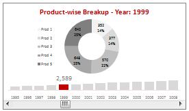
We all know that bar charts can be used to display values spread across various categories or times and pie charts / donut charts can be used to display percentage breakup of various quantities in a sum total. How about mashing up both to create a Donut Bar chart?
In this tutorial, you can learn how to make a donut bar chart and linking it to a form control to display Product-wise sales breakups spread across several years.
Continue »

