All articles with 'screencasts' Tag

Last week, we have learned what Pivot Table Report Filters are & how to use them.
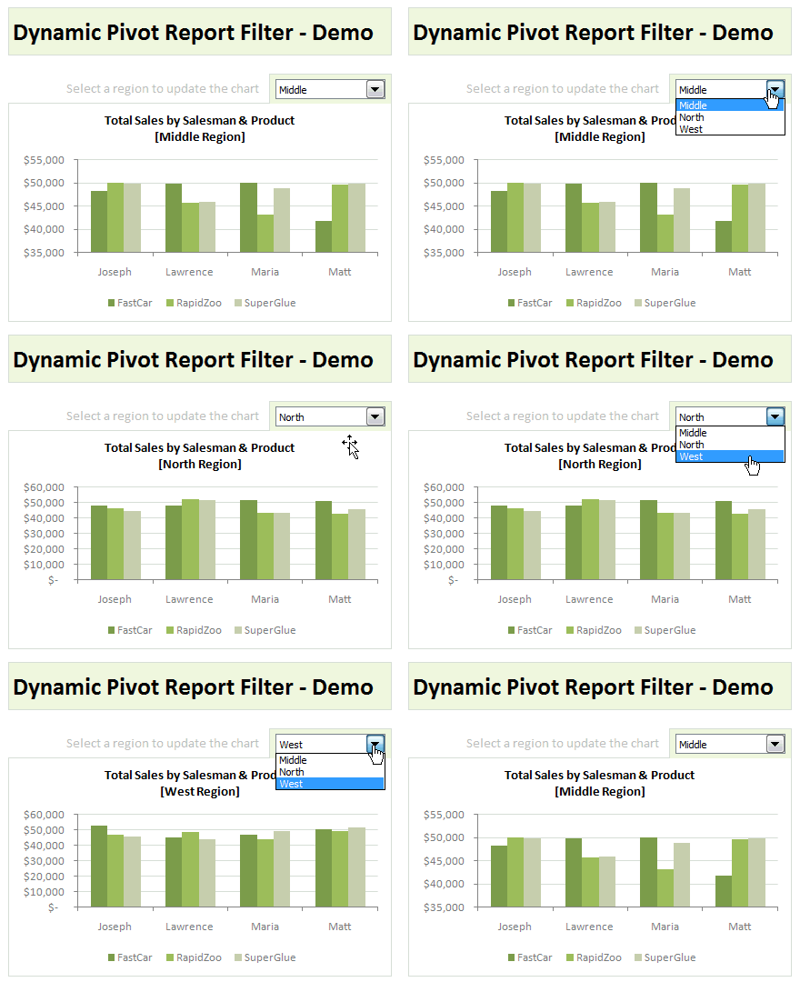
Today, I am going to show, how you can use simple macro code to change the report filter value dynamically.
We will learn how to create the chart shown here.
Continue »Comparing Sales of One Product with Another [Excel Techniques]
![Comparing Sales of One Product with Another [Excel Techniques]](https://img.chandoo.org/c/comparing-sales-of-one-product-with-another-demo.png)
This is a guest article by Theodor on how to Compare Sales of One Product with Another
Ok, now here’s one for you.
Suppose you’d like to come up with a sales report on different products, comparing their evolution on the same period of different years (say Jan ’09 vs. Jan Jan ’10). At the same time, you’d like to keep an eye on their yearly trend (entire 2009 vs. entire 2010).
Read on to learn how you can use Excel Charts to do this very easily.
Continue »What are Pivot Table Report Filters and How to use them?

Today we will learn about Pivot Table Report Filters.
We all know that Pivot Tables help us analyze and report massive amount of data in little time. Excel has several useful pivot table features to help us make all sorts of reports and charts.
Report Filters are one such thing.
Continue »Auditing Spreadsheets? – Disable Direct Editing Mode to save time [quick tip]
![Auditing Spreadsheets? – Disable Direct Editing Mode to save time [quick tip]](https://chandoo.org/img/q/find-dependent-cells-by-disabling-direct-editing-model-excel-tip.gif)
For most of us, the prospect of inheriting a large, undisclosed sum of money is bleak. But we have high probability of inheriting a complex Excel workbook with 19 worksheets and 2300 rows of data and 195 formulas. The kind where entire rainbow colors are used to color code accounts receivable statuses. Then what do we do? We spend a whole afternoon (and then the rest of the month) breaking our head trying to figure out why the total revenues are only $ 41.2 million when profits are $ 99.23 million.
So how do we deal with our inheritance?
Here is a quick tip to help you get started. Disable “Direct editing mode“.
Continue »![Show Details On-demand in Excel [Tutorial + Training Program]](https://img.chandoo.org/c/on-demand-analysis-and-details-in-excel-demo.gif)
Yesterday, we have seen a beautiful example of how showing details (like distribution) on-demand can increase the effectiveness of your reports. Today, we will learn how to do the same in Excel.
Continue »Give more details by showing average and distribution [Charting Tips]
![Give more details by showing average and distribution [Charting Tips]](https://chandoo.org/img/c/show-distribution-along-with-average-to-give-more-details-charting-tips.jpg)
When we have lots of data, we try to summarize it by calculating the average. As they say, averages are mean, they do not give away much.
I want to share with you an interesting example from Amazon.com on how they give more details by combining average with distribution.
As you might know, Amazon shows the rating of each of the products they sell. Customers & users rate the products from 1 to 5 stars. When you visit the product page you will see the average rating. But there is a small down-arrow next to it. When you click on it, Amazon shows you the break-up of that rating so you have a better idea of how the ratings are split.
Continue »Customer Service Dashboard using Excel [Dashword Week]
![Customer Service Dashboard using Excel [Dashword Week]](https://img.chandoo.org/dashboards/dw/customer-service-dashboard-excel.png)
Early in Jan, I got this mail from Mara, a student in Excel School first batch.
Hi Chandoo,
I took your first Excel batch class and loved it. I created a dynamic and interactive dashboard for my work. My boss thinks it’s an excellent tool and I have you to thank for and also Francis Chin who shared his travel dynamic dashboard. I integrated things you taught so thanks so much!
I felt very proud reading her email, so I asked her if she can share the dashboard with some dummy data so that we all can learn from her example.
Being a lovely person Mara is, she gladly emailed me the workbook and I am thrilled to include it in Dashboard Week.
Continue »Use Analytical Charts to Make your Boss Love You

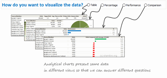
There are beautiful, powerful & awesome charting examples all around us. Today, I want to show you how we can harness the power of Excel to create Analytical Charts.
Analytical What?!?
To be frank, I do not know what to call these charts, so I choose the term Analytical Charts. But this is what I have in mind when I say Analytical charts:
A chart is analytical chart,
(1) If it is interactive
(2) It it can answer different questions by re-structuring same data differently

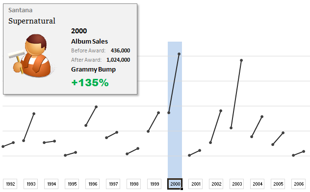
The folks at Washington Post made an interesting chart to understand whether winning a Grammy award makes any difference to album sales. Go ahead and browse it if you have not already seen it. Go, I will wait.
Are you impressed?
I really liked this chart. This is what I liked about the chart,
- It tells a story.
- It is an ego chart. We would all instantly search for our favorite artists and learn about how Grammy award changed their album sales.
- It is a simple chart. No clutter, no gaudy colors, just a bunch of lines and the story is out there.
- It lets you play.
In fact, I liked the chart so much that I wanted to make it in Excel.. You can see a snapshot of what I came up with above. Read the rest of this article to learn more.
Continue »Quickly Compare Data using Row Differences

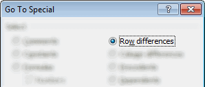
Lets say you have some data in 2 columns and you want to compare row by row to spot the differences. Of course you can write a formula or apply conditional formatting. But there is a quick and dirty solution that works just as fine.
Continue »Make Awesome Data Entry Forms by using Conditional Formatting + Data Validation

Last week we saw a really cool holiday request form made by Theodor. This week, we will learn how to combine conditional formatting and data validation to create an awesome data entry form. First see a demo to understand what I mean: How to create such a data entry form? Very simple, just grab a […]
Continue »How to Filter Odd or Even Rows only? [Quick Tips]
![How to Filter Odd or Even Rows only? [Quick Tips]](https://chandoo.org/img/q/filtering-odd-or-even-rows-excel-howto-th.png)
Ashish sends out this SOS thru email, “I need your help in putting filters . Can we filter the cells on the basis of their even or odd character. i.e in the table of 1-1000, i wish to filter, 1,3,5,7,…”
An odd request, I must say. But nevertheless, possible in Excel.
Read this quick tip, If you want know how to filter odd or even rows only in a list of values.
Continue »How would you Visualize World Education Ranking Data [Homework + Video]
![How would you Visualize World Education Ranking Data [Homework + Video]](https://chandoo.org/img/vp/world-education-scores-excel-chart.png)
Here is a charting challenge to begin your Christmas week. Recently Guardian’s Data Blog released World Education Rankings data and a sample visualization. Now your challenge is to make your chart visualizing World Education Rankings data.
You can see the chart I have constructed above. Read the rest of the post to find out how I made this chart and download the workbook.
Post your submissions using comments.
Continue »Merge Cells without Losing Data [Quick Tip]
![Merge Cells without Losing Data [Quick Tip]](https://chandoo.org/img/vba/merge-cells-without-loosing-values.png)
Many of us face this problem. We have some data in a few cells. Either for alignment or structure, we would like to merge the cell contents in to one big cell. But Excel wont help as it cannot merge values from all cells.
Continue »Excel Animation without Macros!
Today we will learn an interesting animation technique that ONLY uses, … wait for it …, Excel Formulas. That is right, we will use simple formulas to animate values in Excel.
Intrigued? Confused? Interested?
First see a short demo of excel animation achieved using this technique.
Now read the rest of this post to learn more about this technique and download sample workbook.
Continue »

