All articles with 'pie charts' Tag
{ 46 Comments }
6 Best charts to show % progress against goal
Published on May 8, 2020 in Charts and Graphs, Learn Excel

Back when I was working as a project lead, everyday my project manager would ask me the same question.
“Chandoo, whats the progress?”
He was so punctual about it, even on days when our coffee machine wasn’t working.
As you can see, tracking progress is an obsession we all have. At this very moment, if you pay close attention, you can hear mouse clicks of thousands of analysts and managers all over the world making project progress charts.
So today, lets talk about best charts to show % progress against a goal.
Continue »
I have been playing Zelda: Breath of the wild a lot these days and I LOVE the game. Considered one of the BEST video games all time, BOTW is beautifully designed and offers a lot of entertainment. Don’t freak out yet, Chandoo.org hasn’t suddenly branched into a video gaming blog. Instead, I am here to talk about Stamina Wheel Chart.
Continue »{ 0 Comments }
Source vs. Use of Funds – 14 charting alternatives
Published on Apr 10, 2019 in Charts and Graphs

Let’s say you manage a fund or charity. You get money from various places and you use that money for various reasons. How do you tell the story of source vs. uses of funds? In this post, let’s review 14 charting options. Source vs. Use of funds – Sample Data for this problem Let’s say […]
Continue »{ 4 Comments }
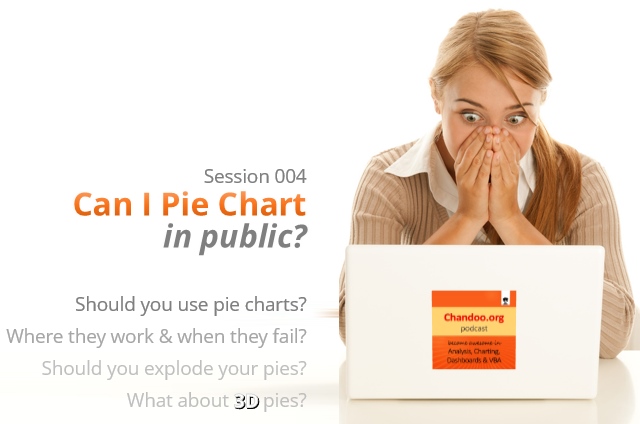
CP004: Can I Pie Chart in Public? Discussion about Pie charts, their merits and drawbacks, when to use & when to avoid them
Published on Apr 3, 2014 in Chandoo.org Podcast Sessions, Charts and Graphs
Podcast: Play in new window | Download
Subscribe: Apple Podcasts | Spotify | RSS
In the 4th session of Chandoo.org podcast, lets talk about Pie charts.
Pie charts evoke strong opinions among analysts & managers. Some people love them and can’t have enough of them in reports. Others despise them and go to any lengths to avoid them. And that is why we are going to talk about them in this session.
You will learn,
- Special, secret transmission from guest stars
- What is a pie chart?
- Why they work? 2 reasons
- Why they don’t work ? 4 reasons
- Cousins & siblings of Pie charts
- Donut charts
- Gauge charts (speedometer)
- 3D pies
- Area charts
- Bubble charts
- 4 Situations when making a pie chart is ok
- Alternatives to Pie charts
- Mistakes you should avoid
- About the resources
- Conclusions
{ 58 Comments }
42% of the world goes to polls around a pie chart – Like it or hate it?
Published on Jan 10, 2014 in Charts and Graphs
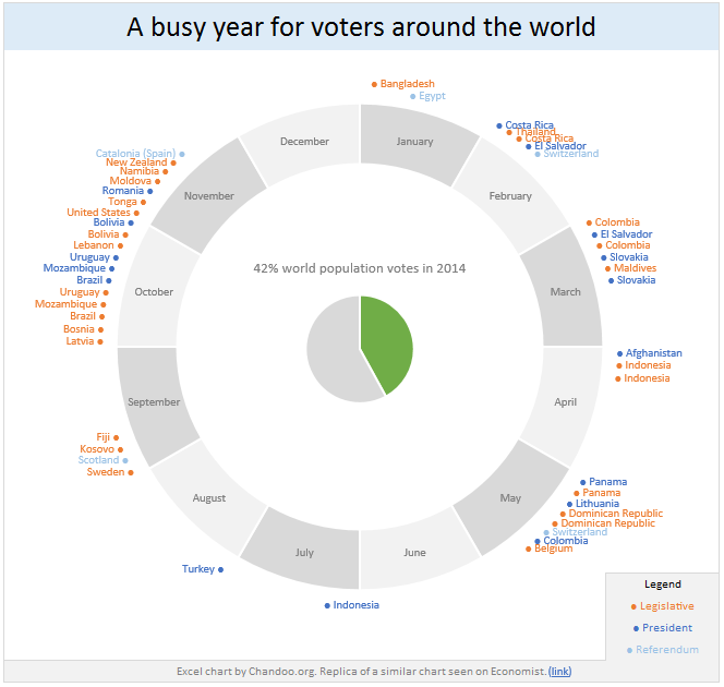
Today lets have a poll. Lets debate if this pie chart about world elections in 2014 is good or bad.
First lets take a look at the chart
This chart, published by The Economist talks about how 42% of the world population is going to vote this year. Take a look and read on to learn how you can re-create this in Excel.
Continue »{ 37 Comments }
Pie of a Pie of a Pie chart [Good or Bad?]
Published on Nov 9, 2012 in Charts and Graphs
![Pie of a Pie of a Pie chart [Good or Bad?]](https://img.chandoo.org/c/water-stats-pie21.jpg)
There are some charts that look so stunning and yet confusing. You cant make up your mind whether it tells a compelling story or it is just plain wrong.
Today, let me present you one such chart. I call this Pie of a Pie of a Pie chart.
Continue »Long time readers of Chandoo.org know that we have a regular featured called as “Excel Links“, where I share some interesting Excel articles published around the web. This used to be a weekly feature, then became a monthly thing and later once a few months thing. As I had a hectic weekend, when I got […]
Continue »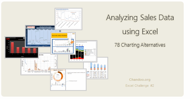
Recently, I ran a contest asking you to analyze a bunch of sales data and present your results in charts. We received a total of 78 charts from 45 people. The contest entries had a mind-boggling variety of excel charts, techniques and ideas. It took me a while to go thru all the files and compile the results. Thanks for your patience. In this post, you can find all the charts along with my comments & links to download files.
Continue »{ 10 Comments }
Making a Dynamic Dashboard in Excel [Part 2 of 4]
Published on Mar 30, 2010 in Charts and Graphs, Learn Excel
![Making a Dynamic Dashboard in Excel [Part 2 of 4]](https://chandoo.org/img/ed/excel-dynamic-dashboard-final-th.png)
In part 2 of Excel Dynamic Dashboard Tutorial, we will learn how to set up various dynamic charts that are part of the dashboard. We start with a simple dynamic pie chart that shows the sales distributions and then move on to sales trend line charts. These charts use various excel formulas to pull in the information based on user selection.
Continue »
I have a new community project for all the members of PHD. It is a simple yet intuitive challenge. Make your own country’s flag using Excel Charts. To start the project, I have made the Indian flag using a bar and pie chart. Go ahead and see the rest of this post to findout how this chart is made and then participate in the “flag project” by making your own country’s flag. All the best.
Continue »{ 1 Comment }
Excel Links of the Week – now even more downloads edition
Published on Feb 1, 2010 in excel links

Welcome to another edition of excel links. During the last week, I have revised excel downloads page on PHD and now it contains over 75 excel templates, tutorial downloads. I am not sure if you dig the new format of the page though. So go take a look at it and let me know what […]
Continue »{ 14 Comments }
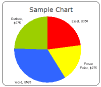
Group Smaller Slices in Pie Charts to Improve Readability
Published on Dec 2, 2009 in Charts and Graphs
Jon Peltier can stand on his roof and shout in to a megaphone “Use Bar Charts, Not Pies”, but the fact remains that most of us use pie charts sometime or other. In fact I will go ahead and say that pie charts are actually the most widely used charts in business contexts.
Today I want to teach you a simple pie chart hack that can improve readability of the chart while retaining most of the critical information intact.
Continue »{ 30 Comments }
Lets Pimp a Gauge Chart [Chart Porn Friday]
Published on Nov 6, 2009 in Charts and Graphs
![Lets Pimp a Gauge Chart [Chart Porn Friday]](https://chandoo.org/wp/wp-content/uploads/2009/11/fancy-excel-gauge-chart-th.png)
Egil, one of our alert readers from Norway sent this to me in e-mail, which I swear, I am not making up – A Fancy Gauge Chart. See the e-mail and chart yourself. I’m having a lot of fun with your gauge template 🙂 To make it more industrial-like, I’ve added: 1. Brushed metal background […]
Continue »{ 15 Comments }
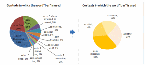
Nightmarish Pie Charts [because it is weekend]
Published on Aug 28, 2009 in Charts and Graphs, Cool Infographics & Data Visualizations
![Nightmarish Pie Charts [because it is weekend]](https://chandoo.org/img/cb/pie-chart-on-piecharts.png)
Nothing like a weekend making fun of something worthless. So we will pick on some of the plump, overloaded and visually disgusting pie charts featured on various extremely popular websites. As a bonus, you get to see my hand-drawn pie chart on the usage of pie charts.
Continue »{ 16 Comments }
What is Your Opinion on Pie Charts?
Published on Feb 20, 2009 in Charts and Graphs, Featured
Pie charts are one of the most used charts in the world. And for obvious reasons: they are simple to create and easy to understand. When it comes to pie chart, I have no clear opinion. Part of me says use them, the other says avoid them.
What is your opinion on Pie charts ?
Continue »
