All articles with 'INDEX()' Tag
{ 13 Comments }
Video Tutorial on Interactive Dashboard using Hyperlinks
Published on Jul 25, 2011 in VBA Macros
Few days ago, we published an article on how to create interactive dashboards using hyperlinks. Many of you loved this tutorial. But quite a few of you also said, this tutorial is a bit complex to follow.
So, I made a short video explaining how the UDF and interactive hyperlinks work and how our dashboard is weaved together.
Continue »
Last week we learned how to create dynamic hyperlinks in Excel. Today, I want to show you something even cooler. An interactive dashboard based on hyperlinks, like shown above.
Isn’t it impressive?
Well, to create something like this, you don’t need a degree in advanced cryogenics. You just need a bunch of data, a chart, a one line macro code and some pixie dust (go easy on pixie dust).
Continue »{ 15 Comments }
How to create a Win-Loss Chart in Excel? [Tutorial & Template]
Published on Jun 9, 2011 in Charts and Graphs
![How to create a Win-Loss Chart in Excel? [Tutorial & Template]](https://img.chandoo.org/c/win-loss-chart-excel-template.png)
Win Loss Charts are an interesting way to show a range of outcomes. Lets say, you have data like this:
win, win, win, loss, loss, win, win, loss, loss, win
The Win Loss chart would look like this:

Today, we will learn, how to create Win Loss Charts in Excel.
We will learn how to create Win Loss charts using Conditional Formatting and using In-cell Charts.
Continue »{ 15 Comments }
Count-down Timer App in VBA to Remind you about the VBAClasses Closing Time!!!
Published on May 18, 2011 in products, VBA Macros
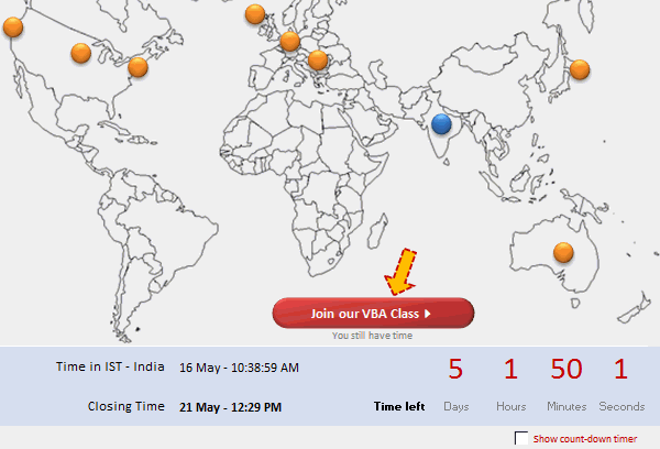
Here is a cool count-down timer application made in VBA to remind you about our VBAClasses registration closing time!
Read the rest of this post to learn how this particular app is built.
If you want to learn VBA, then click here to join our class.
Continue »
Don’t know which way to go ?
Can’t make up your mind between alternatives?
Using collected or known data is the best when developing Excel models, but from time to time this may not be available when you are developing your model. This post will look at some options for setting up Dummy Data using Excels Random number functions.
![Show Details On-demand in Excel [Tutorial + Training Program]](https://img.chandoo.org/c/on-demand-analysis-and-details-in-excel-demo.gif)
Yesterday, we have seen a beautiful example of how showing details (like distribution) on-demand can increase the effectiveness of your reports. Today, we will learn how to do the same in Excel.
Continue »{ 5 Comments }
Health-care Dashboard in Excel [Dashboard Week]
Published on Mar 22, 2011 in Charts and Graphs
![Health-care Dashboard in Excel [Dashboard Week]](https://img.chandoo.org/dashboards/dw/health-care-dashboard-small.png)
As part of Dashboard Week, in this post, we will take a look at Health-care Dashboard prepared and shared by Alberto. He put together an excellent dashboard to visualize hospital performance and understand what is going on. Read this post to understand how this dashboard is made, watch a tutorial video & download example workbook.
Thank you Alberto for sharing the file & helping us learn.
Continue »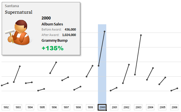
The folks at Washington Post made an interesting chart to understand whether winning a Grammy award makes any difference to album sales. Go ahead and browse it if you have not already seen it. Go, I will wait.
Are you impressed?
I really liked this chart. This is what I liked about the chart,
- It tells a story.
- It is an ego chart. We would all instantly search for our favorite artists and learn about how Grammy award changed their album sales.
- It is a simple chart. No clutter, no gaudy colors, just a bunch of lines and the story is out there.
- It lets you play.
In fact, I liked the chart so much that I wanted to make it in Excel.. You can see a snapshot of what I came up with above. Read the rest of this article to learn more.
Continue »
Does your data hold hidden secrets?
In Part 2 of Are You Trendy? we will examine the Excel functions that assist us in Trend Analysis.
![2011 Calendar – Excel Template [Downloads]](https://img.chandoo.org/c/2011-calendar-template-download.png)
Here is a 2011 new year gift to all our readers – a free 2011 calendar template.
(a little secret: just change the year in worksheet “Full” from 2011 to 2012 to get the next year’s calendar. It works all the way up to year 9999)
You can add notes to individual dates or complete month using the excel template very easily. There are 6 different calendar templates in the download file,
* 4 Yearly Calendar Templates with different color schemes.
* 1 Mini Calendar
* 1 Monthly Calendar (prints in 12 pages)
Go ahead and download the calendar files. Enjoy.
Continue »{ 53 Comments }
How to write 2 Way Lookup Formulas in Excel?
Published on Nov 9, 2010 in Learn Excel
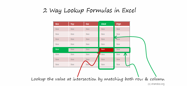
Situation
So far we have seen what VLOOKUP formula is and how to put it to some nifty uses. Today, we will go one step further and learn how to do 2 Way Lookups.
What is a 2 Way Lookup?
Lookup is when you find a value in one column and get the corresponding element from other columns. 2 Way Lookup is when you lookup value at the interesection corresponding to a given row & column values.
For example, assuming you have data like below, and you want to findout how much sales Joseph made in month of March, you are essentially doing a 2 way lookup.
Read more to find how to solve this.
Continue »{ 63 Comments }
How to Look up Based on Multiple Conditions
Published on Nov 2, 2010 in Excel Howtos, Learn Excel
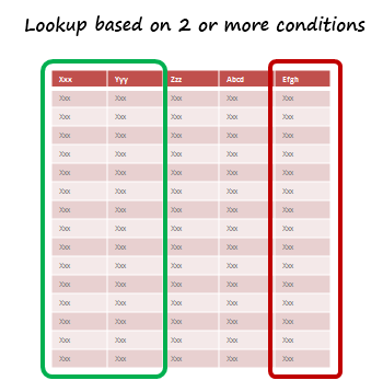
SituationNot always we want to lookup values based on one search parameter. For eg. Imagine you have data like below and you want to find how much sales Joseph made in January 2007 in North region for product “Fast car”? Read more to find how to solve this.
Continue »{ 169 Comments }
How to Lookup Values to Left?
Published on Nov 2, 2010 in Excel Howtos, Learn Excel
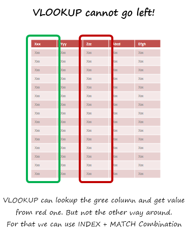
Situation
There is no argument that VLOOKUP is a beautiful & useful formula. But it suffers from one nagging limitation. It cannot go left.
Let me explain, Imagine you have data like below. Now, if you want to find-out who is the sales person who made $2,133 in sales, there is no way VLOOKUP can come to rescue. This is because, once you search a list using VLOOKUP, you can only return corresponding items from the column at right, not at left.
One easy fix would be move the sales data to the left of person name. But this is an annoying fix, because, god knows you may want to lookup based on profit values or something else in future. A better alternative is,…
Read more to find how to solve this.
Continue »
Hello Folks.
I have a rather bad news for you. My internet service provider (TATA Photon) has mysteriously blocked chandoo.org. My site hasn’t been loading since Sunday. While, I know it is up and running, I cannot see it unless I go thru a proxy server.
It may take a few days to get this resolved. I am using this time to take a break from blogging and finish reading a few books.
But I have a contest for you that will keep you busy. Share your favorite VLOOKUP tip / trick and you can win an iPod Nano. Read more for rules & how to participate.
Continue »{ 39 Comments }
How Francis Landed on Chandoo.org, Become Awesome and Made a Superb Dashboard, all in ONE Weekend
As part of our Reader Awesomeness Week, Francis shares with us a travel site dashboard he made for his company. Francis took just two days to prepare this awesome dashboard which uses concepts like bullet charts, sortable KPI grid, Date based filtering, dynamic charts and more. I was really moved by Francis’ gesture in sharing his work with us, so much that, I did a video review of his work. You can see it in the embedded youtube video to the left.
Read the rest of the article to know how this dashboard is made and get a copy of the file.
Continue »
