
Of all the charting features in Excel, Sparklines are my absolute favorite. These bite-sized graphs can fit in a cell and show powerful insights. Edward Tufte coined the term sparkline and defined it as,
intense, simple, word-sized graphics
Edward Tufte

Sparklines (often called as micro-charts) add rich visualization capability to tabular data without taking too much space. This page provides a complete tutorial on Excel sparklines along with 5 secret tips.
What is a sparkline?
A Sparkline is a small chart that is aligned with rows of some tabular data and usually shows trend information.
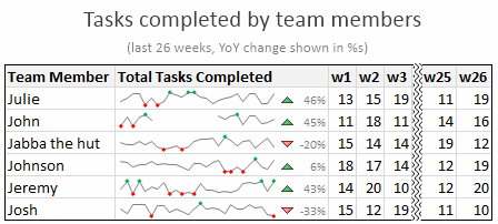
Here is an example of sparklines in a project team status report.
Excel Sparklines Tutorial – 3 steps
Creating sparklines in Excel is very easy. You follow 3 very simple steps to get beautiful sparklines in an instant.
- Select the data from which you want to make a sparkline.
- Go to Insert > Sparkline and select the type of sparkline (you have 3 options – line, column and win-loss chart)
- Specify a target cell where you want the sparkline to be placed
- Optional: Format the sparkline if you want.
Here is a short screen-cast showing you how a sparkline is created.
Types of Sparklines in Excel:
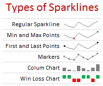
There are 3 basic types of sparklines in Excel 2010. They are,
- Line chart
- Column chart
- Win-loss chart (useful for showing a bunch of wins & losses denoted by 1s and -1s)
Sparkline Formatting and Options – Explored
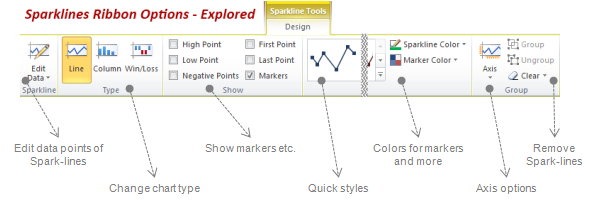
Whenever you select a cell with sparkline in it, you will find a new ribbon called as “Sparklines – Design” ribbon. This is where all the formatting options for sparklines are included. Some of the key formatting / customization options available are,
- Change the sparkline type – between line, column and win/loss
- Change the source data / target cells of sparkline
- Set different colors for first point, last point, highest & lowest points (applicable for column and line chart types)
- Set axis options (show / hide axis, set min and max value for vertical axis, set axis type to date axis etc.)
- Group / un-group a bunch of sparklines (you can change formatting options, axis settings en-masse when you group sparklines)
- Remove sparklines
Sparklines & Missing Data – How does it work?
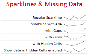
- Non-numeric data: If the sparkline source data contains non-numeric data, they are neglected while plotting the sparklines.
- Errors & #NA values: If data has some #NA values, they are neglected
- Blanks: sparkline show blanks as gaps
- Zeros: If data has zeros, zero value is plotted
- Data in hidden rows / columns: If data has some hidden rows / columns, the values are neglected (unless you enable “Show data in hidden cells” option)
Sparklines in Tables & Pivot Tables
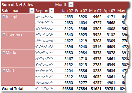
You can add sparklines to tables and pivot tables too. Adding them to pivot tables is a bit tricky but adding sparklines to tables is fairly straightforward and scales nicely.
5 Tips to use Sparklines better
Here is a bunch of quick tips & tricks for those of you starting on sparklines.
- You can auto-fill sparklines. Select the first set of values and add a sparkline. Now copy and past sparklines to auto-fill them based on data in adjacent cells.
- Change their size: When you adjust row-height or column-width of the cell containing sparkline, the size of sparkline changes too.
- Juxtapose sparklines with conditional formatting icons to create stunning charts and dashboards.
- If you want to copy a sparkline over to a ppt or document, you can use “copy as picture” option.
- Enable high / low points to highlight important values
Sparklines & Compatibility
Sparklines are available since Excel 2010. They work in desktop and web versions of Excel.
What happens when someone opens a file with sparklines in Excel 2007?
Sparklines don’t show up in if you open the file in older version of Excel (say Excel 2007).
How does Sparklines compare with other alternatives?
Sparklines vs. In-cell Charts
In-cell charts are a powerful and lightweight way to create bite-sized visualizations. The main technique is to use REPT formula to repetitively show a bunch of symbols (usually | symbol) to create a small chart. The advantage of this approach is that they work in any version of Excel. But the dis-advantage is that we can make only few types of charts (bar charts, column charts by rotating cell text, dot plots). Also, incell charts require some knowledge of excel formulas and creativity.
This is where Excel Sparklines shine, as they are very easy to create and maintain.
Sparklines vs. Conditional Formatting
In Excel 2007, MS introduced a bunch of useful Conditional Formatting options like icons, heat maps that effectively create small visualizations of underlying data. These features are further improved in Excel 2010, 2013 and 2016. While conditional formatting based visualizations are easy to implement and scale very well, there are only few options (a bunch of traffic lights, data bars etc.). This could leave you high and dry if you are looking for rich visualization options. these new features require the actual data to be present in underlying cells (which is a head-ache).
Again, sparklines shine as a simpler and easier alternative.
Sparklines vs. Shrinking an actual chart
We can take an actual chart, strip it of all the clothing (remove gridlines, axis, legend, titles, labels etc.) and resize it so that it fits nicely in a cell [example]. This is the easiest and cleanest way to get sparklines in earlier versions of excel. However this approach has one problem. It doesn’t scale. (ie if you want to get 2 sparklines, you need to do twice the work). Of course, we can write some macros to take care of that, but if you are open to macros, you might as well use SfE and save a lot of trouble. But this approach of shrinking a real chart is better as it gives you full power to customize the underlying chart (add multiple series etc.) which is not available in excel sparklines.
Download Excel Sparklines Tutorial Workbook
Click here to download Excel sparklines tutorial workbook. It shows all three kinds of sparklines in a simple dashboard format. Use the data to create your own sparklines to learn more.
Conclusions on Sparklines
The sparklines in Excel is certainly a great step forward in the world of data visualization. It brings ease and consistency to most users who want better visualizations but do not know how to create them. That said, Microsoft hasn’t really introduced any new types of sparklines since 2010. This is disappointing. Ideally few more types of sparklines such as these can help with dataviz.

On a lighter note, Kudos to Office Team at MS for not adding any 3D capabilities to these sparklines. That would have unleashed a fresh dose of chart monsters.
I use sparklines in most of my dashboards and business reports.
What about you? What are your thoughts on sparklines? Have you used them? What is your experience like? Please share your ideas, impressions and tips thru comments.
Additional examples on Sparklines:


8 Responses to “Top 5 keyboard shortcuts for Excel Charts”
As far as I remember (checked, again, 2 minutes ago) in my "Excel 2013" in order to select various chart elements I need to use the Arrow keys and not the TAB key.
Practically, the TAB key does nothing (within a Chart).
----------------------------
Michael (Micky) Avidan
Thanks for pointing this out. This is how I remember it too, but when I was recording the video yesterday, only TAB key worked. MS must have changed the keys in Excel 2016. I have edited the post to include both keys.
The key navigation on charts is different in 2016.
TAB cycles through a layer of objects (SHIFT+TAB cycles backwards)
ENTER move down a layer
ESC moves up a layer
So on a column chart with title/legend/data labels if you select the plotarea the TAB will go through Title > Legend > Plotarea.
ENTER at plotarea will then select Vertical axis. Tab will take you through
Horizontal axis > gridlines > Series > Horizontal Axis.
ENTER with series selected will then allow you to TAB through individual data points and data labels.
If you ENTER on datalabels you can TAB through each data label.
ALT + F1 : to create default chart
ALT+E S T = CTRL + ALT + V, T : I find that easier to remember
I second what Michael already said about TAB and arrow keys. I can't help but think if this is related to the "," or ";" as separator. I prefer to use the chart tools - layout- drop down box, anyway.
Got to be F11 for instant charting. Highlight your data , hit F11 and voila! ?
Ctrl+1 is the most important chart shortcut. In fact, it works for any Excel object: whatever is selected, Ctrl+1 opens the task pane or dialog to format that object.
Somewhere along the line, maybe when Excel 2016 came out, the arrow keys stopped working to cycle through the elements of a chart. But what works is holding Ctrl while clicking the arrow keys. I haven't gotten used to the Tab and other keys, but as long as Ctrl+Arrow works, I'm good.
And F4 used to be so helpful when formatting a lot of charts. But since Excel 2007 came out, it has been mostly useless. It used to remember a whole set of changes at once, so I get that the newer modeless dialogs make that impractical. But now it only seems to work with formatting of lines and borders, and maybe fills. I find myself writing a lot of VBA one-liners in the Immediate Window to handle these tedious formatting tasks.
after clicking on a chart, is there a shortcut key to copy it?
Thank you for the Alt E S T - tip. This is more than a time saver. Because of dynamic charts or de-activated external references to data when you make the charts, you often have empty charts that are otherwise impossible to format. So this shortcut helps adressing that. I will work with it more and see if there remain some obstacles.