All articles with 'Microsoft Excel Formulas' Tag
Check if 2 ranges have same values (set equality problem)

Hello folks,
Time for another homework problem. Assuming you have 2 ranges of values like below, how do you check if both of them have same set of values?
Continue »![Who is the most consistent seller? [BYOD]](https://chandoo.org/wp/wp-content/uploads/2015/02/who-is-the-most-consistent-seller-data.png)
Who is the most consistent of all?
Imagine you are a category manager at a large e-commerce company. Your site offers various products, but you don’t really make these products. You list products made by other vendors on your site. Every day, these vendors would send you invoices for the amount of product they have sold. Above is a snapshot of such invoices.
Looking at this list, you have a few questions.
- Who is the best seller?
- Who is the most active seller?
- Who is the most consistent seller?
- Which seller has fewest invoices?
Let’s go ahead and answer these using Excel. Shall we?
Continue »What is the length of longest winning streak? [Excel homework]
![What is the length of longest winning streak? [Excel homework]](https://chandoo.org/wp/wp-content/uploads/2015/01/longest-winning-streak-problem.png)
Here is a fun problem to think about.
Let’s say you are looking at some data like above.
And you want to find out what is the longest streak of wins in the list.
How do you calculate it?
bonus question: What formula calculates when the longest streak began?
Continue »
Imagine you are the in-charge of finance department at Hogwarts. So one fine day, while you are practicing the spells, Dumbledore walks in to your office and says, “Our electricity bills are way too high. As the muggles don’t accept wizard money, we have to find a way to reduce our power consumption.”
So you summoned the previous 12 month utility bills to examine energy consumption patterns, and pretty soon you realized that most of the electricity consumption is due to the light bulbs. You suddenly have a brilliant idea. Why not replace the light bulbs with a variety that consumes low power? A light bulb moment indeed.
Your next step is to figure out what varieties of light bulbs are out there. Fortunately this is easier than catching a snitch in a game of quidditch. A quick search revealed that there are 3 types of light bulbs:
- Regular incandescent bulbs (the kind Hogwarts currently uses)
- Compact Fluorescent Light bulbs (CFL)
- Light Emitting Diode bulbs (LED)
Now your job is to do a cost benefit analysis of these options and pick one.
Continue »CP028: How to tell business logic & rules to Excel?

Podcast: Play in new window | Download
Subscribe: Apple Podcasts | Spotify | RSS
In the 28th session of Chandoo.org podcast, let’s figure out how to express business rules & logic to Excel.
What is in this session?
What good are spreadsheets if they can’t solve business problems?
But we all struggle when it comes to modeling real world business conditions in Excel. For example, if you have below business rule to decide how much discount to offer a customer,
- If the customer bought 3 or more times previously and offer 15% discount
- If the customer bought 1 or 2 times previously AND customer’s age is >40, offer 10% discount
- If the customer visited our New York store between 6PM-9PM offer 5% discount
- Else no discount
How would you go about modeling these in Excel?
That is our topic for this podcast session.
In this podcast, you will learn
- The challenge of modeling business logic & rules in Excel
- My struggles with such formulas in early days
- 4 features of Excel that can help you with this.
- Example business rules & how to write formulas

Want to write formulas faster? Here is a quick tip.
Use Auto-correct!
That is right. Excel’s auto-correct feature can be setup to help you write formulas faster. See above demo. Read on for details.
Continue »Free 2015 Calendar, daily planner templates [download]
Here is a New year gift to all our readers – free 2015 Excel Calendar & daily planner Template.
This calender has,
- One page full calendar with notes, in 4 different color schemes
- Daily event planner & tracker
- 1 Mini calendar
- Monthly calendar (prints to 12 pages)
- Works for any year, just change year in Full tab.
Excel to the Next Level by Mastering Multiple Occurrences

This is a guest post by Sohail Anwar.
August 29, 1994. A day that changed my life forever. Football World Cup? Russia and China de-targeting nuclear weapons against each other? Anniversary of the Woodstock festival?
No, much bigger: Two Undertakers show up at WWE Summerslam for an epic battle. Needless to say: MIND() = BLOWN().
And thus begun one boy’s journey into understanding the phenomenon of Multiple Occurrences.
My journey continued, when just a few years later my grandfather handed me down a precious family heirloom: A few columns of meaningless data that I could take away and analyze in Excel. You may laugh but in the 90’s, every boy only wanted two things 1) Lists of pointless data and …
Continue »CP026: All about Excel !@#$%^+/*(}][<
![CP026: All about Excel !@#$%^+/*(}][<](https://files.chandoo.org/podcast/session-026.png)
Podcast: Play in new window | Download
Subscribe: Apple Podcasts | Spotify | RSS
In the 26th session of Chandoo.org podcast, let’s learn all about Excel !@#$%^+/*(}][<.
I am talking about Excel operators, you silly.
What is in this session?
Do you know Excel has more than 25 operators? That is right. There are a variety of operators beyond the simple + – * and /.
In this podcast, let’s understand all about these operators and how to use them. You will learn,
- Why there is a gap between last & this podcast session
- About Excel operators
- Arithmetic operators
- Text operators
- Reference operators
- Comparison operators
- Closing thoughts
Creating In-cell charts with markers for average (or target) values

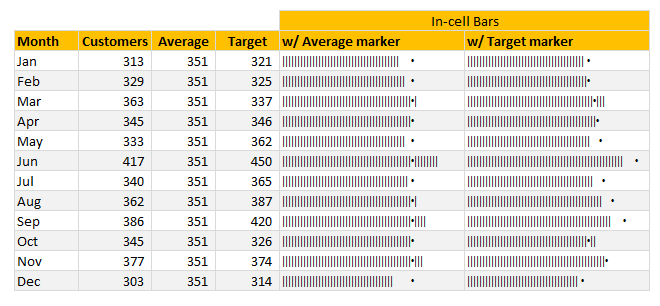
Today, lets talk about an interesting extension to the idea of in-cell charts. Adding average or target markers to the chart.
Adding a marker (like average or target or last year value) can enhance your charts greatly and provide more context. Lets understand how to add marker symbols to in-cell charts.
Continue »
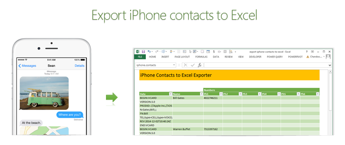
Recently my iPhone 4 crashed. It is 3.5 years old. And just like any other 3 year old, it started acting weird & crazy one night. The next morning it went silent. It won’t go beyond the Apple logo whenever I start it. Since I couldn’t wait for the phone to start, I took out the SIM card (the phone is unlocked, if you are wondering) and placed it in my old Nokia phone. But alas, none of my contacts are on the SIM. They are in “cloud”.
After a day of answering phone calls from everyone including my mom as “Chandoo here”, I’ve decided to get my contacts back. So I logged in to iCloud to download a backup. And the backup was a .VCF file.
Since I wanted to have all my contact numbers in a spreadsheet, I did what any Excel nerd would do. I built a template that can convert VCF data to Excel worksheet.
Continue »Can you calculate the sales commission? [homework]
Imagine you run a cute little pastry in Rome (Italy). To boost the sales you have a 2 person sales team. Caterina & Antonio. Caterina is the manager & Antonio, her assistant. Apart from basic salary, they will also receive sales commission. This comes from a portion of net profit allocated to “incentive pool”. The […]
Continue »Looking up when data won’t play nice – few more alternatives

Recently, we discussed about the case of unwieldy data and how we lookup what we want using formulas like SUMIFS. Today, let us learn few more ways to solve the same problem.
Suitable structure spawns simple solutions
Poorly structured is the 2nd biggest problem of analysts. The first one is not enough coffee. That is why there is a dictum in the data analytics world.
Structure is everything
So, we can easily solve our lookup problem, if our data were to magically re-arranged in 2 column fashion – Data & Value.
Continue »Looking up when the data won’t co-operate (case study)

Occasionally we deal with data that is so uncooperative that we might as well give up and go back to calculators & ledger books.
Recently I found myself in such a situation and learned something new.
Introducing … data that won’t play nice
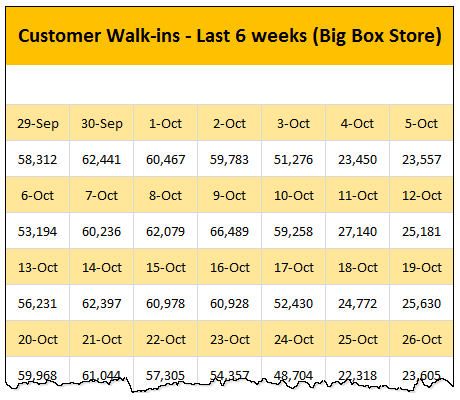
Drum roll please. Here is a data-set that I got from somewhere.
The problem – build a lookup formula
And the problem. Oh, simple. Write a lookup formula to find how many customer walk-ins we have on any given day.
But how?
Continue »The ultimate VLOOKUP trick – Multi-condition Lookup

This is a guest post by Sohail Anwar.
Let’s not bore you with an intro. You are about to learn a VLOOKUP trick that Lucifer himself would not want you to know. It’s so absurdly powerful that it was developed in a lab and had to be tested on Rocky’s arch nemesis Ivan Drago.
Presenting the Multiple criteria VLOOKUP!
…boring…pass, we’ve seen it.
Oh, have you? Not like this you haven’t. This will change the way you work with Excel.
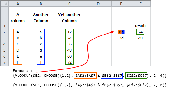
Let me start with an easy example. Here’s some data and we would love to know what Bb and Dd is.
Continue »


