All articles with 'form controls' Tag

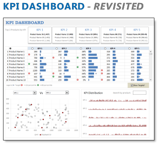
In 2008, I received an email from Robert Mundigl, which was the start of a life-long friendship. Robert asked me if he can teach us how to make KPI dashboards using Excel. I gladly said yes because I am always looking for new ways to use Excel.
The original KPI dashboards using Excel article was so popular. They still help around 12,000 people around the globe every month. Many of our regular readers and members have once started their journey on Chandoo.org from these articles.
In this article, we will revisit the dashboard and give it a fresh new spin using Excel 2007.
Continue »Executive Review Dashboard in Excel [Dashboard Week]
![Executive Review Dashboard in Excel [Dashboard Week]](https://chandoo.org/img/dashboards/dw/executive-review-dashboard-in-excel.png)
Purpose of the dashboard:
This is a guest article written by John for our Excel Dashboard Week.
This Dashboard was constructed for a number of reasons, one of which was to reduce the number of reports produced with the same data ( up to 6 separate files ). As we all know, when it comes to senior management and reports / files the more information they can get on one report / file the better for them. So, with this in mind I created the Dashboard to show the data they need to see “quickly” each week.
Continue »Customer Service Dashboard using Excel [Dashword Week]
![Customer Service Dashboard using Excel [Dashword Week]](https://img.chandoo.org/dashboards/dw/customer-service-dashboard-excel.png)
Early in Jan, I got this mail from Mara, a student in Excel School first batch.
Hi Chandoo,
I took your first Excel batch class and loved it. I created a dynamic and interactive dashboard for my work. My boss thinks it’s an excellent tool and I have you to thank for and also Francis Chin who shared his travel dynamic dashboard. I integrated things you taught so thanks so much!
I felt very proud reading her email, so I asked her if she can share the dashboard with some dummy data so that we all can learn from her example.
Being a lovely person Mara is, she gladly emailed me the workbook and I am thrilled to include it in Dashboard Week.
Continue »A Huge Collection of Spreadsheets for Teachers [What Excel Can Do]
![A Huge Collection of Spreadsheets for Teachers [What Excel Can Do]](https://img.chandoo.org/g/spreadsheets-for-teachers-what-can-you-do.png)
Way back in November, I received this email from Tom, a senior researcher at the Center for Learning Innovation in Australia.
I’ve been developing & have published spreadsheet applications for teachers for some time now. In particular, I have animations, adventure scenarios etc that can be used to create games for the classroom. I need to promote these so teachers eventually try these and use them. … Perhaps you could post some of these on your site.
What a noble cause, I thought. So I wrote back to him and invited him to share his files along with a guest article. Tom acted quick and emailed me his article and Excel workbooks by Thanksgiving day. I was too lazy and got lost in the flow of things. But now, I am very very glad to feature his work.
There are so many valuable tricks, ideas and powerful concepts buried in his workbook. I encourage everyone to play with his file (you need to enable macros) so that you can learn a thing or two. If you are a teacher, feel free to use the files to make your classroom teaching even more awesome.
Continue »Holiday Request Form in Excel [Awesome Ways our Readers are using Excel]
![Holiday Request Form in Excel [Awesome Ways our Readers are using Excel]](https://chandoo.org/img/g/holiday-request-form-download.png)
Theodor, one of our readers, first emailed me in December asking a question. But he also made a promise to share some of his techniques with us thru Guest posts. Naturally, I was too happy and invited him to share a file or two so that I can use them for articles here.
Later during Christmas holidays, he sent me this beautiful Holiday Request Form made using Excel.
Continue »
Introducing a method of allowing data points to be interactively highlighted in Excel Scatter / X-Y Charts and Line Charts.
You will see a lot of these style charts in various places where you want to highlight various aspects of the chart to your audience. It is a great technique for complex scientific and engineering charts where you may have hundreds or thousands of points.
How to cook a delicious dynamic chart that will have your boss drool

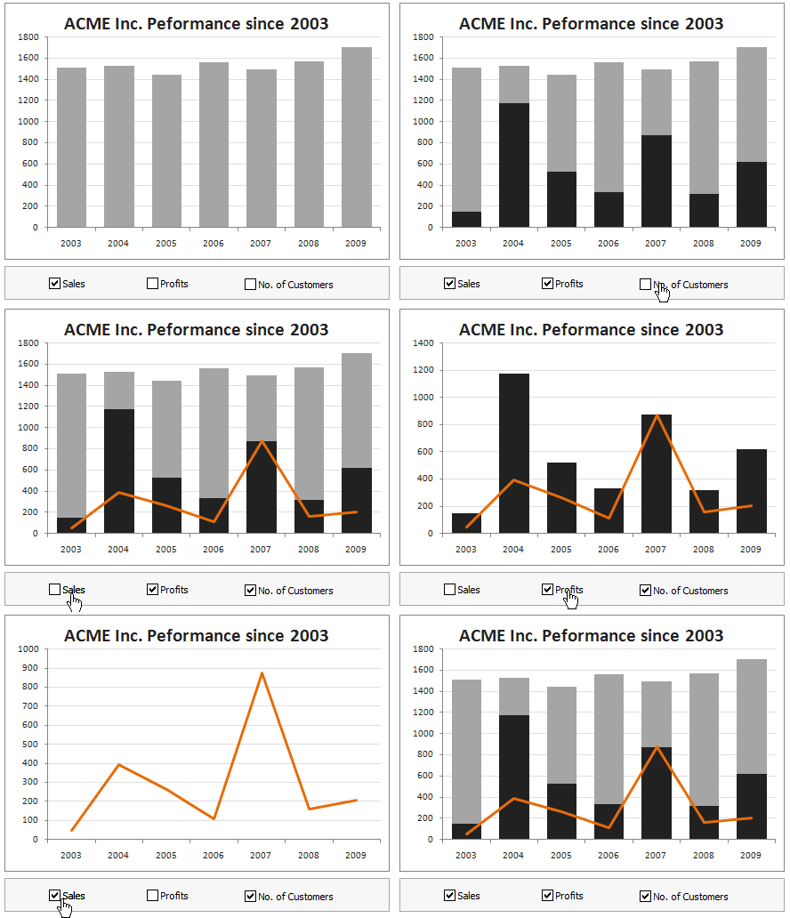
Dynamic charts are like my favorite food, Mangoes. They tempt, tease and taste awesomely. In this post, we are going to learn how to create a dynamic chart using check boxes and formulas as shown in the animation aside. Are you ready for some excel chart cooking?
You can also download a FREE Dynamic chart template from the post. So go ahead and make your boss drool.
Continue »Use Excel For Rapid UI Prototypes [Awesome uses of Excel]
![Use Excel For Rapid UI Prototypes [Awesome uses of Excel]](https://chandoo.org/img/i/excel-ui-prototype-example.png)
Here is an interesting use of Excel. Use it to design User Interface Prototypes. A UI Prototype is one of the steps we do while developing systems. It contains a clear and detailed user interface mocked up so that we can clearly find-out how end-users would react to such a system. Now, there are a […]
Continue »Official FIFA World-cup Soccer Balls since 1930 in an Excel Chart [Excel Fun]
![Official FIFA World-cup Soccer Balls since 1930 in an Excel Chart [Excel Fun]](https://chandoo.org/img/vp/official-fifa-worldcup-soccer-balls-from-1930.png)
The FIFA World-cup 2010 edition is around the corner. Like millions of people around the world, I too am an ardent fan of football. (although, I have played only one game of soccer in which I waited near opponents goal post as I was too lazy to run around. And when my team mates kicked […]
Continue »Annual Goals Tracker Sheet [awesome ways to use excel]
Marko, who is a long time PHD reader and an excel ninja sent this via email, I work at an insurance company in Slovenia. At the beginning of each year we have a conversation with our superiors to review our work in the past year and to set new goals (main activities) that we’re gonna […]
Continue »
Today we will build a mortgage payment calculator (and amortization schedule) using excel. But we will not build a boring excel sheet, we will build a mortgage calculator that is easy to play with.
A mortgage payment is a monthly installment that you pay towards a loan. Any mortgage loan will typically have, (1) loan amount, (2) duration of the loan in years, (3) interest rate per year
Given these 3 parameters, we can easily determine the monthly installment amount (this will be the same amount for all months during loan tenure)
We are going to use Excel’s form controls (more on this below) to build a mortgage payment calculator like this.
Continue »Product Recommendation – Excel Dashboard Training Kit

If you want to make better charts and create lasting impressions, chances are you have heard about Jorge Camoes. He writes at excelcharts.com (previously charts.jorgecamoes.com). I have been reading Jorge’s blog for over 2 years now and have linked to his excellent articles on PHD several times. Jorge also has an Excel Dashboard Training Kit, which teaches us how to make a dynamic and comprehensive excel dashboard. The dashboard training kit is a culmination most of his lessons implemented in a practical way using Excel.
In this article, I review the product and tell you why you should get a copy of it.
Continue »Recipe for a Donut Bar Chart

We all know that bar charts can be used to display values spread across various categories or times and pie charts / donut charts can be used to display percentage breakup of various quantities in a sum total. How about mashing up both to create a Donut Bar chart?
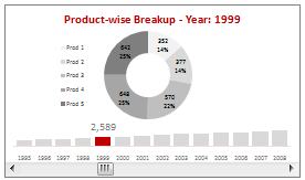
In this tutorial, you can learn how to make a donut bar chart and linking it to a form control to display Product-wise sales breakups spread across several years.
Continue »Excel Check Boxes, Even Simpler Way

In how to get tickmarks in excel, Jon commented,
“[…] Better yet, use real checkboxes, so the user can change them with the mouse.”
That got me thinking,
In excel, you can add a checkbox to spreadsheet using developer tools. But what if you need a whole bunch of checkboxes, one in each cell?
Continue »Dynamically Grouping Related Events [Excel Combo Charts with Pizzazz]
![Dynamically Grouping Related Events [Excel Combo Charts with Pizzazz]](https://chandoo.org/img/n/dynamic-event-grouping-charts-th.gif)
Yesterday we have posted how to use excel combo charts to group related time events. Today we will learn how to change the event grouping dynamically using form controls.
This effect can be easily achieved with a cup of coffee, one combo box form control and the good old IF formula. Read more to learn how to do this.
Continue »

