All articles with 'Learn Excel' Tag
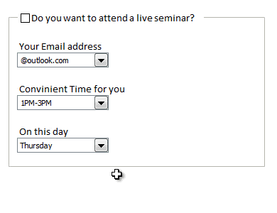
Rama, one of our readers emailed this:
I Have Many List boxes In That I need to Hide Few Of them Using Check box
Show Hide list boxes by using a check box
We can use check box and a bit of VBA to do this easily. Something like above demo.
Read on to learn how to do this using Excel & VBA.
Continue »{ 240 Comments }
Can you find that pattern? [Homework]
Published on Dec 14, 2012 in Excel Challenges
![Can you find that pattern? [Homework]](https://img.chandoo.org/hw/can-you-find-that-pattern-excel-homework.png)
Are you ready for an Excel challenge?
Today, your job is very simple. Just find a pattern in a text and return corresponding value.
Your Homework:
In a range we have some resource types & their billing rates.
In another range, we have some descriptions. Each description contains a resource type somewhere inside it. We need to retrieve billing rate for each description by looking up which resource type is mentioned in it.
See above diagram.
Continue »{ 12 Comments }
Highlight best week & month in a trend chart [tutorials]
Published on Dec 12, 2012 in Charts and Graphs
![Highlight best week & month in a trend chart [tutorials]](https://img.chandoo.org/c/highlight-best-week-month-in-trend-charts-excel-howtos.png)
When analyzing business data like sales, shop visits or productivity, one of the questions managers always ask is,
What is the best month / week for this data?
To answer this question, we need to make a chart that looks like above. Today, lets learn how to highlight portions of such charts that correspond to best week or best month.
Continue »{ 2 Comments }
Dressing Financial Statements – What Motivated Mr. Bean to Defraud Latte?
Published on Dec 11, 2012 in Financial Modeling
Did you know What Happened at Last Coffee Day?
Mr. Bean “dressed up” the financial statements and was caught in the fraud. But he was the CEO of Latte! So why did he commit fraud in his own company??
Any Guess?
Take a cappuccino and I will give you a hint – How was Mr. Bean’s Bonus to be decided?
Read on to know more…
Continue »{ 38 Comments }
How the tax burden has changed over the years – Excellent chart by NYTimes & Redoing it in Excel
Published on Dec 6, 2012 in Charts and Graphs
If I need some charting inspiration, I always visit New York Times. Their interactive visualizations are some of the best you can find anywhere. Clear, beautifully crafted and powerful. Long time readers of Chandoo.org knew that I like to learn from visualizations in NY Times & redo them using Excel.
Today let me present you one such chart. This is based on an interactive visualization prepared by NY Times explaining how the tax burden has changed over years for various income groups.
Take a look at tax burden chart – Excel implementation
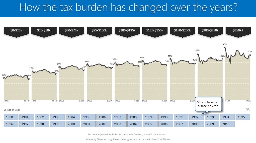
Read on to learn how to create this chart using Excel.
Continue »{ 7 Comments }
Macros for Automatically Implementing Modeling Best Practices
Published on Nov 29, 2012 in Financial Modeling, VBA Macros

In the first part on our Modeling Best Practices series, we learned 5 best practices to follow. This article shows how to automatically implement the best practices using macros.
Continue »{ 5 Comments }
Excel Links – Lets meet in Chennai this Sunday edition
Published on Nov 26, 2012 in excel links
Hi readers… I am in Chennai this week, conducting in-house training at Renault Nissan on Advanced Excel. As I am busy teaching Excel & making young graduates awesome in it, I will not be able to write much on the blog. But don’t worry. We have some great articles coming up from Hui & other […]
Continue »{ 19 Comments }
Financial Ratios – Cappuccino or Latte?
Published on Nov 21, 2012 in Financial Modeling

A Quick Question for you!
Don the hat of a financial wiz today. What I have for you are the financials of two companies: Cappuccino and Latte – Two dot com companies (Sometimes they also make revenues ;-))
Which is better – Cappuccino or Latte? ( Hint: It’s a trick question! 😉 )
It may seem obvious that Latte is performing better (Higher the revenue, the better the performance!). Sometimes a single source of data does not speak the full story!
Continue »![Project Portfolio Dashboard in Excel [Part 2 of 2]](https://img.chandoo.org/pm/project-portfolio-dashboard-small.png)
In this 2 part tutorial, we will learn how to design a project portfolio dashboard. Part 1 discussed user needs & design. Part 2 will show you Excel implementation.
Project Portfolio Dashboard Pack is now available.
Click here to get your copy.
Click here to get your copy.
Final Implementation – Project Portfolio Dashboard
First lets take a look at the finalized dashboard implementation. Continue reading to learn more & download this dashboard.
Continue »{ 29 Comments }
Project Portfolio Dashboard – Official Trailer
Published on Nov 15, 2012 in Project Management
Behold, here is the official trailer for our Project Portfolio Dashboard, releasing worldwide on 19th November (Monday), 2012.
Continue »{ 8 Comments }
Happy Diwali [Animated Chart inside]
Published on Nov 13, 2012 in Charts and Graphs, VBA Macros
![Happy Diwali [Animated Chart inside]](https://img.chandoo.org/c/animated-diwali-chart-in-excel.png)
My heartiest Diwali wishes to all our readers.
The spirit of Diwali is to encourage people to spread joy, celebrate good things and throw away darkness (evil). These ideas are universal. So let me wish you a very happy Diwali.
Diwali, festival of lights, is celebrated in the month of October / November. It is one of my favorite festivals since childhood. A time when all family members get together, celebrate all the good in their life, laugh and light a few fire crackers (fire works).
This year, our kids (Nishanth & Nakshatra) too are excited about the festival. They are eager to light diyas (small lamps), watch the fire works and enjoy. Naturally I do not feel like opening Excel.
But then…,
Sometime during my morning coffee, I thought “hey, why not create a small Diwali greeting using Excel?”
So here we go.
Continue »{ 37 Comments }
Pie of a Pie of a Pie chart [Good or Bad?]
Published on Nov 9, 2012 in Charts and Graphs
![Pie of a Pie of a Pie chart [Good or Bad?]](https://img.chandoo.org/c/water-stats-pie21.jpg)
There are some charts that look so stunning and yet confusing. You cant make up your mind whether it tells a compelling story or it is just plain wrong.
Today, let me present you one such chart. I call this Pie of a Pie of a Pie chart.
Continue »{ 3 Comments }
Highlight Quarters, Weekends in pivot reports using styles [quick tip]
Published on Nov 8, 2012 in Excel Howtos, Pivot Tables & Charts
![Highlight Quarters, Weekends in pivot reports using styles [quick tip]](https://img.chandoo.org/pivot/monthly-pivot-reports-with-quarter-highlighting.png)
Here is a quick pivot table tip.
When reporting summaries by month, it would be better to highlight 3 months at a time (Jan, Feb, Mar in one color, Apr, May, Jun in another color) than showing all in one color. Today, lets learn how to do this in easiest possible way.
Continue »{ 54 Comments }
Show monthly values & % changes in one pivot table
Published on Nov 6, 2012 in Excel Howtos, Pivot Tables & Charts
Pivot tables are great help when analyzing lots of data. One of the common questions managers & analysts ask (when looking at monthly sales data for example) is,
How is the monthly performance of our teams (or regions, products etc.)?
A pivot report can answer this question in a snap. Today lets learn how to do that.
Continue »{ 162 Comments }
Write a formula to check if two dates are in same month? [homework]
Published on Nov 2, 2012 in Excel Challenges, Excel Howtos
![Write a formula to check if two dates are in same month? [homework]](https://img.chandoo.org/hw/check-two-dates-in-same-month-excel-homework.png)
Its Home work time folks. Sharpen your Excel pencils and get cracking.
Find out if 2 dates are in same month
Lets say you have 2 dates in A1, A2.
Q1. What formula tells us if both of them are in same month?
Both dates must be in same month & year!
Go ahead and post your answer in comments.
Continue »
