All articles with 'excel chart templates' Tag
Format charts quickly with chart styles & color themes [quick tip]
![Format charts quickly with chart styles & color themes [quick tip]](https://chandoo.org/wp/wp-content/uploads/2016/01/chart-formatting-with-styles-colors.png)
Here is a quick tip to reduce the time you spend on chart formatting – use chart styles & color themes.
Excel offers various pre-defined color schemes and chart styles. Using them is very simple.
- Select your chart
- Go to Chart Design ribbon
- Click on the style or color scheme you want.
- Your chart changes instantly.
Create a line chart with bands [tutorial]
![Create a line chart with bands [tutorial]](https://img.chandoo.org/c/line-chart-with-bands-to-depict-kpi-or-goals.png)
Here is an interesting scenario.
Imagine you are responsible for customer satisfaction at ACME Inc. Every month you track customer satisfaction rate for the 3 products you sell which are conveniently named Product A, B & C.
You also have bands for the satisfaction rating.
- Rating of 85% or below is Average
- Rating between 85% & 95% is OK
- Rating above 95% is good
At the end of the year, you want to visualize the ratings for last 12 months for 3 products along with bands.
Something like above.
Unfortunately, there is no “Insert Banded line chart” button in Excel. So what to do?
That is what we will learn today. Ready?
Continue »Growing a Money Mustache using Excel [for fun]
Mustache and Excel?!? Sounds as unlikely as 3D pie charts & Peltier. But I have a story to tell. So grab a cup of coffee and follow me.
Today, lets talk about how to construct a dynamic chart that can show us how much progress we have made against a financial goal (in this case, accumulating a big chunk of money). I call this growing mustache chart, inspired from the wonderful Mr. Money Mustache.
Continue »Yet Another Sales Funnel Chart in Excel

A while ago, our reader Shay emailed me a Sales Funnel chart template.
I had to create a sales funnel for my company and I looked all over the internet to see how to do what I needed to do. I couldn’t find anything. I tried your funnel chart as well but because my numbers are all over the place I couldn’t get it to work for me.
I get so much information from you that I decided to share this chart with you. I used the shapes drawings to create the funnel graphic and the camera tool to place the values in each shape. I used formulas in the original data so that I will not have to recalculate every month.
I took the liberty of making little changes to Shay‘s funnel chart template to make it even better. Here is how the funnel looks like.
Continue »Introduction to Panel Charts using Excel – Tutorial & Template

In this article we will learn what a Panel Chart is and how you can construct a panel chart in Excel.
What is a Panel Chart?
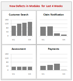
A panel chart is a set of similar charts neatly aligned in panels to help us understand some data which has multiple variables in it. Panel charts are also called by names “trellis displays” or “small multiples”. They are an effective way to display multi-variable data.
Here is an example panel chart showing the total defects per module over the last 4 weeks.
Continue »Issue Trackers & Risk Management using Excel [Project Management using Excel – Part 5 of 6]
Tracking issues and risks is where most of the project management time goes. Once the project planning and organizing activities are in good shape, most of the project management activities are around risk management and issue tracking. In this installment of project management using excel, we will learn how to create a simple issue tracker template using excel and how to analyze issues using excel.
Continue »Tweetboards – Alternative to traditional management dashboards
Here is a fun, simple and different alternative to traditional dashboards. Introducing….

Learn how to use excel chart templates in this installment of spreadcheats. Save time.
Continue »
Gauges are a familiar metaphor, everyone can understand them, you can see them everywhere – near your stove, ac, car, gaming console, pc – you name it. So, when you are preparing a chart to tell a point, gauge chart like the one above can be effective. (I know charting pros like Jon Peltier wouldn’t […]
Continue »Here is a ridiculously simple workaround for those of you trying to generate an organization chart in excel: Use google org. chart widget instead 🙂 [If you are reading this in a feedreader this post may not display properly, visit the post page instead.] Open a new google docs spreadsheet (or work on the example […]
Continue »73 Free Designer Quality Excel Chart Templates – Grab now and become a charting superman
How many times you created a chart in Microsoft excel and formatted it for minutes (and sometimes hours) to reduce the eye-sore? Well, I will tell you my answer, its 293049430493 times 😉 Worry not! for you can become a charting superman (or elastigirl) by using these 73 free designer quality chart templates in literally […]
Continue »

