All articles with 'downloads' Tag
{ 30 Comments }
Making a slick on/off switch using Excel & little bit of VBA [case study]
Published on Dec 5, 2013 in VBA Macros
![Making a slick on/off switch using Excel & little bit of VBA [case study]](https://img.chandoo.org/c/on-off-switch-interactive-chart-demo.gif)
I have a confession to make.
I am not sure how to describe this new thing I made in Excel / VBA. So first take a look at it.
Read on to learn how you can create something like this using Excel & a little bit of VBA.
Continue »In this episode of Formula Forensics, lets talk about how to build a model where costs vary per year and age. In this example, we are talking about a plantation project. The costs & yields of plants vary by the year they are planted in and the age of plants. In this case, how do we calculate the total costs or returns with formulas?

{ 18 Comments }
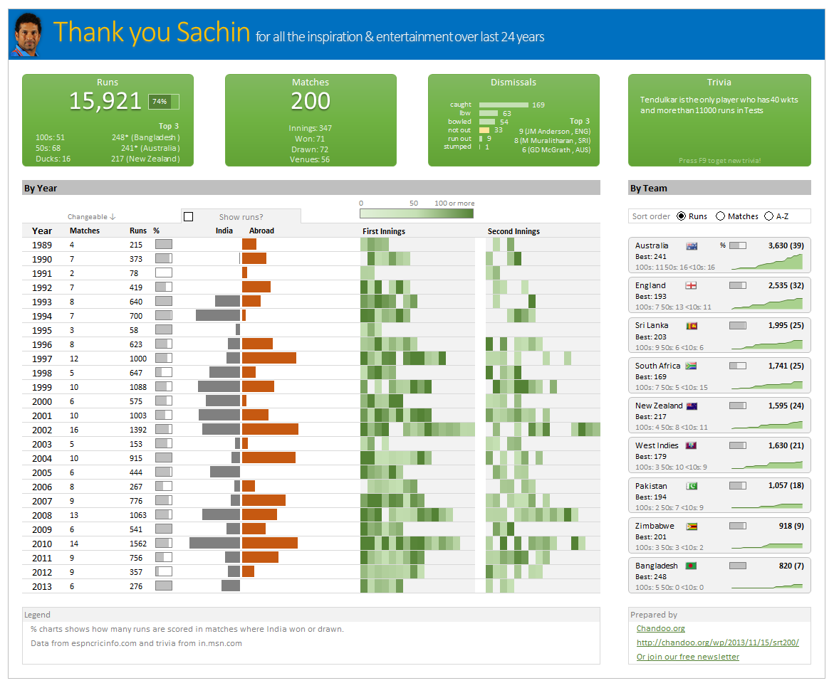
Thank you Sachin [a small tribute]
Published on Nov 15, 2013 in Charts and Graphs, Cool Infographics & Data Visualizations
Lets talk about people who inspire us. People who show us that anything is possible. People who prove that commitment, hard work and perseverance are true ingredients of a genius.
I am talking about Sachin Tendulkar. Those of you who never heard his name, he is the most prolific cricketer in the world. He is the leading scorer in both tests (15,921 runs) and one day matches (18,426 runs). Read more about him here.
Tendulkar has been an inspiration for me (and millions of others around the world) since I was a kid. The amount of dedication & excellence he has shown constantly motivates me. It is a pity that the great man is retiring from test cricket. He is playing his last test match (200th, most by any person) as I am writing this.
So as a small tribute, I have decided do something for him. Of course, I have never been a cricketer in my life. Once in college I was reluctantly asked to be a stand-by player in a game with seniors. I did not get a chance to pad up though. That is the closest I have been to a cricketer. So I did what I do best. Create an Excel workbook celebrating Sachin’s test career.
Thank you Sachin – his test career in a dashboard
Here is a dashboard I made visualizing his test cricket statistics. It is dynamic, fun & awesome (just like Sachin).
(click on the image to enlarge)
{ 41 Comments }
Show pop-up calendar upon right click [Excel VBA]
Published on Nov 13, 2013 in VBA Macros
There are times when we are entering dates into several columns and would like to select a date from a popup calendar instead of manually typing.
Today, lets understand how we can set up a pop-up calendar in Excel so that your users can easily input dates by right clicking on a cell and inserting a date.

{ 8 Comments }
Closing gaps in this Gender Equality Gap chart…
Published on Nov 5, 2013 in Charts and Graphs
Today lets close some gaps.
Recently I saw this interesting chart on Economist Daily Charts page. This chart is based on World Economic Forum’s survey on how women compare to men in terms of various development parameters. First take a look at the chart prepared by Economist team.
So what are the gaps in this chart?
This chart fails to communicate because,
- All country charts look same, thus making it difficult to spot any deviations.
- We cannot quickly compare one country with another on any particular indicator.
- It does not provide a better context (for eg. how did these countries perform last year?)
But criticizing someone’s work is not awesome. Fixing it and making an even better chart, that has awesome written all over it. So that is what we are going to do. You can see the improved chart above. Click on it to learn how you can create it.
Continue »
{ 89 Comments }
7 reasons why you should use INDEX() formula in Excel
Published on Sep 18, 2013 in Learn Excel

Today lets get cozy. Lets start a fling (a very long one). Lets do something that will make you smart, happy and relaxed.
Don’t get any naughty ideas. I am talking about INDEX() formula.
INDEX?!?
Of all the hundreds of formulas & thousands of features in Excel, INDEX() would rank somewhere in the top 5 for me. It is a versatile, powerful, simple & smart formula. Although it looks plain, it can make huge changes to the way you analyze data, calculate numbers and present them. It is so important that, whenever I teach (live or online), I usually dedicate 25% of teaching time to INDEX().
Enough build up. Lets get cozy with INDEX.
Continue »Using Arrays To Update Table Columns We are creating a lot of reports everyday and these reports contain a lot of data which is presented in various styles as per the requirements. The data that allows us to create the reports is usually referred as raw data and in most of the cases is stored […]
Continue »{ 16 Comments }
Calculating average of every nth value [Formula tips]
Published on Sep 5, 2013 in Excel Howtos
![Calculating average of every nth value [Formula tips]](https://img.chandoo.org/f/average-of-every-nth-value-excel-formulas.png)
Lets say you have a large list of numbers, and you want to calculate the average of every nth value. Not the average of all numbers, but just every nth number.
That is what we will learn in next few minutes.
Continue »{ 7 Comments }
Last day for enrollments – Join our Power Pivot class & become awesome analyst
Published on Aug 16, 2013 in Power Pivot
 Hi folks,
I have a quick announcement & a creative dashboard to share with you. First the announcement.
Only few hours left to join our Power Pivot course…
As you may know, I have opened enrollments for our 2nd batch of Power Pivot course few days ago. The aim of this course is to make you awesome in Excel, Advanced Excel, Dashboards, Power Pivot & Advanced Power Pivot.
We will be closing the doors of this program at midnight, today (11:59 PM, Pacific time, Friday, 16th of August).
If you want to join us, click here and enroll now.
Continue »{ 40 Comments }
How to create a Then vs. Now interactive chart in Excel?
Published on Aug 6, 2013 in Charts and Graphs
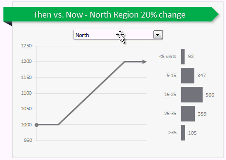
You have been there before.
Trying to compare last year numbers with this year, or last quarter with this quarter.
Today, let us learn how to create an interactive to chart to understand then vs. now.
Demo of Then vs. Now interactive chart
First, take a look the completed chart below. This is what you will be creating.
Continue »{ 41 Comments }
How to use Excel Data Model & Relationships
Published on Jul 1, 2013 in Excel Howtos, Pivot Tables & Charts

Have you ever been in a VLOOKUP hell?
Its what happens when you have to write a lot of vlookup formulas before you can start analyzing your data. Every day, millions of analysts and managers enter VLOOKUP hell and suffer. They connect table 1 with table 2 so that all the data needed for making that pivot report is on one place. If you are one of those, then you are going to love Excel 2013’s data model & relationships feature.
Continue »{ 15 Comments }
Are you ready for 2,000 miles, 15 days & 10 Excel tips road trip?
Published on Jun 24, 2013 in Charts and Graphs, personal

Finally my Excel classes in USA are over. It was a lot of fun traveling to new cities, teaching Excel & dashboards to enthusiastic crowds and making new friends. As if that is not fun enough, we (Jo, kids & I) are going on a 2,000 mile, 2 week road trip starting today.
Although I am enjoying all this, I also feel bad for not taking enough time to share new tricks, ideas & techniques with you here. So, I have a wacky, wild & awesome plan for you. Join us on our road trip.
That is right. You can join me on our road trip and see what I see, learn some pretty cool Excel tricks, all while sipping coffee and stretching legs in the comfort of your office cubicle.
Continue »
We all have some projects to manage every now and then and there are needs of various trackers that help us in gauging the progress of the same. One of the most important things are heat maps that quickly help us in visually displaying the names of the projects that need special attention and resolve issues that are impacting them.
Continue »{ 28 Comments }
How to find sum of top 3 values based on filtered criteria [video]
Published on May 17, 2013 in Excel Howtos
![How to find sum of top 3 values based on filtered criteria [video]](https://img.chandoo.org/f/sum-of-top-3-values-meeting-filtered-criteria-excel.png)
Lets say you are looking at some data as shown above and wondering what is the sum of budgets for top 3 projects in East region with Low priority. How would you do that with formulas?
Continue »
