All articles with 'dashboards' Tag
My First Podcast!!! – Listen to know some cool charting and dashboard stuff

Just weeks before Christmas, Ross McLean, who runs Methods in Excel (a very cool and useful Excel blog) asked me if I can join him for a small podcast interview on things we both love – excel, charts and talking. I couldn’t be more happier to accept his offer. We did the podcast and life kept busy both of us for a while. That is until yesterday, when Ross made the podcast available online for all of us.
Please go here to listen to my first podcast interview.
Continue »![Making a Dynamic Dashboard in Excel [Part 1 of 4]](https://chandoo.org/img/ed/excel-dynamic-dashboard-final-th.png)
In this and next 3 posts, we will learn how to make a Dynamic Dashboard using Microsoft Excel.
At the end of this tutorial, you will learn how easy it is to set up a dynamic dashboard using excel formulas and simple VBA macros.
Continue »Sachin Tendulkar ODI Stats – an Excel Info-graphic Poster

Sachin Tendulkar is undoubtedly the best cricketers to play One Day International Cricket. He is a source of inspiration and joy for me and many others. So, naturally I was jumping with joy when I heard that he scored the highest ever runs in a single match on 24th of Feb. He scored 200 runs […]
Continue »Best Sales Dashboards, as Voted by You [Visualization Challenge #2 – Winners]
![Best Sales Dashboards, as Voted by You [Visualization Challenge #2 – Winners]](https://img.chandoo.org/v/s/sales-data-dashboard-alex-kerin-1-excel.png)
Finally, our second visualization challenge comes to an end. We got a winner. Background about Zoho Reports Visualization Challenge: (skip this section if you know what I am going to say) Back in November, 2009, I have asked the readers to come up with best possible ways to visualize a set of fictitious sales data. […]
Continue »Product Recommendation – Excel Dashboard Training Kit

If you want to make better charts and create lasting impressions, chances are you have heard about Jorge Camoes. He writes at excelcharts.com (previously charts.jorgecamoes.com). I have been reading Jorge’s blog for over 2 years now and have linked to his excellent articles on PHD several times. Jorge also has an Excel Dashboard Training Kit, which teaches us how to make a dynamic and comprehensive excel dashboard. The dashboard training kit is a culmination most of his lessons implemented in a practical way using Excel.
In this article, I review the product and tell you why you should get a copy of it.
Continue »Sales Dashboards – Visualizing Sales Data – 32 Dashboard Examples & Implementations

Sales reports and dashboards are very common in any company. There are several ways in which you can visualize sales data to understand the trends and sales performance. So in November, I have asked you to visualize sales data using sample data. The visualization challenge #2, sponsored by Zoho Reports generated a huge buzz around the community and fetched 32 incredible entries. The response was so overwhelming that it took me almost 24 hours to write this post. Thanks everyone for participating and making this a huge learning experience for everyone. Personally I have learned several useful dashboard and charting tricks. I will be sharing some of these lessons with all of you in the coming weeks.
Continue »Use Shapes and Images to make Prettier Charts [Dashboard Tricks]
![Use Shapes and Images to make Prettier Charts [Dashboard Tricks]](https://chandoo.org/img/c/use-shapes-to-make-better-dashboard-charts.png)
One of the annoyances of charts is that they all look like boxes (except for pie charts, they just look wrong). Boxes might be ok when you are making 1 or 2 charts. But a whole dashboard of boxes can look little rigid. So how can we make the charts peppy without loosing any effect? Like these charts below:
Very simple, we use drawing shapes in MS Excel to draw whatever we want and overlay the chart on top.
Continue »50% off on ExcelUser’s Dashaboard Kit [2 days only]
![50% off on ExcelUser’s Dashaboard Kit [2 days only]](https://chandoo.org/wp/wp-content/uploads/2009/12/exceluser-dashboards-th.png)
Charley at Excel User is running a sale on the excel dashboard kits. It is too good to be true. You get the plug and play dashboard kits for half the regular price. Go here to avail this offer and read on, if you are not sure what the dashboard kit is.
For a long time now, I have been an advocate of Excel User’s dashboards. Charley is a pioneer when it comes to excel based dashboard reporting. He has popularized several techniques like using sumproduct formula, using camera tool etc. I have been such a fan boy of his work that I even interviewed him once on this blog.
Continue »Excel Links of the Week [Excel Dashboards Edition]
Over the weekend I spent some time to update the Excel Dashboards page. It now features more articles, downloads and resources for those of you making Excel Dashboards. Go ahead and check out the page here and let me know your feedback.
Moving on to this weeks excel and charting links worth checking.
Continue »Dashboard Best Practice – Google Analytics Intelligence Report

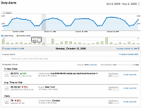
Yesterday while checking my website analytics reports on Google analytics site, I have noticed a new beta feature called “Intelligence”. Out of curiosity I clicked on it. It took me to a an intelligence alert dashboard. Ok, lets just back up for a minute and understand what “intelligence dashboard” is before moving on. In the […]
Continue »Project Dashboard + Tweetboard = pure awesomeness!!!

Check out an implementation of project dashboard along with tweetboard by our reader Fernando. He says, it “turned out to be a great success”. I am so happy for him.
Btw, the post includes a link to download the workbook so that you can see the dashboard and tweetboard in action.
Continue »
I have a super exciting news for all our members. During the last several weeks, I have been working on making 24 strikingly remarkable and easy to use excel templates for better project management. Finally the bundle is ready. You can get a copy of the bundle starting today.
Continue »![Project Management Dashboard / Project Status Report using Excel [Part 6 of 6]](https://chandoo.org/img/pm/project-status-dashboard-th.png)
Project management dashboards, project status reports help stakeholders, project sponsors and team-members can understand project status very quickly. In the last installment of project management using excel, learn how to make project management dashboard using excel in this tutorial. Also download the excel project status dashboard template.
Continue »50 Best Cities for Finding a Job [Incell Dashboard using Excel]
![50 Best Cities for Finding a Job [Incell Dashboard using Excel]](https://chandoo.org/wp/wp-content/uploads/2009/08/incell-comparison-charts.png)
We all know that incell charts are a very cool way to explore and visualize data. Personally I like them so much that I have written several tutorials on it here. Today we will see how a Job dashboard on “50 best cities for finding a job” originally prepared by Indeed job search engine can be recreated in Excel using In-cell charts. The final outcome is something like this.
Continue »Twitter Formula Contest – We are 5000 strong now

Time for blowing my own trumpet and patting my own back over my pointy hair. I feel very proud to announce that our little community at Pointy Haired Dilbert now has its five thousandth member.
Take a minute and pat yourself on the back. This is an achievement because of you. Go ahead, I am waiting.
Ok, enough patting. Time for some gifts and fun.
We have 2 contests to celebrate the occasion. This is the first one. I will announce the second contest tomorrow. Read the rest of this post to find out more about the twitter formula contest
Continue »

