
Learn how to create these 11 amazing dashboards
Today lets talk about how to build world-class dashboards.
What is a dashboard?
Dashboard reports allow managers to get high-level overview of the business and help them make quick decisions. A dashboard is usually a one page report that contains critical information for decision support.
How to make dashboards?
Excel is an excellent tool to make powerful dashboards that can provide analysis, insight and alert managers in timely manner. But creating a dashboard takes a lot of skill & practice. That is where a resource like Chandoo.org comes handy. In this site you can find more than 200 different dashboard examples, tutorials, samples and downloads – all designed to make you awesome.
Read on to learn more…
What is your favorite Excel book? [open thread]
Today lets talk about Excel books. The question is simple.
What is your favorite Excel book? Please share your answers using comments.
My favorite books are..,
Top 10 things I learned using Excel for a decade
Sometime during the 2nd half of 2013, I finished 10 years of Excel usage. In the last 10 years, I completed my studies, got my first job, married, had kids, visited 15 different countries, quit my job to start a business, bought first car, first house, made dozens of new friends, read 100s of books, wrote a book and learned 1000s of new things. And all along, Excel stayed a true companion. Right from MBA entrance exam preparation in 2003 to making my summer internship project reports in 2005 to planning my wedding expenses in 2007 to getting a promotion in 2009 to planning my kids feeding schedule in 2010 to running a successful business in 2014, Excel helped me in every step.
So today, I want to tell you the top 10 things I learned using Excel in last decade. Grab a hot cup of coffee, buckle your belts and get ready for time travel.
Thank you Sachin [a small tribute]
Lets talk about people who inspire us. People who show us that anything is possible. People who prove that commitment, hard work and perseverance are true ingredients of a genius.
I am talking about Sachin Tendulkar. Those of you who never heard his name, he is the most prolific cricketer in the world. He is the leading scorer in both tests (15,921 runs) and one day matches (18,426 runs). Read more about him here.
Tendulkar has been an inspiration for me (and millions of others around the world) since I was a kid. The amount of dedication & excellence he has shown constantly motivates me. It is a pity that the great man is retiring from test cricket. He is playing his last test match (200th, most by any person) as I am writing this.
So as a small tribute, I have decided do something for him. Of course, I have never been a cricketer in my life. Once in college I was reluctantly asked to be a stand-by player in a game with seniors. I did not get a chance to pad up though. That is the closest I have been to a cricketer. So I did what I do best. Create an Excel workbook celebrating Sachin’s test career.
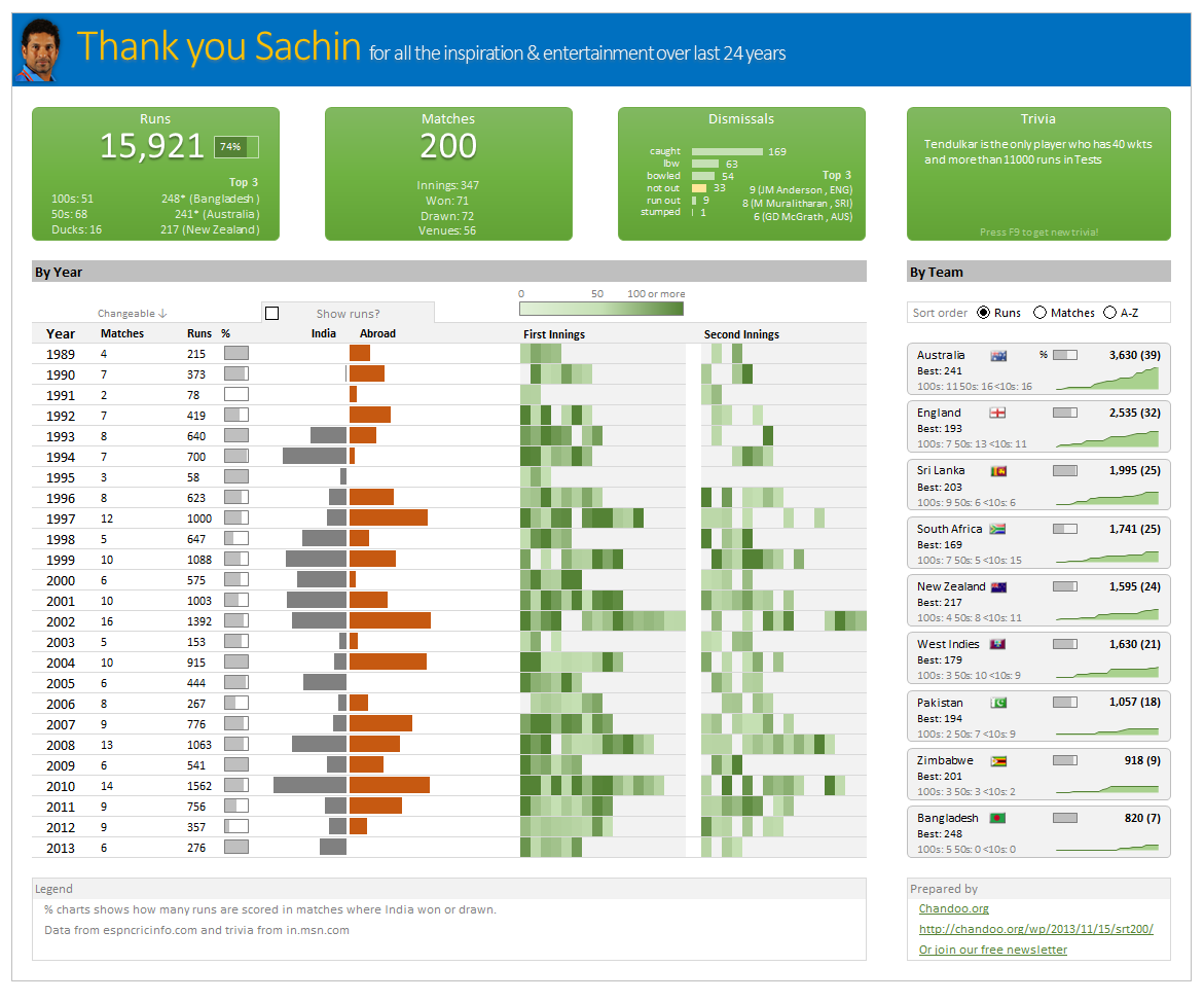
Thank you Sachin – his test career in a dashboard
Here is a dashboard I made visualizing his test cricket statistics. It is dynamic, fun & awesome (just like Sachin).
(click on the image to enlarge)
Closing gaps in this Gender Equality Gap chart…
Today lets close some gaps.
Recently I saw this interesting chart on Economist Daily Charts page. This chart is based on World Economic Forum’s survey on how women compare to men in terms of various development parameters. First take a look at the chart prepared by Economist team.
So what are the gaps in this chart?
This chart fails to communicate because,
- All country charts look same, thus making it difficult to spot any deviations.
- We cannot quickly compare one country with another on any particular indicator.
- It does not provide a better context (for eg. how did these countries perform last year?)
But criticizing someone’s work is not awesome. Fixing it and making an even better chart, that has awesome written all over it. So that is what we are going to do. You can see the improved chart above. Click on it to learn how you can create it.
Last day for enrollments – Join our Power Pivot class & become awesome analyst
 Hi folks,
I have a quick announcement & a creative dashboard to share with you. First the announcement.
Only few hours left to join our Power Pivot course…
As you may know, I have opened enrollments for our 2nd batch of Power Pivot course few days ago. The aim of this course is to make you awesome in Excel, Advanced Excel, Dashboards, Power Pivot & Advanced Power Pivot.
We will be closing the doors of this program at midnight, today (11:59 PM, Pacific time, Friday, 16th of August).
If you want to join us, click here and enroll now.
Excel Links for you – Busy busy edition
As the launch date for our 2nd batch of Power Pivot class nears, my plate looks fuller than ever. Fine tuning the course details, preparing our online classroom for new batch of students and coordinating with Rob for video recording etc.
But I wanted to take a few mins today and share with you some really useful Excel tricks, ideas and examples from web. I found these really useful and inspiring. I am sure you will learn from these links as much as I learned.