All articles with 'Microsoft Excel Conditional Formatting' Tag
{ 9 Comments }
Christmas Gift Shopping List Template – Set budget, track your gifts using Excel
Published on Nov 23, 2011 in excel apps, Learn Excel
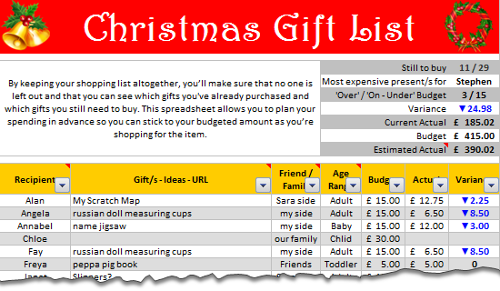
Last year, Steven shared a beautiful Christmas Gift List template with all of us. It is packed with lots of Excel goodness. Just a few days ago, he emailed me another copy of his file with some improvements. So if you are planning for Christmas shopping and want a handy tracker, you don’t want to miss this.
Continue »{ 15 Comments }
Compare 2 Lists Visually and Highlight Matches
Published on Oct 27, 2011 in Excel Howtos, Learn Excel
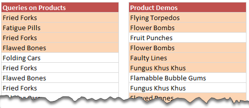
Comparison is one of the most common things we do with Excel. Naturally, there are so many ways to compare 2 lists of data using Excel.
Today, I want to share an interesting comparison problem with you.
Lets say you run a small shop which sells some highly specialized products. Now, since your products require quite some training before customers can buy them, you keep track of all product queries and arrange demos.
After a hectic week, you are staring at 2 lists. One with product queries, another with product demos. And you want to know whether all the queries are answered with a demo or not.
Continue »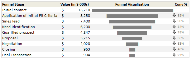
Sales Funnel or Sales Process refers to a systematic approach to selling a product or service. [more on sales process] Whether you run a small business or part of a large corporation, chances are, you heard about Sale Funnel. Understanding & analyzing your sales performance from a Funnel point of view is a great way […]
Continue »{ 12 Comments }
Analyzing Performance of Stocks using Excel [Example]
Published on Sep 21, 2011 in Charts and Graphs
![Analyzing Performance of Stocks using Excel [Example]](https://chandoo.org/wp/wp-content/uploads/2011/09/stock-analysis-in-excel.png)
Last week, we learned how to visualize Suicides vs. Murders data using Interactive charts in Excel. William, one of our readers, took this technique and applied it to Stocks. He emailed me because he has some formula issues with the stock data. Once I solved the problem, I asked him, “Can I share this with […]
Continue »{ 24 Comments }
Suicides & Murders by US States – An Interactive Excel Chart
Published on Sep 9, 2011 in Charts and Graphs, Cool Infographics & Data Visualizations
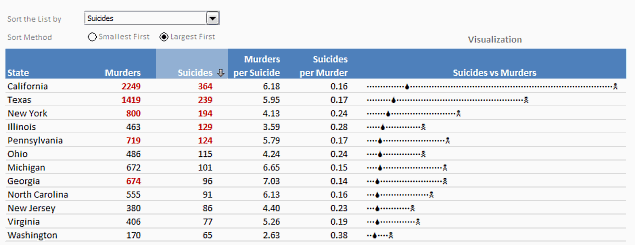
Over at PTS Blog, my dear friend & charting guru, Jon Peltier has an interesting post on using dot plots to visualize Murders & Suicides data by US States.
Not that murders & suicides fascinate me, but I wanted to play with this data myself and see how we can visualize it. So I emailed Jon and asked him to share the raw data. Being a lovely chap Jon is, he immediately sent me the data. So here we are, playing with gory data on a Friday.
Suicides & Murders by US States – An Interactive Excel Chart
You can see a demo of the chart I came up with above. Read on to learn how this chart is constructed.
Continue »{ 21 Comments }
Simple KPI Dashboard using Excel
Published on Aug 25, 2011 in Charts and Graphs, Cool Infographics & Data Visualizations
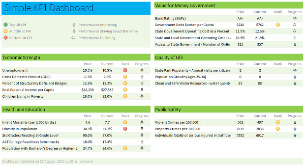
Any Tom, Dick and Sally can make things complex. It takes guts and clarity to simplify things. That is why I was pleasantly surprised to see this dashboard prepared by Michigan State. You can see it in the detailed article.
Linda, one of My Excel School students shared this dashboard link with me and asked if I can show how to construct something like this. Here is my version of the dashboard.
Read this post to learn how to construct a similar dashboard on your own. Also, you can download the excel workbook and play with it.
Continue »
Today I want to share an Employee Shift Calendar Template with you. You can use this template to keep track of shift timings on various days. See a demo of the template: How does this template work? This template uses a 3 main ideas, Excel formulas to create the calendar & checking for a day’s […]
Continue »
Two weeks ago we asked you what you wanted to see at Chandoo.org and you responded.
We have had 71 responses giving us 101 ideas to date.
Here are the results…
Continue »
Last week we learned how to create dynamic hyperlinks in Excel. Today, I want to show you something even cooler. An interactive dashboard based on hyperlinks, like shown above.
Isn’t it impressive?
Well, to create something like this, you don’t need a degree in advanced cryogenics. You just need a bunch of data, a chart, a one line macro code and some pixie dust (go easy on pixie dust).
Continue »{ 15 Comments }
How to create a Win-Loss Chart in Excel? [Tutorial & Template]
Published on Jun 9, 2011 in Charts and Graphs
![How to create a Win-Loss Chart in Excel? [Tutorial & Template]](https://img.chandoo.org/c/win-loss-chart-excel-template.png)
Win Loss Charts are an interesting way to show a range of outcomes. Lets say, you have data like this:
win, win, win, loss, loss, win, win, loss, loss, win
The Win Loss chart would look like this:

Today, we will learn, how to create Win Loss Charts in Excel.
We will learn how to create Win Loss charts using Conditional Formatting and using In-cell Charts.
Continue »{ 15 Comments }
Comparing Sales of One Product with Another [Excel Techniques]
Published on Apr 25, 2011 in Charts and Graphs
![Comparing Sales of One Product with Another [Excel Techniques]](https://img.chandoo.org/c/comparing-sales-of-one-product-with-another-demo.png)
This is a guest article by Theodor on how to Compare Sales of One Product with Another
Ok, now here’s one for you.
Suppose you’d like to come up with a sales report on different products, comparing their evolution on the same period of different years (say Jan ’09 vs. Jan Jan ’10). At the same time, you’d like to keep an eye on their yearly trend (entire 2009 vs. entire 2010).
Read on to learn how you can use Excel Charts to do this very easily.
Continue »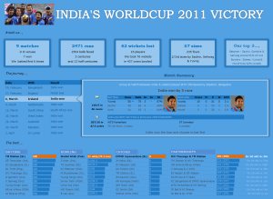
I know I am late to the party, but better late than…, uh! forget it.
As the keen readers of our blog knew, I like cricket and I show my enthusiasm by making an excel dashboard (or info-graphic) whenever Indian team reaches a major milestone. So naturally, I was super excited when we won the ICC World cup 2011. Last time Indian won the event was in 1983 and my idea of a dashboard at that time was a bottle of milk and jingo-bell, my favorite shake-to-make-annoying-noise toy. I think our latest world-cup victory deserves something more than that. So here we go.
Continue »![Show Details On-demand in Excel [Tutorial + Training Program]](https://img.chandoo.org/c/on-demand-analysis-and-details-in-excel-demo.gif)
Yesterday, we have seen a beautiful example of how showing details (like distribution) on-demand can increase the effectiveness of your reports. Today, we will learn how to do the same in Excel.
Continue »{ 5 Comments }
Health-care Dashboard in Excel [Dashboard Week]
Published on Mar 22, 2011 in Charts and Graphs
![Health-care Dashboard in Excel [Dashboard Week]](https://img.chandoo.org/dashboards/dw/health-care-dashboard-small.png)
As part of Dashboard Week, in this post, we will take a look at Health-care Dashboard prepared and shared by Alberto. He put together an excellent dashboard to visualize hospital performance and understand what is going on. Read this post to understand how this dashboard is made, watch a tutorial video & download example workbook.
Thank you Alberto for sharing the file & helping us learn.
Continue »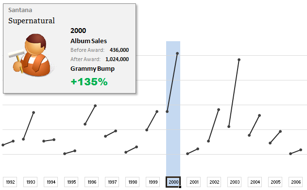
The folks at Washington Post made an interesting chart to understand whether winning a Grammy award makes any difference to album sales. Go ahead and browse it if you have not already seen it. Go, I will wait.
Are you impressed?
I really liked this chart. This is what I liked about the chart,
- It tells a story.
- It is an ego chart. We would all instantly search for our favorite artists and learn about how Grammy award changed their album sales.
- It is a simple chart. No clutter, no gaudy colors, just a bunch of lines and the story is out there.
- It lets you play.
In fact, I liked the chart so much that I wanted to make it in Excel.. You can see a snapshot of what I came up with above. Read the rest of this article to learn more.
Continue »
