All articles with 'Microsoft Excel Conditional Formatting' Tag
Thank you Sachin [a small tribute]
Lets talk about people who inspire us. People who show us that anything is possible. People who prove that commitment, hard work and perseverance are true ingredients of a genius.
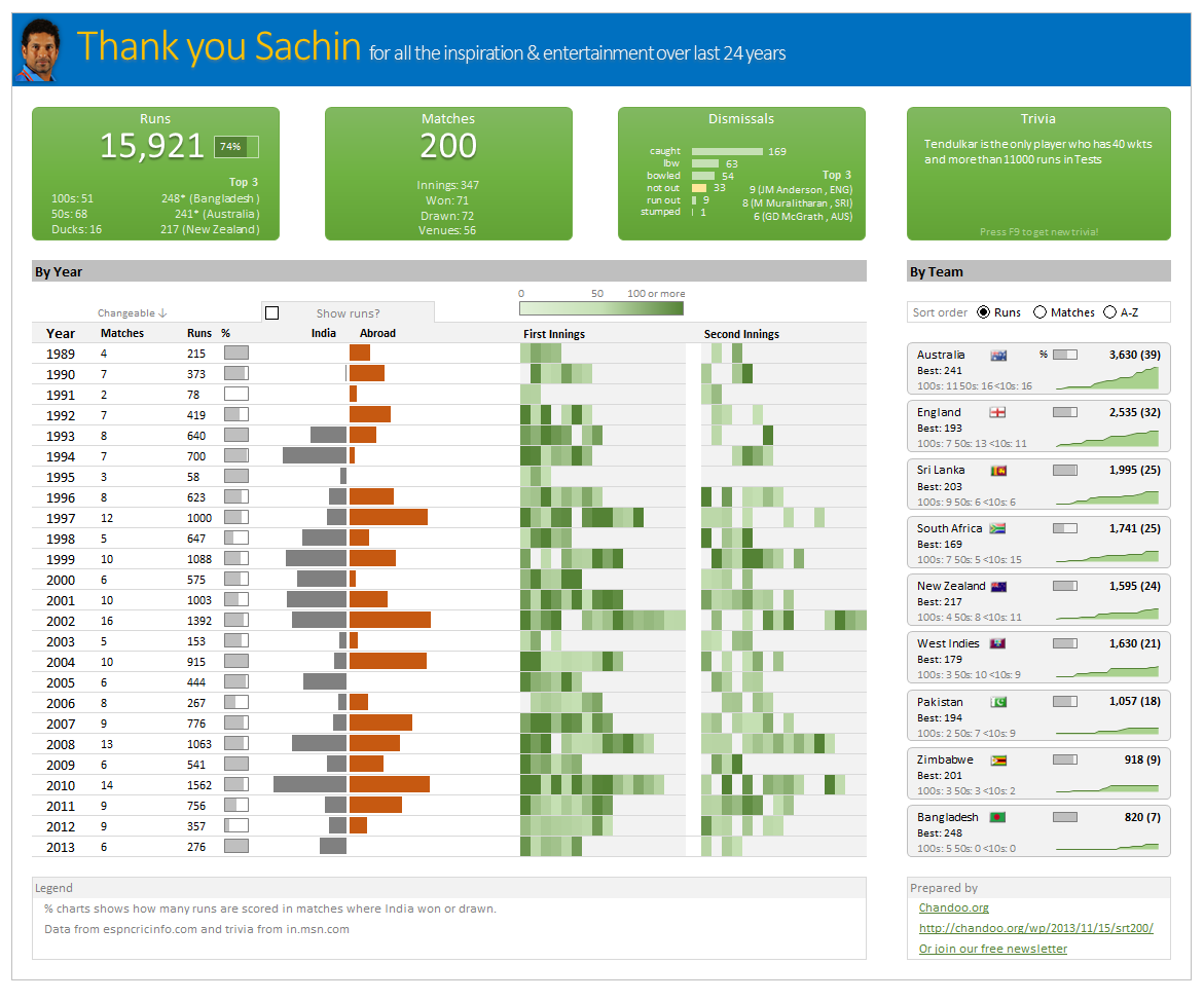
I am talking about Sachin Tendulkar. Those of you who never heard his name, he is the most prolific cricketer in the world. He is the leading scorer in both tests (15,921 runs) and one day matches (18,426 runs). Read more about him here.
Tendulkar has been an inspiration for me (and millions of others around the world) since I was a kid. The amount of dedication & excellence he has shown constantly motivates me. It is a pity that the great man is retiring from test cricket. He is playing his last test match (200th, most by any person) as I am writing this.
So as a small tribute, I have decided do something for him. Of course, I have never been a cricketer in my life. Once in college I was reluctantly asked to be a stand-by player in a game with seniors. I did not get a chance to pad up though. That is the closest I have been to a cricketer. So I did what I do best. Create an Excel workbook celebrating Sachin’s test career.
Thank you Sachin – his test career in a dashboard
Here is a dashboard I made visualizing his test cricket statistics. It is dynamic, fun & awesome (just like Sachin).
(click on the image to enlarge)
Continue »Closing gaps in this Gender Equality Gap chart…
Today lets close some gaps.
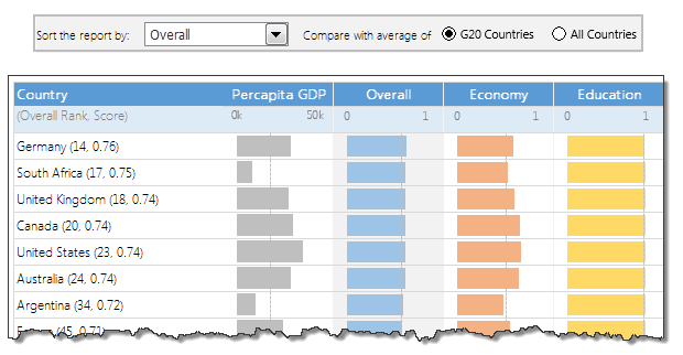
Recently I saw this interesting chart on Economist Daily Charts page. This chart is based on World Economic Forum’s survey on how women compare to men in terms of various development parameters. First take a look at the chart prepared by Economist team.
So what are the gaps in this chart?
This chart fails to communicate because,
- All country charts look same, thus making it difficult to spot any deviations.
- We cannot quickly compare one country with another on any particular indicator.
- It does not provide a better context (for eg. how did these countries perform last year?)
But criticizing someone’s work is not awesome. Fixing it and making an even better chart, that has awesome written all over it. So that is what we are going to do. You can see the improved chart above. Click on it to learn how you can create it.
Continue »Last day for enrollments – Join our Power Pivot class & become awesome analyst
I have a quick announcement & a creative dashboard to share with you. First the announcement.
Only few hours left to join our Power Pivot course…
As you may know, I have opened enrollments for our 2nd batch of Power Pivot course few days ago. The aim of this course is to make you awesome in Excel, Advanced Excel, Dashboards, Power Pivot & Advanced Power Pivot.
We will be closing the doors of this program at midnight, today (11:59 PM, Pacific time, Friday, 16th of August).
If you want to join us, click here and enroll now.
Continue »![How to find the lowest value? [Quick tip]](https://img.chandoo.org/q/finding-lowest-value.png)
Lets say you are the head of purchasing department at Big Corp Co.
You are obviously very busy. Every day starting with a large cup of coffee and ends with a big smile, as you save your company thousands of $s by negotiating best deals, finding best providers and being awesome.
Today, let me share a small Excel tip with you that will make you even more awesome.
Continue »Never use simple numbers in your dashboards (bonus tip: how to fix default conditional formatting)
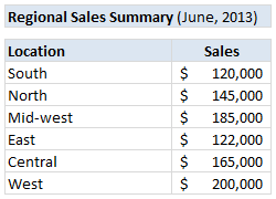
Pop quiz: What is wrong with above report?
At first glance, it looks alright. But if you observe closely, you realize that it is not telling the entire story. Just looking at regional sales numbers, you have not much clue what is going on with them.
So how to improve it?
Continue »
Last week, we had a lovely poll on what are your favorite features of Excel? More than 120 people responded to it with various answers. So I did what any data analyst worth his salt would do,
I analyzed the data and here are the top 10 features in Excel according to you.
Read on to learn more.
Continue »![How to create interactive calendar to highlight events & appointments [Tutorial]](https://img.chandoo.org/vba/interactive-event-calendar-in-excel.png)
One of the popular uses of Excel is to maintain a list of events, appointments or other calendar related stuff. While Excel shines easily when you want to log this data, it has no quick way to visualize this information. But we can use little creativity, conditional formatting, few formulas & 3 lines of VBA code to create a slick, interactive calendar in Excel. Today, lets understand how to do this.
Continue »Designing a dashboard to track Employee vacations [case study]
![Designing a dashboard to track Employee vacations [case study]](https://chandoo.org/wp/wp-content/uploads/2013/01/employee-vacation-dashboard-full-view.png)
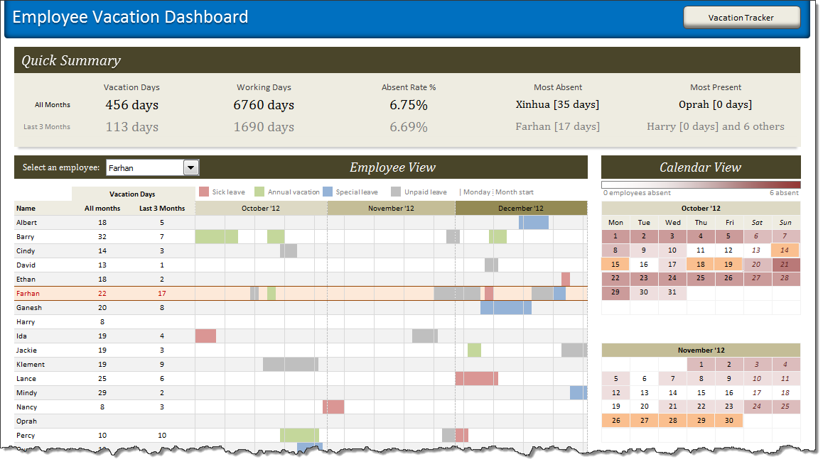
HR managers & department heads always ask, “So what is the vacation pattern of our employees? What is our average absent rate?”
Today lets tackle that question and learn how to create a dashboard to monitor employee vacations.
What do HR Managers need? (end user needs)
There are 2 aspects tracking vacations.
1. Data entry for vacations taken by employees
2. Status dashboard to summarize vacation data
To-do List with Priorities using Excel
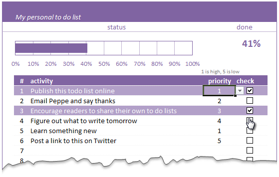
A while ago, we published a new year resolution template. This was a hit with our reader with thousands of you downloading it. During last week, Peppe, one of our readers from Italy, took this template and made it even more awesome.
The original template had tasks and completion check mark. As you finish each task, you can see the progress bar moving.
Peppe added priorities to this. With his new version, progress is measured based on how much priority we assigned that particular task. Pretty neat eh?!?
Continue »2012 has been the most awesome year since we started Chandoo.org.
The credit for this goes to our community of Excel users – that is you.
For practically every day of 2012, you have inspired me (and all of us at Chandoo.org) to learn something new, share and make you awesome. I know I say this many times, but I can never feel enough – Thank you for your support to Chandoo.org.
Apart from you, there are many other amazing people & companies that played a role in our success. In this post, let me highlight them & express my sincere gratitude.
Continue »![2013 Calendar – Excel Template [Downloads]](https://img.chandoo.org/c/2013-calendar-template-FREE-download.png)
Here is a New year gift to all our readers – free 2013 Excel Calendar Template.
This calender has,
- One page full calendar with notes, in 4 different color schemes
- Daily event planner & tracker
- 1 Mini calendar
- Monthly calendar (prints to 12 pages)
- Works for any year, just change year in Full tab.
![Project Portfolio Dashboard in Excel [Part 2 of 2]](https://img.chandoo.org/pm/project-portfolio-dashboard-small.png)
In this 2 part tutorial, we will learn how to design a project portfolio dashboard. Part 1 discussed user needs & design. Part 2 will show you Excel implementation.
Click here to get your copy.
Final Implementation – Project Portfolio Dashboard
First lets take a look at the finalized dashboard implementation. Continue reading to learn more & download this dashboard.
Continue »Show monthly values & % changes in one pivot table
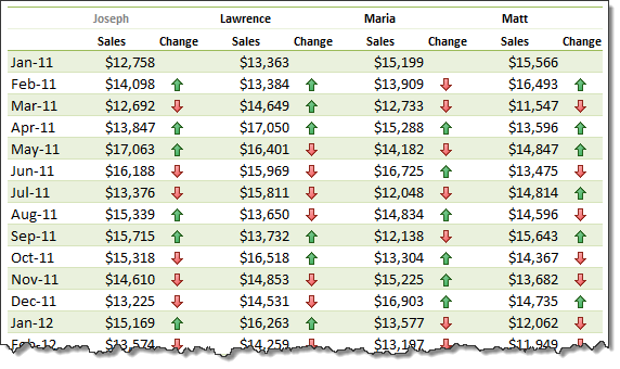
Pivot tables are great help when analyzing lots of data. One of the common questions managers & analysts ask (when looking at monthly sales data for example) is,
How is the monthly performance of our teams (or regions, products etc.)?
A pivot report can answer this question in a snap. Today lets learn how to do that.
Continue »Customize Zebra lines Quickly using Table Styles [tip]
![Customize Zebra lines Quickly using Table Styles [tip]](https://img.chandoo.org/q/custom-zebra-lines-excel-tip.png)
Zebra lines, the dull highlighting applied to alternative rows is a very good way to make your tables readable & pretty.
We can use either conditional formatting or table formats to quickly add zebra lines to our data.
But what if you want a little more?
What if you want to highlight, lets say 3 rows in one color and 3 in another and repeat this …
Continue »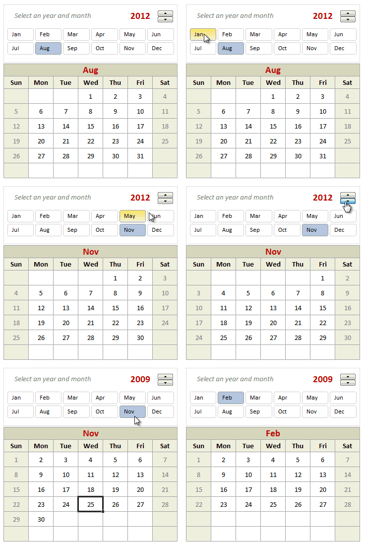
Can we make a calendar using Pivot Tables?!? Of course we can. Today let us learn a simple technique to create calendar style reports using Pivot tables. Thanks to Rob for inspiration Before making any progress, let me thank Rob from PowerPivotPro for the inspiration. Recently he wrote an article explaining how to use PowerPivot […]
Continue »
