All articles with 'charting' Tag
Monitoring Monthly Service Levels using Excel Charts [Example]
![Monitoring Monthly Service Levels using Excel Charts [Example]](https://img.chandoo.org/c/service-levels-7-years-excel-chart.png)
Recently, I wrote a tutorial on tax burden in USA chart.
Jared, One of our readers liked this chart very much. Jared works as a workforce scheduler and has data similar to our chart. So he applied the same technique to analyze monthly service levels for last 7 years & sent me the file so that I can share it with all of you.
First take a look at the demo of Jared’s chart. And read on to know how this works.
Continue »Highlight best week & month in a trend chart [tutorials]
![Highlight best week & month in a trend chart [tutorials]](https://img.chandoo.org/c/highlight-best-week-month-in-trend-charts-excel-howtos.png)
When analyzing business data like sales, shop visits or productivity, one of the questions managers always ask is,
What is the best month / week for this data?
To answer this question, we need to make a chart that looks like above. Today, lets learn how to highlight portions of such charts that correspond to best week or best month.
Continue »How the tax burden has changed over the years – Excellent chart by NYTimes & Redoing it in Excel
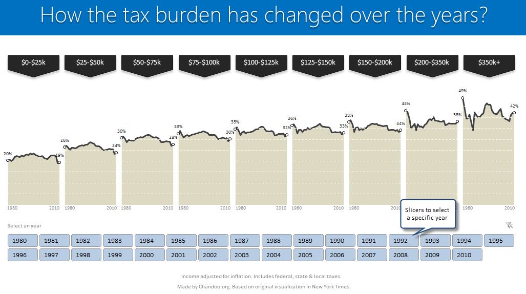
If I need some charting inspiration, I always visit New York Times. Their interactive visualizations are some of the best you can find anywhere. Clear, beautifully crafted and powerful. Long time readers of Chandoo.org knew that I like to learn from visualizations in NY Times & redo them using Excel.
Today let me present you one such chart. This is based on an interactive visualization prepared by NY Times explaining how the tax burden has changed over years for various income groups.
Take a look at tax burden chart – Excel implementation

Read on to learn how to create this chart using Excel.
Continue »![Project Portfolio Dashboard in Excel [Part 2 of 2]](https://img.chandoo.org/pm/project-portfolio-dashboard-small.png)
In this 2 part tutorial, we will learn how to design a project portfolio dashboard. Part 1 discussed user needs & design. Part 2 will show you Excel implementation.
Click here to get your copy.
Final Implementation – Project Portfolio Dashboard
First lets take a look at the finalized dashboard implementation. Continue reading to learn more & download this dashboard.
Continue »Happy Diwali [Animated Chart inside]
![Happy Diwali [Animated Chart inside]](https://img.chandoo.org/c/animated-diwali-chart-in-excel.png)
My heartiest Diwali wishes to all our readers.
The spirit of Diwali is to encourage people to spread joy, celebrate good things and throw away darkness (evil). These ideas are universal. So let me wish you a very happy Diwali.
Diwali, festival of lights, is celebrated in the month of October / November. It is one of my favorite festivals since childhood. A time when all family members get together, celebrate all the good in their life, laugh and light a few fire crackers (fire works).
This year, our kids (Nishanth & Nakshatra) too are excited about the festival. They are eager to light diyas (small lamps), watch the fire works and enjoy. Naturally I do not feel like opening Excel.
But then…,
Sometime during my morning coffee, I thought “hey, why not create a small Diwali greeting using Excel?”
So here we go.
Continue »Pie of a Pie of a Pie chart [Good or Bad?]
![Pie of a Pie of a Pie chart [Good or Bad?]](https://img.chandoo.org/c/water-stats-pie21.jpg)
There are some charts that look so stunning and yet confusing. You cant make up your mind whether it tells a compelling story or it is just plain wrong.
Today, let me present you one such chart. I call this Pie of a Pie of a Pie chart.
Continue »Journey of Hurricane Sandy – Animated Excel Chart

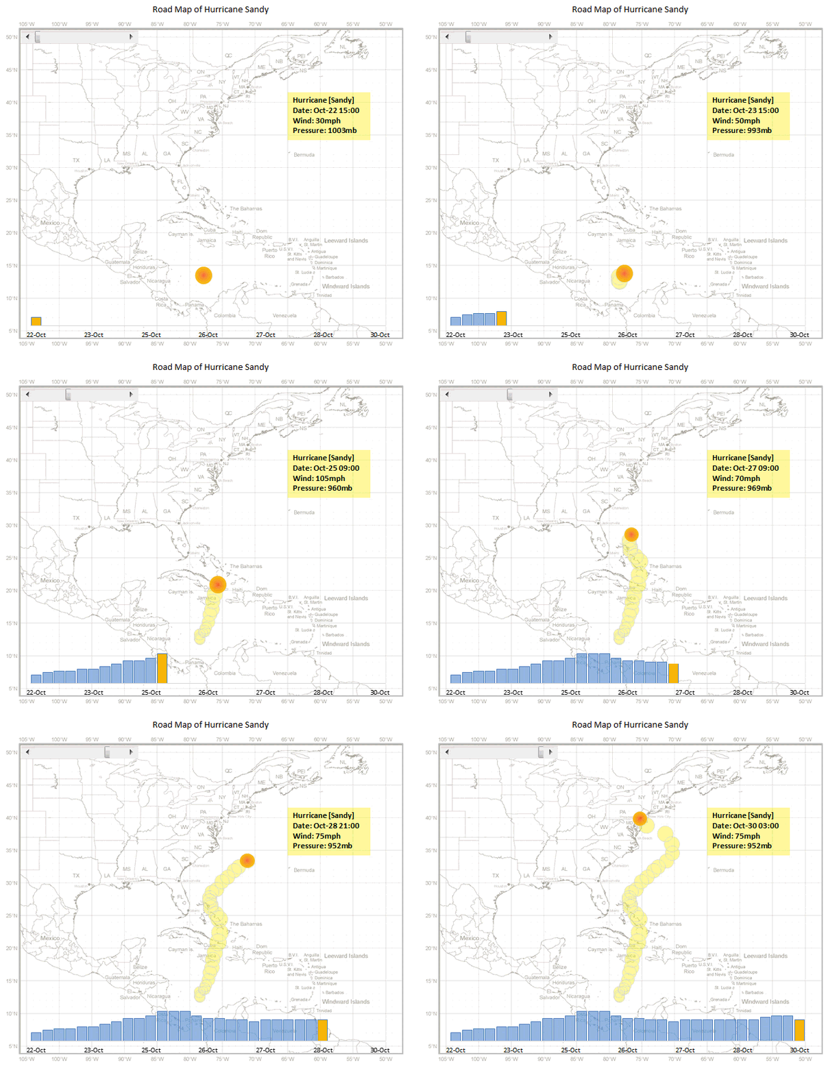
Hurricane Sandy has taken front seat in all major news channels, papers, websites even in far off places like India. I hope & pray that our readers in US East coast are safe.
Today, lets understand the journey of Hurricane Sandy in this animated chart, prepared by Chris from Excel365.
Continue »Designing a Project Portfolio Dashboard [Part 1 of 2]
![Designing a Project Portfolio Dashboard [Part 1 of 2]](https://img.chandoo.org/pm/project-portfolio-dashboard-mockup.png)
In this 2 part tutorial, we will learn how to design a project portfolio dashboard. Part 1 will focus on user needs & design. Part 2 on Excel implementation.
Background
As you may know, we sell a set of Excel Project Management templates. These templates help plan, track, manage & report a project right from Excel.
While these templates good, they have one limitation. They work for one project at a time. Many customers have asked me if I come up with a project portfolio dashboard that can tell what is going on in a set of projects in one view.
And that is where we begin.
Continue »Use Indexed charts when understanding change [Charting Techniques]
![Use Indexed charts when understanding change [Charting Techniques]](https://img.chandoo.org/c/example-indexed-chart-in-excel.png)
Today, lets talk about indexing, a technique used to compare changes in values over time.
What is indexing?
Lets say you want to compare prices of Gold & Coffee over last few years. Gold price in 2011 (oct) is $1,655 per ounce. And now (sept 2012) it is $1,744. Like wise, Silver price in 2011 is $32.06 and in 2012 it is $33.61. How do we compare such diverse numbers?
Enter indexing.
First we need to calculate price of Gold and Silver in 2012 assuming their starting price is 100. This can be done with simple arithmetic.
Now, we can easily compare the prices. Looking at the indexed prices, we can conclude that both Gold & Silver prices have gone up by similar percentage (~5%).
Continue »Excel Formatting Tips – Gangnam Style [open thread]
![Excel Formatting Tips – Gangnam Style [open thread]](https://img.chandoo.org/f/excel-formatting-gangnam-style.jpg)
Ever seen a glaring, over the top, wow-I-am-sooo-cool type of spreadsheet? Lets call them Gangnam spreadsheets!
Gangnam what?!?
If you have never heard about Gangnam style, do not worry. Just like you I too was living under a rock for about a week ago. Then I watched the awesome Gangnam style song. And now I am hooked. You can see it here.
What has all this got to do with Excel?
Oh I am coming to the point. One of the key ingredients of being awesome in Excel is,
To make our Excel workbooks communicate best by avoiding over the top formatting, unnecessary bells & whistles and focusing on what our users want.
But Excel being a feature rich software, it does have various so called Gangnam styles – superfluous 3d effects, formatting options, charting choices and as such.
Today, lets talk Excel formatting – Gangnam style
Continue »Growing a Money Mustache using Excel [for fun]
Mustache and Excel?!? Sounds as unlikely as 3D pie charts & Peltier. But I have a story to tell. So grab a cup of coffee and follow me.
Today, lets talk about how to construct a dynamic chart that can show us how much progress we have made against a financial goal (in this case, accumulating a big chunk of money). I call this growing mustache chart, inspired from the wonderful Mr. Money Mustache.
Continue »Excel Salary Survey Dashboards – Choose the winner [poll]
![Excel Salary Survey Dashboards – Choose the winner [poll]](https://img.chandoo.org/contests/ssc/excel-salary-dashboards-pick-the-winner-poll.png)
Recently, we published 66 dashboards visualizing Excel salaries around the world. Each of the contestants have put in great effort and hand-crafted these beauties. Now its time we picked a winner.
How does the voting work?
The voting has 2 components
- Readers (that is you) pick a winner and runner-up using online voting.
- Judges (2 of them) will also pick winners. Judges vote carries 20% weight.
![Making your dashboards interactive [Dashboard Essentials]](https://img.chandoo.org/vp/grammy-bump-chart-replication-in-excel-demo.gif)
Everyone likes to be in control. Even my 2 year old daughter jumps with joy when she lays her hands on TV remote. She pushes the buttons and assumes it is working. It is another story that we rarely watch TV at home.
By adding an element of control, we can make our dashboard reports fun. Interactive elements like form controls, slicers etc. invite users to play with your dashboard, get involved and understand data by asking questions. That is why I recommend making dashboards interactive.
Today lets understand how you can make dashboards interactive.
Continue »How to make Box plots in Excel [Dashboard Essentials]
![How to make Box plots in Excel [Dashboard Essentials]](https://img.chandoo.org/dashboards/bp/box-plot-in-excel-how-to.png)
Whenever we deal with large amounts of data, one of the goals for analysis is, How is this data distributed?
This is where a Box plot can help. According to Wikipedia, a box plot is a convenient way of graphically depicting groups of numerical data through their five-number summaries: the smallest observation (sample minimum), lower quartile (Q1), median (Q2), upper quartile (Q3), and largest observation (sample maximum)
Today, let us learn how to create a box plot using MS Excel. You can also download the example workbook to play with static & interactive versions of box plots.
Continue »Analyzing 20,000 Comments

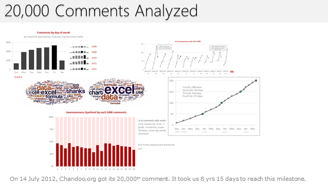
On 14th July, evening 4:51 PM (GMT), Chandoo.org received its 20,000th comment. 20,000!
The lucky commenter was Ishav Arora, who chimed, “Like super computers…Excel is a super calculator!!!!” in our recent poll.
It took us 8 years & 15 days since the very first comment to get here. And it took just 1 year 7 months & 23 days to add the last 10,000 comments (we had our 10,000th comment on 21st November, 2010).
Out of curiosity, I wanted to understand more about these 20,000 comments. So I downloaded our comment database, dumped it in Excel and start analyzing.
Continue »

